5 Accessibility Tips for Mobile Apps

Vidit Bhargava
Accessibility in Apps isn’t just a thing for the differently abled people. Its for everyone who would find some assistance from the App helpful in finding the way through his or her app. Be it some one who needs a larger text or just some one new to such kind of gadgets (People generally in their late 50s or 60s), everyone finds it helpful if his / her app is accessible. Moreover making an app accessible doesn’t take a lot of resources, time or money. Its just a few steps to ensure that your app is easy to use for everyone
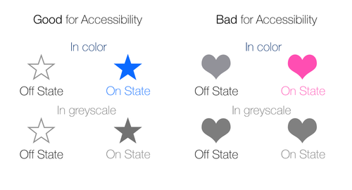
1. The Grey Scale Check
Whenever we create an icon related button with an on and off state. Its a good practice to go through a grey scale check. Basically you are ensuring that the app is just as easy to use for those with color recognition issues as those who can clearly distinguish between different colors. Here’s a good and a bad example of this technique:
2. Dynamic Text
People sometimes prefer a large text to be displayed on their phones. This is due to an eye condition that naturally develops at a certain age. Operating Systems like iOS have support for dynamic text for third party applications as well. This allows the user to adjust the text size on his phone according to his needs. For Reading Heavy apps dynamic text is a must! However, since a Dynamically Resizable text might harm the UI in certain cases, causing more damage then benefit for the users, its advisable to choose dynamic text only when needed.
3. Correctly Labelled Buttons
Having correctly labelled buttons is a big advantage for those who rely on the voice over accessibility feature of iOS. Basically, when a person taps on a button with voice over turn on, the phone speaks out the button label. It really helps if it goes like this “Star Button: Save your favorite word by tapping here” instead of “Button 2”.
4. Speak Functionality
Something that a lot of great apps seem to be skipping these days is an option to speak selected text. This is incredibly useful for people with reading disabilities but its also a great utility for those who’d quickly like to read something. I too am an avid user of this accessibiltity feature. Its just too convenient for reading just about anything, specially long articles.
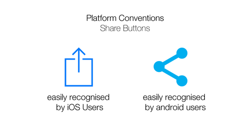
5. Following Platform conventions
Following Platform conventions is a secret accessibility tip. Its often discussed as a good design practice but using the platform conventions like System like Navigation, appropriate Sharing buttons for different platforms and generally following the platform’s conventions file designing the User Interface for a mobile app significantly reduces the learning curve. When the user is able to navigate through an app as easily as he’s able to navigate through his phone’s system apps, it builds a great level of trust in the user.