Always on display on the Apple Watch Series 5

For anyone who has used the Apple Watch Series 5, the always on display is something that’s literally hard to miss. It’s an essential feature that Apple’s done well.
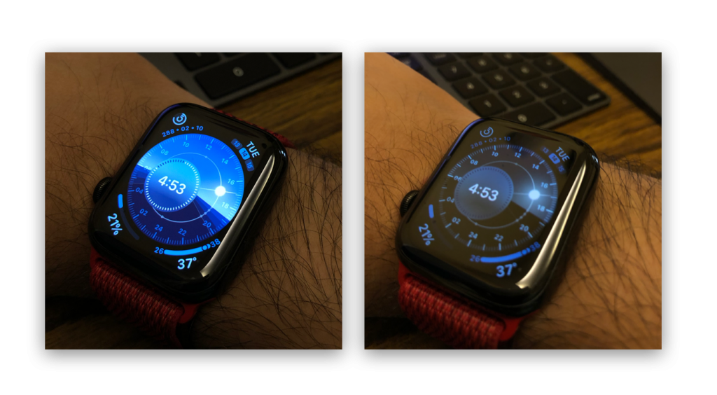
The watch faces elegantly fade into their dimmer versions. Not only reducing the alpha values, but also adjusting the interface so as to be entirely readable in a ‘dim mode’ of sorts. Just look at how the Solar watch face which has a bright day time interface, dims out to maintain the legibility of sun position. The interface animations have this apple like detail to them that feels more than just a nice touch.
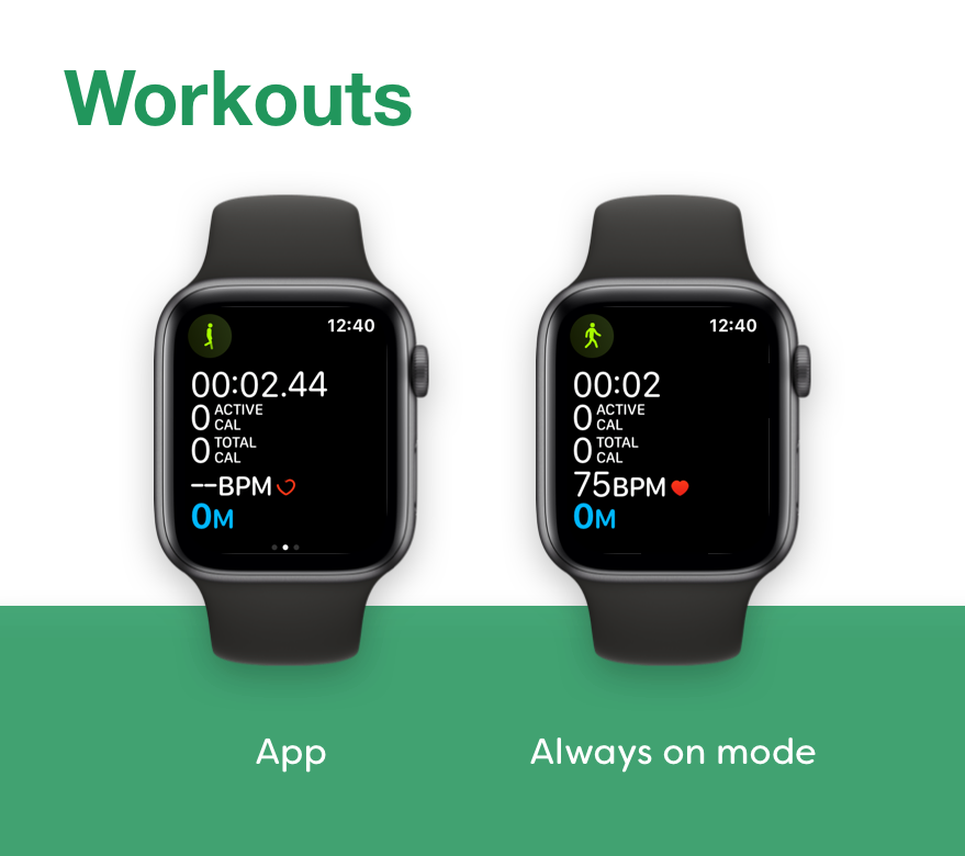
Apple also extends the always on display to the Workouts app where the always on mode retains some of metrics visible in the normal mode. But then stops there. There’s literally no other app on the Apple Watch platform that takes advantage of the always on display. Every other app gets this blurred out mode where only time is visible, and while that is the right thing to do in some apps, in a lot of cases, that’s not really helpful, in fact those apps would benefit from glanceable information being present on screen.
I did a few mockups on how Apple could take advantage of the always on display for some of its default apps on the Apple Watch:
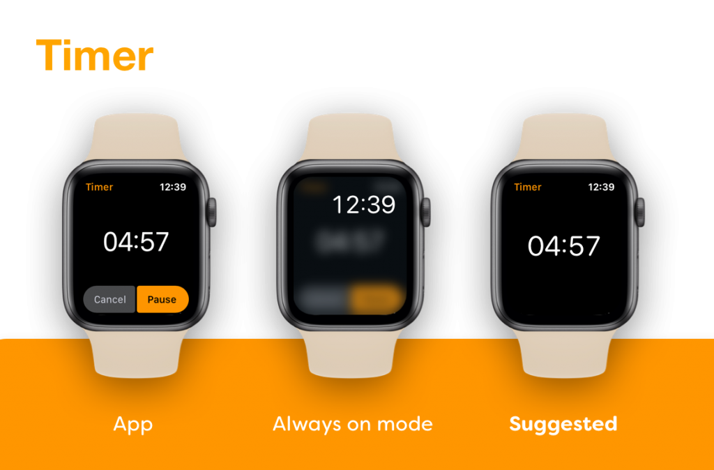
The idea behind always on mode is to keep presenting the glanceable information on the screen and dim out or remove the interactive elements. As you’d have to raise your wrist or touch your watch to perform them any way. In the timer app, I remove all the buttons from the active timer, and keep only the countdown on the always on display.
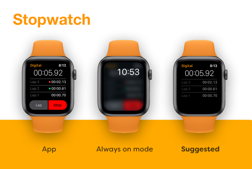
The Stopwatch also presents the counter in an always on mode. It also retains the lap information on the always on screen, but dims it a little.
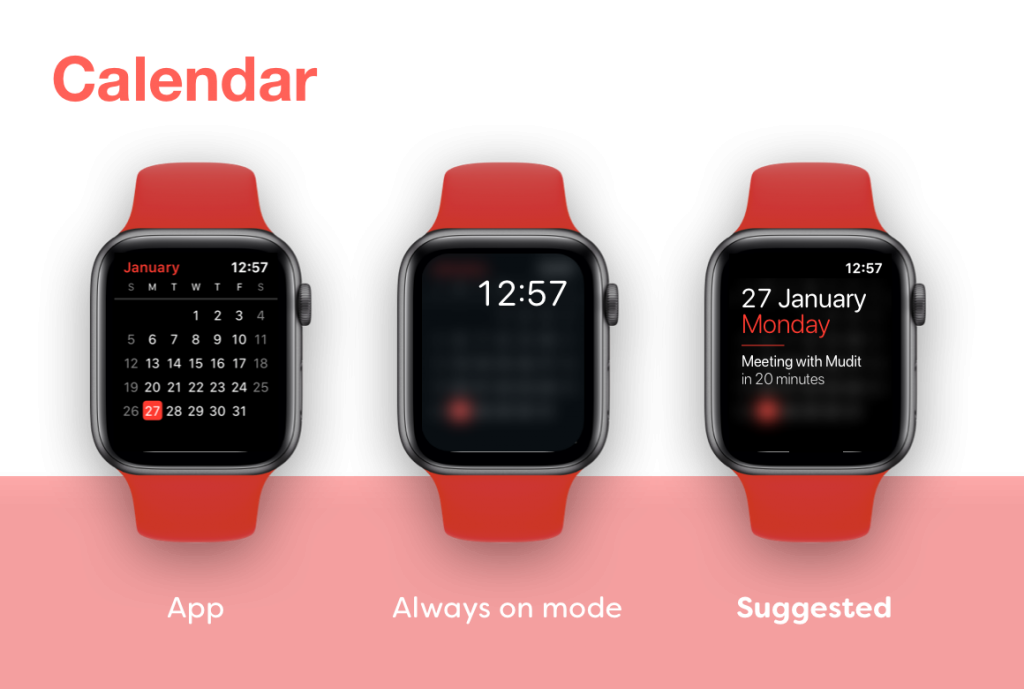
In the calendar app, there are two glanceable elements. First, the current date and month (which is part of the UI in the app’s normal interface) and second the upcoming events on the day. Which would usually require the person to tap on the date but because that’s the intent of using the calendar app on the watch, that information is retained on the always on screen.
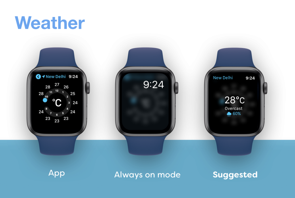
The Weather app poses an interesting conundrum. Much of the app’s interface is interactive and doesn’t always show the required information in big bold letters until you interact with it. So, in the always on mode the interface is blurred and the essential information from all three interactive states is put forward.
—
I would really like to see the Apple Watch gain this functionality in upcoming watchOS releases as, much of watchOS app design is about putting glanceable information above the fold, and glanceable in its true sense should mean, alwaysglanceable and not glanceable when the app is active. The always on mode doesn’t have to have fancy graphics. It only needs basic text elements, and that seems like a plausible solution for the battery restrictions that need to be put in for such a mode.