Android Lollipop: Design Preview
Vidit Bhargava
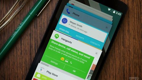
A few months ago, I had a look at Google’s material design guidelines. My First Impressions, plainly put, are that the new design certainly has an aesthetic appeal and is a much better documented guideline than the previous ones which included the ill-fated Halo theme but at the same time, it’s miles behind in things like Universal Design (doesn’t even pass basic tests) and that material design is not perfect, it is arbitrary in places, flashy at some others.
Lets start with interactions. Interactions are great in Android Lollipop. They Fly. They’re extremely fluid and subtle. It’s easy to go overboard with the idea of fluid User Interactions but Google’s done a great job at keeping them as subtle as possible. Most of the interactions are great but then there’s this awkward one that google’s using for active buttons where the button “rises up” up tap which gives the impression that its moveable, when really it is just going in press state. Overall, Interactions on Android Lollipop were a much needed upgrade for Android and are put to good use.
The home screen has been refreshed with a new User Interface too. It’s an iterative update, which is great. Its also extremely clean and fresh. Google’s done a great job here. The larger icons are more tap-able, the swipe left to Google Now option is extremely helpful and the status bar finally has uniform coloration. Wait. But wasn’t that in the Kitkat release too? Yes but it’s only with Lollipop’s redesign that you experience the full force of these little updates that Duarte and team have put up.
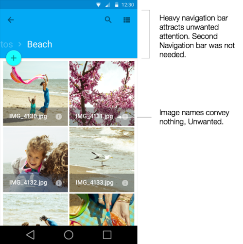
Coming to the Material UI applications. This is where Android starts slipping away from its path. There’s an excessive use of bold colours in the top navigational bar of all applications and those navigational bars are thick. Which pretty much makes them Attract attention for no reason, as the content below those thick bars is in much lighter shades. To top that the choice of colours is arbitrary. Facebook uses a blue title bar, because its branded that way, however its weird to see google’s mail app use a turquoise blue. The real problem is the fact that the colours are extremely bright and to a point distracting as because of the fact that the app content is generally more light weight.
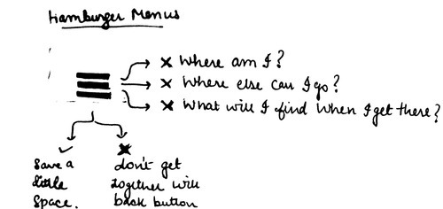
Another interesting aspect of Google’s redesign is the use of Hamburger menus. Now, Hamburger menus aren’t always bad, except they are an extremely inconsistent navigation tool which blow past all design norms. They act as drawers to put extra navigational content in apps. Using them in apps like Gmail is definitely helpful. But i wonder why, would someone need a drawer of navigational options for something like a music app? Then again, navigational drawers don’t always go well with back buttons. What if you were to put a hamburger menu in a screen where a back button also existed? Who would get the coveted top left spot? Will it be shared? (In which case it will become extremely confusing). Google’s design guidelines are surprisingly mum about hamburger menus and their uses and placements.
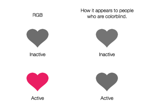
Universal Design. This might be coming a little late in the analysis but Accessibility and Universal Design is something that is of supreme importance not just for the differently abled but for everyone, including new first time users. Accessibility includes a lot of things and one of them is about designing interfaces that everyone can use. Back in June, I put some of Android’s buttons to the famed greyscale test. The results were extremely disappointing and more importantly the problem wasn’t restricted to just a few buttons but it existed system wide. In fact, it still exists in the final build.
The thing is, Accessibility has been ignored excessively in Android. Apart from a few Accessibility features stuck to a Settings menu, there isn’t much emphasis on Accessibility or Universal Design. Again, Accessibility is not just about differently abled people, its for everyone. A more accessible enhances the user experience significantly for everyone. In fact, I’d say, Accessibility is about quality. Its not just a checklist point to be ticked off at the end, it should be built into your design process.
in terms of Design, Android Lollipop is a great update to Android. It is a significant and much needed aesthetic improvement over the previous versions. However, Material Design is far from perfect and Accessibility is a major let down.
–
Further Reading: The new Android Design
