Design Concept: Menu Bar and Multitasking for iPadOS
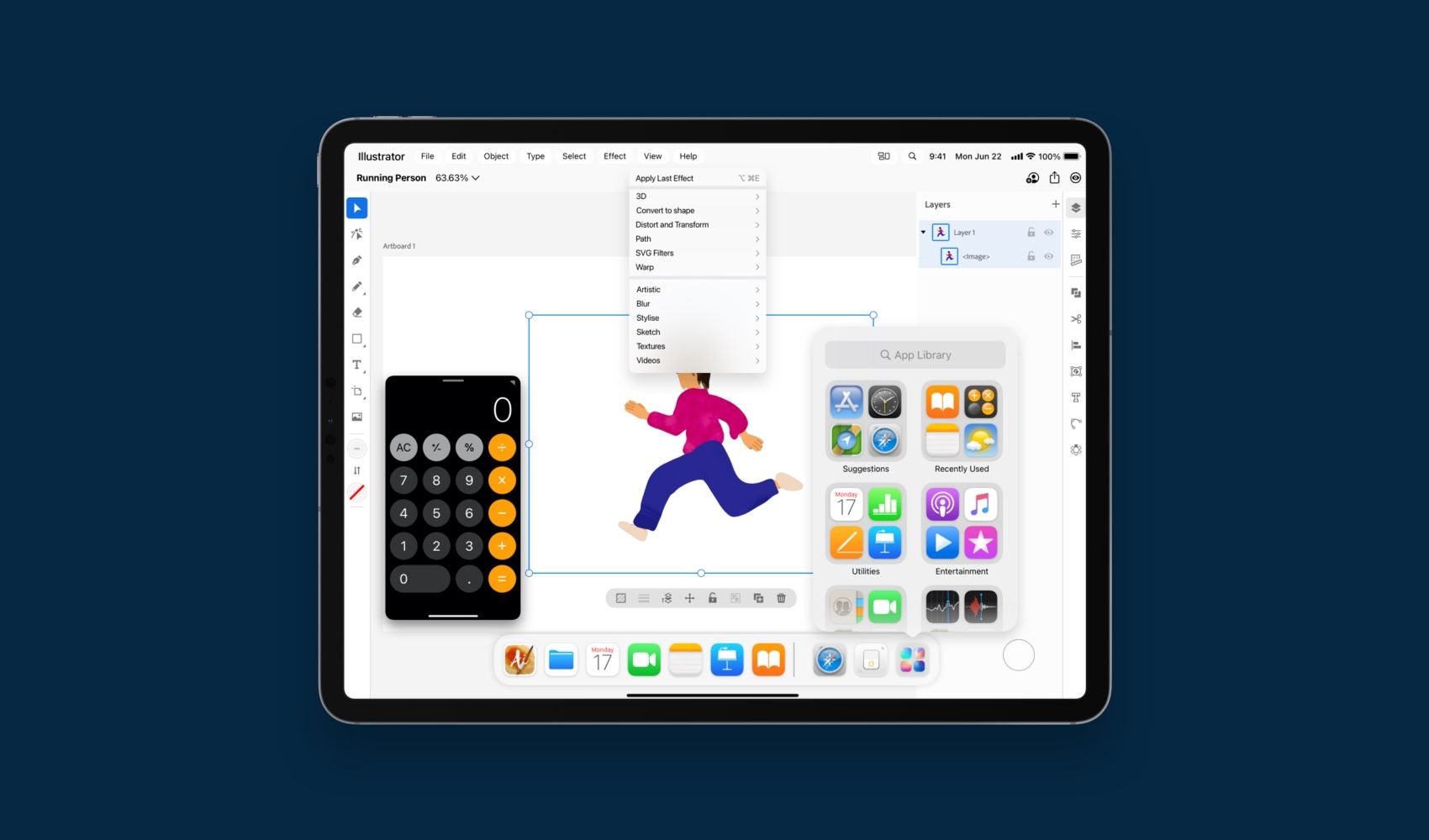
Imaging what a menu bar for iPadOS would look like
When we look at apps like Illustrator, or Affinity Designer or even Procreate on the iPad. They are powerful utility apps that some how struggle with providing a simple, easy to use and understand navigation for their actions. Actions are often hidden behind modes, strips of complicated icons or simply not available for the lack of space.
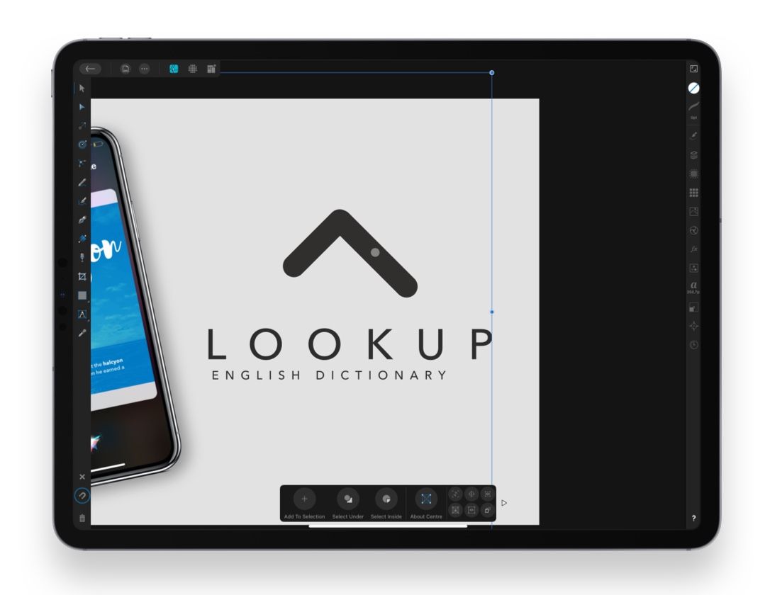
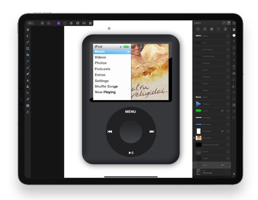
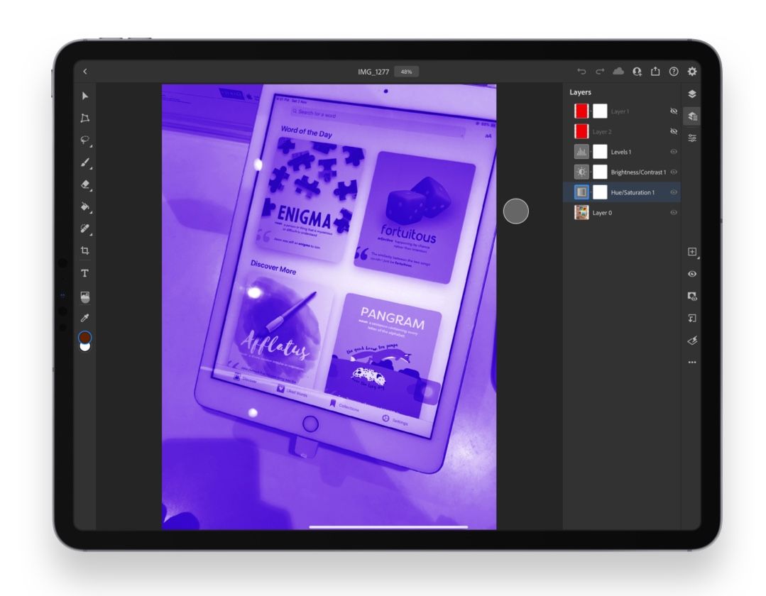
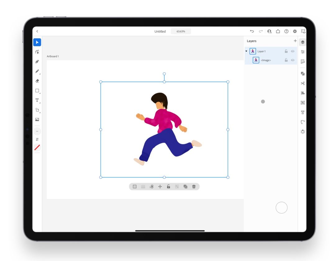
There's no one place to easily access all possible actions for an app, like there is on macOS. The first part of this concept imagines what a menu bar for iPadOS could look like, closely linked to how it could also simplify multitasking.
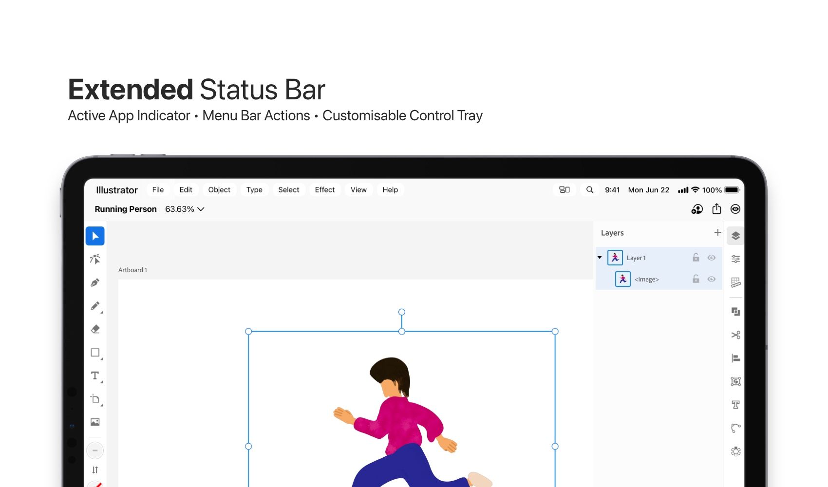
My concept of the Menu Bar hinges on the idea of an extended status bar on iPadOS that provides room for Menu Bar actions, app name that indicates the active app on the screen, and a customisable tray that offers quick access to system wide actions.
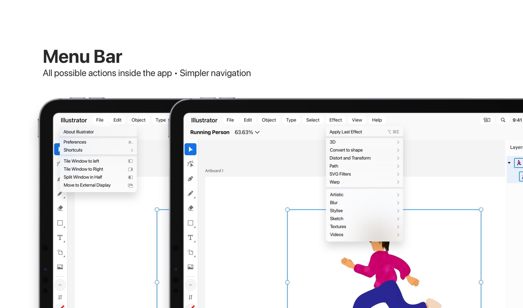
The Menu Bar Actions like macOS offer a menu of all possible actions, complete with Help and Documentations to quickly reach a particular action in the app, it also indicates the relevant keyboard shortcut for it.
Tap on the app name and just like macOS, it shows actions like Preferences, and "About the app" but it also adds iPad Specific actions like a list of all available Shortcuts and actions to put the app in a split-screen multitasking mode or potentially moving an app's window to an external monitor.
The active app indicator is simply the app's name in full screen mode, in split screen multitasking, or when more than one window is present the indicator show's which app's window is active on the screen and changes the menu bar according to it.

The customisable control tray allows users quick actions to essential actions in the OS, right from the status bar itself. It's a quick access to some of the system's most frequently used actions. Such as Spotlight search, or accessing pinned widgets, or shortcuts, or simply having an action to quickly switch to split-screen multi-tasking.
Here's a video showing how it works:
Multitasking
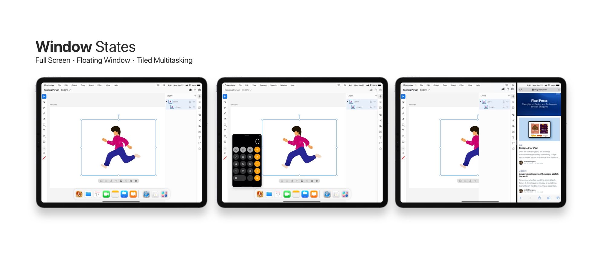
Multitasking in this concept involves three states:
Full Screen: The iPad is a full screen first device. There's a lot of benefit to having one app be in focus. It keeps distractions away and it makes the device so much more easier to use for its less tech savvy users than on a Mac. And so when you tap on an app icon, it takes you to the app in full screen.
Floating Window: Drag an icon on the screen however, and you have a floating window. That can be resized and moved around wherever you like.
Split Screen Multitasking This is the multi window multitasking we all know on the iPad, it enables tiles the window into two parts and shows two different windows simultaneously.
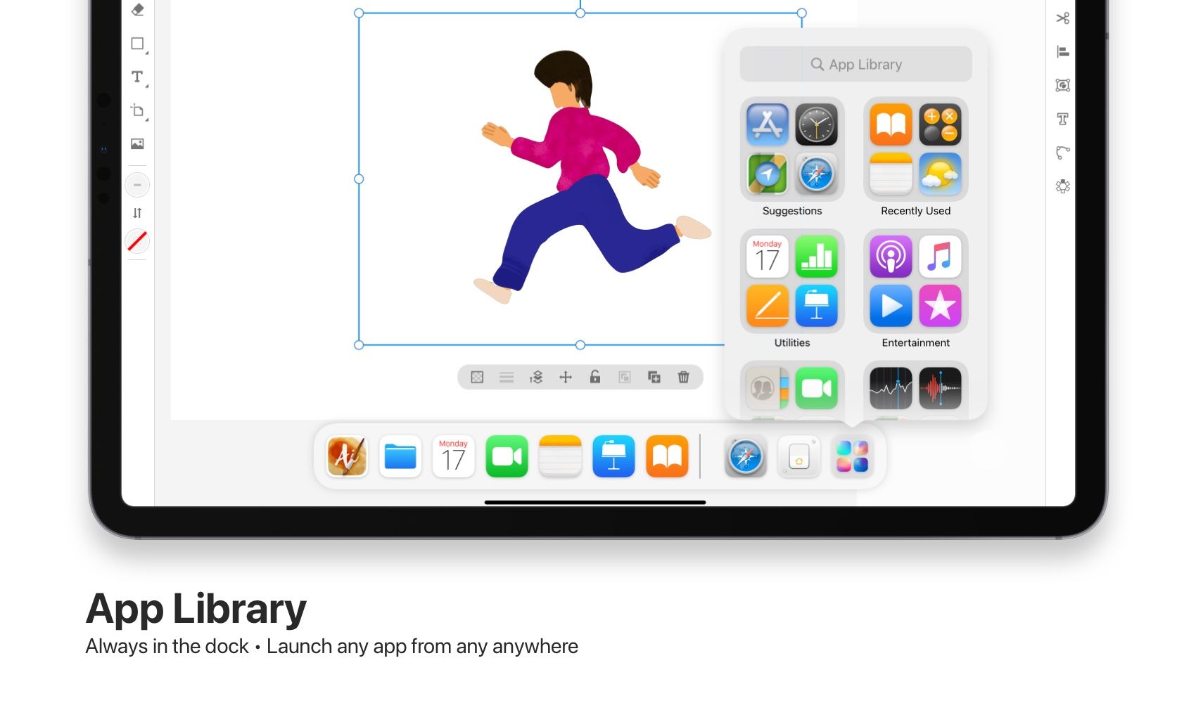
One of the biggest complaints with mutlitasking on the iPad is that all apps are not easily visible on the iPad. This is solved by positioning the App Library to the iPad dock. Simply click on the app library and access any app to start multitasking.
These were just a few ideas that I think would be really cool for a future iPadOS release.
