Designed for iPad

Over the last few years, the iPad has transformed significantly from being a large touch screen device to a device that supports multiple inputs and can be used in a variety of situations. It’s changed the way people interact with their apps.
A good iPad app experience is not only defined by an adaptive interface that scales to the different window sizes, but it’s also defined by technologies like multi window & drag and drop, along with support for the different input modes that the iPad offers.
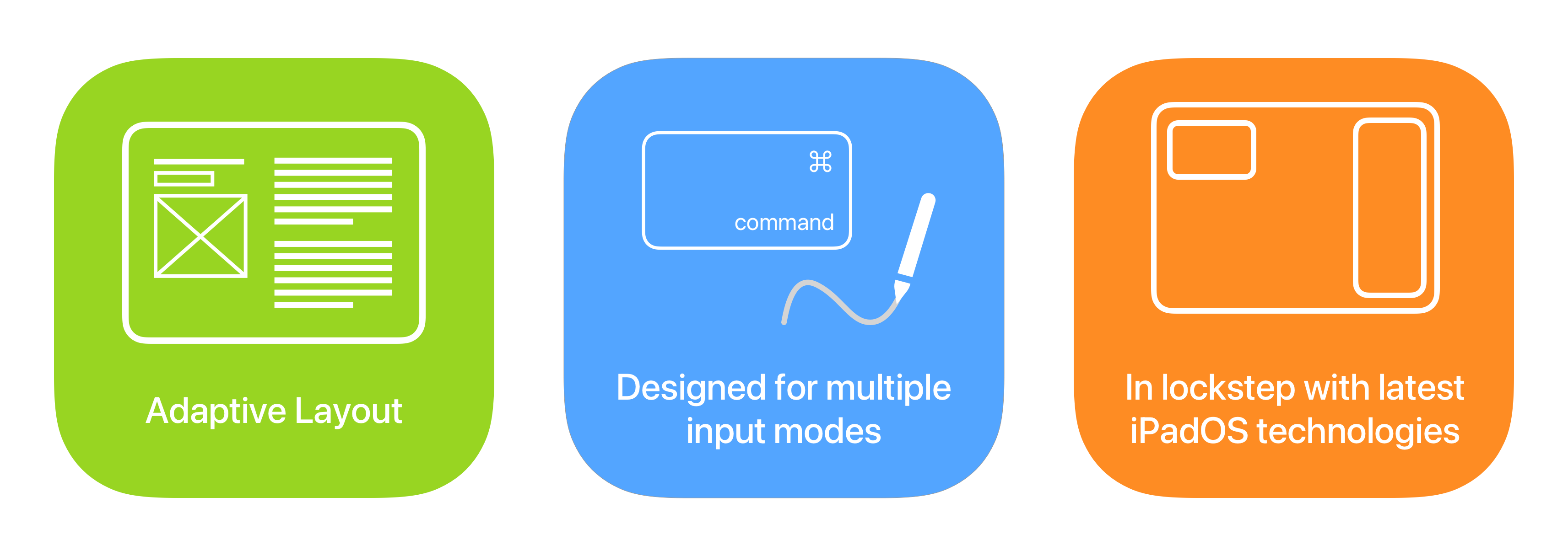
To me designing a great iPad app experience involves three parts:
- An adaptive layout that makes use of the large touch screen
- Support for multiple input methods like the Keyboard, Trackpad and Apple Pencil.
- Being in lockstep with the latest iPad technologies like Drag and Drop, Multi Window and picture in picture.
So, while designing LookUp, I kept all this in mind and documented how the app takes advantage of some of the latest technologies to provide a modern iPad experience:
Layout
Readable Margins: From typographic principles, we know that the legibility of written text depends on its line length (i.e. the number of characters per line). If the line is too wide, it becomes difficult to parse and challenging to read at a decent cadence. On the other hand, if it’s too thin, the text becomes disjoint and it becomes difficult to stay in context of what’s written.
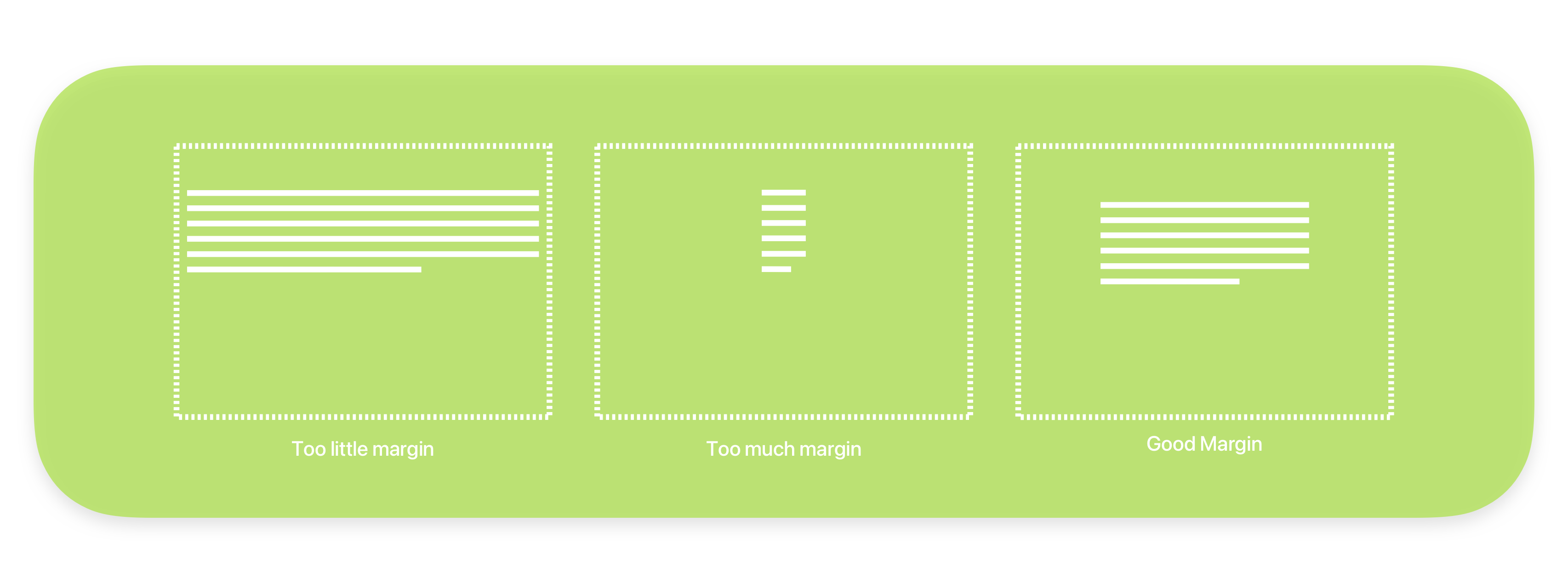
These principles can also be applied to a user interface. On the iPad, where you have a wide screen, the thin 16pt margins of the iPhone make the text look too wide, it becomes difficult and slow to read.
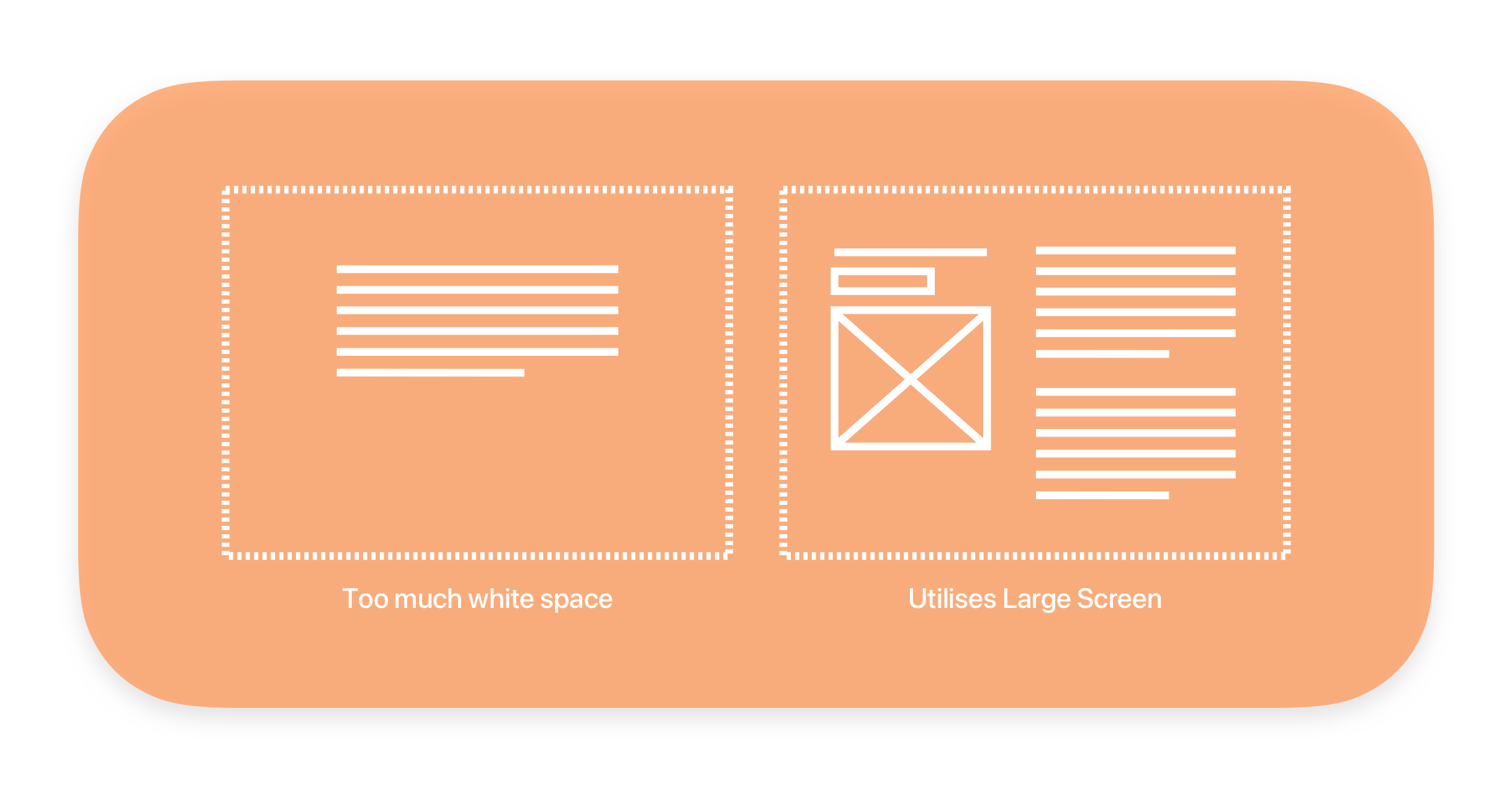
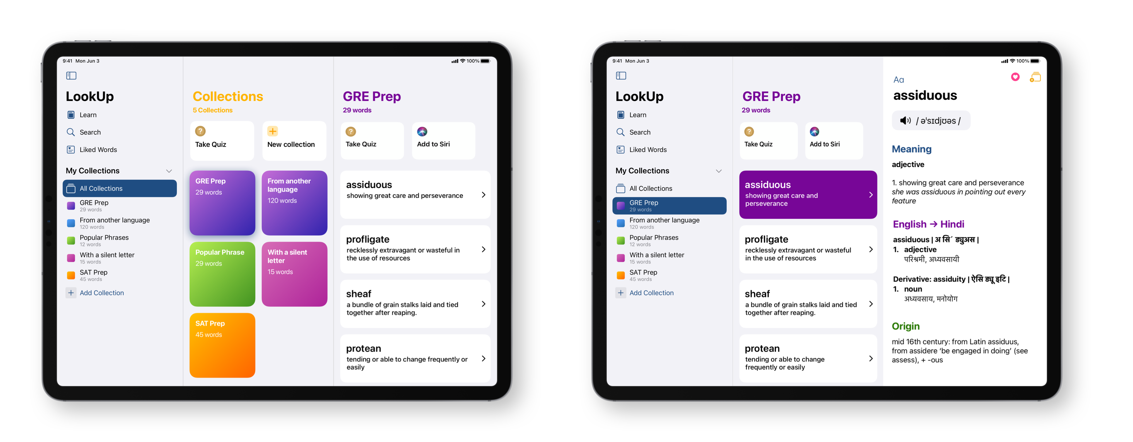
In fact, sometimes it’s best to use a multi-column approach, because the margins can be too wide and the UI appears a bit sparse on larger iPads. For LookUp’s definitions I took a similar approach. While text follows a readable line length, the UI shows a two column layout where the left column can be used for actions and images corresponding to the text on the right. This balance makes the text both readable but also utilizes the screen space in an efficient way.
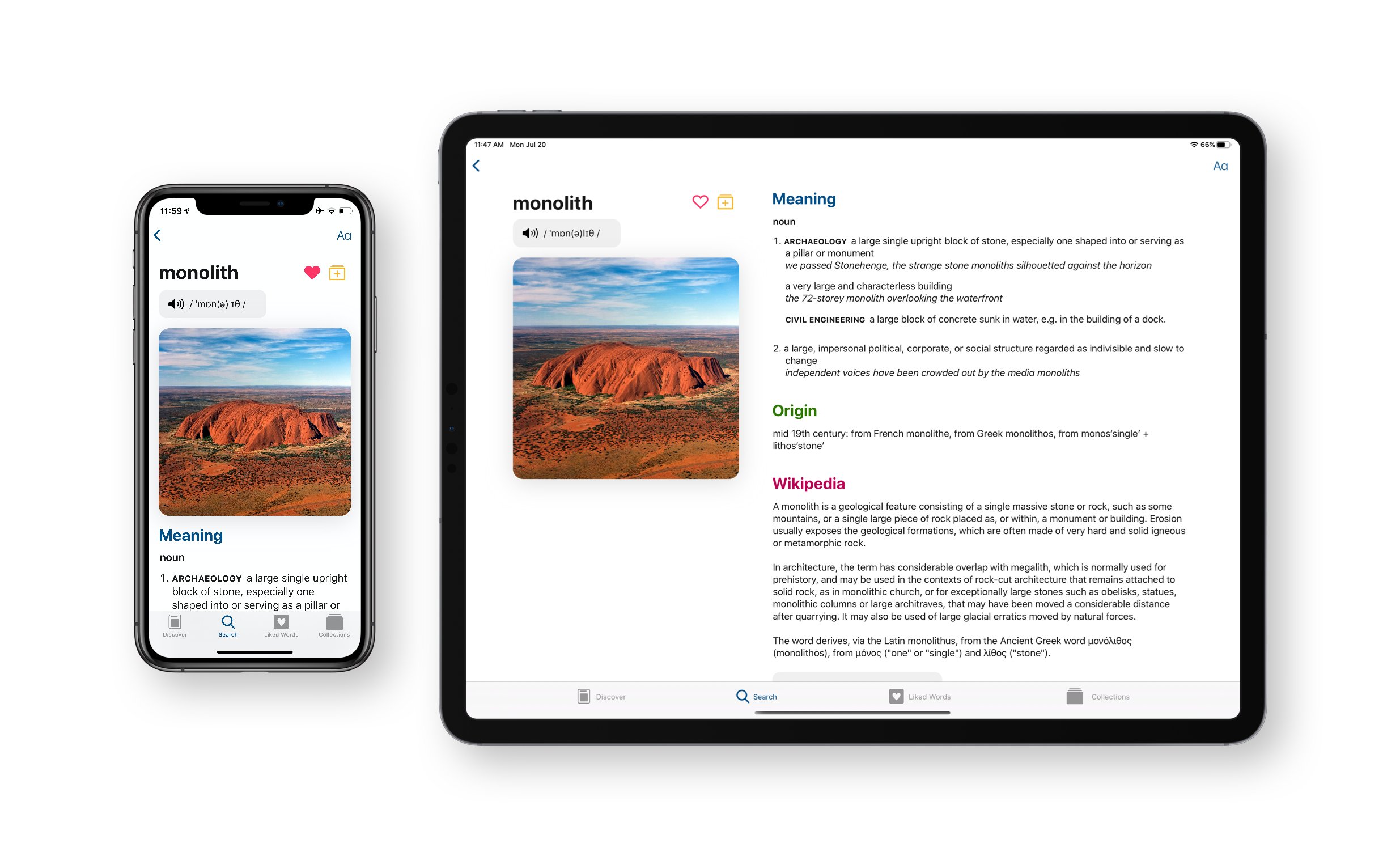
Modified for the larger screen: When designing for the iPad, each interface element is carefully analyzed to consider how it can work on larger screens.
On the left, the screen takes the full width of the iPhone, ensuring a legible experience. On the iPad however, this turns into a two column layout with more margins, utilizing the larger screen.
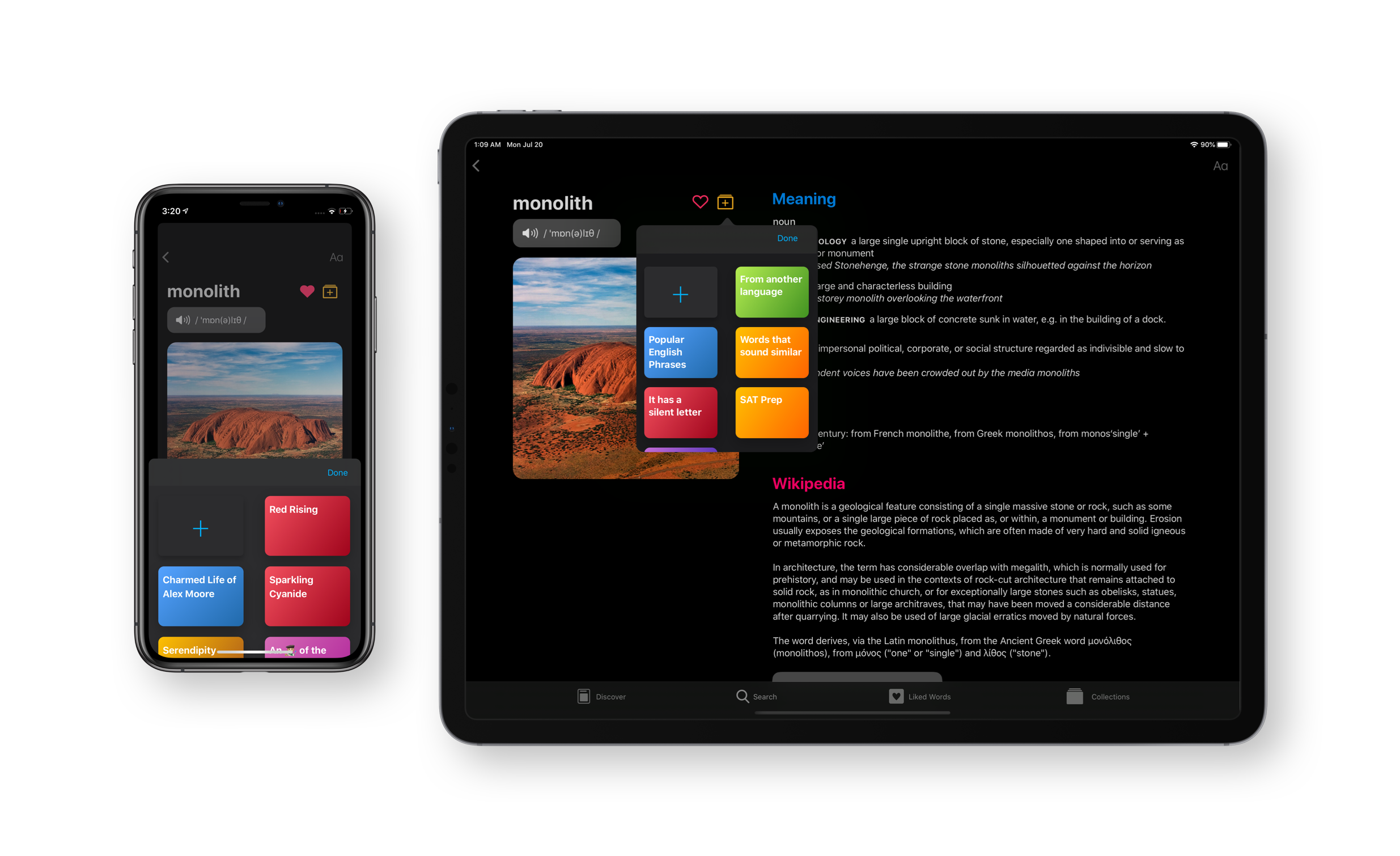
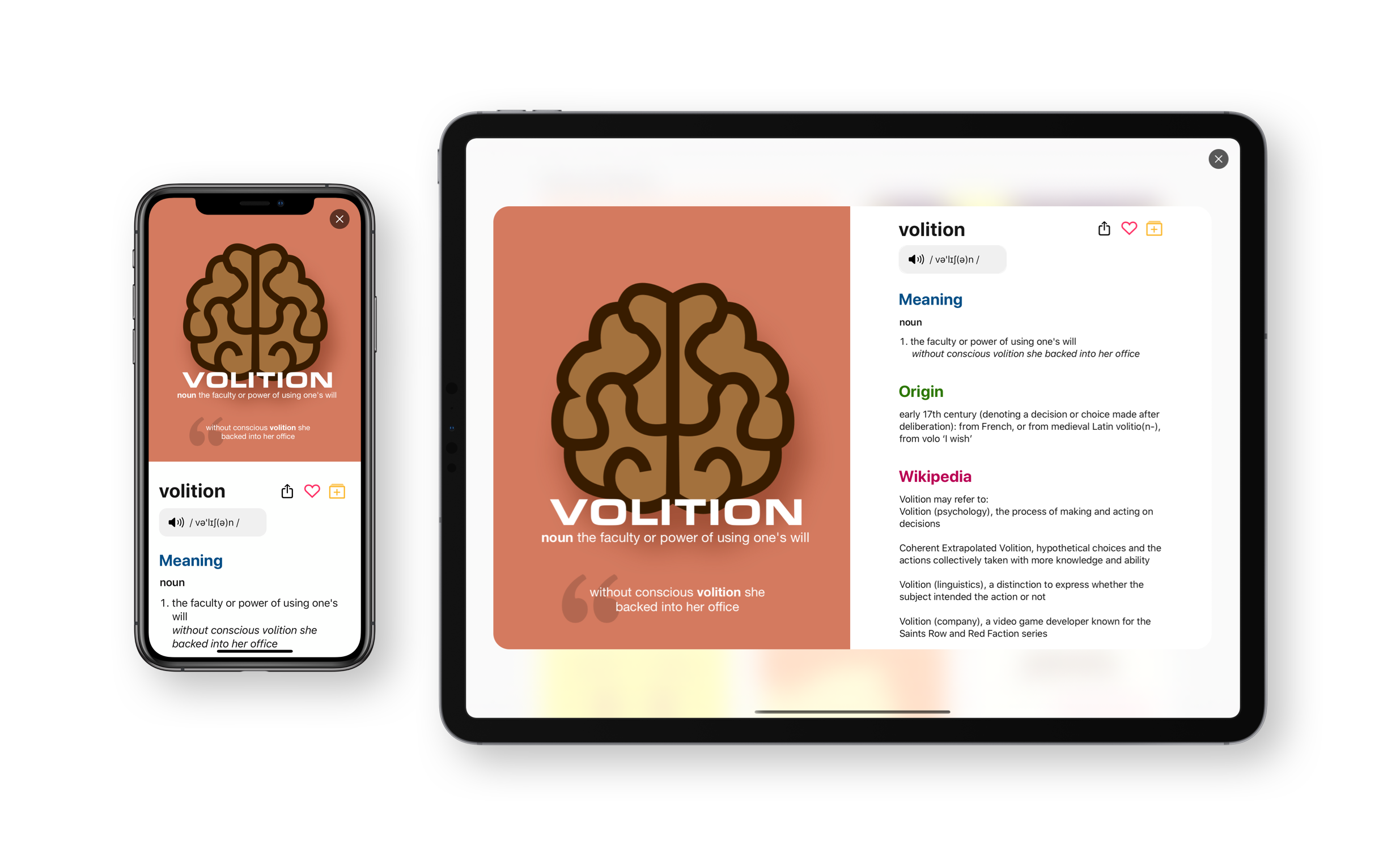
On the iPhone, the card comes from the bottom of the screen and offers an easy way to pick the collections. On the iPad, the same approach would make a big change to the UI, so we just use a popover to display the same content.
Using Grid Layouts: Another great way to scale an interface is to use a grid based layout instead of a single column layout. Here the grid can adapt to present different columns based on the width of the window.
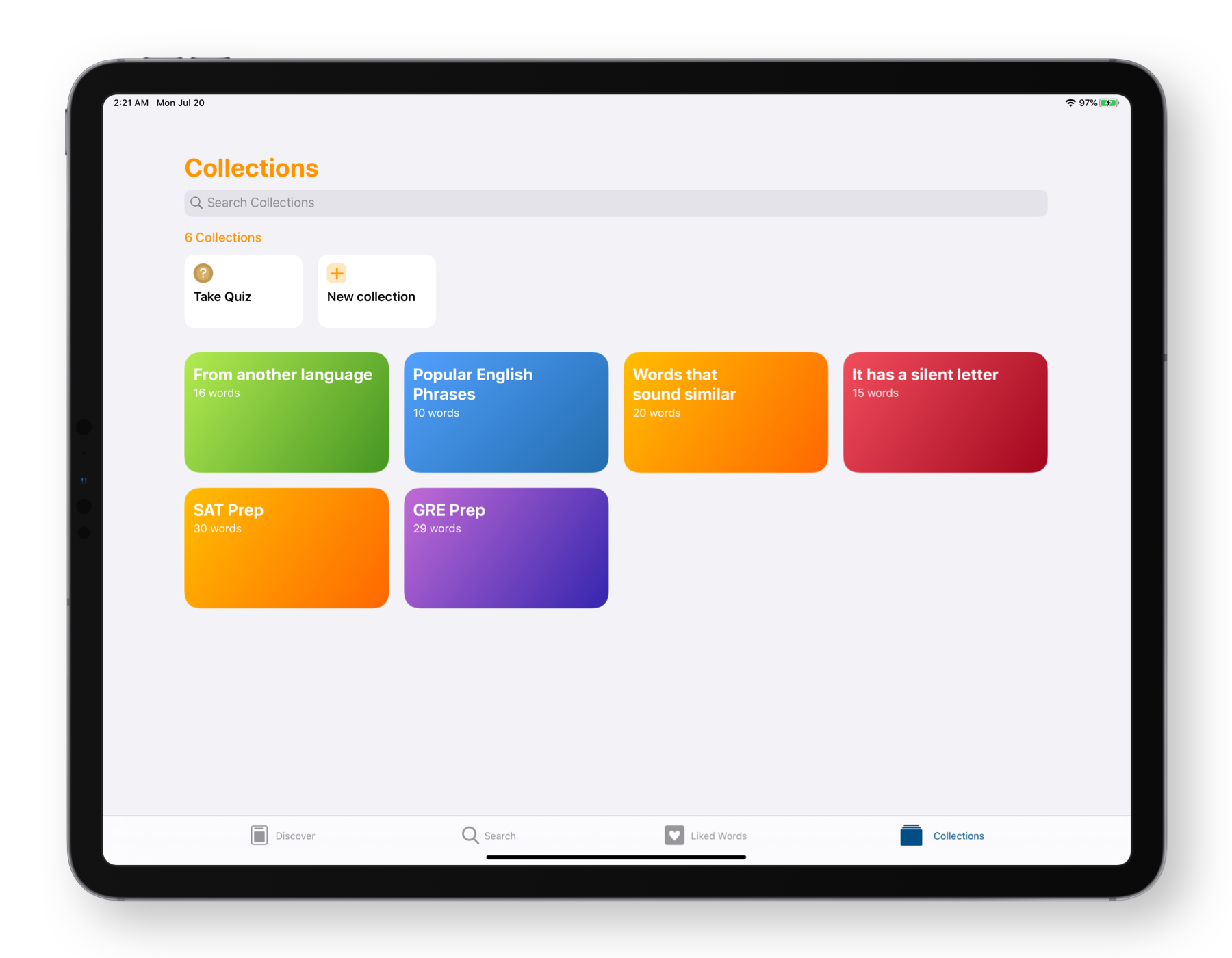
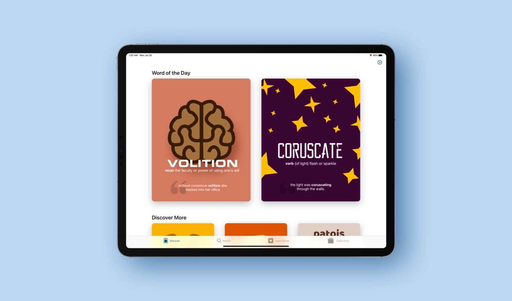
For LookUp, this is how we present much of the UI. From Word of the Day cards, to Collection lists They all appear as grids that scale depending on the size of the device.
Supporting Multiple Input Modes
iPad Pointer
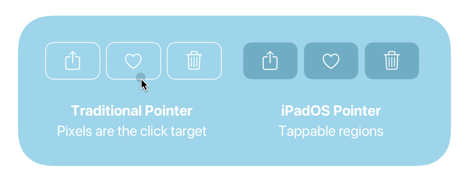
The pointer on iPadOS is a little different from the regular pointer that we see on desktop computers.
While traditional desktop computers use pointers that work at pixel level precision, i.e. the pointer clicks specific pixels on an interface; the iPadOS pointer uses a slightly different method. Because interface elements on iOS are always designed by regions (as they are touch first), the iPadOS pointer takes the shape of the region to allow for clicks. This is just one of the many ways in which the iPadOS pointer works differently.
To add support for the iPadOS pointer in LookUp, I decided to take a look at how Apple’s own apps behave with the pointer and documented my learnings below:
Pointer effects are used sparingly: Not everything warrants a pointer effect. For example going through a list of notes in the notes app doesn’t show an effect when the pointer hovers over or scans through the items.
Pointer effects never distract the user from the task at hand. They don’t come in the way of using the iPad, and are only shown when needed.
The pointer shape rarely changes to a custom shape. But when it does, it’s a meaningful change. For example, when hovering over a drag handle for a column in Numbers the pointer changes shape to show that dragging in that region would change the width of the column. But this effect is not seen on something like a slider, which is a much more commonly used interface element and already shows an accordance of change.
The pointer takes the shape of a rounded rectangle in transparent buttons
For transparent buttons, like the ones we see in the navigation bar, toolbar or the tab bar, the iPadOS pointer takes the shape of a rounded rectangle encapsulating that button. i.e. it adds the highlight effect to the pointer interaction.
Lift effect is used on opaque buttons of small or medium size
The Lift effect adds an interactive shine to an opaque button. On an opaque button the highlight or hover effect may not show enough change to indicate a selection. Whereas adding a parallax and shine not only results in a playful interaction, it also makes the selection more easily apparent.
This is one of the areas where I tested out different effects to get the right one. These buttons are not too large but they’re not exactly button sized either. While a hover effect would’ve done the job to show interactiveness, the lift effect really makes these buttons pop and shine in a way that makes them standout. And because they don’t interfere with the usability of the app, I went with the latter.
Sizes and margins matter! Notice how the Cancel button takes a pill shape that matches the create button on the right. Create, an opaque black button, gets the lift effect, while Cancel gets the highlight effect.
Using the Hover Effect
This is one of the effects that can be a bit tricky to use. The hover effect adds a scale, tint or shadow depending on the button. It’s subtle enough to not distract the user, but also significant enough to show interactiveness. And that makes it an ideal effect for a lot of interface elements. But at the same time, it’s important to not over-use the effect.
The buttons are interactive. While an hover effect would only accentuate that affordance of a button, hovering over a list of items is something we do all the times, and for a variety of reasons, sometimes just to parse through a list and having each button lift ever so slightly would create an annoying experience instead of providing an affordance for the button’s interactiveness.
A much smaller list or one that indicates a significant change (The appearance popover), can make use of the hover effect to add that additional affordance of interactiveness without being distracting.
Right Click Menus:
Contextual menus change to right click menus. And one of the important changes made to LookUp’s contextual menus earlier this year, was to add a good amount of options and shortcuts. It comes in handy when you’re using the trackpad.
Adding support for hover on Progress charts
In LookUp’s progress charts, you need to drag through or tap on a particular data point to see how much you scored in a quiz. This is an easy to use interaction that’s designed for touch. But when you try to do the same with a trackpad, clicking the precise data point can be a bit challenging. So what I did here, is added a hover recogniser that enables users to just hover their trackpad and get details without having to tap multiple times.
Keyboard Support
For an app like LookUp where it’s usually a user’s writing companion on the iPad, it’s common for the users to be using their keyboard while launching the app. And one of the things that you quickly realize while using the iPad with a keyboard is, that context switching can difficult. People don’t often switch between the keyboard and touch screen. So it’s important for iPad apps to have an extensive support for keyboard usage.
Keyboard Navigation: In LookUp, The entire interface can be navigated through the keyboard, this is really usefull if you’re using LookUp as a companion to your writing app. You can quickly look up words and then switch back to writing without ever having to lift your fingers.
Arrow Key Navigation: You can use the arrow keys to navigate through any list. Each time you use the arrow key, the app shows a focus shadow around the selected item, you can then press enter or any of the keyboard shortcuts dedicated for a selected collection.
For example: if you were to press enter you could jump into the definition of the word or if you were to press delete the option it would let you remove the word from the collection.
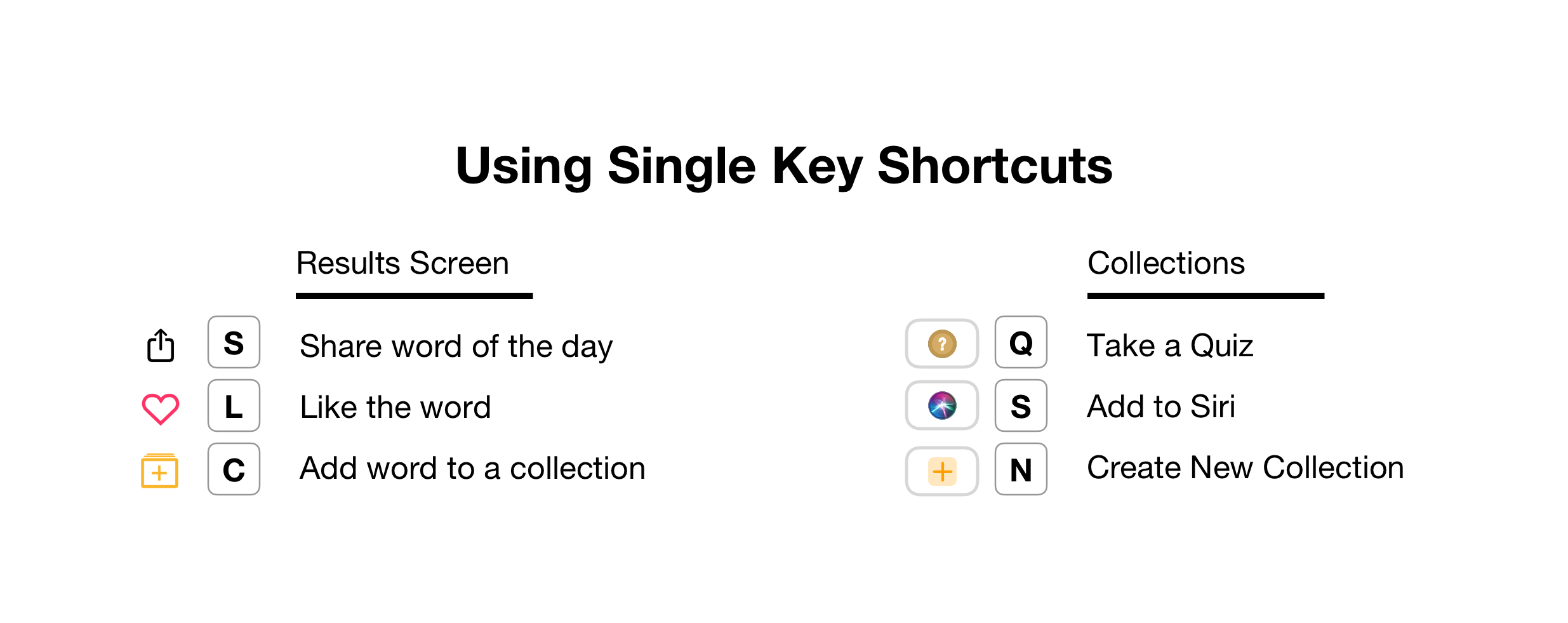
Using Single Key Shortcuts: Using cmd-[key] shortcuts can sometimes slow you down. Especially when it’s a common and quick action. For example, Liking a word in LookUp. It’s something you’d want to do quickly and with minimum fuss.
So for these, important and quickly accessible actions in LookUp single key shortcuts are used. If you are reading the meaning of a word and you’d like to mark it as liked, all you need to do is press L on your keyboard.
Supporting System Shortcuts: These are the keyboard shortcuts that the user expects after having used iOS / macOS.
For example, a popular way to launch preferences for any app on macOS is to use the [ Cmd , ] keyboard shortcut, and to increase or decrease the text size we’re familiar with the [Cmd + and Cmd – ] shortcuts. Mac users are also familiar with using the space bar to quickly scroll down a page, a shortcut that’s lasted generations of macOS.
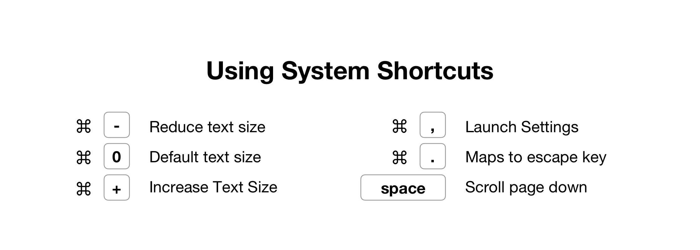
It’s common sense to support these system shortcuts, as it adapts to the user’s mental model of using keyboard shortcuts in system apps and shows them the change they expect to see. When the system behaves the way they expect it to, it creates a satisfying experience.
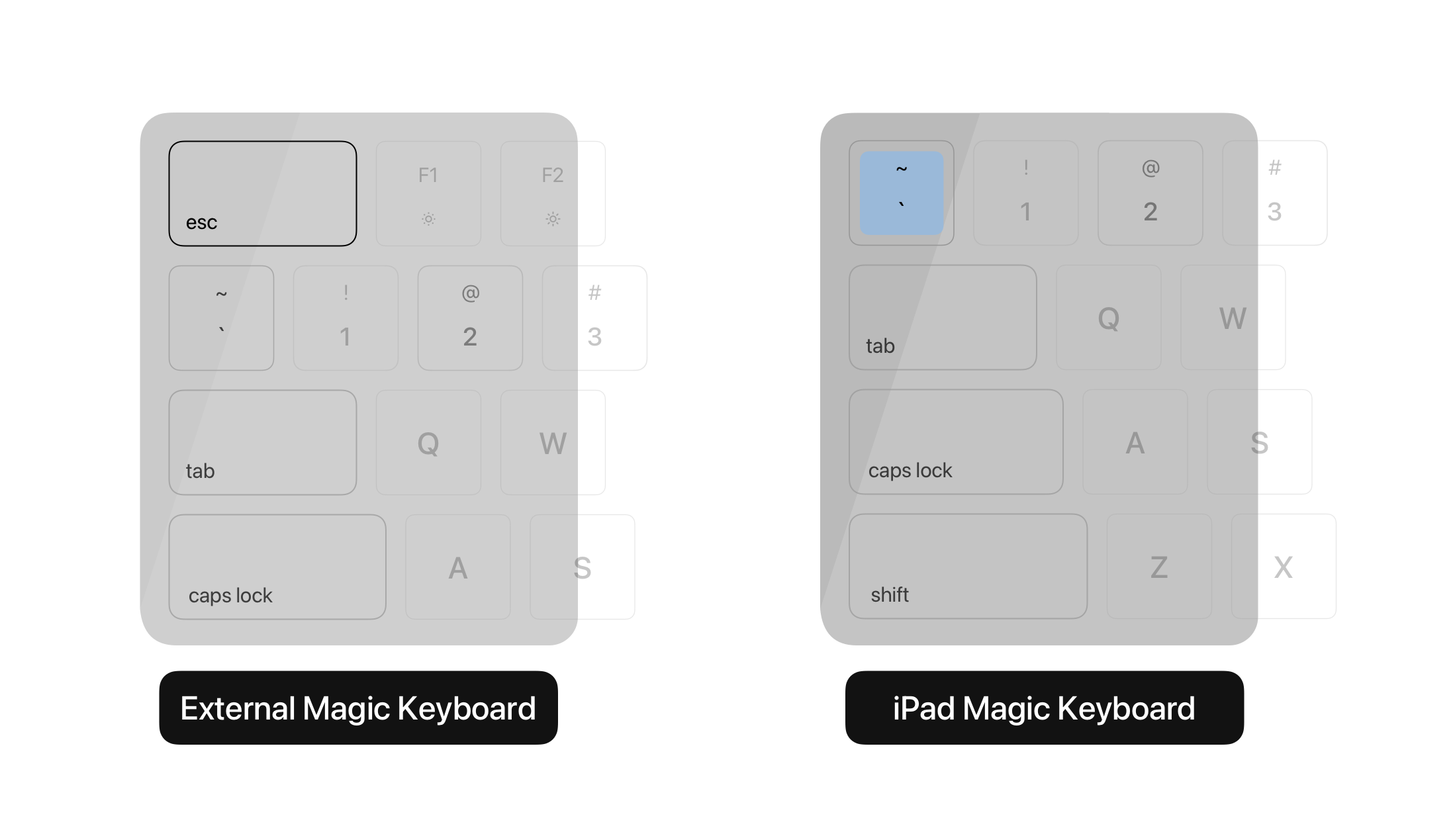
One of the interesting things about the iPad Smart keyboards is the absense of an escape key. However, many external keyboards have the escape key, so LookUp does support escape to go back but also maps the top left key [~] to the move back action. This is done to adapt to muscle memory of the escape key’s location. So when you think of hitting the escape key, your fingers naturally move to the top left of the keyboard, and even though there isn’t one, the navigation still pops back to the previous screen.
Opening new windows with a command + click: This keyboard shortcut lets users to hold the command key and click or tap on the screen to launch items in a separate window. It’s a power user feature that once you know about you find yourself using every time.
Supporting State of the Art iPad Technologies
Drag and Drop
Drag and Drop is one of the most intuitive ways of using iOS. With two windows placed on the side, it’s only natural to assume that you can drag items between the windows.
For LookUp it presents a great opportunity where users can drag out parts of the definition to use as excerpts in their written text, and they can also drag words into the app to quickly look them up.
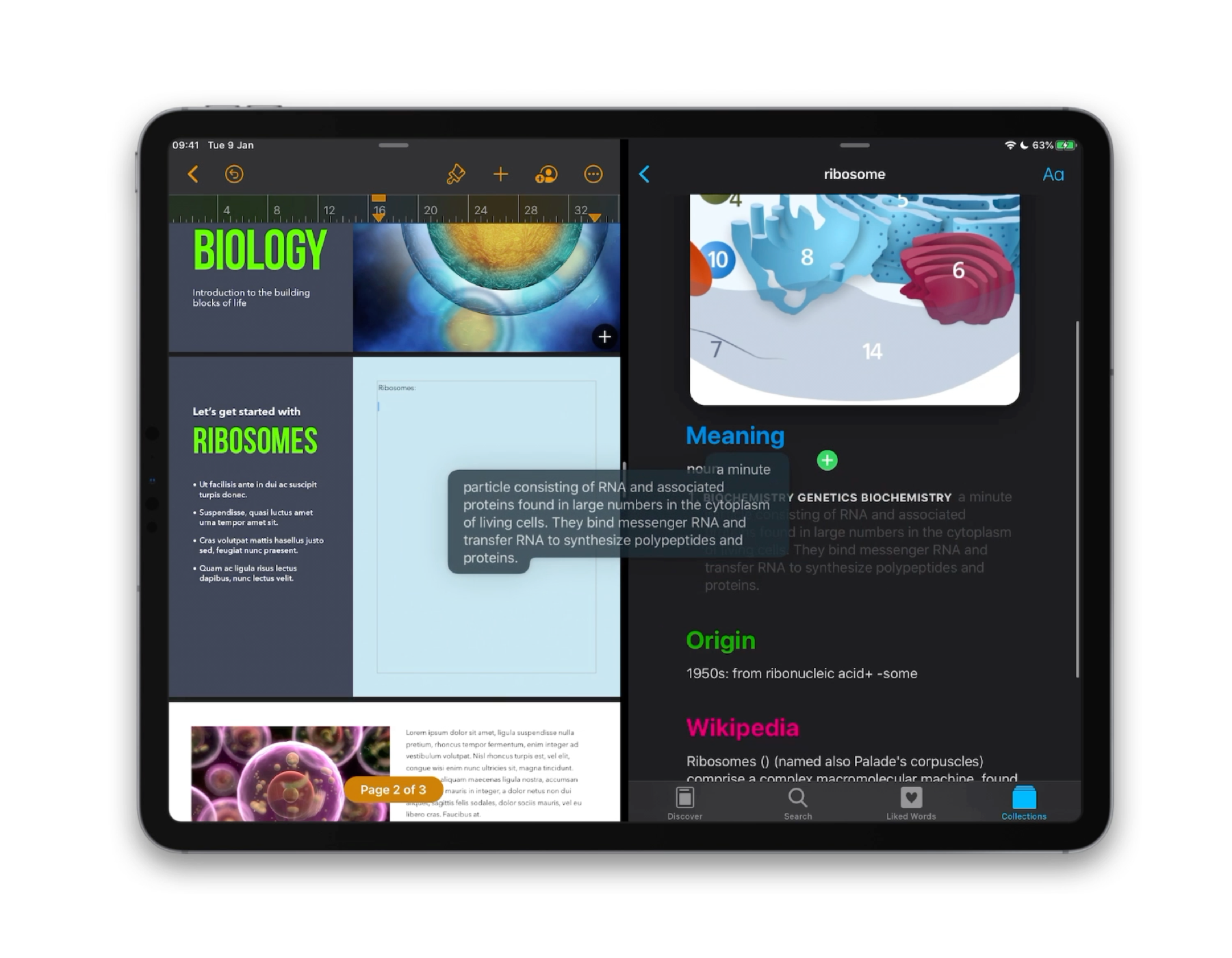
Multi Window Support
Starting iOS 13, apps can support multiple windows on iPad. This is especially useful for writing tools that allow users to have multiple documents at the same time. However, It also brings about a change in user behaviour where users begin to think of apps as multi window instances, they begin to expect multiple windows in more applications.
For an app that’s your reading and writing companion (Two areas where it makes a lot of sense to support multiple windows), it becomes important for the companion app to think in terms of multi window experiences too.
With LookUp, users can create new windows for just about every instance in the app, be it a word’s definition or a specific collection. Almost everything can have it’s own separate window.
This lends to two important uses:
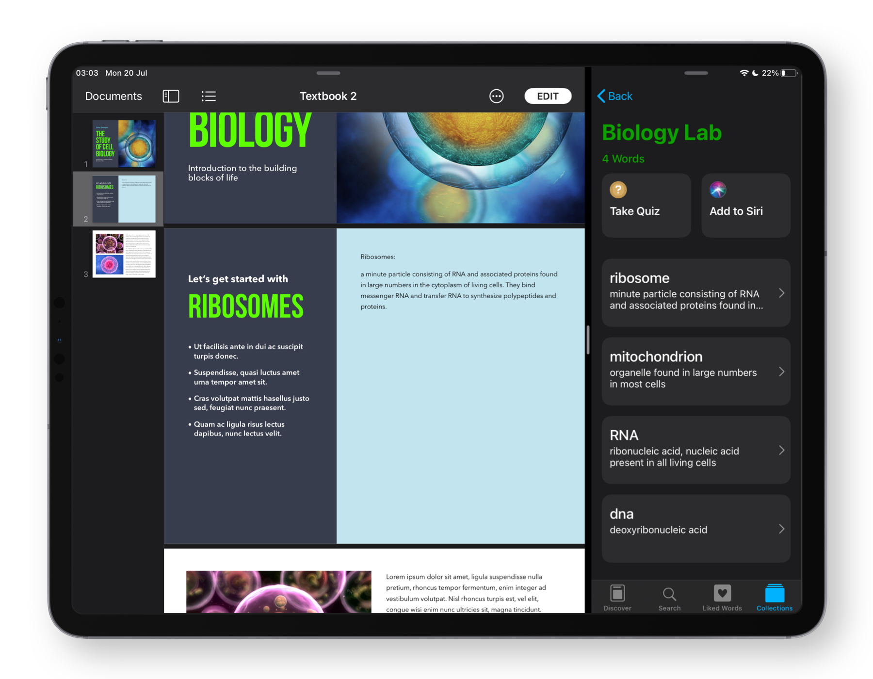
1. Pinning collections to different windows: Let’s say you’re writing a report for your biology lab, and you’ve collected all the requisite terminology in the Biology Lab collection, you could pin that collection to your pages document. So when you next launch your report, you’re taken straight to that collection.
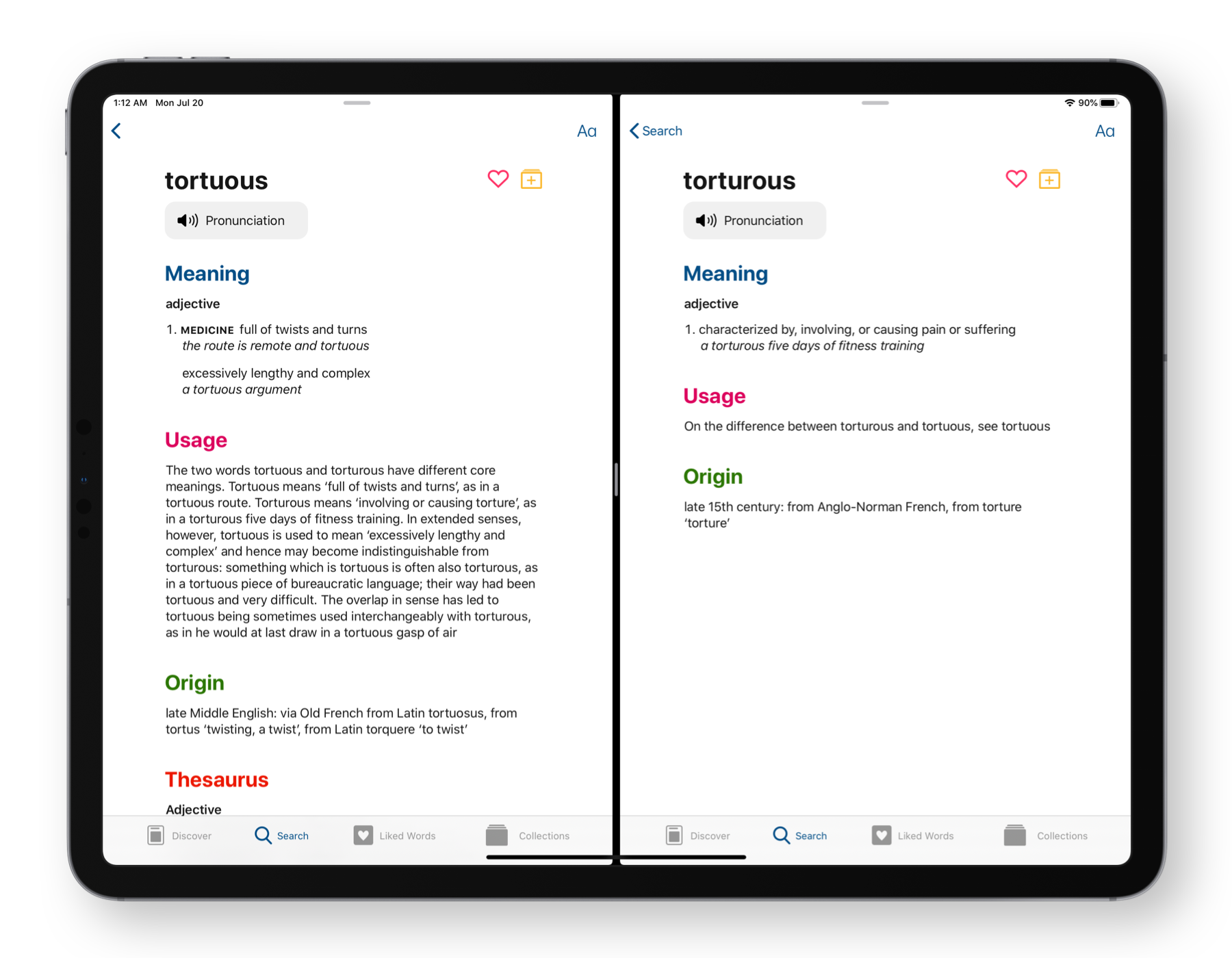
2. Comparing definitions: This is specially important when comparing things like homonyms, or homophones, or even comparing synonyms for a word. Having the definition by the side, makes it easy to understand the differences in usage and connotations.
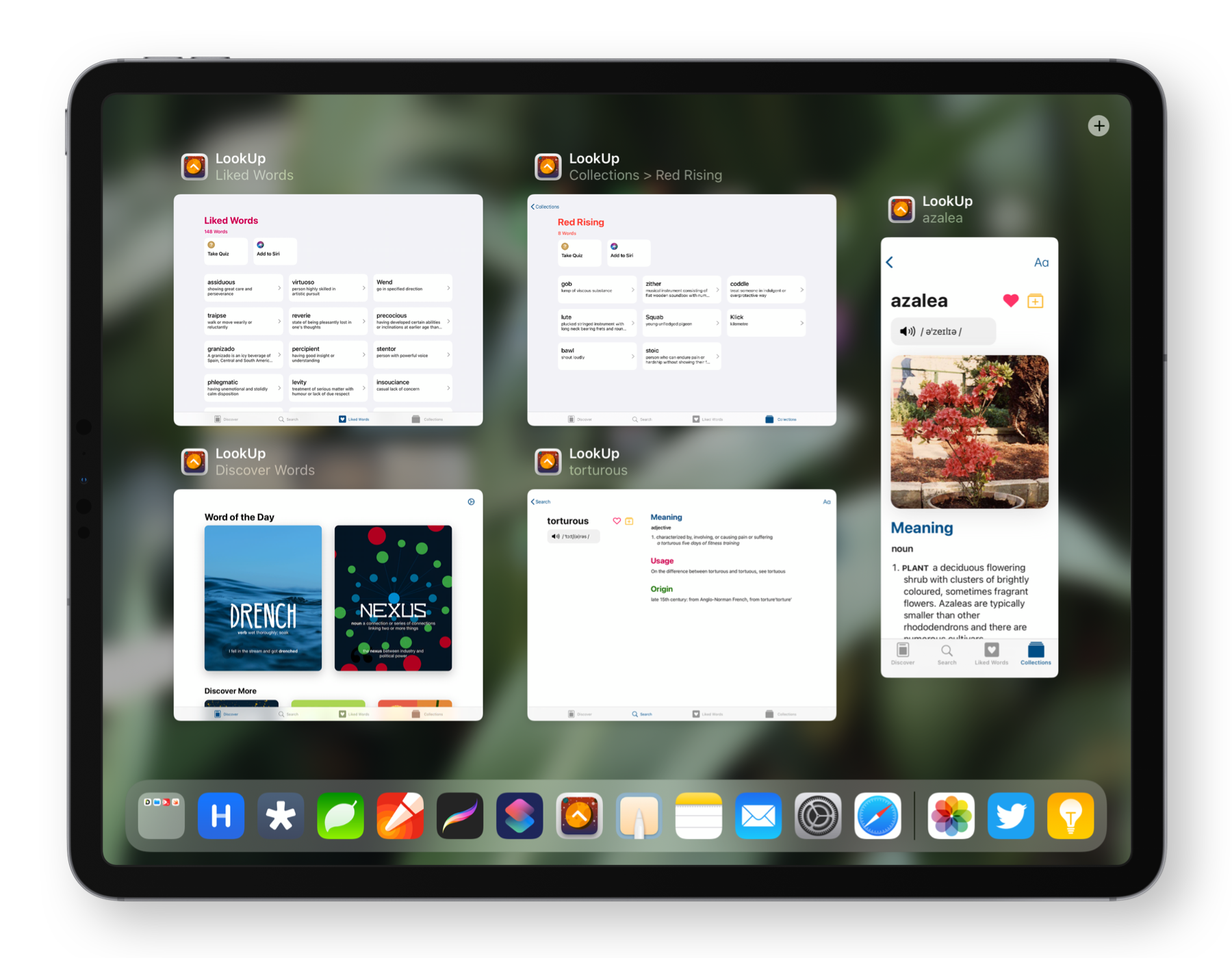
Multi Window Titles: Small things add up. Using relevant window titles not only guide the user about the app’s state, they make it easy to understand the context of a window at a glance.
Contextual Menus
Contextual Menus are great ways to add secondary controls and shortcuts to specific functions. And with the new trackpad support, they easily transform into right click menus.
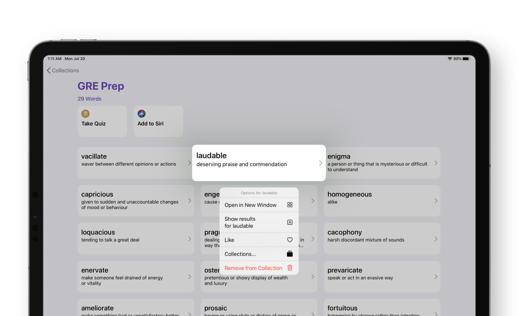
LookUp uses them everywhere. You can long press on a word of the day, and have it added to a specific collection. You can long press on a collection and take it’s quiz, or have it be open in a separate window or rename them with ease. These actions would usually involve multiple steps. But contextual menus provide an easy way to access them.
Designing for iPadOS 14
By adding support for macOS with Catalyst last year. We learnt a lot about how LookUp adapts to bigger screens, multi window interfaces and a flattened navigation structure.
With iPadOS 14, some of these learnings are coming to the iPad with a brand new sidebar design that fits in well with the rest of the system.
For us, sidebars bought two key takeaways.
- Sidebars are a great way of showing information and changes on larger displays without creating big animations and swipes.
- They work great when it’s easy to trace a consistent focus lineage. Showing focus at each step of the sidebar columns results in an easy to understand navigation.
While I’m still working on LookUp’s next big release, here’s a sneak peak at what the new sidebars look like.