Designing LookUp for the Apple Watch

Vidit Bhargava
About an year ago, my brother and me released a dictionary app for the iPhone: LookUp. LookUp is a modern day dictionary, it provides more than just meanings with an easy to use and elegant interface. There are instances where an image is a better definition than just text. There are instances where a wikipedia article might be useful. A traditional dictionary fails here but LookUp provides all this data.
This month, we were featured in the 20Under20 Promotion by the App Store (It is a section featuring the apps made by young developers). Along with that, we also released a version 2 for our app. The second version features a major redesign and a watch app.
The prospect of a watch app is extremely exciting. It’s very convenient to lookup a word’s meaning on your wrist, without having to fetch your phone from the pocket. But It’s extremely challenging too. When we started to develop the watch app, there was no watch to test it on! I was creating an interface for something I hadn’t even seen in person. Needless to say, It was a great learning experience and I’d love to share some of the things I learnt while designing the interface for LookUp’s Watch App.
Designing for the Watch Without the Watch.
One of the key steps to designing the interface for LookUp on the Apple Watch was Paper Prototyping, and while I had spent a lot of time prototyping interfaces on Sketch (Thanks to the templates that Apple Provided with it’s design kit), I eventually fell back to the paper prototypes. Paper Prototypes alone are a great way of learning. One of the first things you realise when you sketch the apple watch on paper is that how small it is, even the 42mm version. The screen’s tiny. This fact, changes the dynamics of the UI, completely.
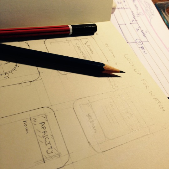
Another thing that proved to be extremely useful were paper cutouts of the watch itself. There’s lots of insight to be gathered from the exercise of just pretending to wear the watch for a day. I would sit wearing the watch’s cutout for sometime and try to fiddle in the screen area. This gave me some great insights into button placement.
Though the paper prototypes and sketch templates, there were a lot of things that I realised in the entire process of designing the interface for the watch. I’ve listed a few of them below:
There’s Limited Time.
Watch Interaction is measured in seconds. Designing an interface for the phone is different from designing for the desktop because the interaction time on a phone is much shorter than that on the desktop. While interaction time on Desktop is measured in hours, it’s measured in minutes for the phone and in seconds for the watch.
One can’t use the watch in the same way as one uses the phone. This calls for limiting the functionality of the app, so that, key tasks are performed in seconds and the app’s primary tasks are clearly defined as easily navigable.
Initially the Watch App had the option to search for everything. But it was apparent soon, that something of the sort would be highly impractical given how short the interaction is.
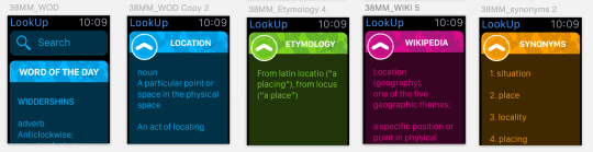
When I initially prototyped LookUp’s watch app, it was a miniature version of the iPhone app. It had all the functionality, it displayed everything from Meanings to Images and even the UI looked like a shrunken iPhone app.
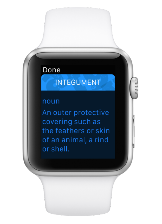
Eventually we ended up displaying only meanings for the watch app. True, LookUp’s all about providing more than just meanings, but retrieving all that information would take a lot of time, as apps aren’t fully native at the moment. What good would our app be, if it took you minutes to lookup a words meaning? Wouldn’t you rather use your phone instead? Sometimes, doing fewer things is better for the app. Of course, this is just a non-native apps issue, so we’ll add more functionality, once it is possible to retrieve it quickly.
Sometimes less is better. With the watch it was extremely crucial to trim down the functionality of our app to its primary use. No distractions. The interactions are super quick, and if it takes too long or if the interface is to clumsy to even perform the smallest of tasks, it isn’t worth it.
The Screen is very small.
The Watch Screen is small. It is tiny in fact. While the watch is capable of extremely complicated tasks, adding a lot above the fold is sometimes easy, when designing on ‘sketch templates’. Drawing the watch on paper gives the right perspective. Providing fewer controls at a time is very helpful to the user. But there’s room for a lot of content to be displayed. The less frequently used content can go below the fold.
Paper prototypes have given great perspective while designing for the Watch
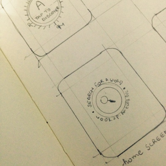
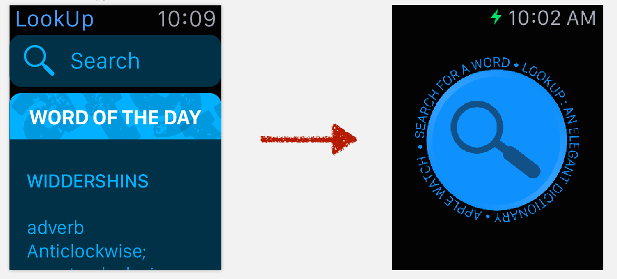
While designing the app, Initially, the first screen was very similar to that of the phone app. The search bar would sit atop the Word of the Day card. However, I soon realised that this wasn’t the right kind of interface. The word of the day card side-stepped the primary function of our app: To LookUp words. Our current interface for the first screen is just a single button, that allows you to quickly search for a word’s meaning. The primary function of the app is clearly highlighted on the screen.
Our current interface for the first screen is just a single button, that allows you to quickly search for a word’s meaning. The primary function of the app is clearly highlighted on the screen.
Apple Watch’s Force Touch Menus
Force Touch Menus are a great tool to add extra functionality to the app. Things that don’t find a place in the primary interface of the app, secondary functions, can go in the force touch menu. Easily accessible but not cluttering the interface in any way.
They aren’t instantly visible though. It isn’t as instantly apparent to a user to force touch on the display for more actions, as it is to scroll with the crown or to use the touch screen. Which is probably why, Apple’s Human Interface Guidelines don’t recommend adding primary functions to a force touch menu.
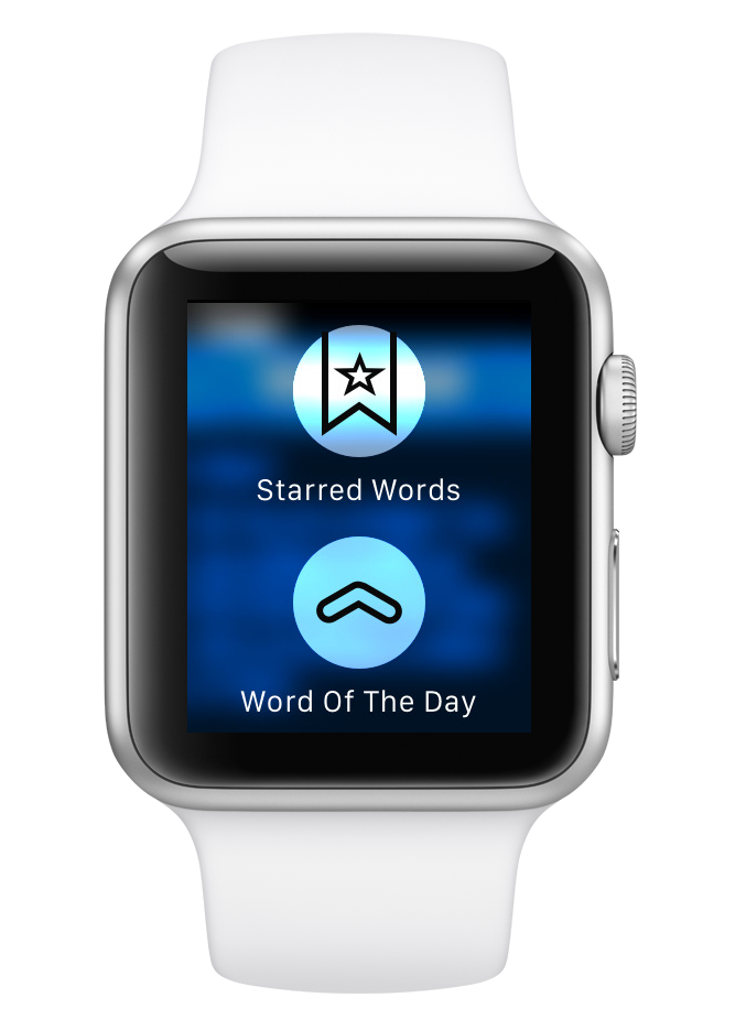
The Word of the Day Screen which we left out from the first screen eventually ended up in the force touch menu. It’s a secondary function for the watch. It’s not something you’d want to see every time you open the watch app. The Starred List is both a secondary function and something that should be accessible from any screen. It’s a diary of your favourite words which warrants a place for it in the force touch menu.
Natural Padding
One of the things I realised, after reading a few blogs upon the release of the watch, was that the watch provides natural padding to an interface and so the text on a black background can be edge to edge. Moreover, heavily margined text might also hamper the readability on the small screen. It’s a minor tweak, It’s something that’ll probably go unnoticed a lot of times, but it’s a smart move that uses the watch’s natural padding in a great way.
—
The design and development of the LookUp Watch App took nearly six months. I had begun on the design as soon as the watch kit came out but everyday since then has been a learning experience. Apple’s Human Interface Guidelines and Marco Arment’s post on redesigning his app for the Apple Watch (which had come much later during the development, but has been heavily useful) have been great guides here. Mike Stern’s “Designing for the Apple Watch” Session at WWDC has also helped me further improve the interface. It’s a great session and extremely recommended. The thing’s I’ve learnt from the session will definitely make it to the watch app’s future updates.
I’m yet to try my app on an actual watch though and I’m sure I’ll learn a lot more about interfaces on Apple Watch by using it. However, Creating an interface for a device which I haven’t even used or seen yet was a wonderful learning experience. The paper prototyping stage holds a lot of importance here. There’s a lot you can learn by just sketching a watch on the paper and drawing the interface on that.
LookUp: An Elegant Dictionary is available for the iPhone and Apple Watch on the App Store. It’s just $1.99. Your feedback on the Apple Watch app would be heavily useful to me.
App Link: https://itunes.apple.com/us/app/lookup-an-elegant-dictionary/id872564448?mt=8
Vidit Bhargava | @viditb