Designing Pro Apps

INTRODUCTION
Computers have almost always had professional applications.
They’ve always been in the workplace. But with Touch Screen Tablets
like the iPad there’s been a massive shift in terms of the target
audience for the applications, and it’s been more in the direction of
consumer friendly apps (An Image editor like Instagram) or
‘Prosumer’ applications that perform basic tasks on the surface but
can also be used for a more professional purpose.
But building something as feature rich as something like Photoshop
can be a good challenge. And while I have no experience in designing
such an application, it’s still interesting to take it as a design study.
TO BE OR NOT TO BE PROSUMER
The first thing that you’ll want to do before making a professional
application would be to map out all possible stakeholders of your app.
Get a clear sense of your target audience.
Who are they? What is their computer literacy? Will they get
intimidated with a complex interface? Or do they just want to do
everything quickly? These are just some of the questions you’d want
answers to before you decide on making a prosumer app that just about
every one can use and professionals can do cool stuff with it or a full
blown professional app that targets a specific audience and does
everything for them.
DISCOVERABILITY
The other day I was using a wire-framing application on the iPad and to
duplicate a UI element I had to dive deep into a Separate menu every
time I wanted to do that. It was so annoying to not have it more easily
discoverable.
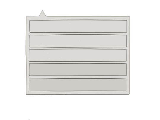
If it’s a professional app, I believe designers must be clear about the
architecture of the primary navigation of their app, sub menus are of
little help on a touch screen. And if you are designing for a 12 inch
display, make sure you make a good use of the space provided.
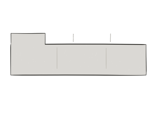
A ribbon like interface can sometimes help in constructing a
navigational structure for a professional app, because of it’s ability to
group and enclose large number of options in a readable format. Having
said that, it’s not the only good option available.
CUSTOMISABLE
Nailing down primary navigation can be
tricky, an interface that’s helpful to one
could prove to be tedious to another. When
designing a professional app, it’s important
to realise that people use these apps in
many possible ways. For example,
Photoshop, primarily a photo editing tool,
has proven out to be one of the most used
tools for UI Design. Had the navigation
been focused on tasks, it would have lead to
a cumbersome experience to design
interface on such an app. On a touch screen,
instead of a navigation to perform specific
tasks, on could instead provide hooks to
select an adjust the interface to ones needs.
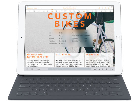
Workflows are also a great way of customisation. Do I need to export
my document to just a PDF file, or can I make a JPEG too? Can I use a
python script to convert what I just wrote into a full fledged HTML page
along with CSS? One of the best examples of a customisable export
option, appear in Editorial, a writing app, that offers various workflows
to export a written markdown document into various other
applications. There’s not just a set of five file formats, instead a mini
platform to export into whatever you’d like to.
Customisability isn’t just restricted to actions, it should also extend to
shortcuts, gestures and a whole lot of other settings, what you can do
under the hood is just as essential here, as what you can do above the
hood. At the end of the day, the user wants to be able to do his work
quickly, and a lot of users may have different ways of working. A
professional app is not set in stone. It adapts to the way a user uses it.
AVOID MENU CREEP
It’s easy to put tons of options in front of the user, in the name of
providing as many options as possible, given everyone uses a pro apps
differently. And while there’s a case for maximizing the navigational
space with actions, it can lead to menu creep, i.e. The user may get
overwhelmed with a lot of options. And in turn may not be able to
achieve what he plans to in a desired time.
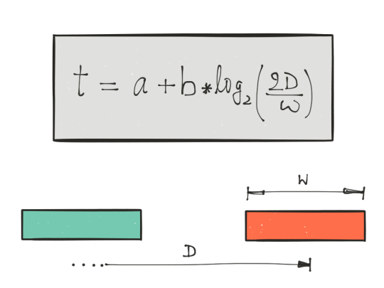
One way to avoid menu creep is to follow the ”Fitts Law” thoroughly.
Basically make sure, that your menus and sub menus are spaced in a
correct manner to let a user go through them easily
AUTOMATE
If there’s one thing that the iPad has become great at, and the laptop
hasn’t is the fact that it’s easy to automate tasks on an iPad. I cannot
imagine using an application that doesn’t have options to setup custom
workflows to automate the post writing process of formatting and
publishing.
Automation saves time, also for some reason it just feels natural to have
that in a touch screen device more than in a laptop.
KEYBOARD SHORTCUTS
Keyboard shortcuts save a lot of time. In fact on the iPad they can serve
to make apps function much faster than they do with taps, and over
time they’ve also become easy to implement and discover on the iPad.
Personally I feel keyboard shortcuts are a must, for the same reasons
that automation workflows are important.
In fact, I’d like to see keyboard shortcuts be customisable, they
shouldn’t just be restricted to a few options set by the developers. I’m
currently writing this post using Editorial for iPad and I just can’t
imagine using it without its customisable shortcuts, and the ability to
map them with key combinations.
TO SUM IT UP
Professional Applications on the iPad are still at a very nascent stage
and while a lot of app developers are making some really interesting
things (for example, Ferite for audio editing and uMake for 3D
Sketching) there’s still a long way to go for such applications.
And designing them in an intuitive manner could just be the key to
making the iPad into a fully fledged professional device.