Designing with Accessibility

Vidit Bhargava
Credit: Apple Inc.
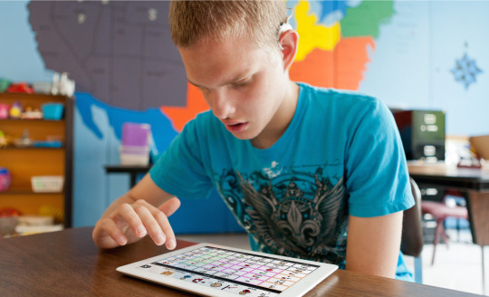
Accessibility features are extremely helpful for the disabled. These features enable them to use the devices that they love, without letting their disability to get in the way but they are equally important to those who are perfectly abled. A lot of times these features provide an extra level of convenience too. I’ve always loved to play around with Accessibility controls on my iPhone. I’m an ardent user of the speech functionality, even though I don’t have any reading disabilities. The speech functionality is great for proof-reading!
What’s more, Accessibility isn’t something that needs long hours of programming or excessive design tweaking. With a few lines of code and minor interface tweaks, your app can reach a much wider audience. But having said that, Accessibility isn’t something that you put on a checklist of items and check it off in the end. True accessibility is ingrained deep into an App’s interface.
Design and Accessibility Venn Diagram
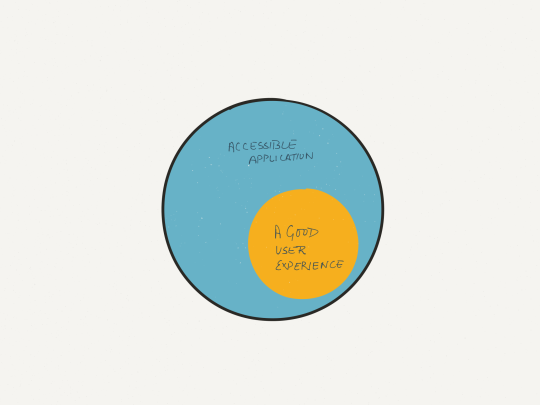
It isn’t a good user experience if it isn’t accessible
Accessibility is key to a good user experience. If you are designing an app without making basic considerations for easy usage, it isn’t right. If a colour blind person cannot tell the difference between an on or off state of a button, was the button really designed keeping all the users in mind? I don’t think so.
I’d like to share a few tips to quickly make apps more accessible, here:
A Quick Accessibility Check
The first thing you’d want to do with your app would be put every interface element that serves a purpose accessible. It’s a basic checklist of five tasks that you could perform for every element. Eventually it makes your app work with the voice over functionality of the device.
- Does it need to be an accessible element?
If your element serves a purpose while using the app. It should be accessible. - Label your Element
Keep the labels succinct. If it’s a search button, The label should say, “Search”. “A button to find things” isn’t a great idea. - Define its trait
Is it a button or a slider or a change of state notification? Define, your element’s trait. - For Value Based Elements: Define the value to be returned.
Let’s say your app has a slider to set the percentage of opacity for a box. When I do a voiceover on the element, it should say, “Opacity: 30%” and not just “Opacity.” - Provide Hints!
As a designer, you have the responsibility to guide the user as to what should be done next.
Some would argue that this is more about code than designing the interface and they are right in a way. Most of the things I mentioned above need to be done in code but they are definitely a part of a good user experience.
Grey Scale Check
While designing an interface for a touch screen device, we make elements and states distinguishable from each other. For example: An ‘on state’ appears different from the ‘off state’ of the same button.
However, a lot of times this doesn’t translate to people of all kinds of abilities. For example if your button is only changing colour on change of state. Somebody who is colour blind won’t be able to distinguish between the two states. A greyscale check solves the issue. I’ve tried to explain the grey scale test through the illustration here:
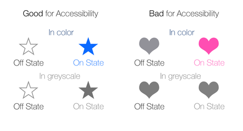
An interface that works in greyscale too, helps you create a more universal interface
This doesn’t only translate to buttons, it also translates too every change in the interface. The important question here is, Can a user see a change on screen, without a change in colour? He should.
Accessibility with Text
iOS provides users with an ability to increase the text size on their phones. This is a functionality especially useful to those with distant vision. A functionality I believe, every app should have.
There’s also a speak functionality. Optional but highly useful. It not only helps the visually impaired. It’s extremely useful for having things read out. In fact I use this feature for nearly every article that I read online. It helps me read at a pace I’d otherwise not be able to and while it is being read I can focus on other work too. An extremely handy feature which is also a part of making your app more accessible.
Subtitles and Closed Captioning

Subtitles are probably the most used accessibility feature and our highly recommended for every video
Heavily used for a variety of reasons, subtitles and closed captioning are a classic example of accessibility. There are times when people find it hard to catch the accent of a person in the video, there are others where a language unknown to audience is being spoken and most importantly, sometimes the user has a hearing problem. Subtitles and Closed Captioning help a long way here.
Following Platform Conventions
Following platform conventions is a good design practice. It helps lower the learning curve for an app, significantly. A Lower learning curve also helps in making a more universal app. An app that’s usable by all, shouldn’t be difficult to navigate or take time to provide basic functionality. Following platform conventions is one of the most significant ways in which an app’s learning curve can be brought down.
Users get used to a lot of interactions while using the default app. For example the swipe gesture which takes you back to the previous screen or the icon that pulls up a share sheet. Each platform has its own conventions, navigation on an iOS device is different from navigation on an Android device. Different operating systems have different design languages and hence their icons are different. A share icon looks different on iOS and Android and so does their respective share sheets.
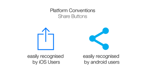
So, when a user opens a third party app he is already expecting the interactions and icons from the operating system is using. But if an app decides to use its own platform’s conventions it takes time for the user to adjust in the new app. The app is no longer as easy to use as it would have been if it followed the interactions and icons from the platform it is running on.
Not following platform conventions creates a learning curve which might be hard to overcome for different people with different abilities. It is a bad design choice that hampers not only the user experience but the accessibility of the app.
–
A good user experience without designing for accessibility is a myth. At this point if you are not designing your app to be accessible to people with different abilities, you are missing out. It’s not only about the social responsibility of making your app work for the differently able, it’s about reaching a wider audience and enhancing the quality of your app.