Fake Apps: How to prototype your way through a major redesign
How I redesigned LookUp into smaller, sizable chunks and then strung them together into a main app.

This summer I set out to redesign LookUp for Liquid Glass. It wasn't just a liquid glass update, it was going to be a major redesign, improving the app's layout, speed and interactions. It's a massive project, and I had only three months to complete it to get the app ready for the iOS 26 launch.
So I did what every prototyper does with big projects. Break them down into small, manageable chunks and make fake apps! Like every good prototype, the only thing real about them was the feature I was testing, everything else was scaffolding to aid the testing of the design.
What did each of these prototype apps contain? Here's a brief demo:
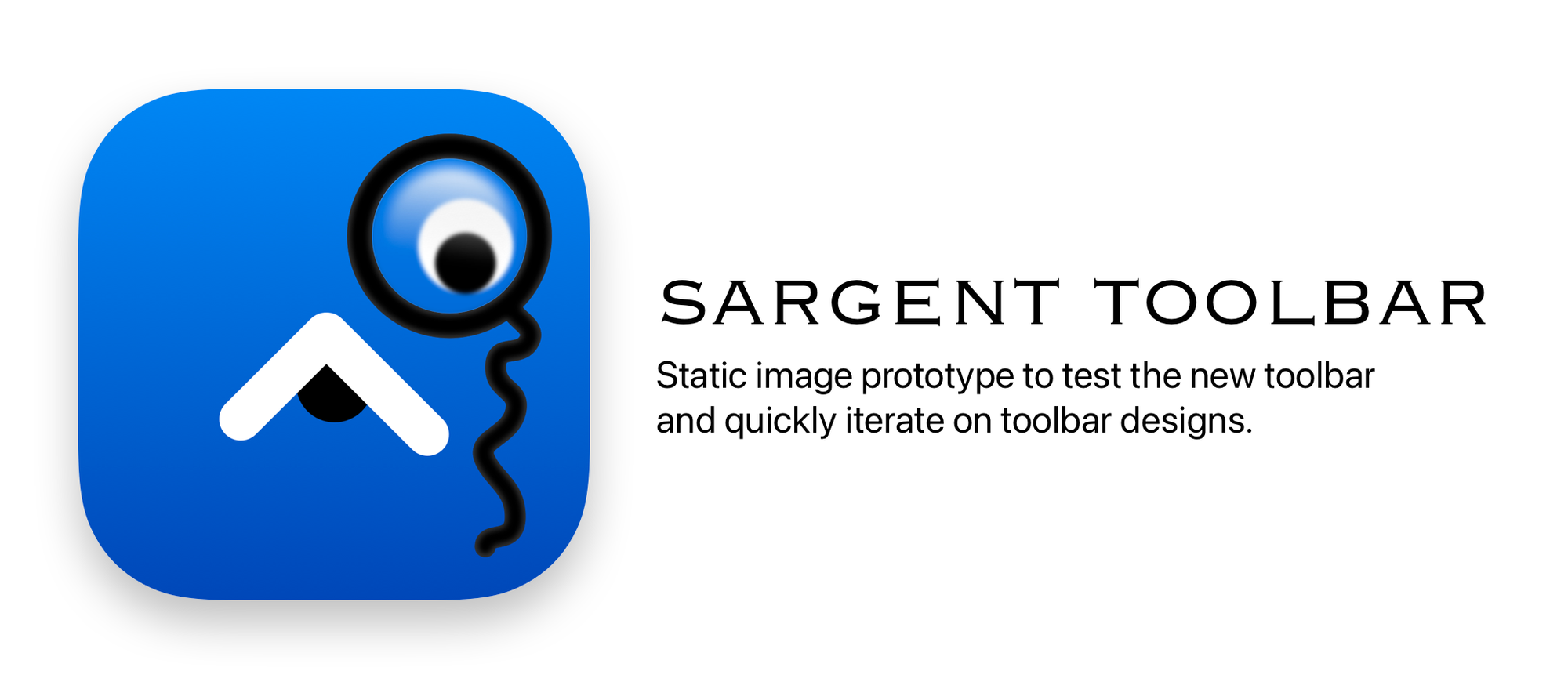
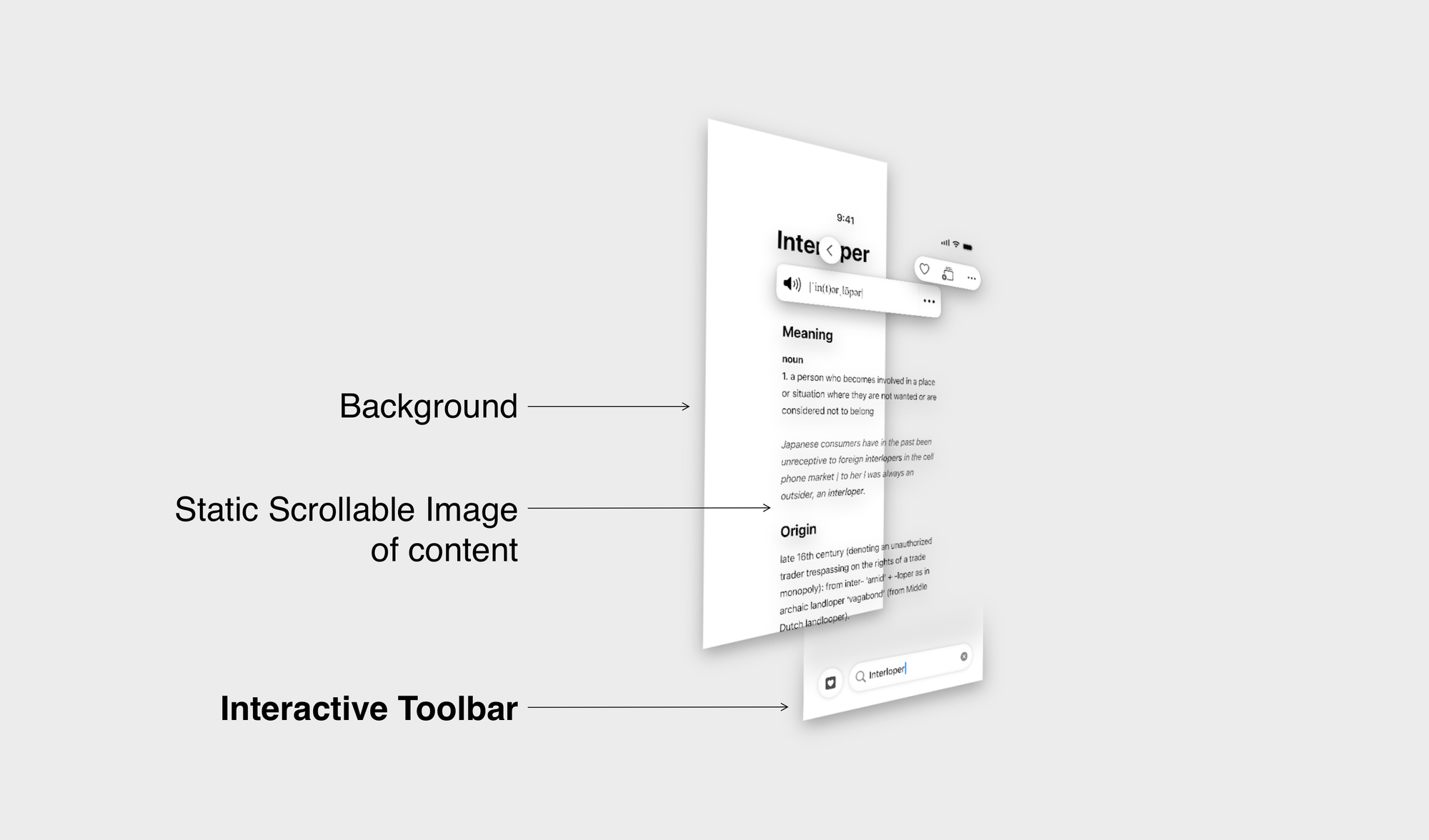
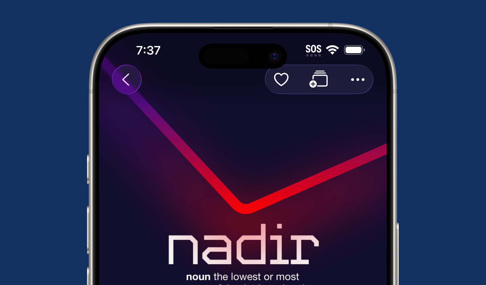
Sargent toolbar is a dummy app to test the result screen redesign, starting with the new toolbar controls.
The way it's designed, is that everything is a static image, except for the toolbars which are interactive and give a good sense of how the navigation of the new app flows.
Notice how janky the toolbar interaction is.
This updated interaction feels just right. Thanks to the fact that I was only testing the toolbars here. This was literally a 10 minute exploration with minimal code change. Fake apps are a massive win for rapid iteration.
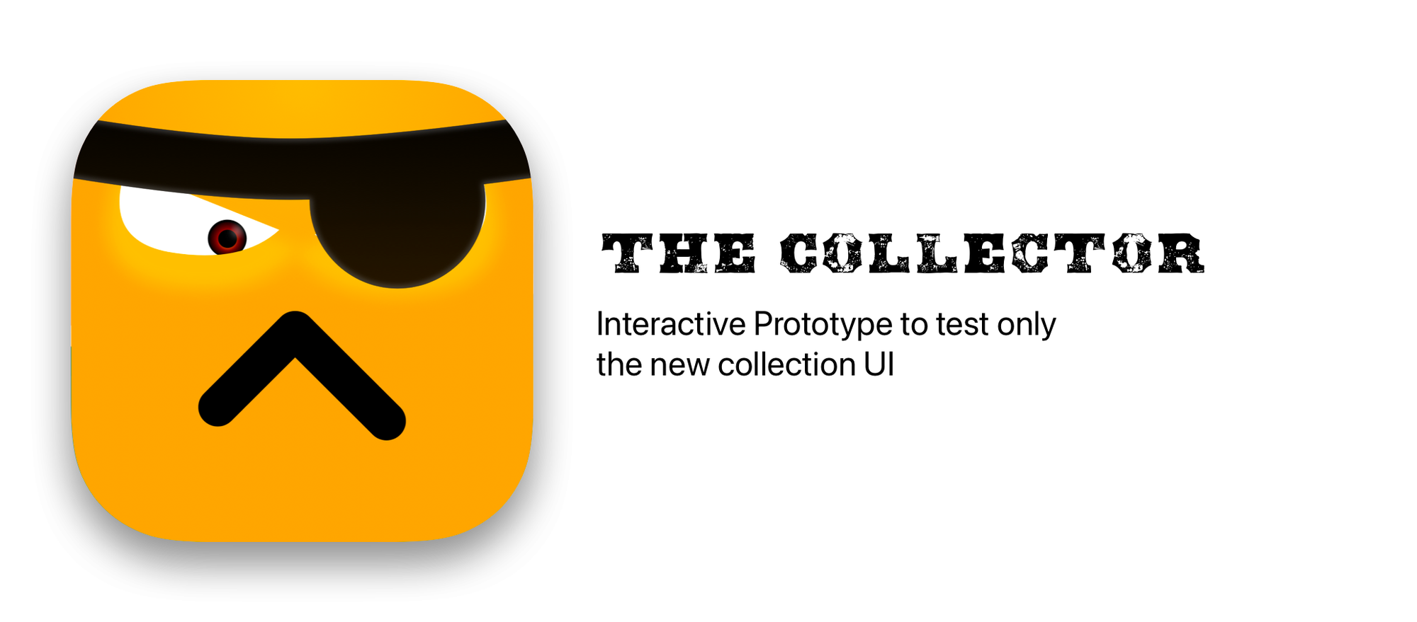
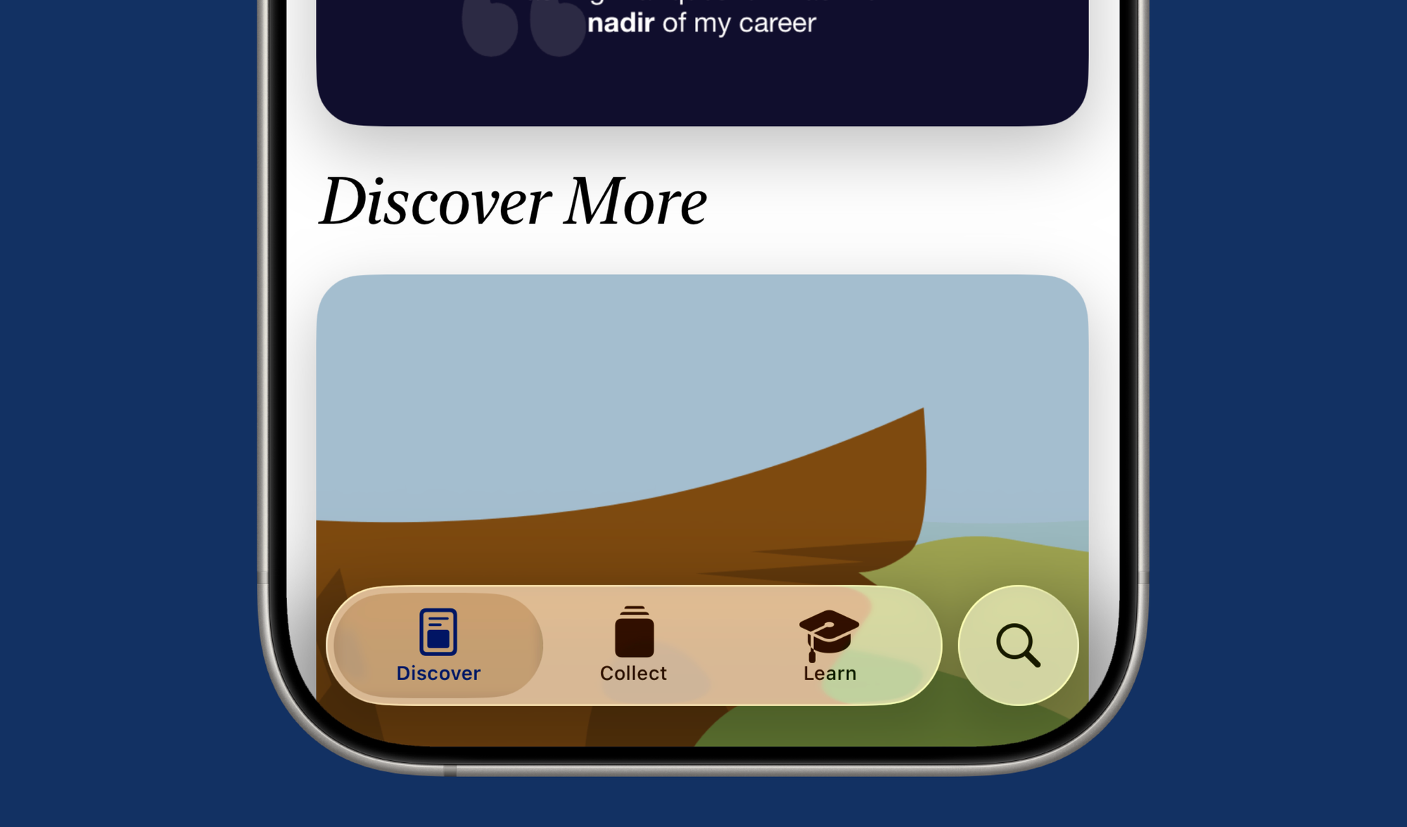
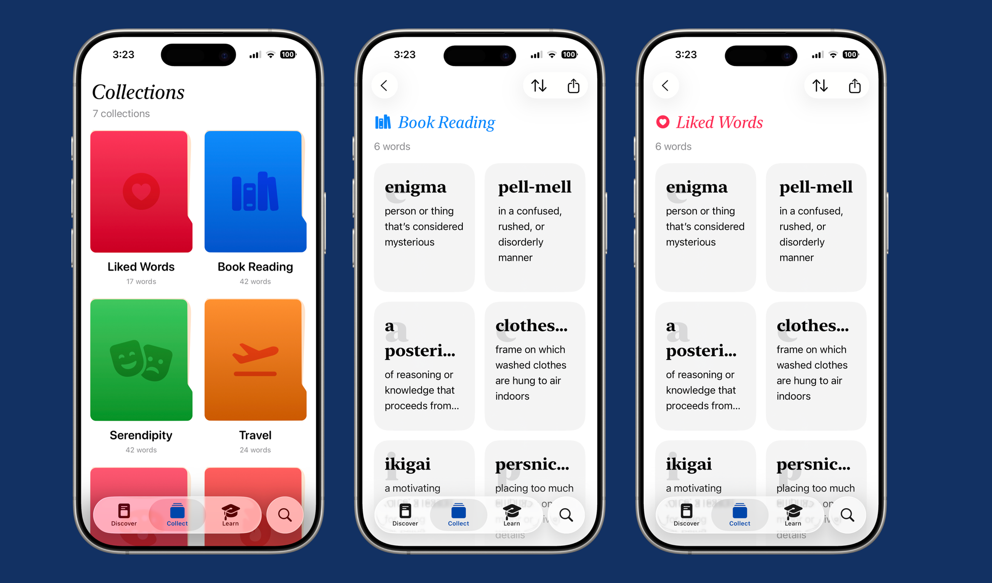
Once I had the result screen locked in, I moved on to the new collections UI. New prototype. Only the collections screen was interactive, using dummy data.
The goal here was to test the interaction of tapping on a new collection and tapping across words. It serves no other purpose.
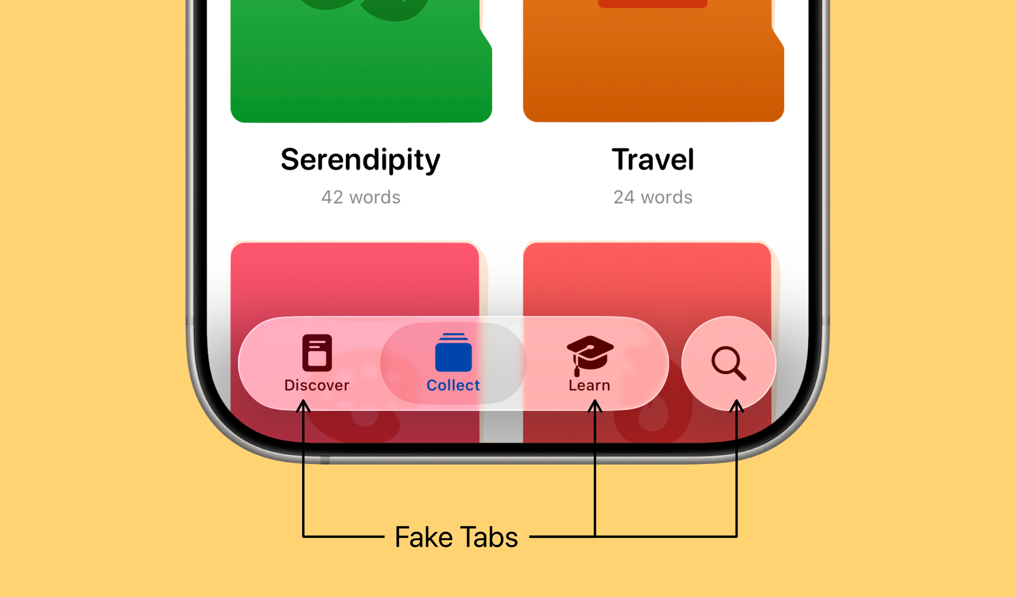
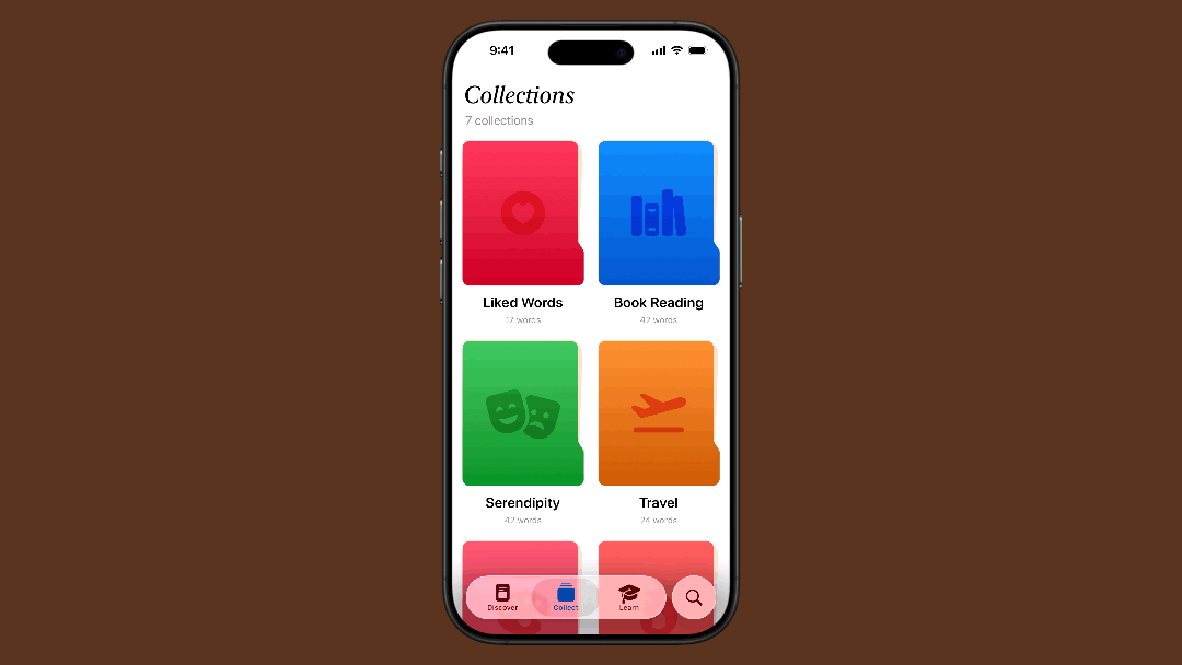
In fact, if you tapped on any other tabs they'd just not show anything. It's that straight forward.
The collector just served as a way to tinker and play with the collections UI, making the interaction robust and fast, everything else was scaffolding to give the illusion of a real app.
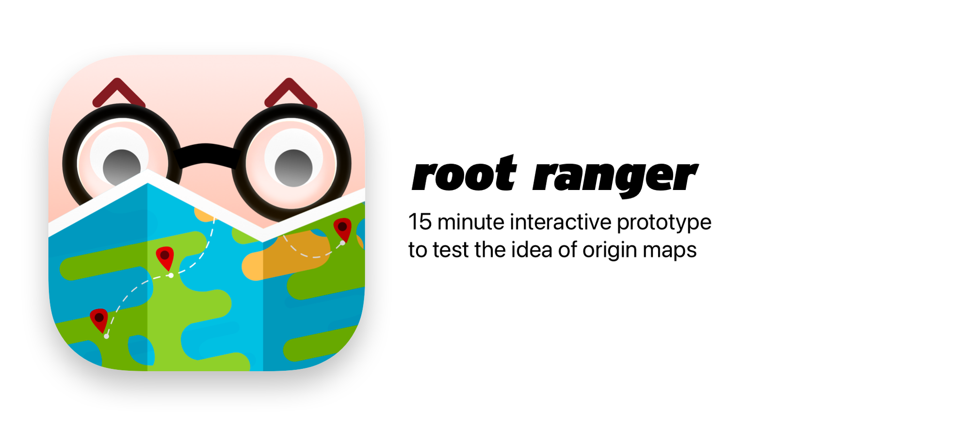
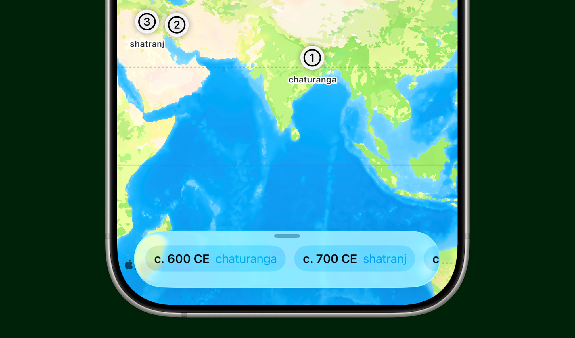
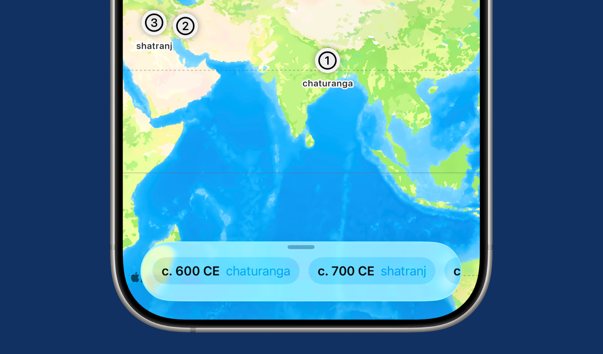
Root ranger was an interesting exploration. It's an app to test the origin maps feature. The feature itself originated from a very rough idea, i.e. what if we could map how a word has travelled across space and time.
For this one, I tried doing something I don't usually do, I "vibe-coded" my first exploration. But with more intention than asking ChatGPT to give me an app. I built out the 'map' of the action I wanted to support. Providing the information, the logic and the output user interface that I mocked up in five minutes.
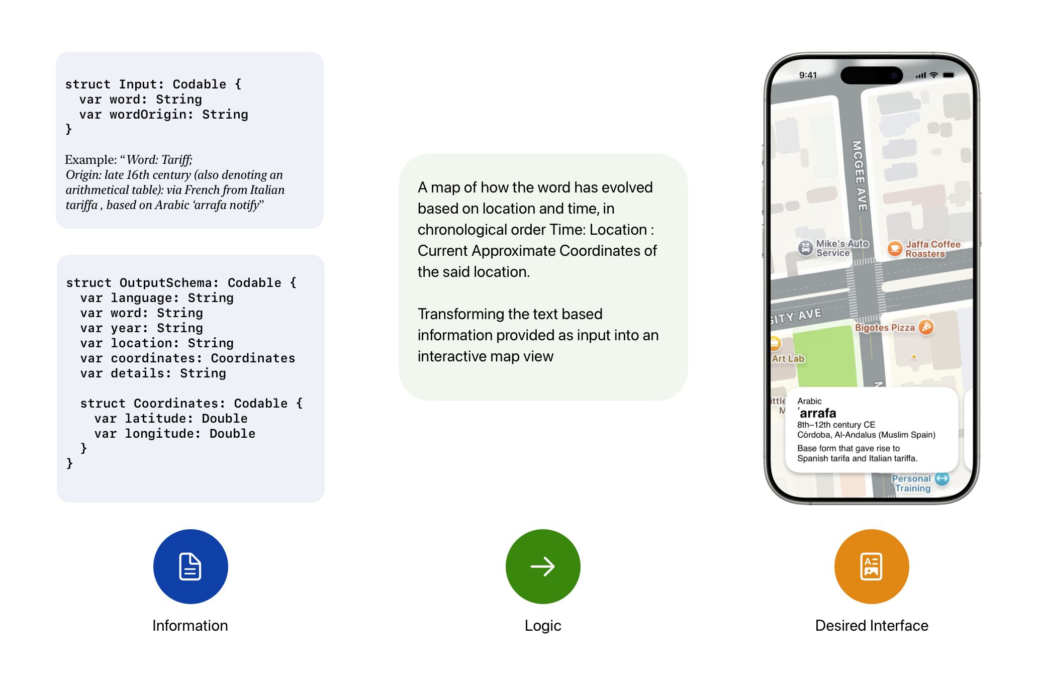
The result was a usable prototype that let me explore the functionality for any word. Impressive for a 15 minute prototype. Fully interactive. But just an exploration of the feature. No other frills. No connections to the dictionary.
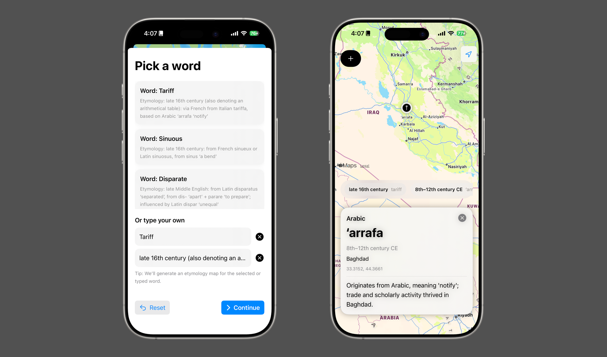
It served its purpose. It showed great proof of concept. Helped me iterate quickly and create a completely new feature in record time.
Apple's Foundation Models, introduced with iOS 26, enable apps to get artificial intelligence features through on-device Large Language Models, eliminating the need for using massive, power guzzling models for a small set of tasks.
Foundation models are immensely resourceful. They're also extremely tricky to work with, given how small the models are, they don't behave like ChatGPT or other LLMs, they need to be prompted in a very constrained environment and there are specific things they are good at.
So I setup a works-like test app to prototype new Foundation Model features on the one device I had that supports them. i.e. the iPad.
As you can see this is a total departure from other prototypes. It's a works-like exploration of ideas. "Designed" to give me maximum control over how the outputs show up, this is a bare-bones app where each tab works as a playground for different potential features.
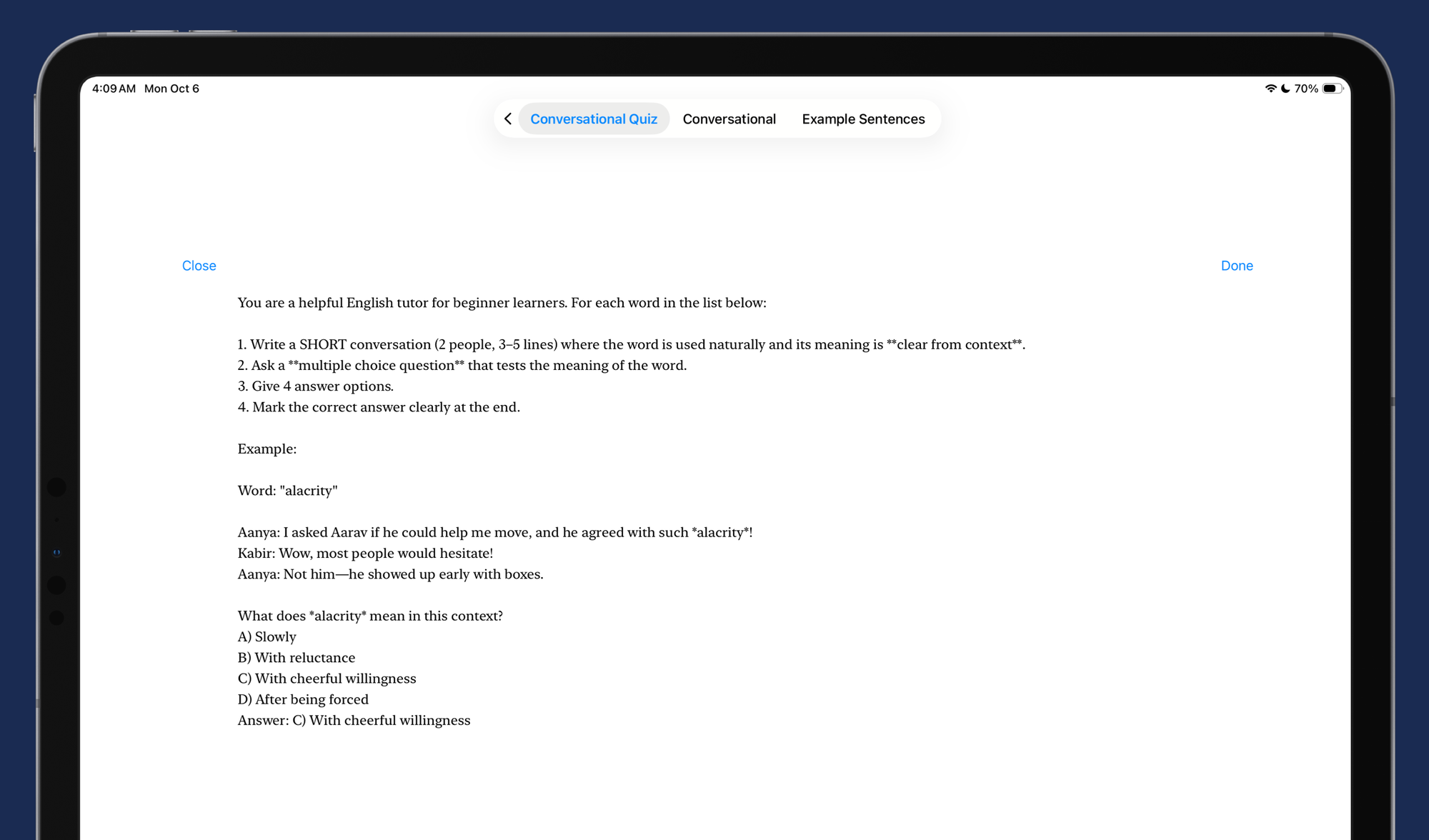
I even built a prompt editor in there so I don't have to build the app again and again to get a new output.
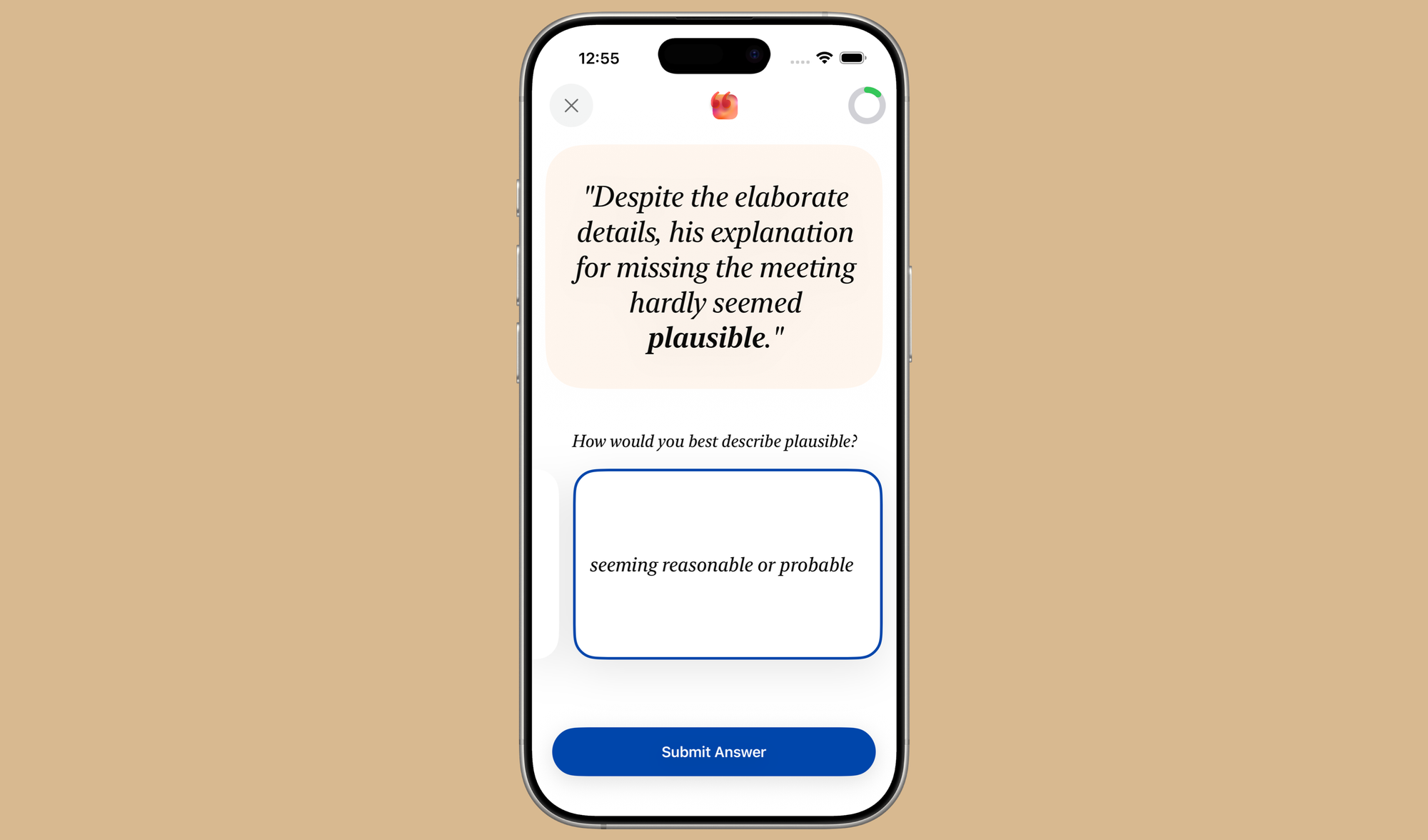
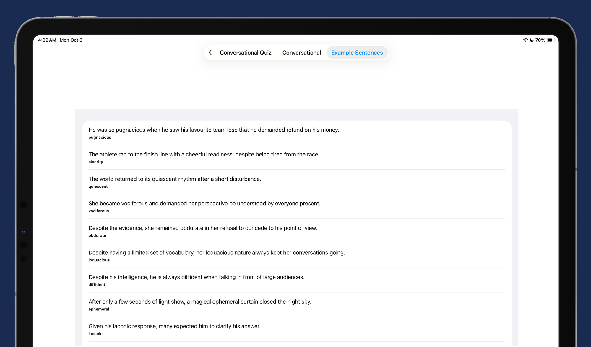
Once the models were tested and designed to work exactly the way I wanted, I was able to put some of the features into the app. Like this Example Sentence quiz feature.
While on-device models are great, both on-device and server based models have one thing in common. They're incredibly slow by modern computing standards. And the amount of time or the exact steps they'd take to reach an output is unclear.
This calls for a new kind of a loading screen, one that's a little more playful than a circular progress bar. It needs to be as fun, and interactive as the liquid glass on iOS 26; it's so fun to play with, you almost loose track of time.
Like all other art pieces this little piece of interactive art, it starts as an abstract exploration and then converges into something meaningful. So, I built out a little testing playground to play with different styles.
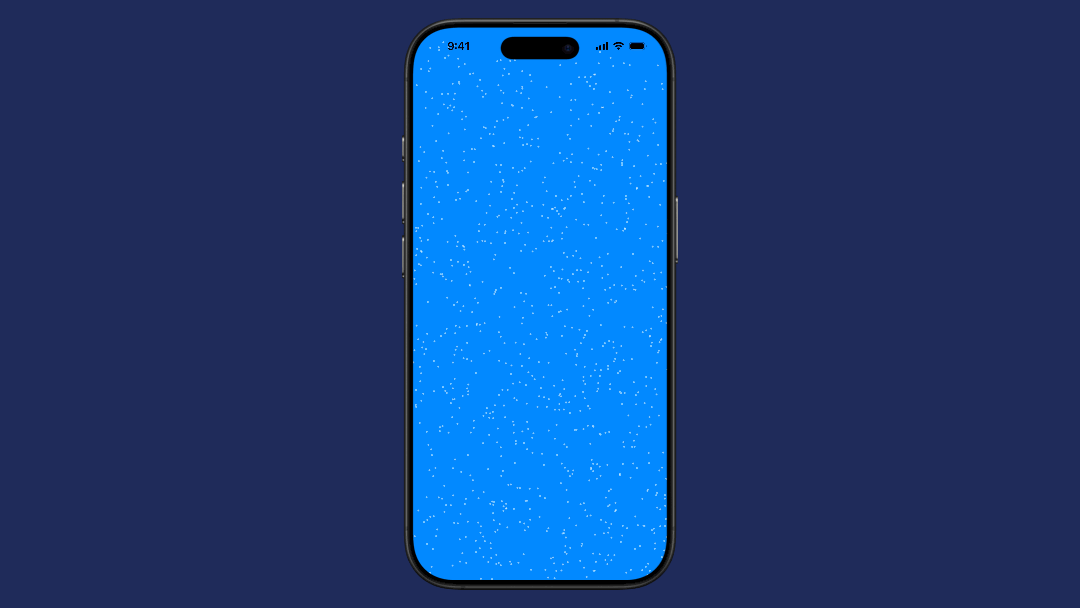
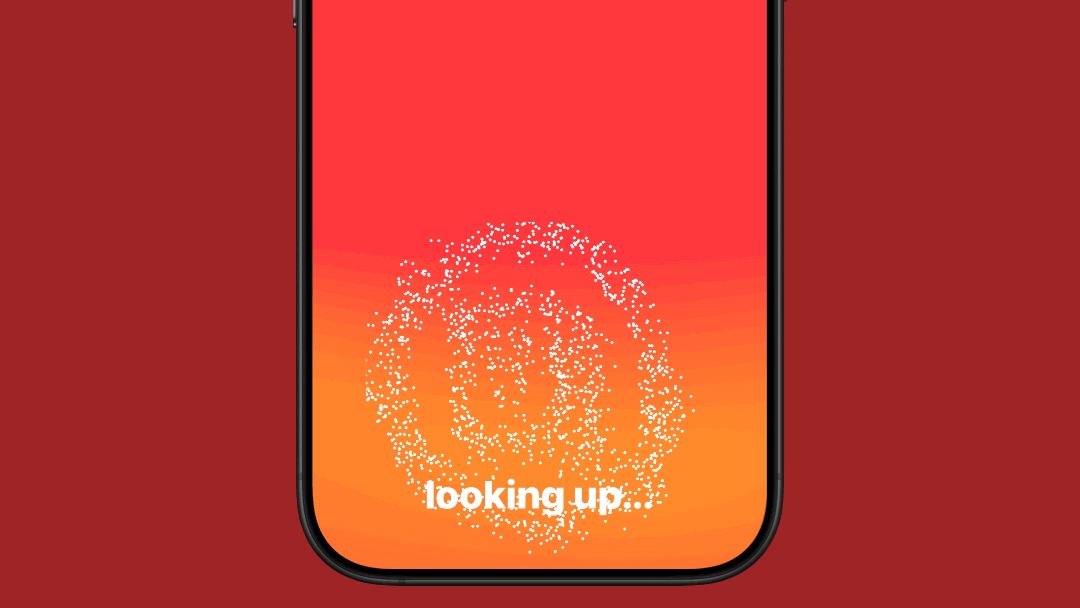
The result was these stunning particle effects!
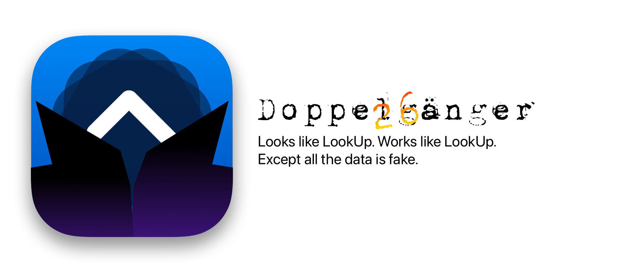
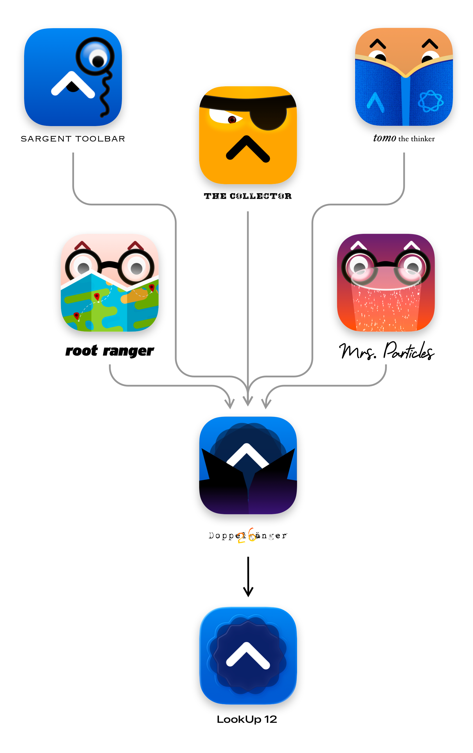
Here's a little secret. Every LookUp video I shared on the social media was not actually the LookUp app. It was Doppelgänger 26. An app that looks like LookUp, works exactly like LookUp, but isn't LookUp. It uses a series of charades, dummy data and convenient scaffolding that's identical to the strategies used in the other prototypes, to make it look like a ready product.
Why? It serves one purpose. To bring in all the research and prototyping I did all summer into LookUp. Bit by bit, I piece together the individual features I built out on fake apps. Gradually over the summer this app took the shape of LookUp; until it was ready to be LookUp, and then it replaced the old app.
With major design projects, it can be hard to get started, given the number of things required to be accomplished.
Breaking down the redesign into smaller, sizeable chunks and building it out bit by bit is the only logical thing to do. I hope this little sneak peak into the development process of LookUp was insightful.
You can try LookUp on Apple platforms here:
 Squircle Apps LLP