Solving Liquid Glass' Accessibility issues with more materials
Liquid Glass needs to have tinted glass and frosted glass materials to help make it become more legible and Accessible.

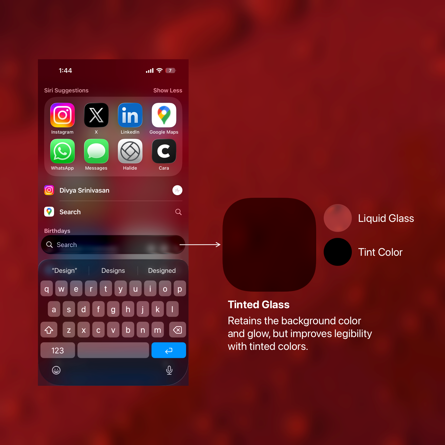
This week Apple announced they'll be bringing a "Tinted" toggle for the Liquid Glass appearance. Adding a very thick blur to the UI if the person chooses that appearance. This is ofcourse in order to address Liquid glass' accessibility issues, especially when dealing with light backgrounds.
To me it came off as a surprise because Apple spent the summer tinkering around with the Liquid Glass UI, moving around the blur, saturation and depth settings to give it the almost right shape and then they've gone on to add this toggle. Clearly, they too see the Accessibility issues.
I think Apple can do better. I think they can take inspiration from their own pre-iOS 26 "Materials" design language and put them into Liquid Glass.
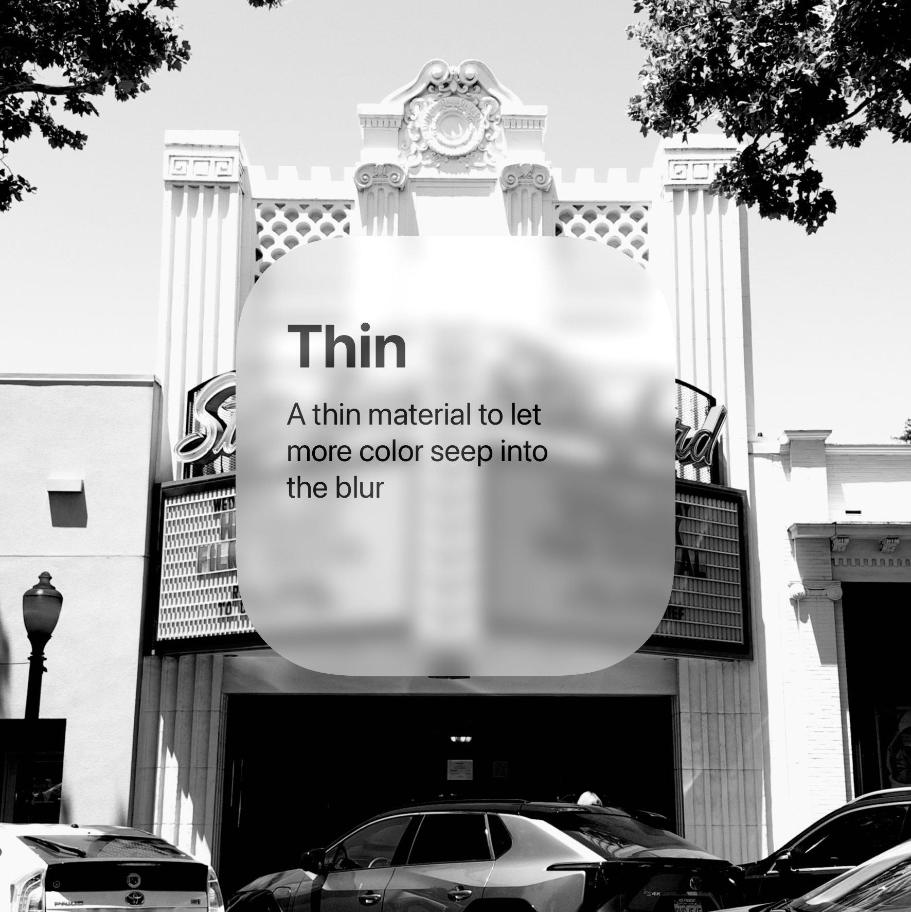
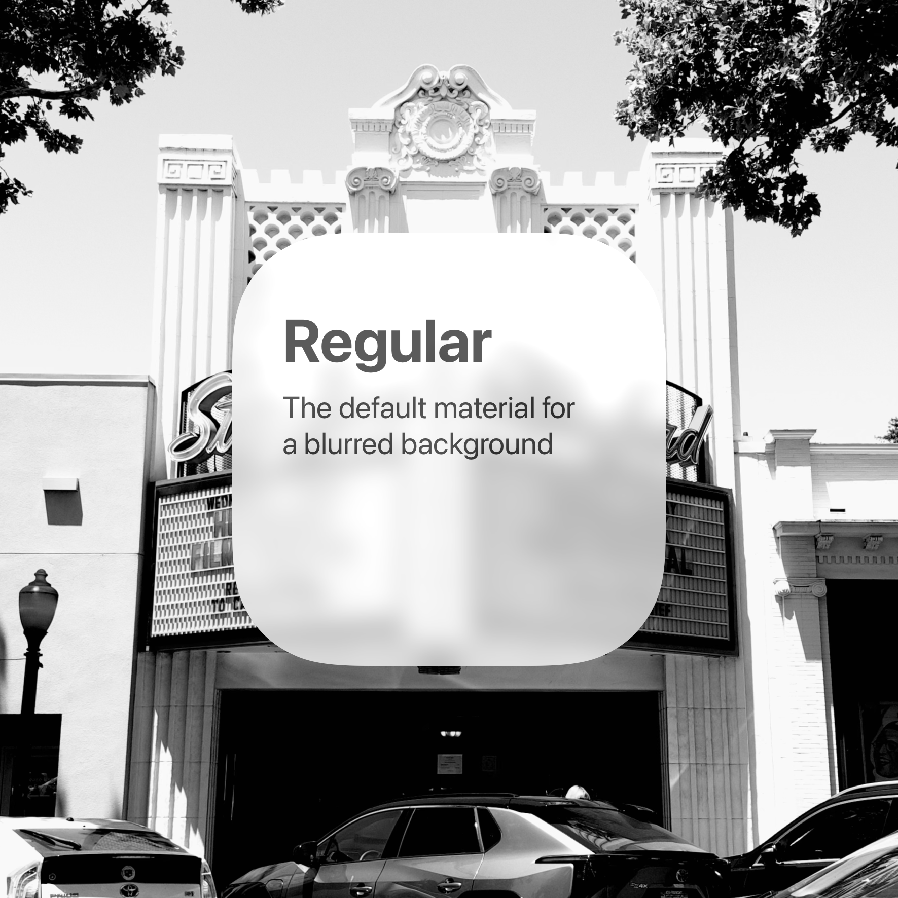
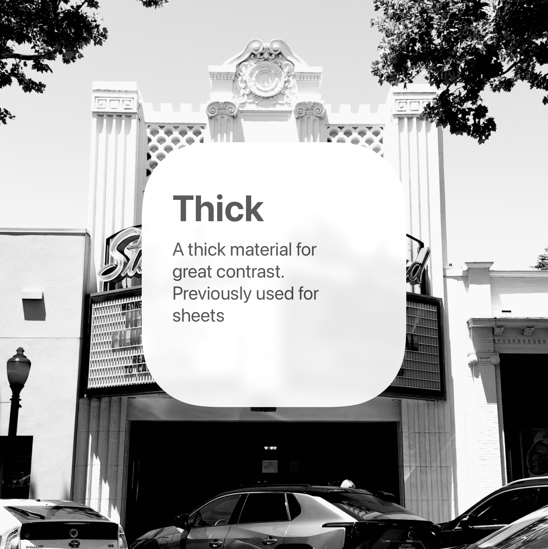
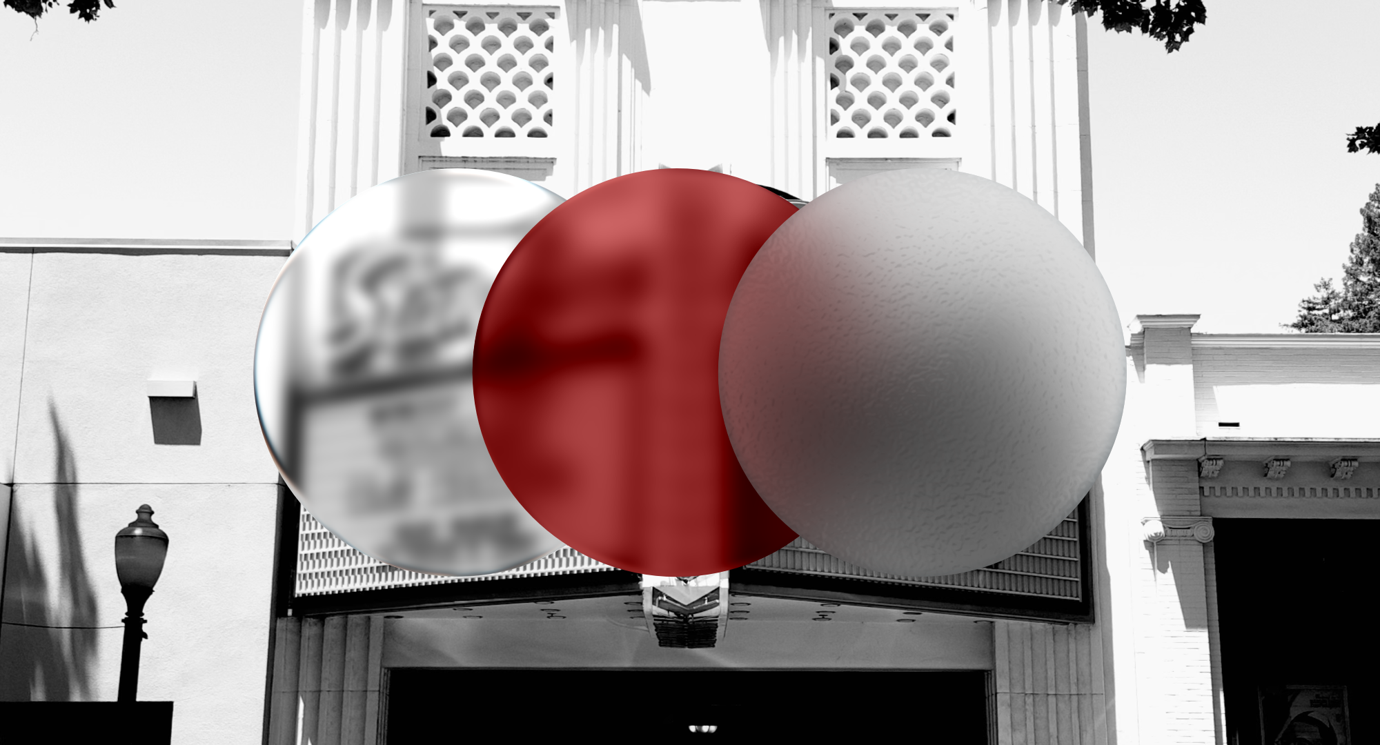
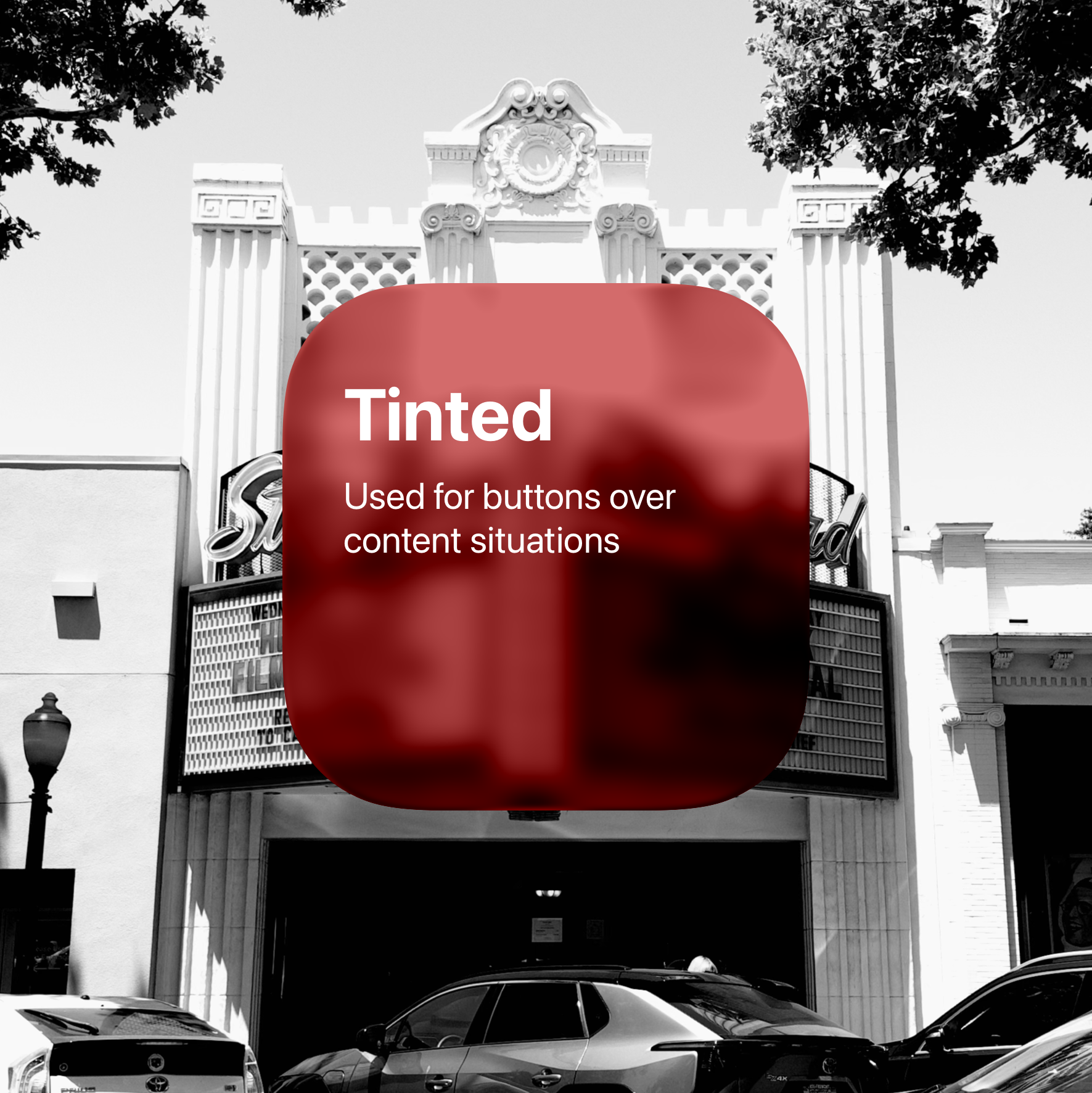
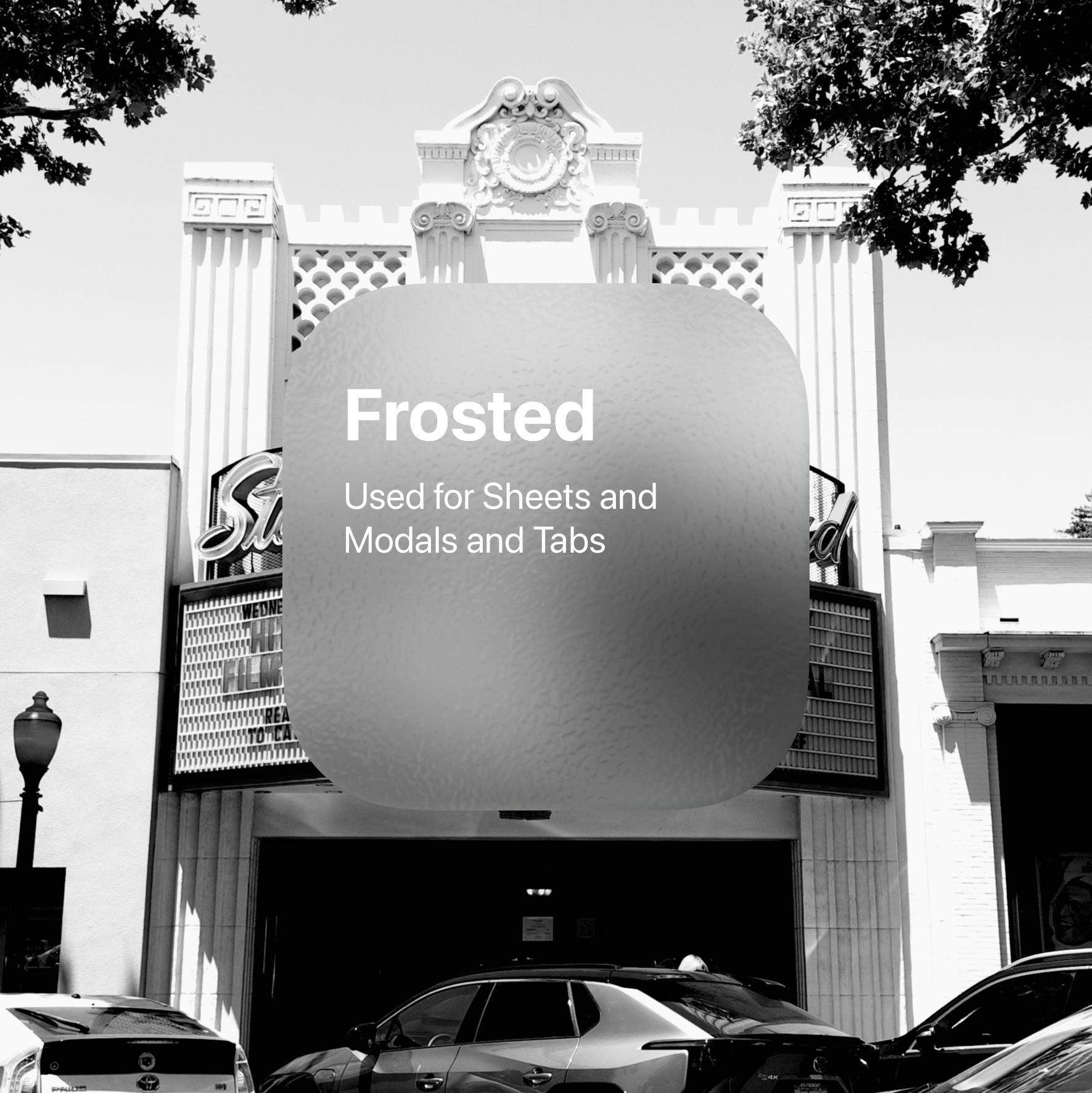
For Liquid Glass, IMHO Apple should provide a way to pick the type of Liquid Glass, Clear (i.e. the default Liquid Glass), Tinted (with greater blur and a color tint), and Frosted (a new type of material with even greater blur, but also a fun frost texture).
To illustrate why this is a better approach, I'd like to show some examples.
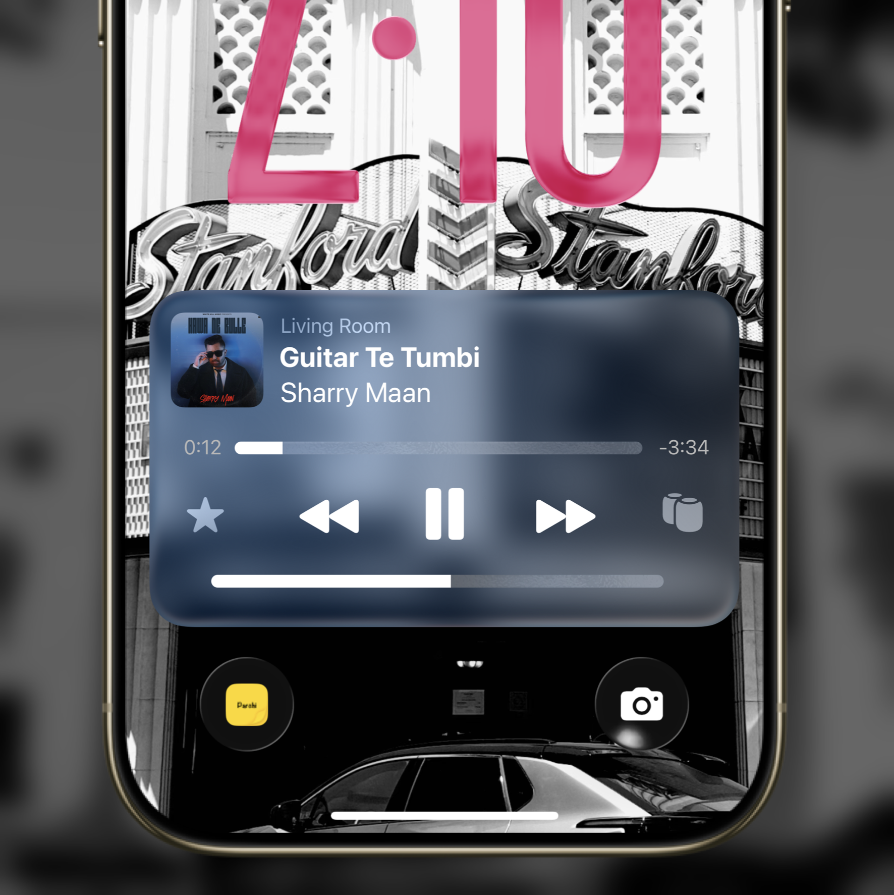
Spotlight Search
Creating a more legible search bar
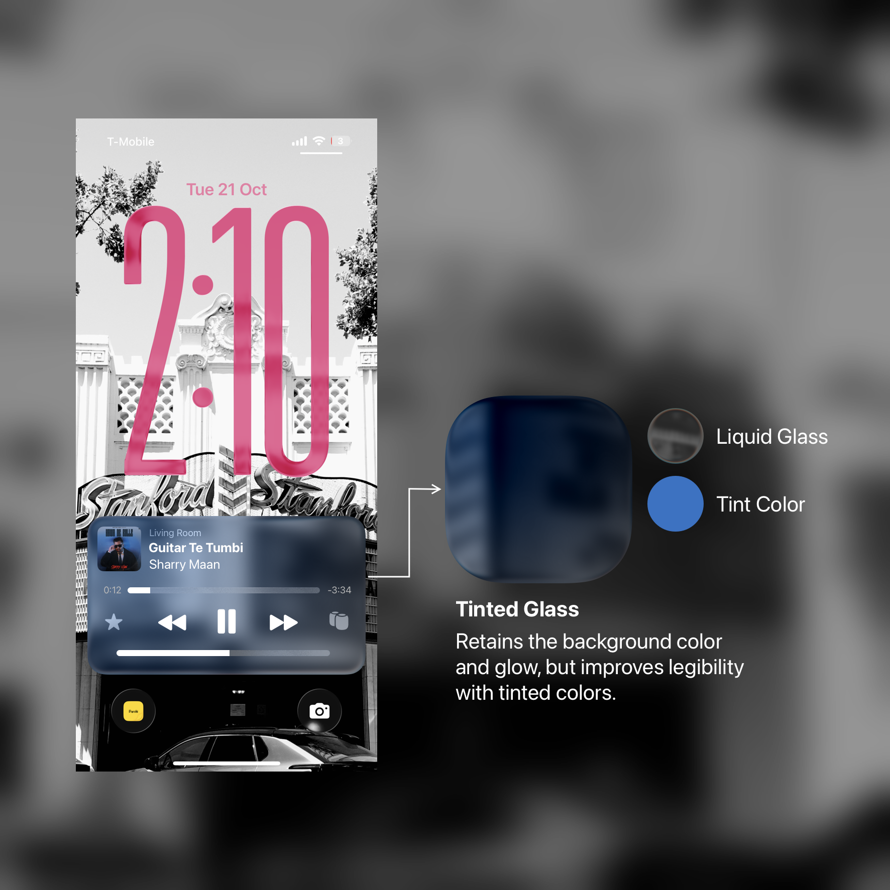
Look at how the text below the search bar actually seeps into the search bar. Creating a very distracting layer of white text below the search bar, affecting the legibility of the text in the search bar.
In this search bar, a tinted glass effect ensures that the text below the search bar is not visible, while the colors still seep through. An added dark tint improves the legibility further. The blur isn't too deep. It's just slightly greater than the previous (clear) blur.
Apple Music Live Activity
Making the contrast better on a white-ish background
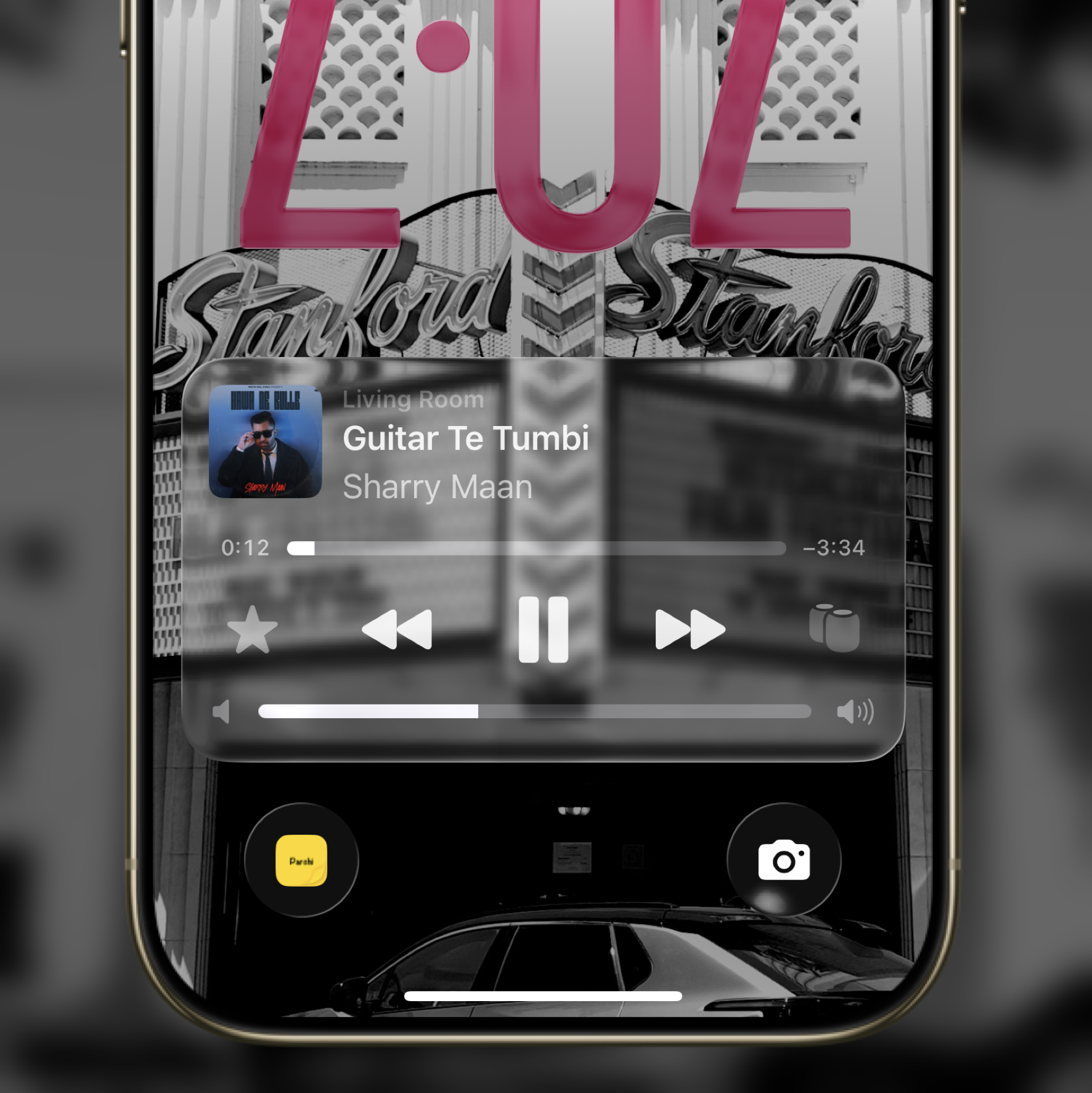
In this example we see how a lot of elements in this clear UI are less legible because of how the light refracts on the glass. Creating a confusing UI.
To solve this, I do three things.
- Add a tinted glass background
- Reduce the vibrancy on text and icons
- Add a frosted glass layer to the seeker and volume control
This new UI works so much better. It's legible, and still shows the colors underneath the UI. Unlike Apple's approach of adding a diming layer underneath it.
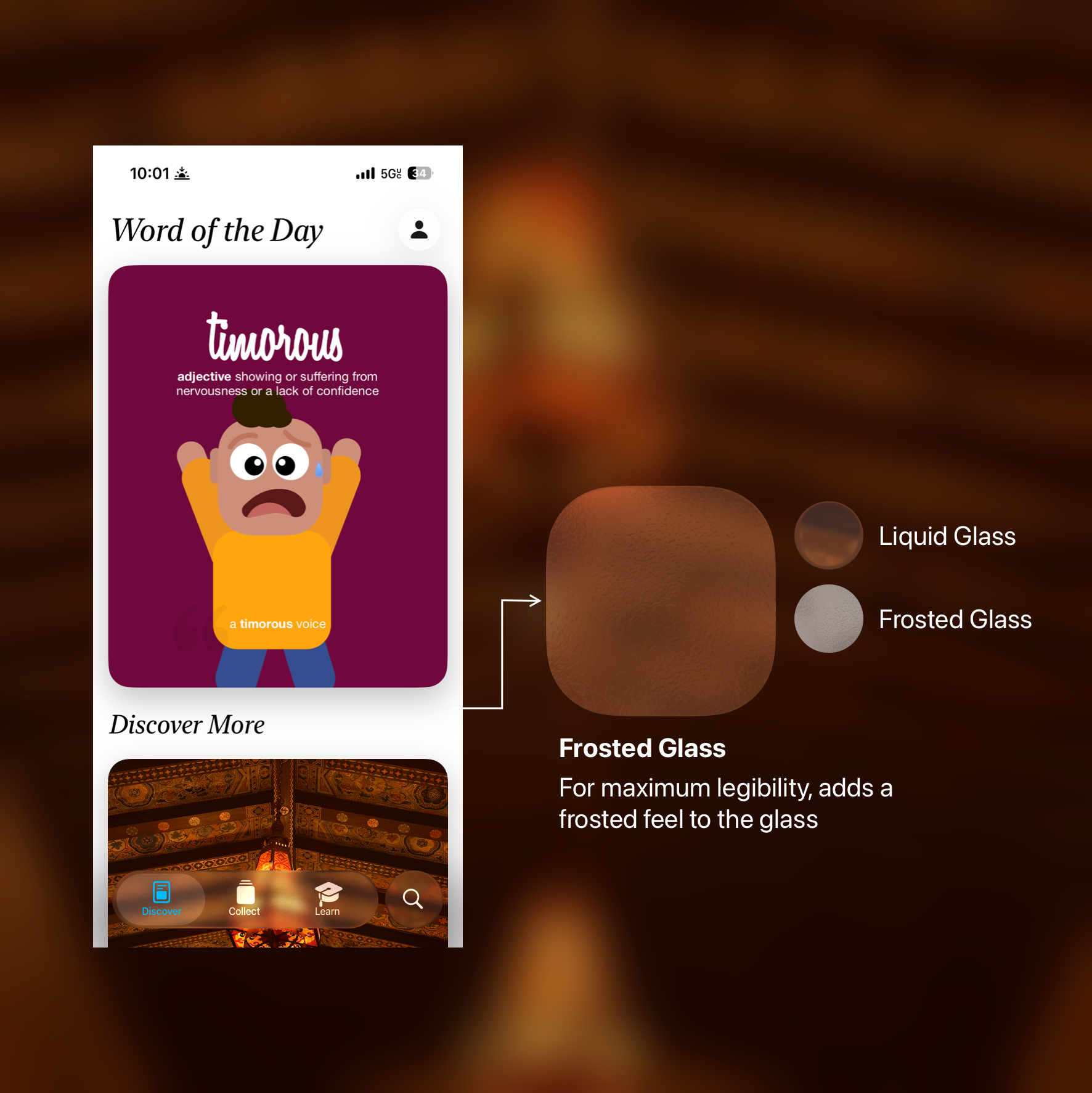
Tab Bar
Creating a tab bar that works across different style of apps
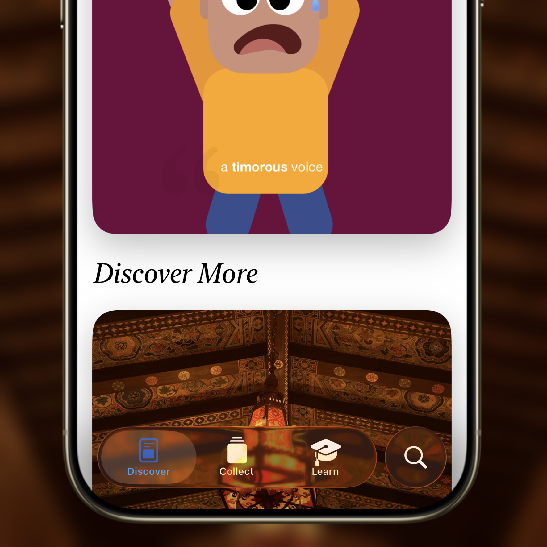
This Tab Bar is good, but not the most legible tab bar. It also doesn't play with all the images. Especially because there is both text and symbols crammed into this little space.
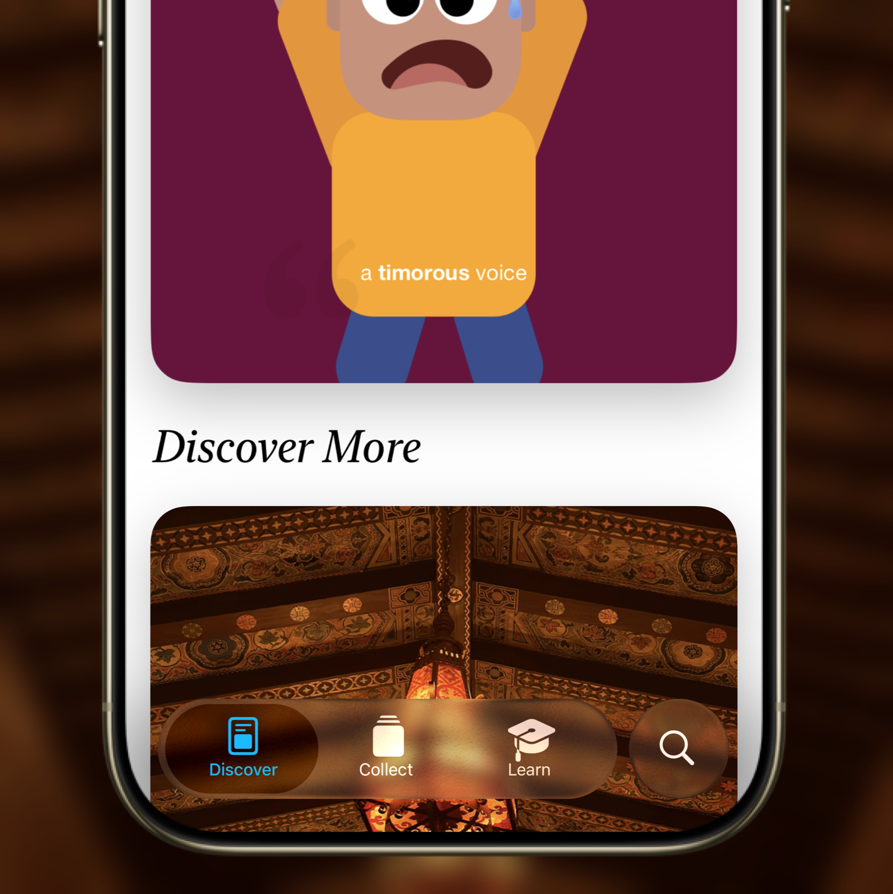
A frosted tab bar on the other hand, retains the colors from the background, keeping the background light but at the same time adding a layer of frost, providing good contrast across the board to the tab UI.
I think Apple can solve their Accessibility woes with Liquid Glass by adding more materials to their design language. Liquid Glass is compelling and fun to use, but with any sort of transparency, it's very difficult to control how something looks and so it inevitably creates legibility issues in the UI.
Because Liquid Glass is not a traditional blurred background, fixing the issues needs the solutions to be a little more creative. I believe taking the approach to create a 3 tier system actually helps strengthen the material.