The assembly-line-ification of App Icons
Today's app icons look as if they came out of an assembly line. All looking the same, designed for maximum scale, and devoid of any identity or soul. Turning the craft of designing an app icon into a lost art.

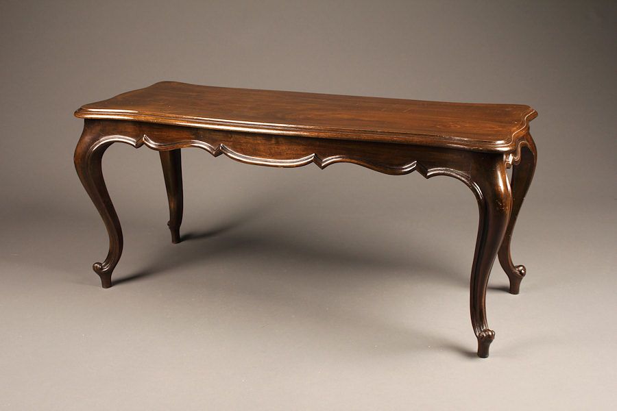
Early 20th century and 19th century furniture looked like this:
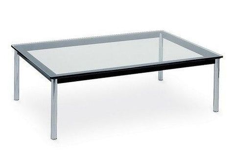
Then the Bauhaus Movement started. And everything became blander, more mass producable. So a coffee table began to look more like this:
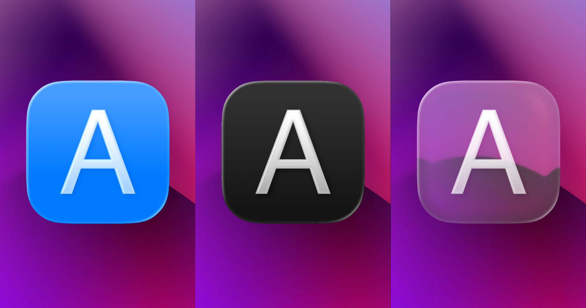
This is what is happening to App Icons right now. Everything needs to be made for Light, Dark, and Tinted and Clear Modes. Everything needs to be ready to have multiple style variations, present brand logos, and be ready for ASO metrics. So an app icon is no longer one glyph that represents the app. It's a system of images that show up in different contexts in the app, and must present themselves as consistent.
So, instead of this:

We have this:
and this:
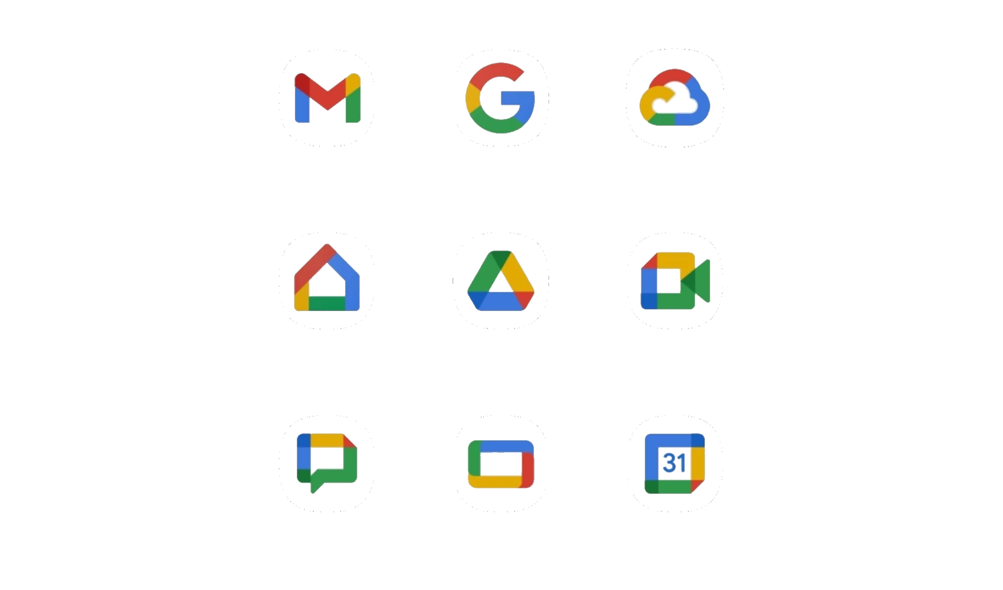

These icons maximise brand consistency (or rather sameness). Apple's Liquid Glass icons are Liquid Glass like, and they probably scale extremely well with all the different modes of icons that iOS and macOS support.
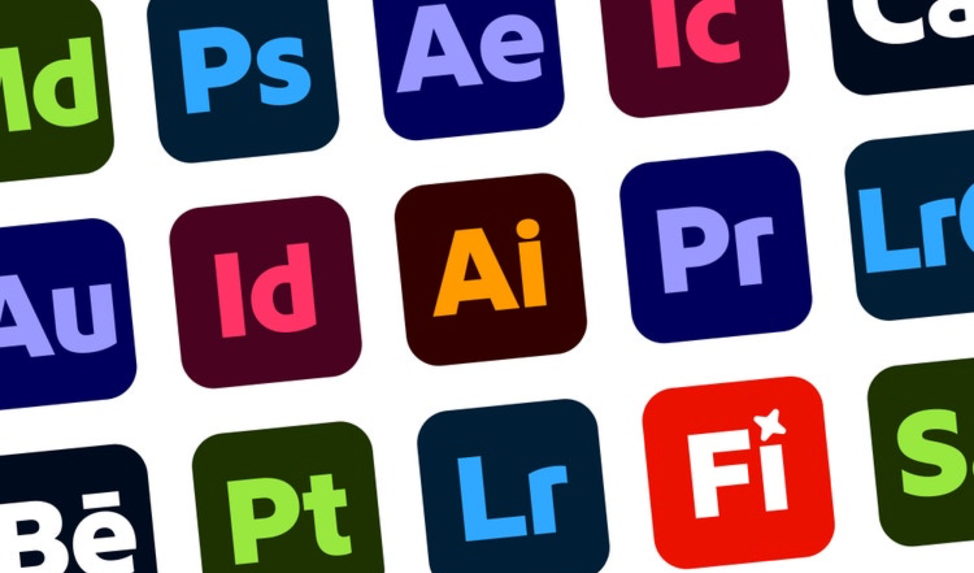
Same with Google and same with Adobe.
Undoubtedly, no one can say that the newer icons are "better" than the older ones. They're more consistent, yes, they "scale" across platforms and sizes while maintaining visual sameness (consistency as corporate designers will tell you).
They're meant for an assembly line of app icons that must be pushed out, in order to satisfy every thing but the want of a good visual design.
But here's the thing, the Bauhaus movement addressed the requirements of the industrial revolution, the need to scale manufacturing to meet the demands of many more people.
The industrialised app icons serve no one but managers and executives who conflate consistency with everything looking the same. Design leadership that cannot come with a design system that enables and celebrates creativity, and the harsh reality that companies care more about the "brand identity" than pushing something that's beautiful.