The New Android Design

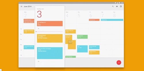
The First thing you’ll notice when you dive into Google’s New Design for its device, is that its got a splash of colour. Those Colours do look great. But the meaning they are trying to convey is either non existent or not easily apparent, For example the photos app has a big blue navigation bar, why? I have no idea. Which is the entire essence of Google’s New Design language for Android. It looks good but is still as confusing as ever.
Buttons Lift on touch: If there’s one thing that I just can’t get passed in the new look, is the state of buttons after they get pressed. They Rise Up! Which is quite non intuitive. Generally when we press something it has a tendency to push down instead of rising up. This absurd choice can be easily confused with the drag states of the operating system.
Buttons Lift on Touch When in Reality they should just push down
Ripple “Animations” are a subtle enhancement to the press action of the button. Though, not needed, the animation is still less absurd than Lifted state of a pressed button.
The Design guide which Google published on their website does the job well. It teaches newbie designers and developers with no design experience to quickly build a decent looking application. Though it leaves a lot of User Experience to the developers choice.
The New Android L Interface itself is neat and good looking. But here’s the thing, A pretty interface is not always the best interface.
Google’s choice of Arbitrary elements like a Square, Circle and a Triangle to represent Multitasking, Home & Back buttons respectively, make an already complex system of navigation into a further more complicated one.

This is the paint spray this operating system had long waited for. Its now got a splash of colour. Its got some fancy new animations, but Android as the operating system is still the same. Its got all this geeky stuff which normal people will find hard to understand. The perfect example of what I am trying to say is this particular image:
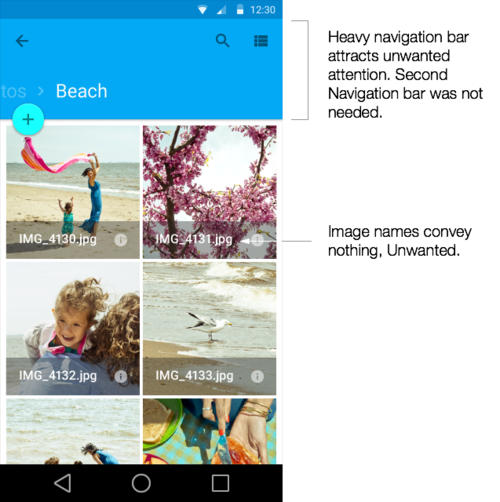
It looks pretty. But is it a good design? Well No, Notice the Image Names. IMG_4130 tells me practically nothing. Either it should have had something more meaningful or its should have not been there at all.
Further more Google pays little heed to simple good design practices like providing accessibility support by making icon states distinguishable even after removing the colour

Notice this image, I can tell little difference if its active or not after grey scaling it. It usually passes the normal people test, but fails the accessibility test bitterly.
Good Looking Design does not always translate to the best User Experience
Basically, I’m not a very big fan of Material Design Aesthetic. Much Less Its implementation.Its a bit gimmicky and leaves a lot for future updates. Though, I do like the neatness that Google’s brought into Android this time around. This kind of neat interface for android is unheard off and I hope will gradually improve into something much better than Google’s previous attempt at creating a great user interface.