Wireframing on Numbers

Vidit Bhargava
One of the things I’ve learnt in UI Design is, that the faster you get through the Steps to actually ‘generate’ prototypes, the better you can focus on more pressing matters like testing them in the real world. And one of the most important aspects of any design is to be able to layout your elements in a visual grid. And a grid based design has it’s own benefits. But how does one create wireframes quickly?

Turns out, macOS comes with a pre-installed tool to accomplish this. It’s called “Numbers”. While primarily meant to be a spreadsheet app, the numbers interface of arranging data in different tables, is actually a great flexible way of designing things from roadmaps to User Interfaces.
The best tool for Wireframing is the one that’s most accessible
Getting Started
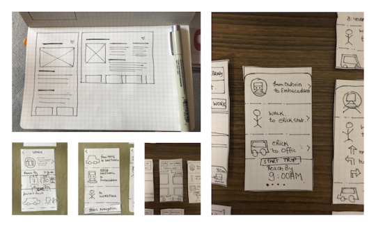
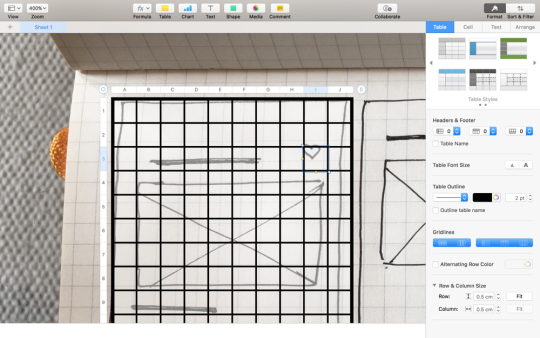
To start with Wire-framing you need a paper-layout of your app first. It’s doesn’t need to be an elaborate sketch work, just a 15 second sketch of how you want your information and pictures to be organised. Don’t worry about getting details right with this one. It’s just meant to be a sketch.
Some examples of a paper-sketch, rudimentary UI Design. Remember these were 15 second sketches and don’t need to be great works of art.
Generating your Wireframe
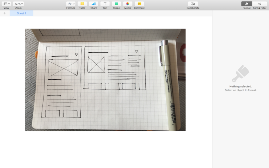
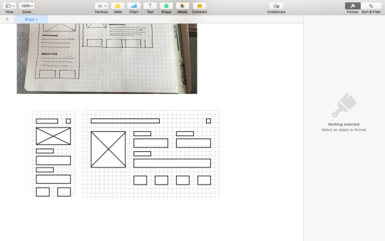
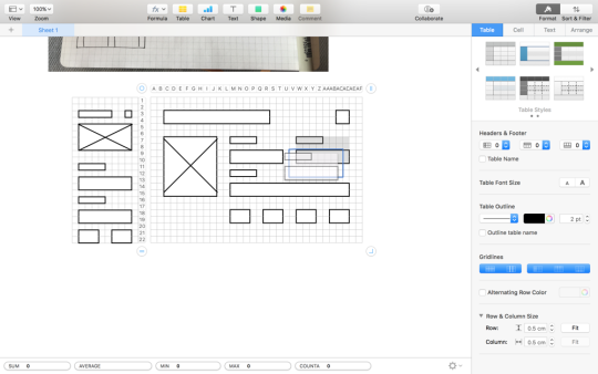
Once you have your sketch ready. Click a pic of it and import it to your computer. Now fire up Numbers, and begin a blank project. (Delete the default table that comes with it). And Import the picture of your sketch.
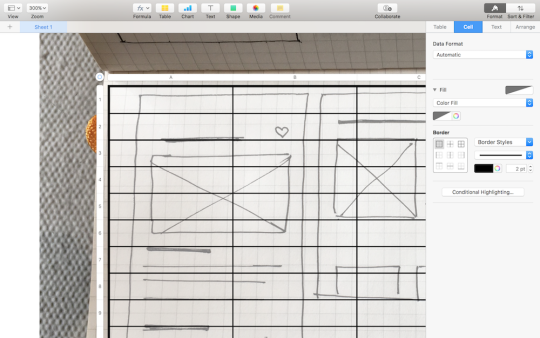
Insert a new blank table and overlay it on your sketch.
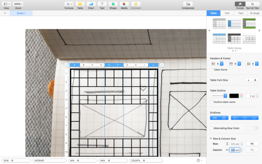
Tip 1: More Number of Cells in your table mean greater flexibility.
Tip 2: You can select the multiple columns and adjust their width simultaneously to create the gutters and columns of your grid.
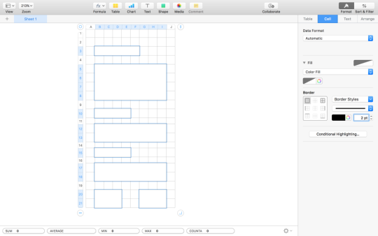
Tip 3: Merge cells and adjust borders to mark Multiple Layout elements. (You may even write stuff occasionally)
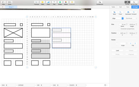
Tip 4: Making Responsive Layouts is also pretty easy on Numbers. You just need to duplicate your wireframe, and rearrange your elements.
Tip 5: Set your minimum cell size wisely. The ideal cell would be easy to multiply to generate bigger squares & rectangles. And it’ll be the size of your gutter (the space between two columns). I generally like to put squares of size 0.5 cm as my smallest cell unit. Imagine each cell as a lego brick.
Tip 6: You can copy the table you made and paste it in Sketch or Keynote to get going with your Interactive Prototype.
I think, It’s easy to dive into the multiple details of how your interface should look on screen when creating a wireframes. And Number’s is pretty good at being able to adjust column widths and making efficient grids, perhaps more so, at making them responsive.
Lesser Time spent on Wireframing = More Time to test your designs with users
But at the end of the day, it’s still a wireframe that you are making. And Wireframes like other low-fidelity prototypes should be made quickly. If I were designing an interface, I wouldn’t spend more than a few minutes to generate wireframes for all of my interface. I’d focus on the User-testing and Evaluation more than the generation of wireframes. So while it’s a handy tool, I’d only recommend it, if you can get around numbers quickly enough. Don’t spend hours just to get your cell width right!