The way we interact with apps is changing, so should the way they are designed.
The current state of apps and the advent of Apple Intelligence makes it important to have an action centered design approach to designing apps. The phone is only a part of a much larger ecosystem.
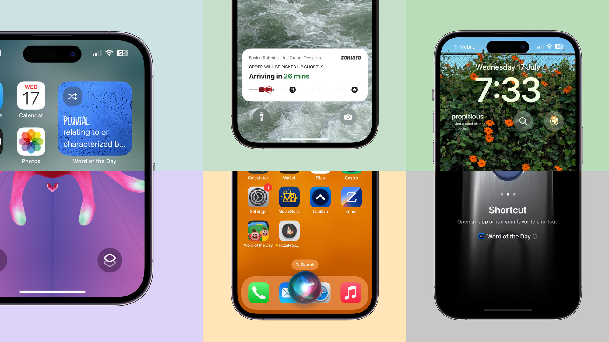
The way we interact with apps is changing. It’s been changing gradually over the years but in the last four years it has drastically evolved.
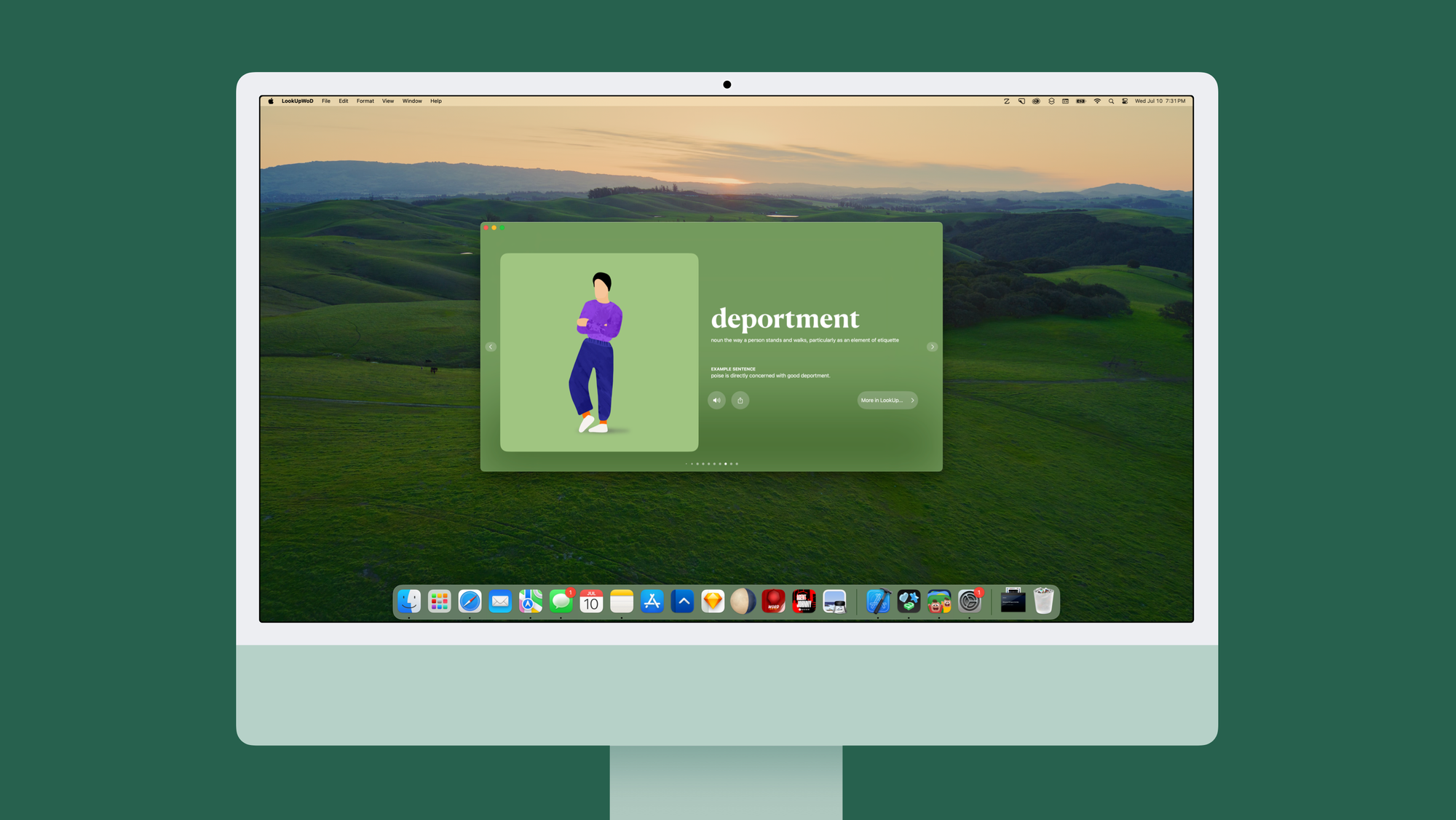
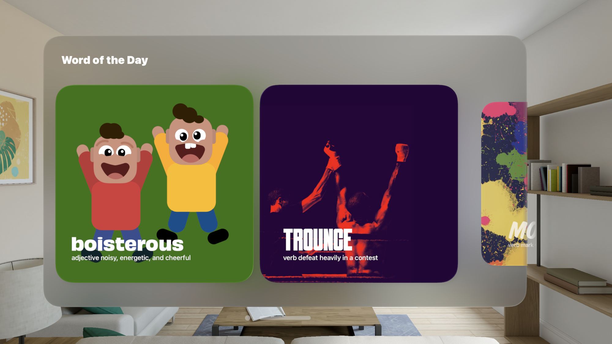
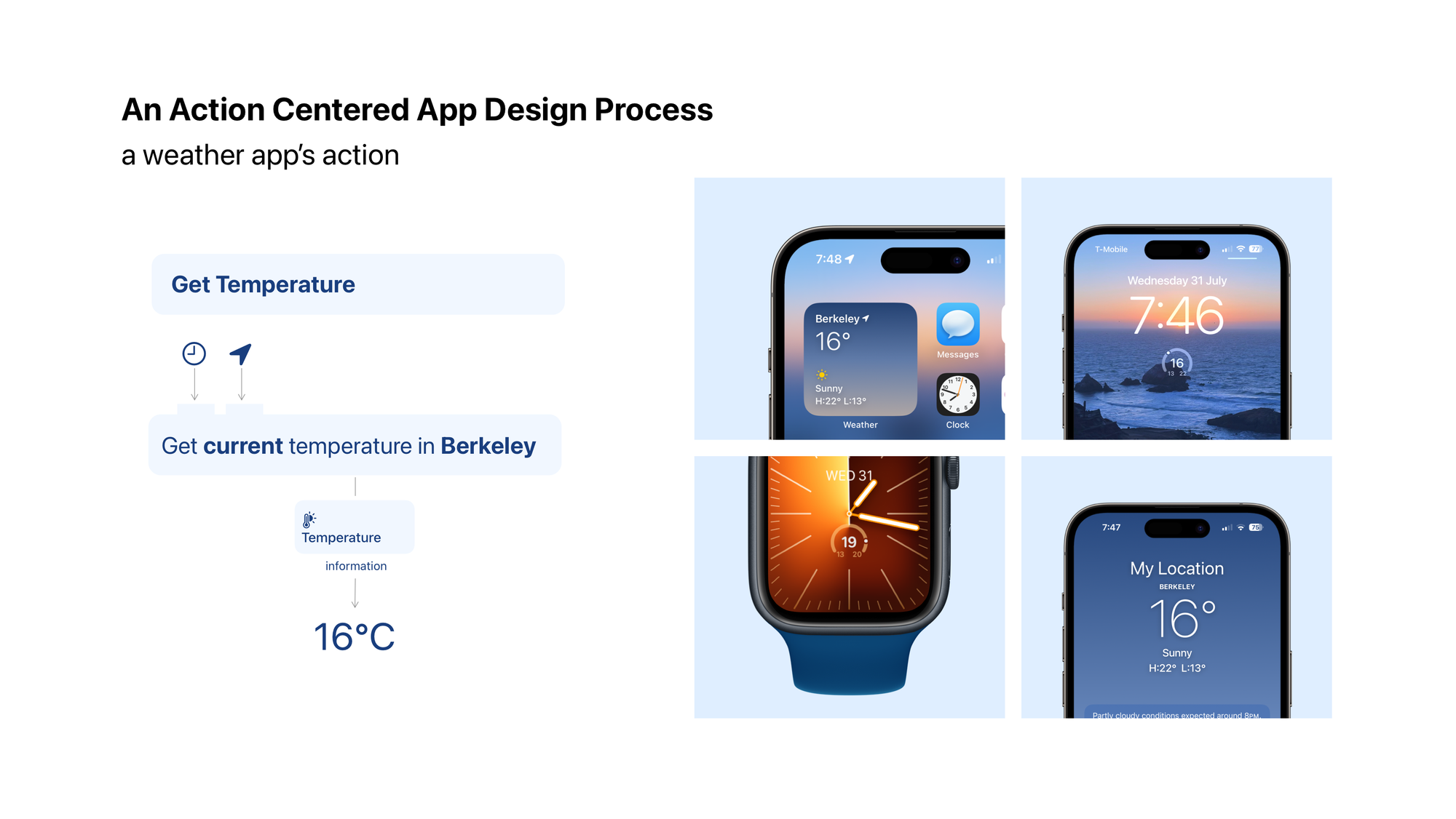
At Config 2024, Figma launched a swanky new AI tool that would allow designers to get over the blank-canvas problem by generating UI for them. Except it begins with a phone UI. This is antithetical to how we use our products today. For example for most people, their interface to a weather app is either a Watch complication, an iPhone widget or something that Siri says.
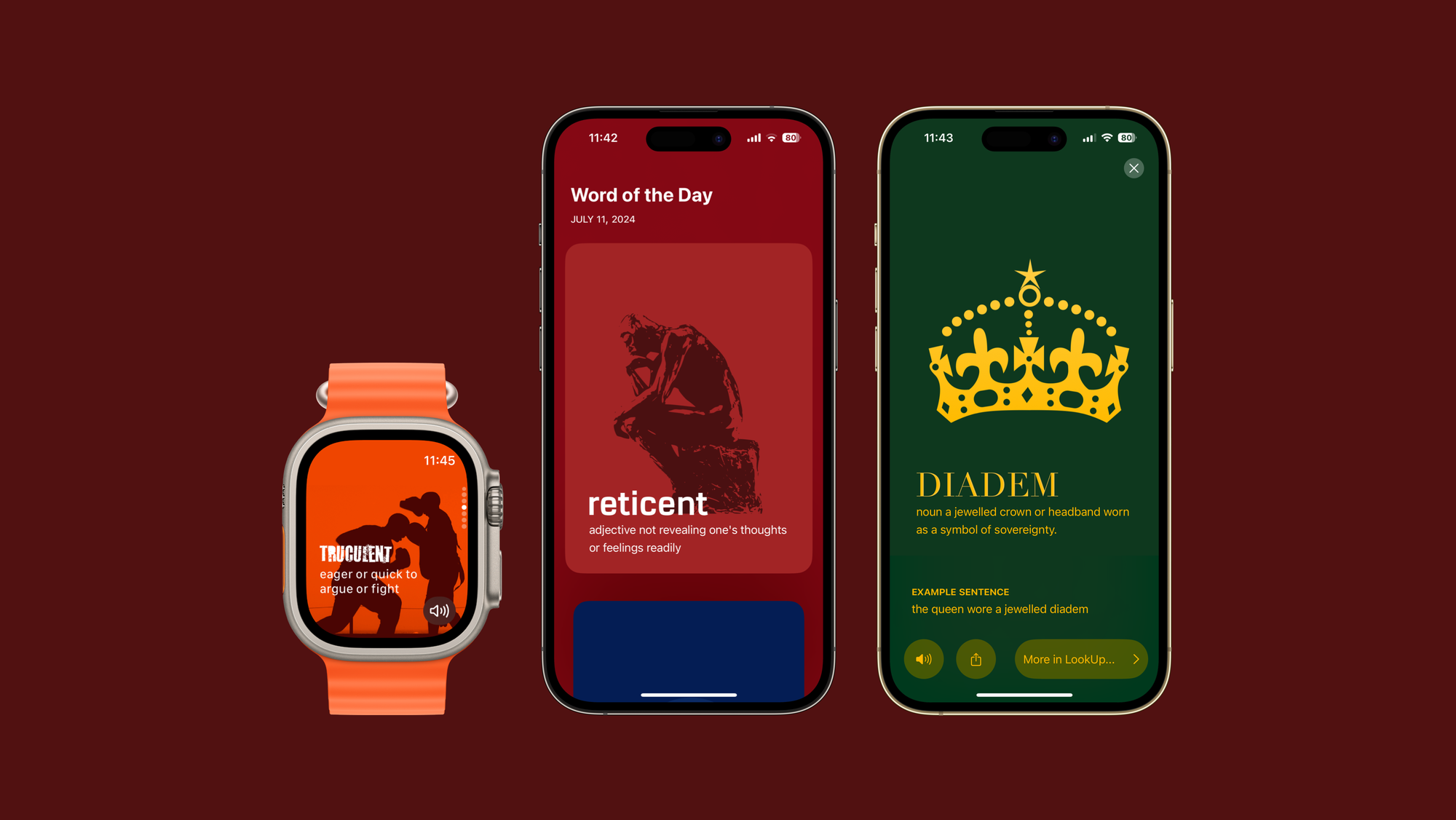
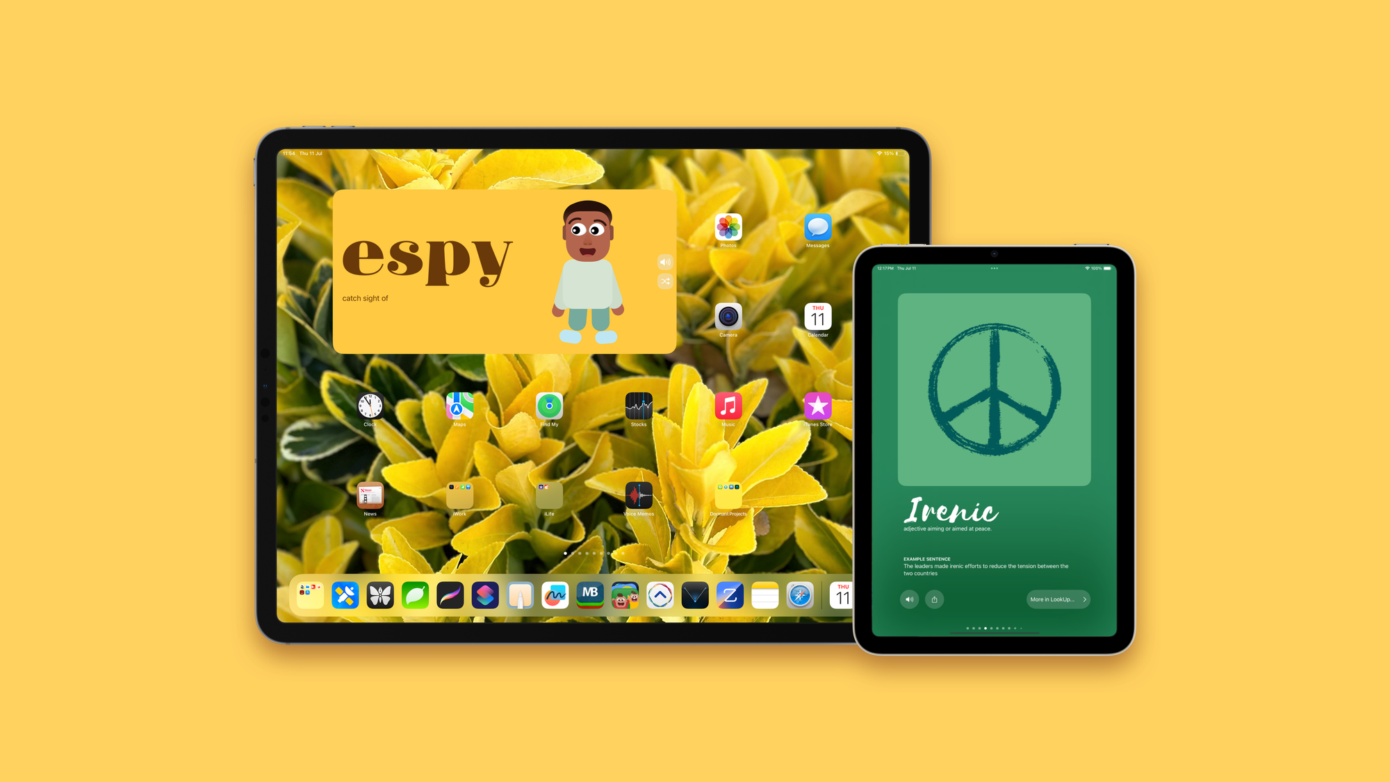
Not only is the iPhone app not the center of a user’s interaction on the phone. It’s increasingly becoming one of the many parts of an ecosystem where apps are expected to scale both in terms of interface and functionality starting from something as small as an Apple Watch and going all the way up to an unbounded experience like Vision Pro.
Not only do apps exist in the larger ecosystem of products, they are constantly interacting and communicating between them.
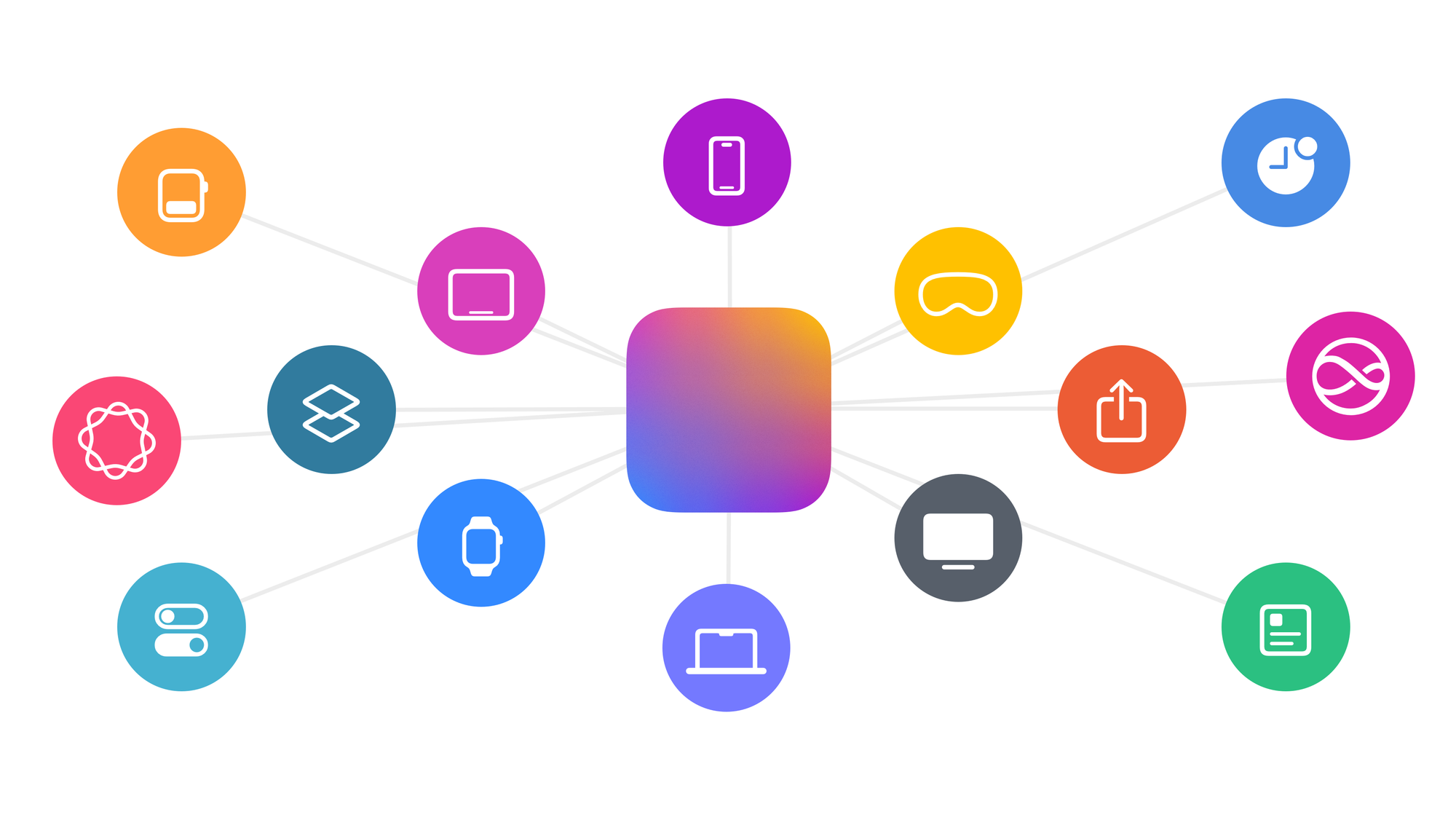
Simply put, there are very few apps that just live on a phone’s display.
There’s something quite wrong about starting with a phone UI then. It’s like we’re designing apps like they’d exist in 2008 and not like they exist in 2024.
---
What is an app?
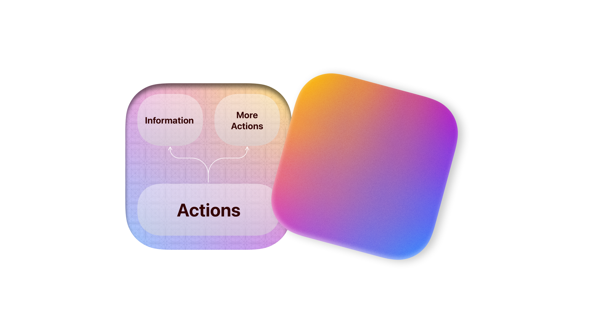
But what really is an app? I like to think of “apps” as clusters of actions that help us reach or present information, and carry out processes (i.e. other actions)
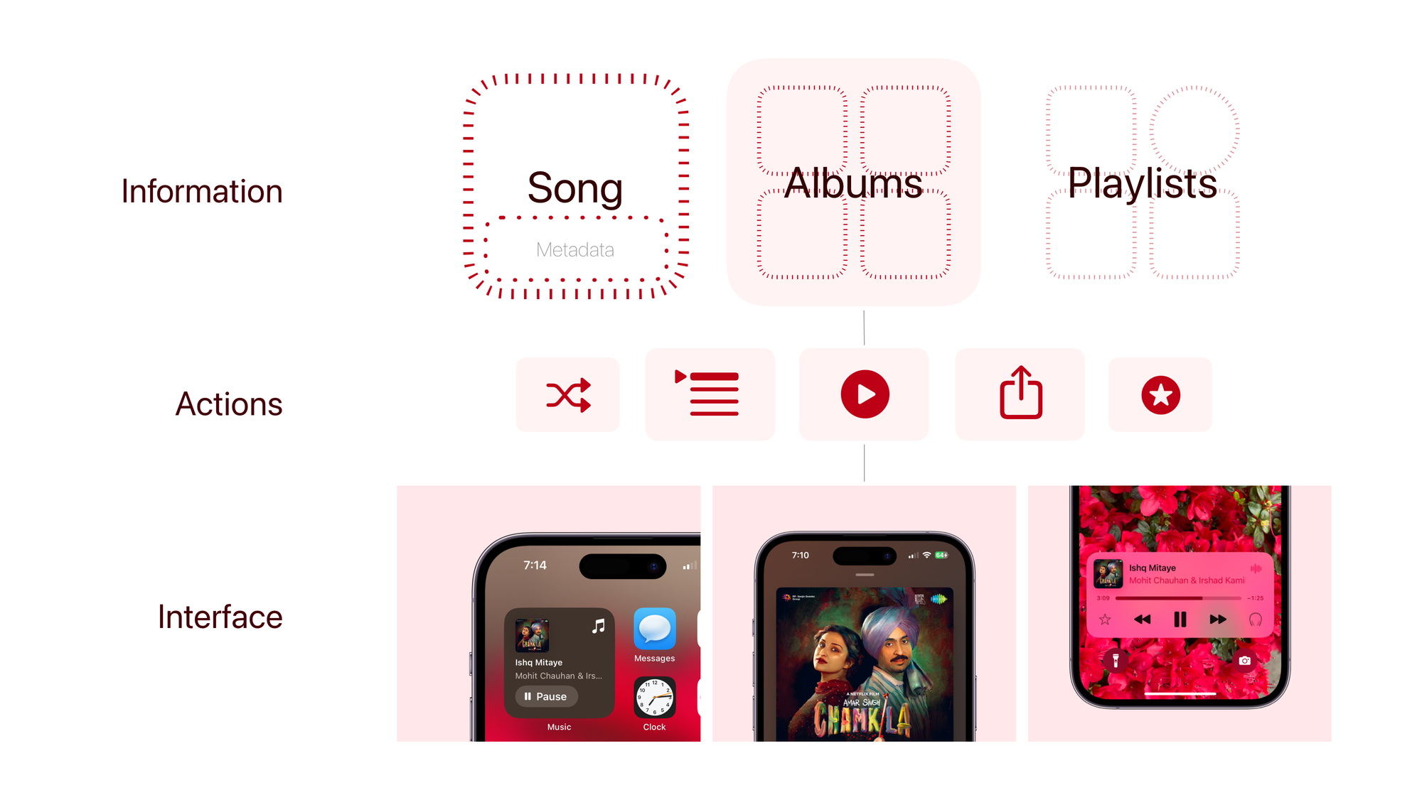
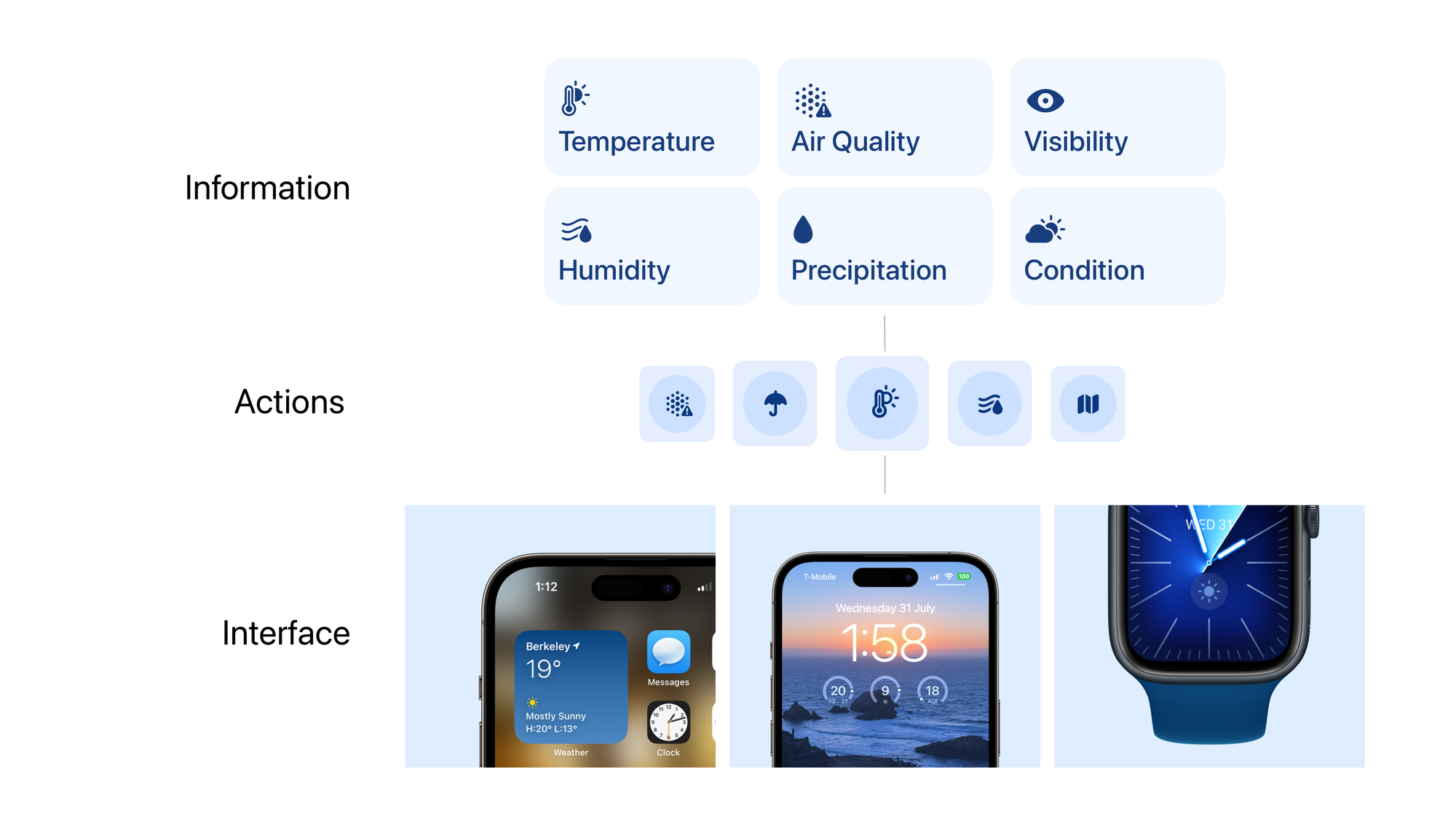
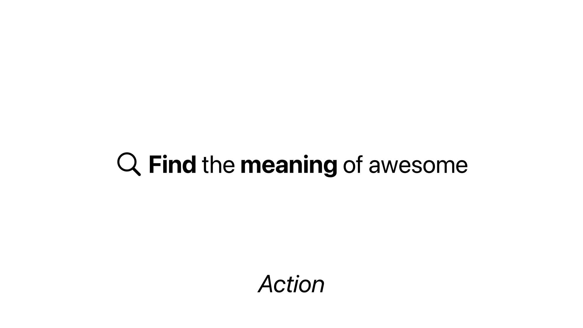
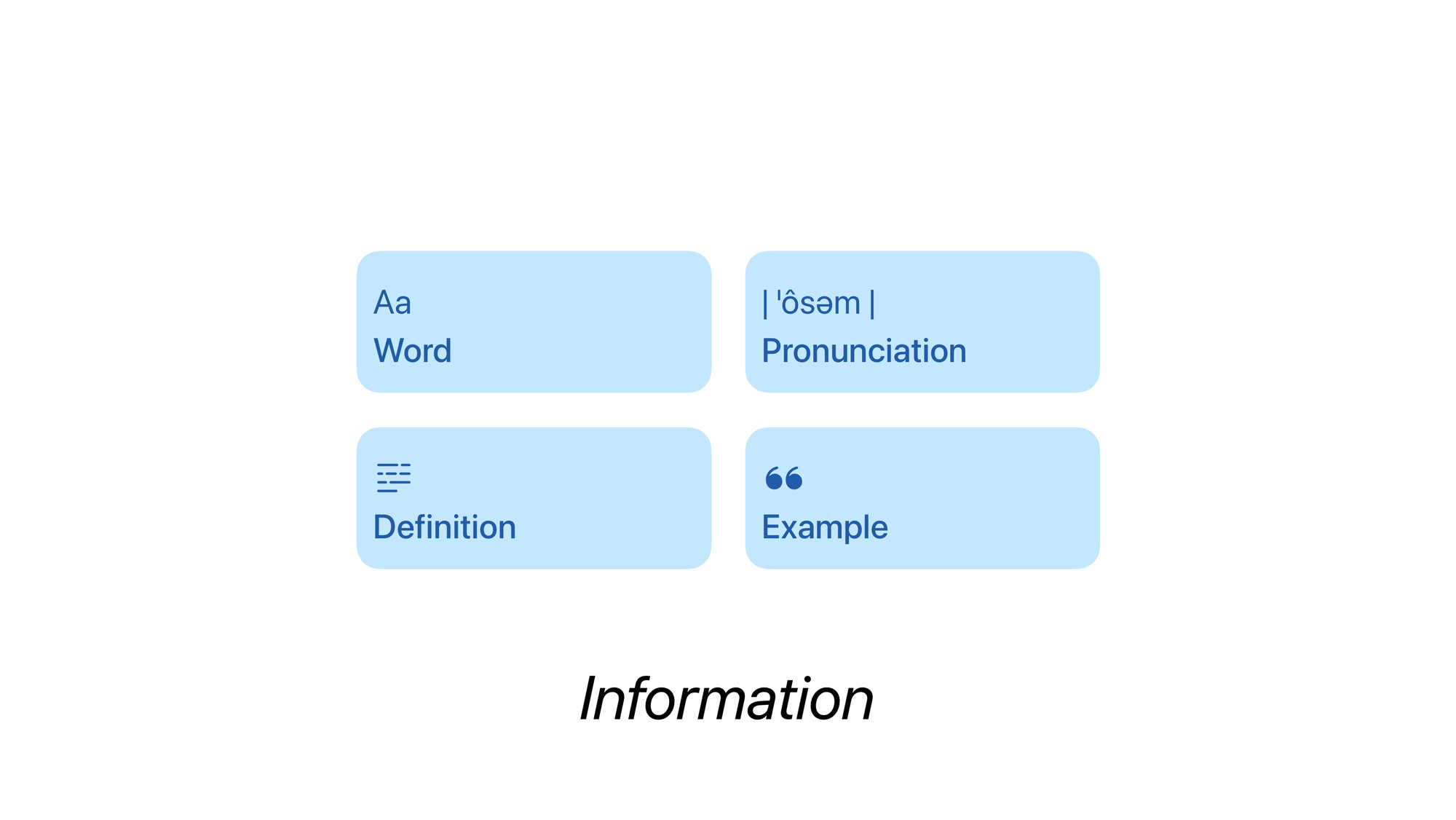
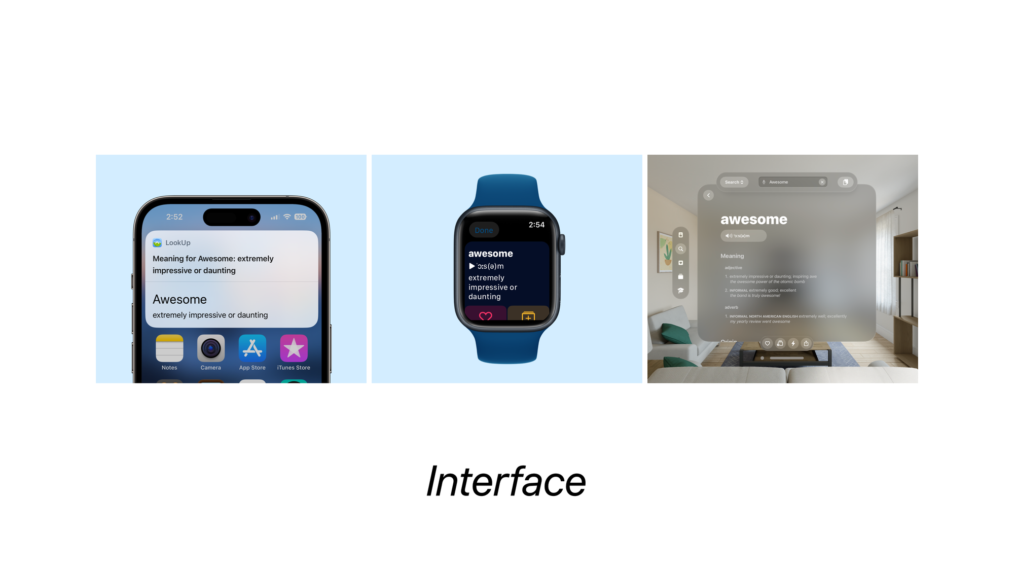

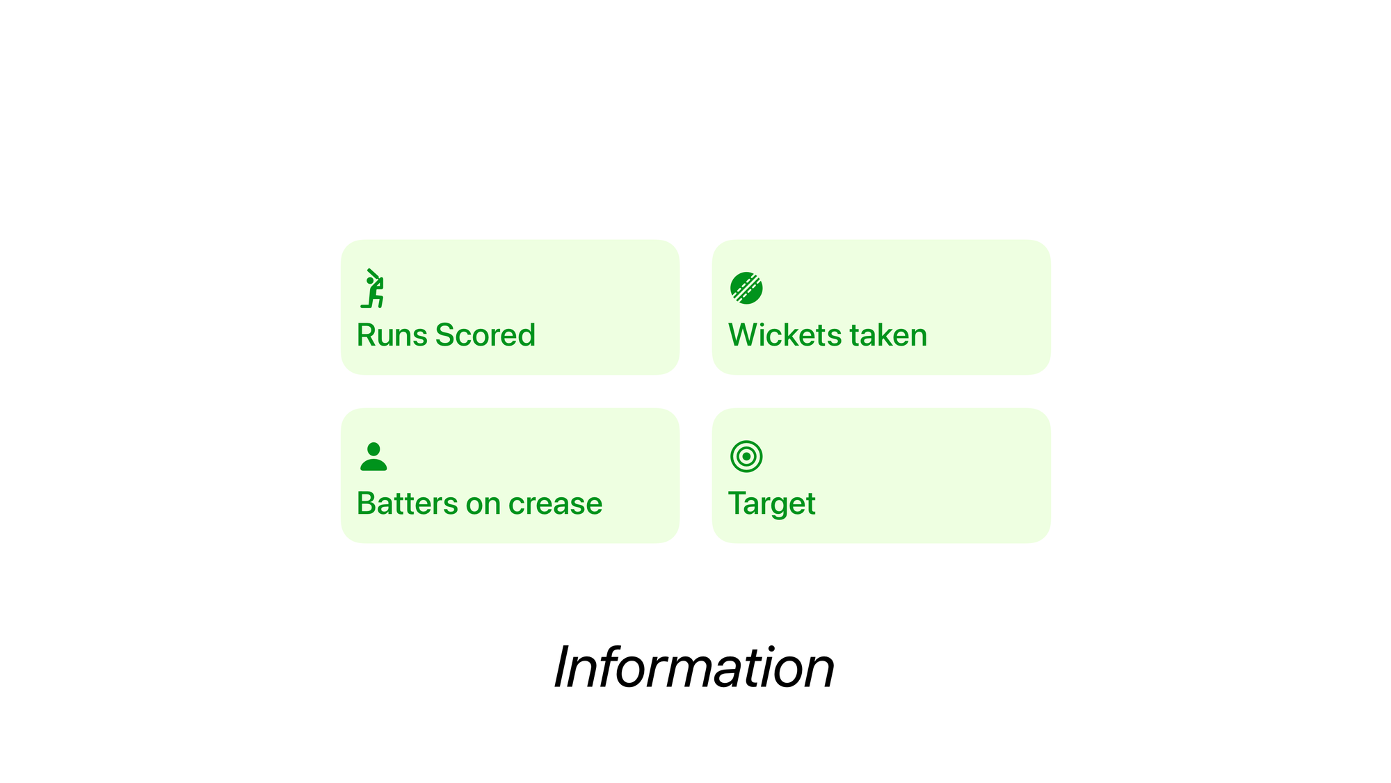
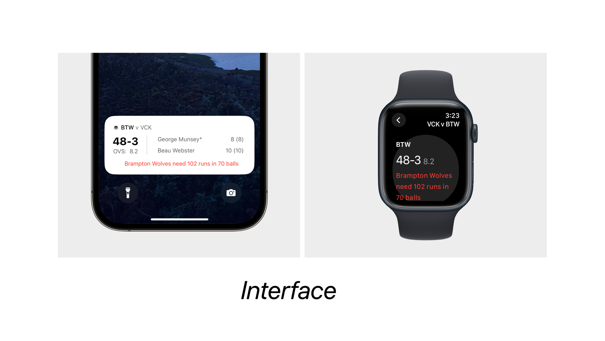
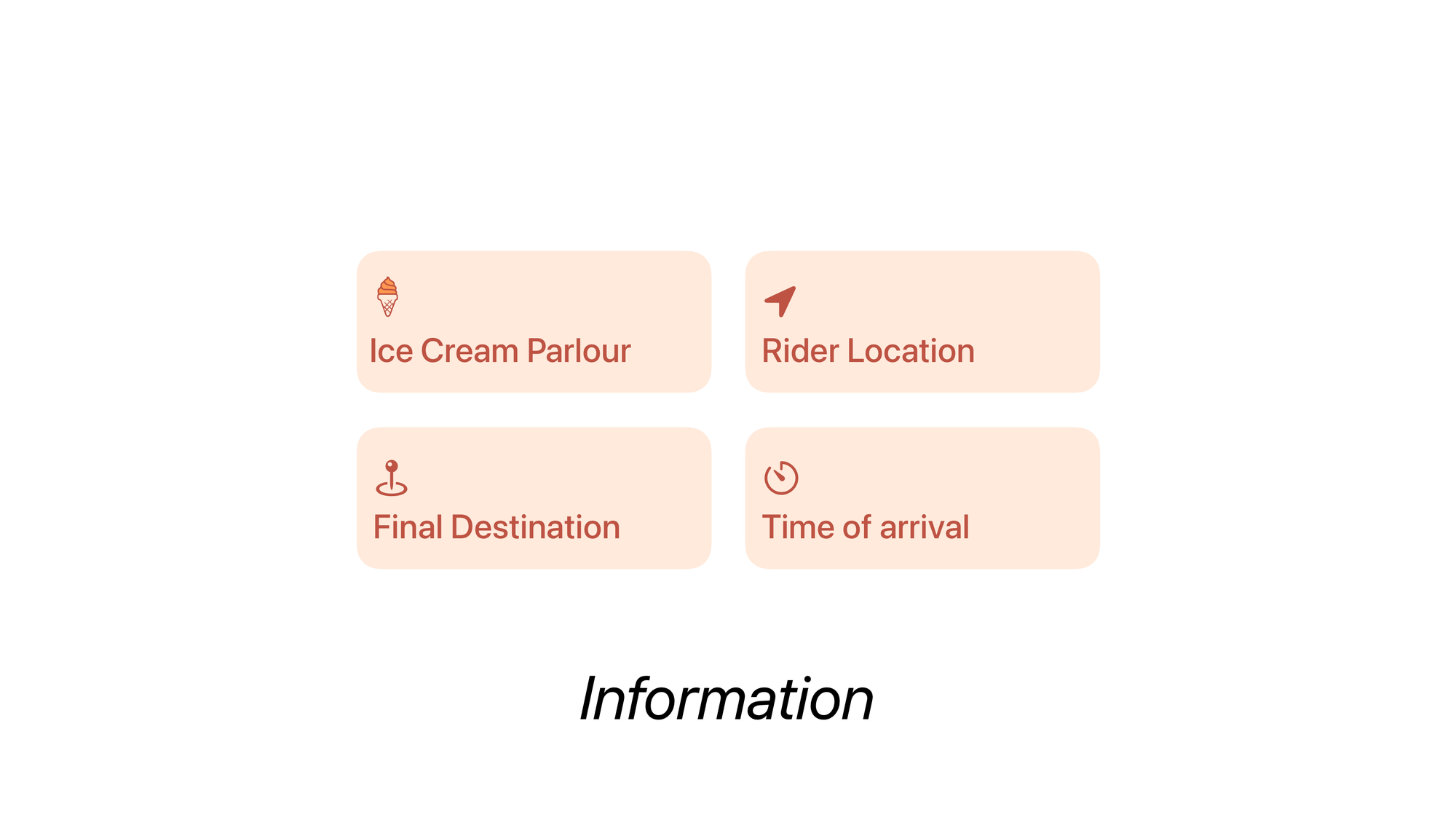
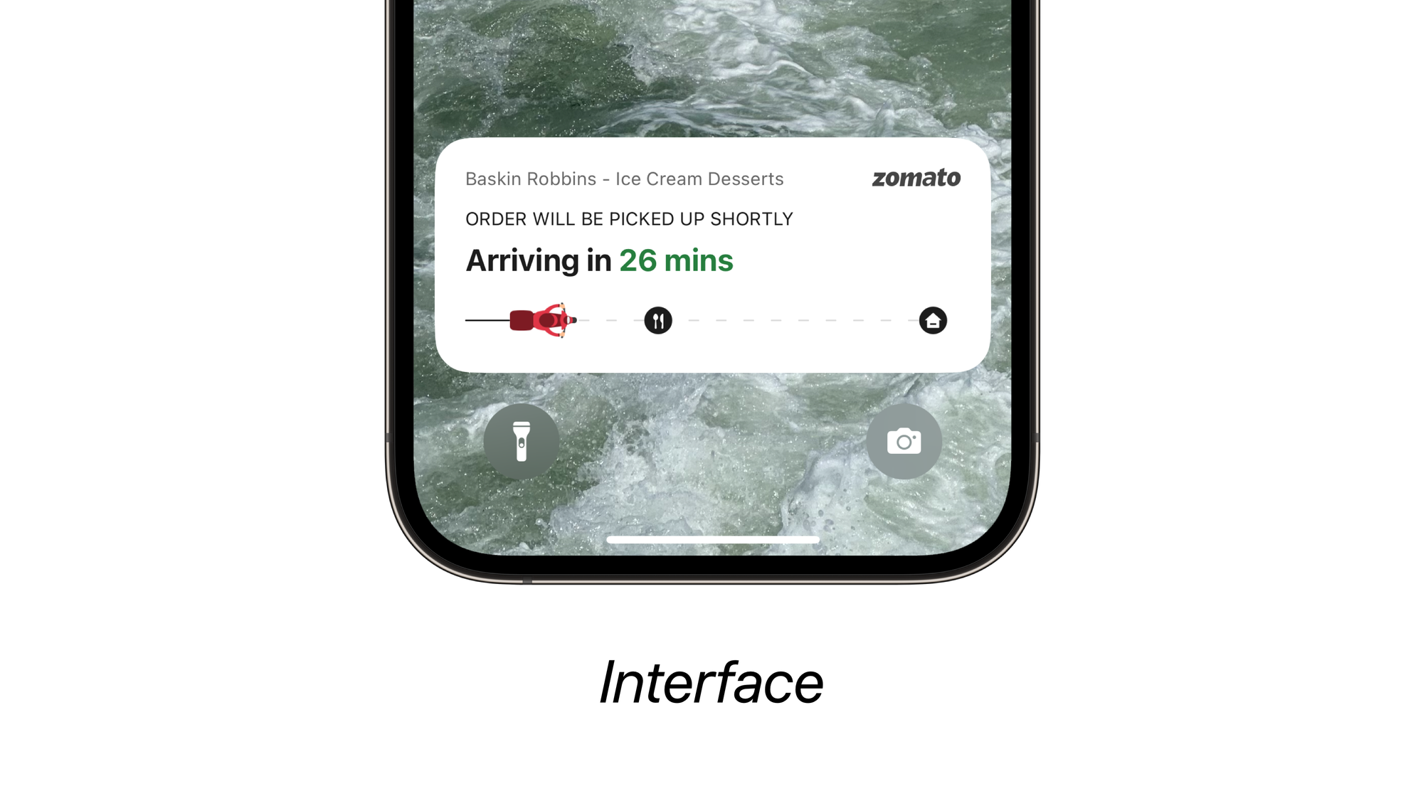
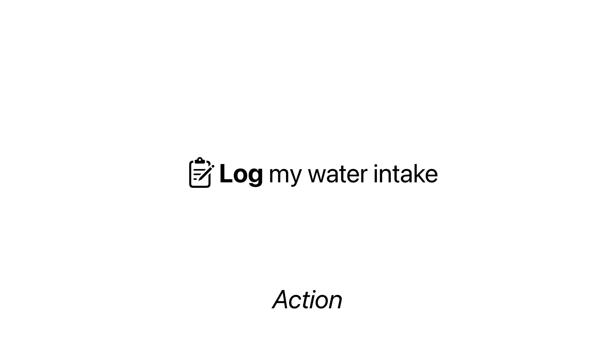
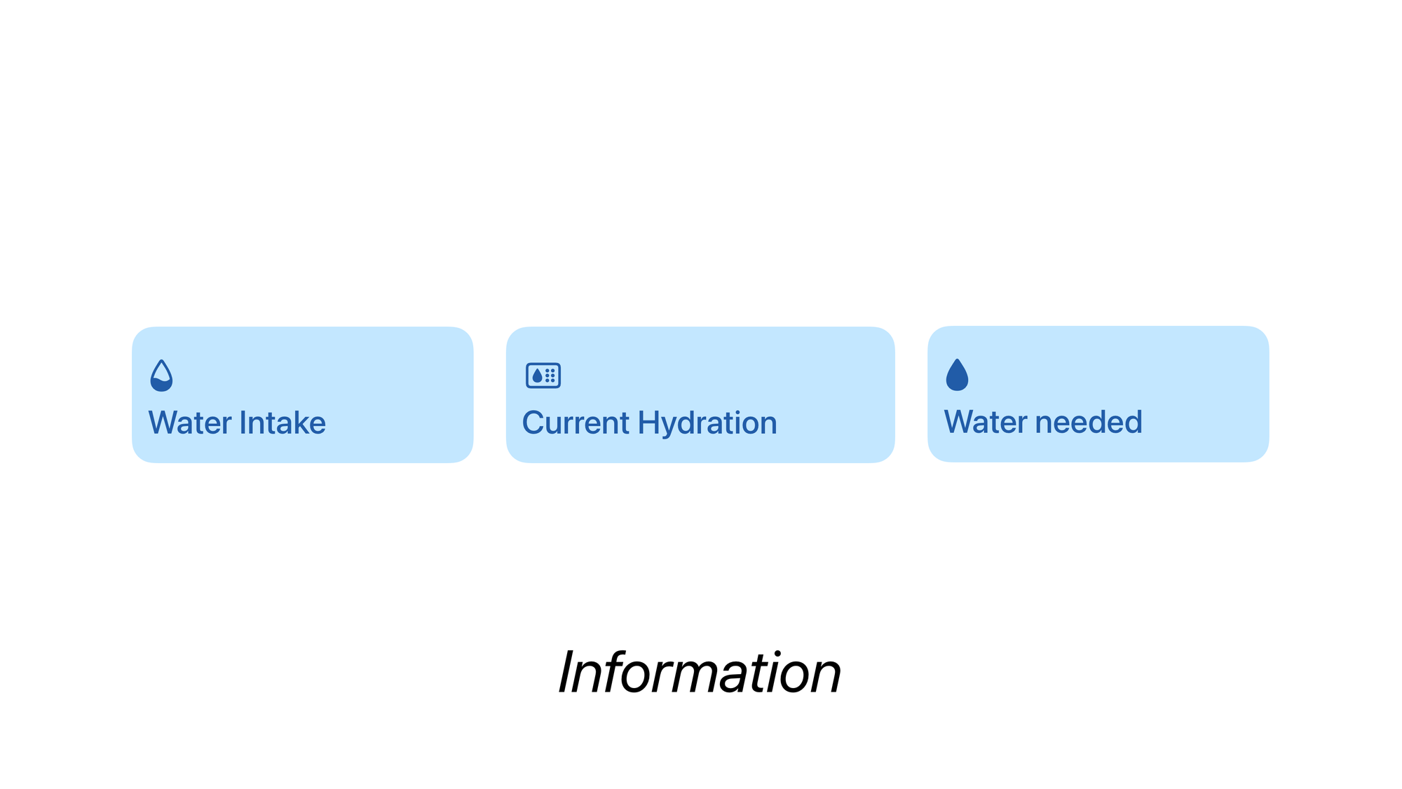
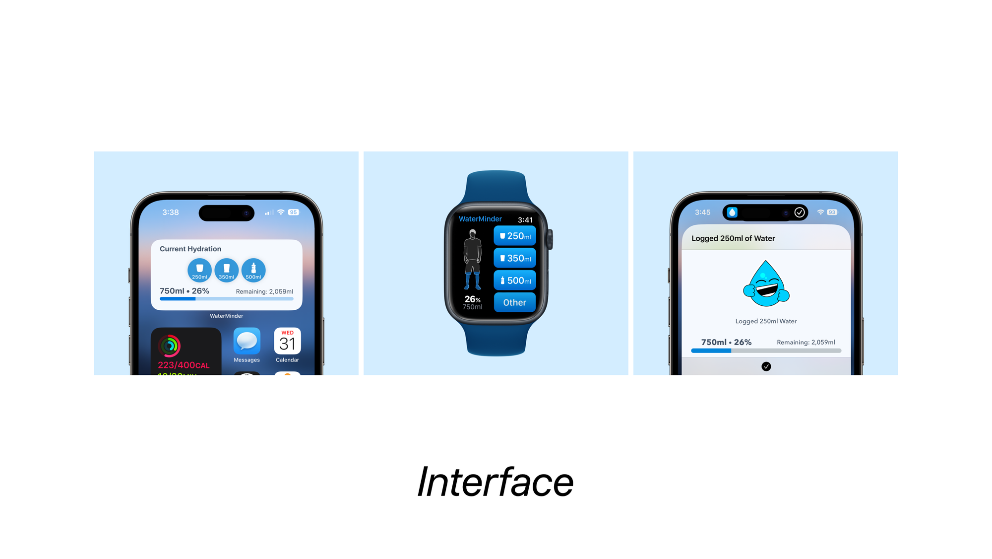
A new design methodology
Given how spread out each interface is across multiple platforms, modalities and different conditions, it’s important to take a step back, and abstract the information and action from the app’s interface; and then analyse what makes the app.
To do that we must address the question of What actions and information does the app need to support. To meaningfully answer that question, we must know, what our users need, most importantly who are the users?
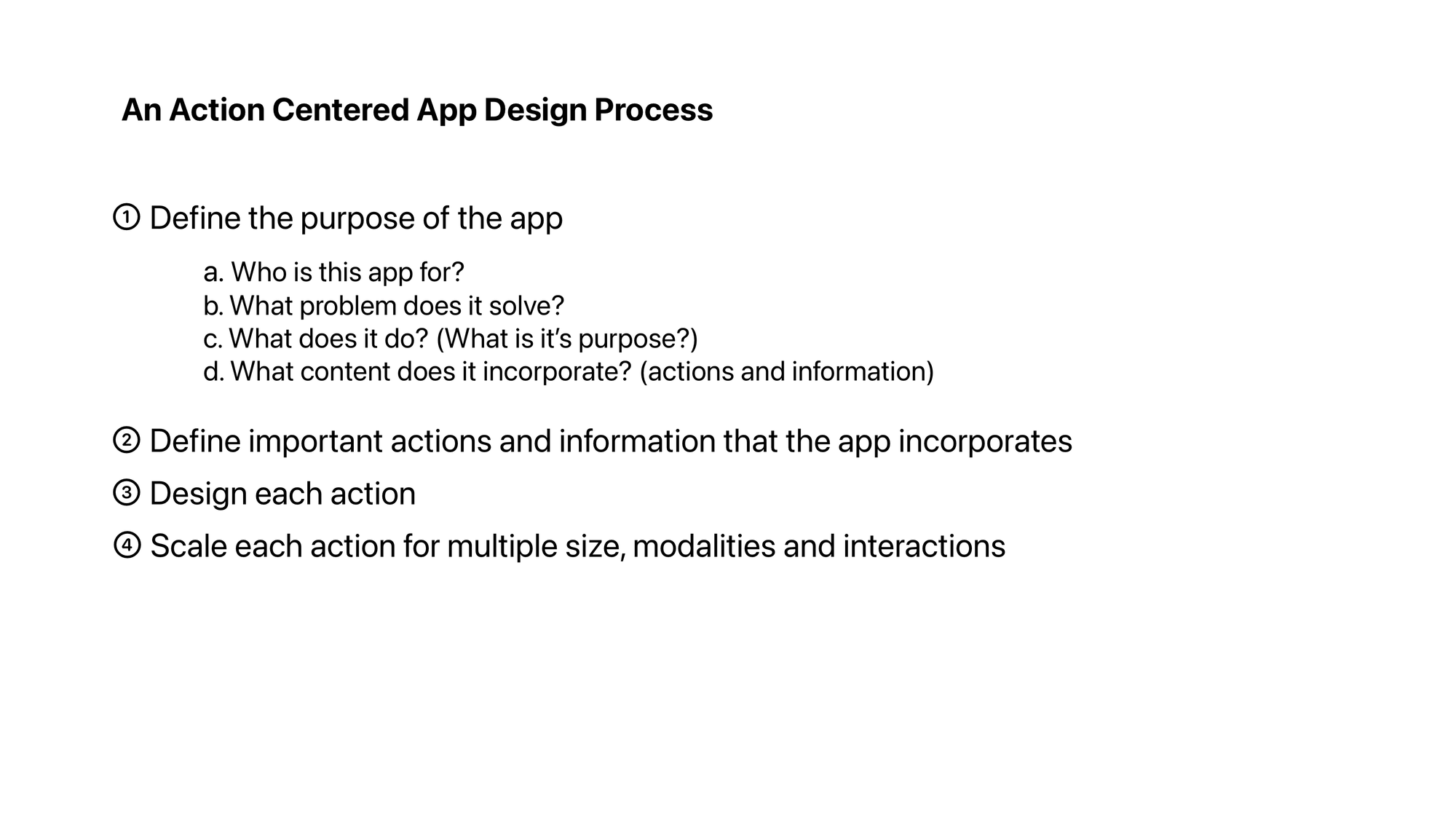
You’re probably getting the drift. We must incorporate the design research that leads us to the interface design in this new approach. We must go back to 4 basic questions:
Who is this app for?
What problem does it solve?
What does it do? (What is it’s purpose?)
What content does it incorporate?
The problem space and the target audience defines the functionalities of any product. The function is what defines the content it’d incorporate and the content and functionality together make the core actions an app needs to perform.
Once we work our way through these questions, we are left with a set of actions that we must design around. We then begin to use the tools and platforms in our arsenal to meet the users where they are.
Actions and Information define how different technologies can be used.
Is it information that our user needs to see every morning? How about a widget to represent that?
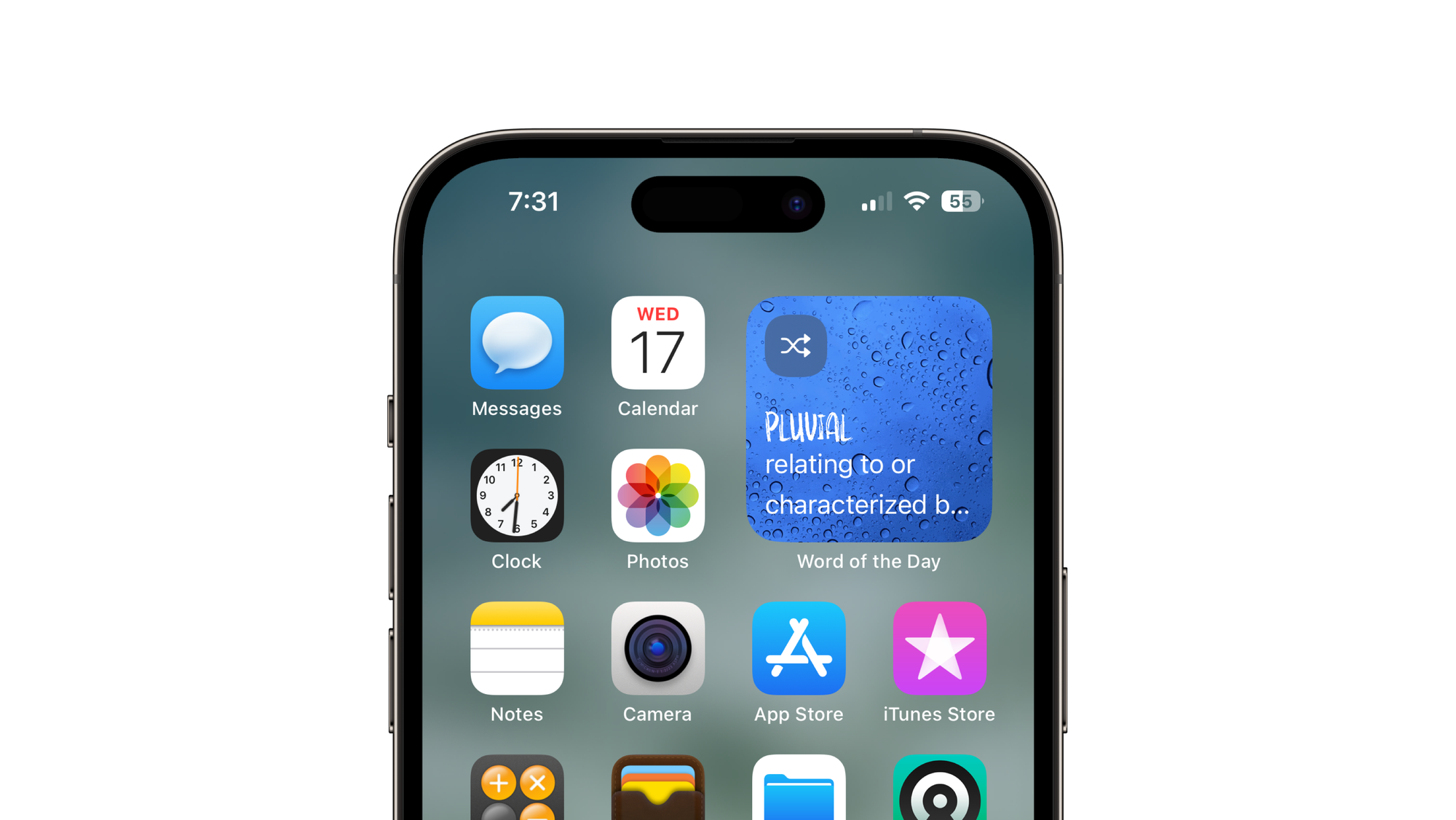
Is it something that needs to be seen at a quick glance and changes throughout the day? How about a watchOS app with complications.
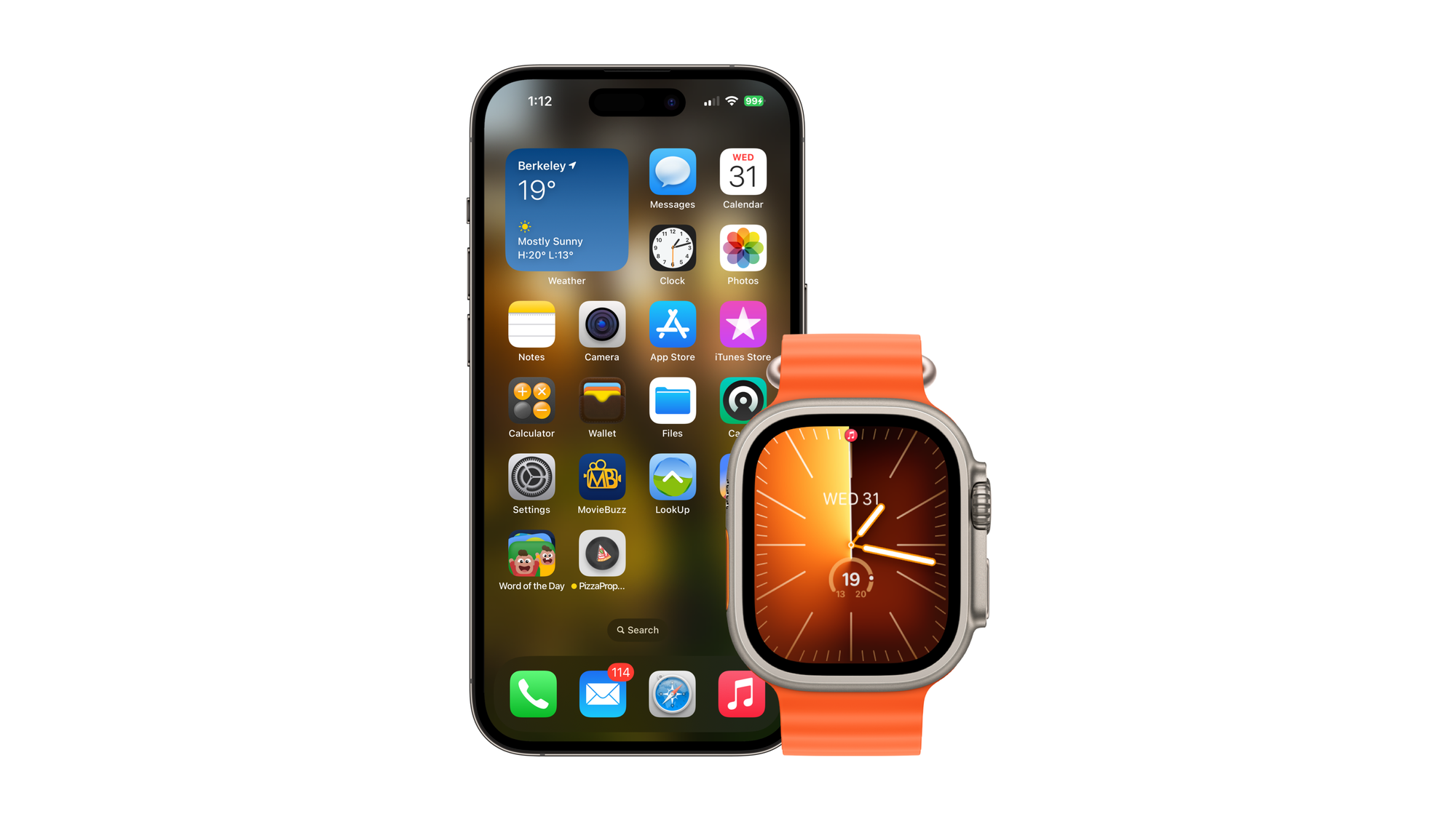
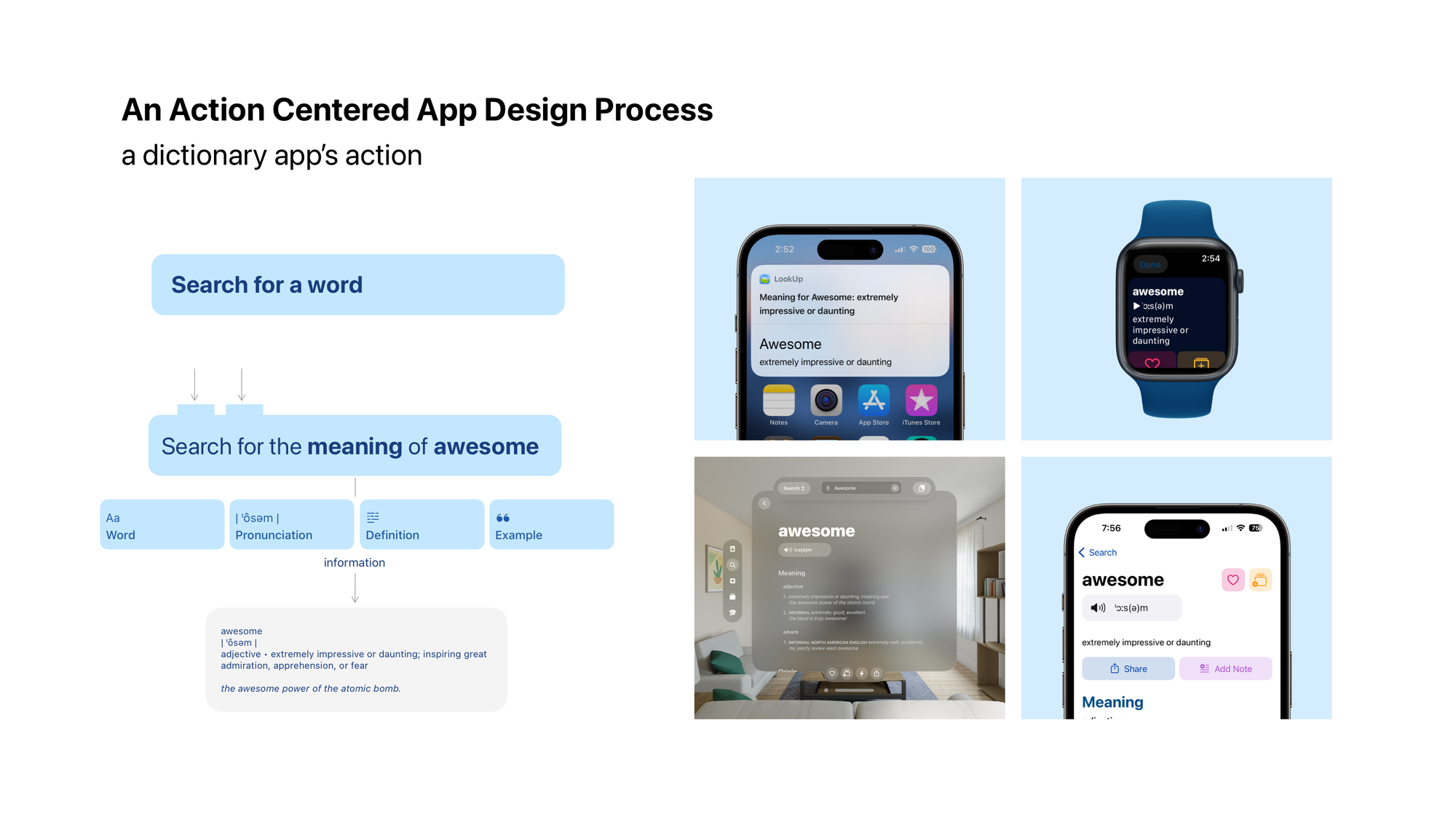
Is it a complex action that people do repeatedly that can be automated? Or made faster using voice commands? How about Shortcuts and Siri support.
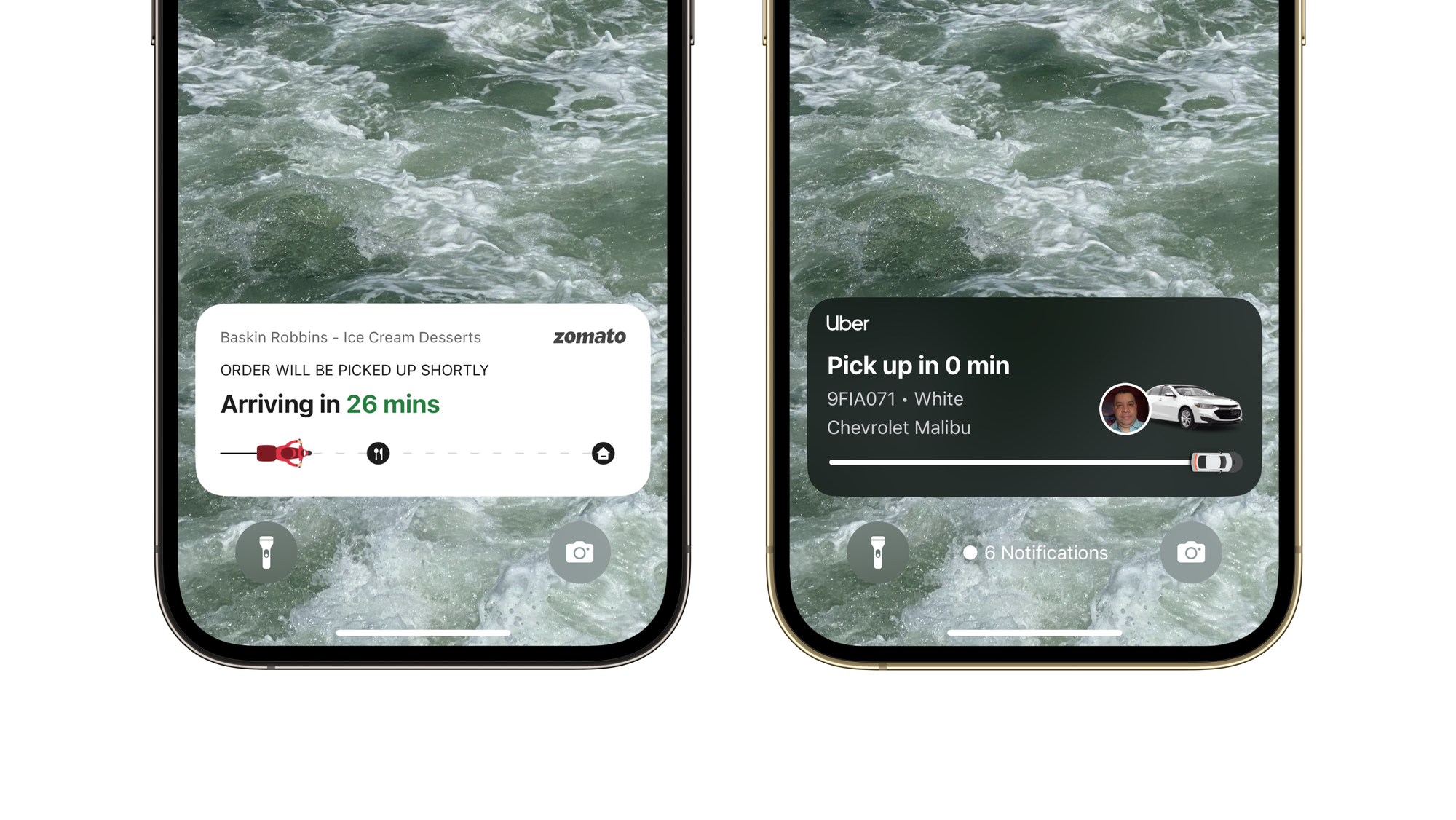
The user needs to keep track of this information at all times. And opening the app is cumbersome. What if we added a live activity to track that?
Apple Intelligence
If there’s anymore indication needed on how apps are changing. Look no further than Apple Intelligence and Siri’s latest updates. These updates focus on the idea of AppIntents and AppEntities for apps to integrate with Apple Intelligence; AppIntents and Entities are basically developer speak for Actions and Information.
They are the underpinnings of much of how modern Apple platform extensions like Widgets, Control Center controls, Shortcuts and Focus Modes work.
Essentially, AppIntents allow developers to break down their app’s actions into small chunks that can run independently but are also flexible enough to interface with other applications. Much like lego bricks.
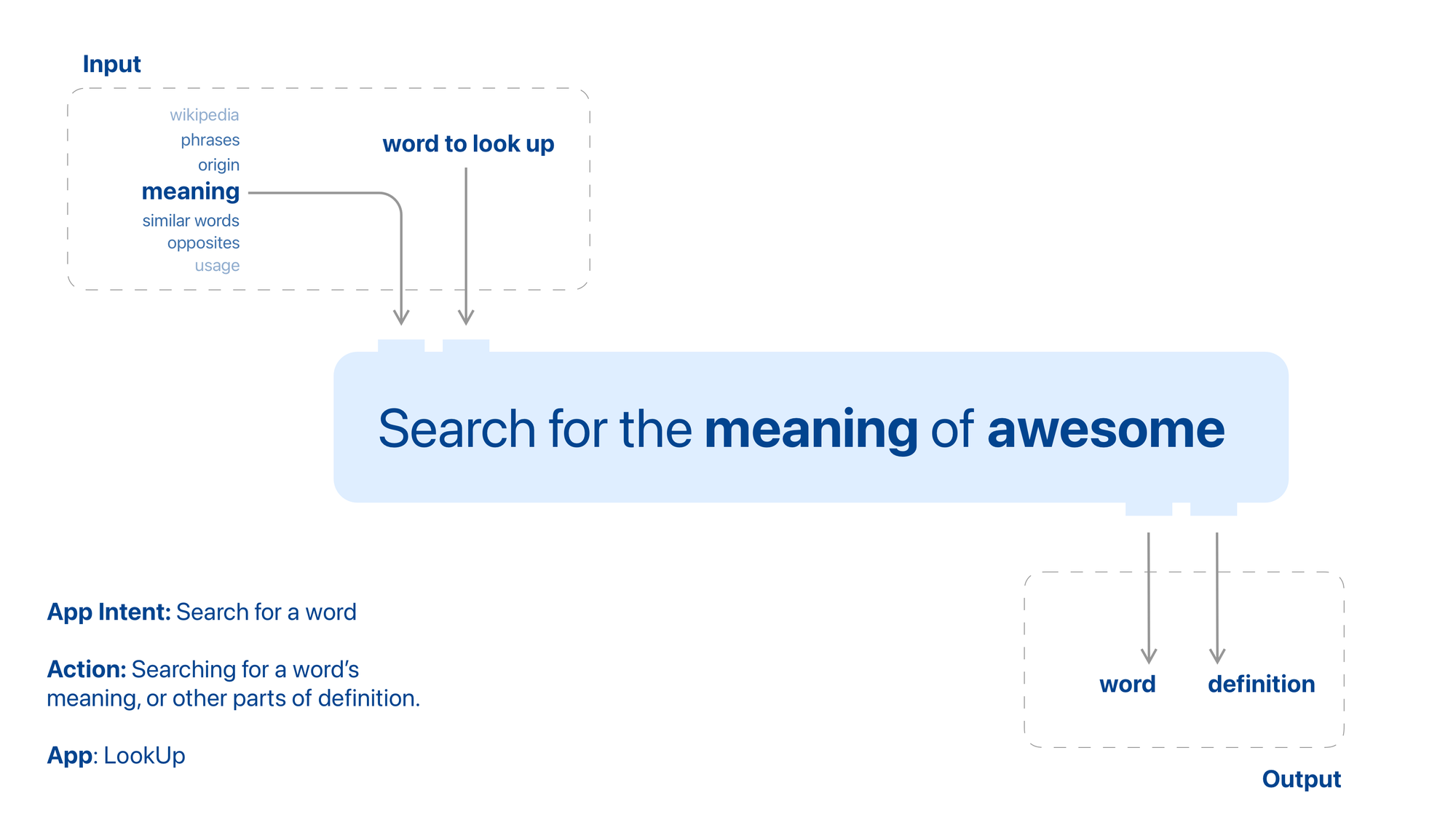
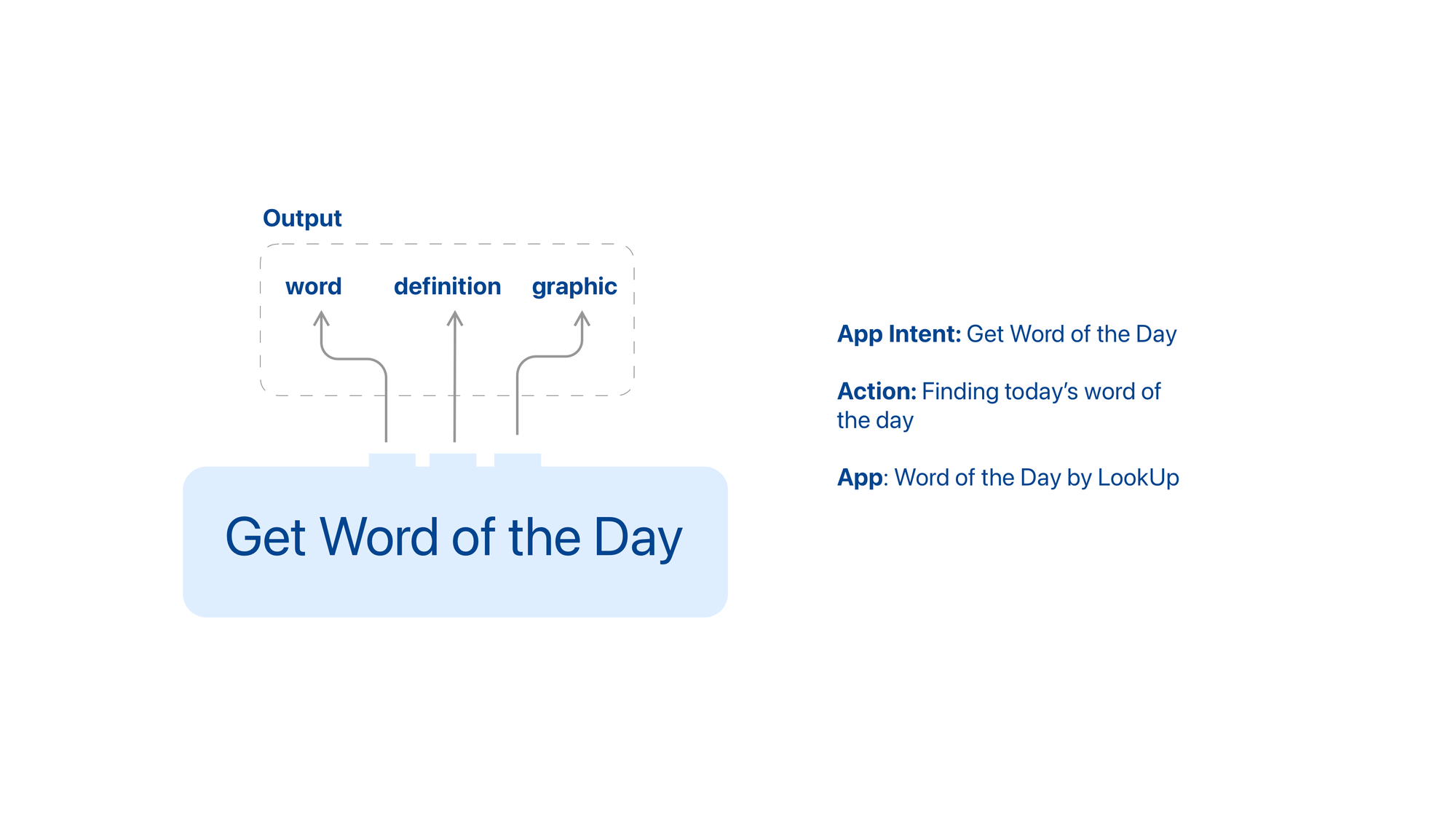
AppEntities on the other hand help developers define information that would be useful for their users to search for.
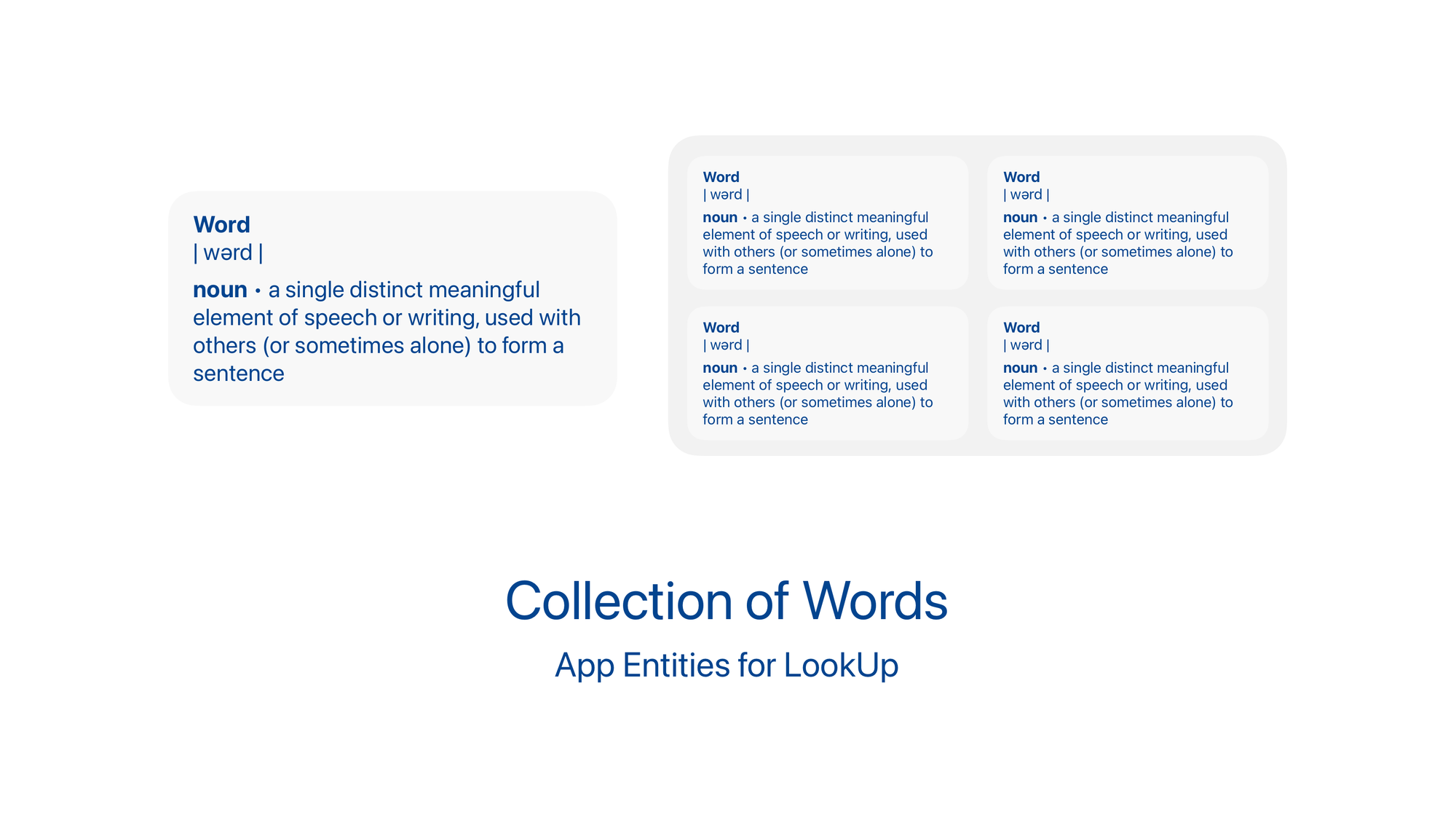

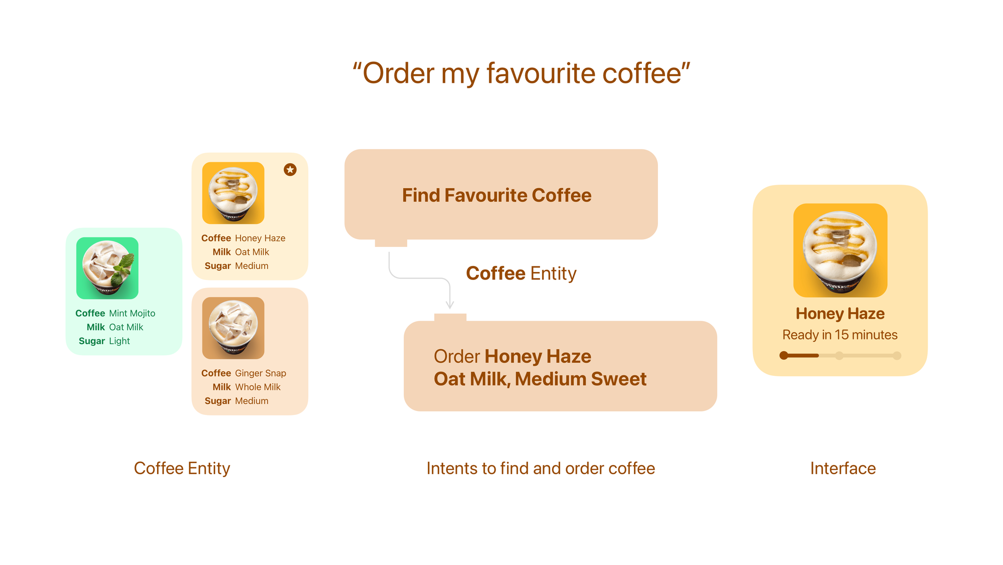
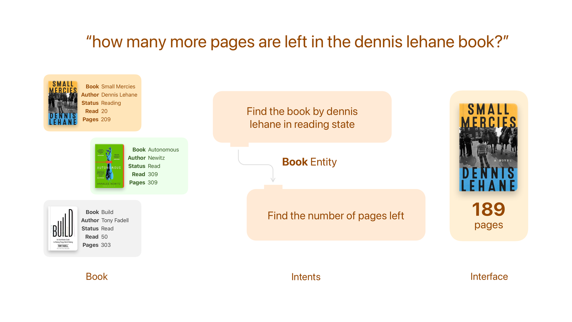
With Apple Intelligence AppIntents and AppEntities feed into the larger context of a person’s computing experience.
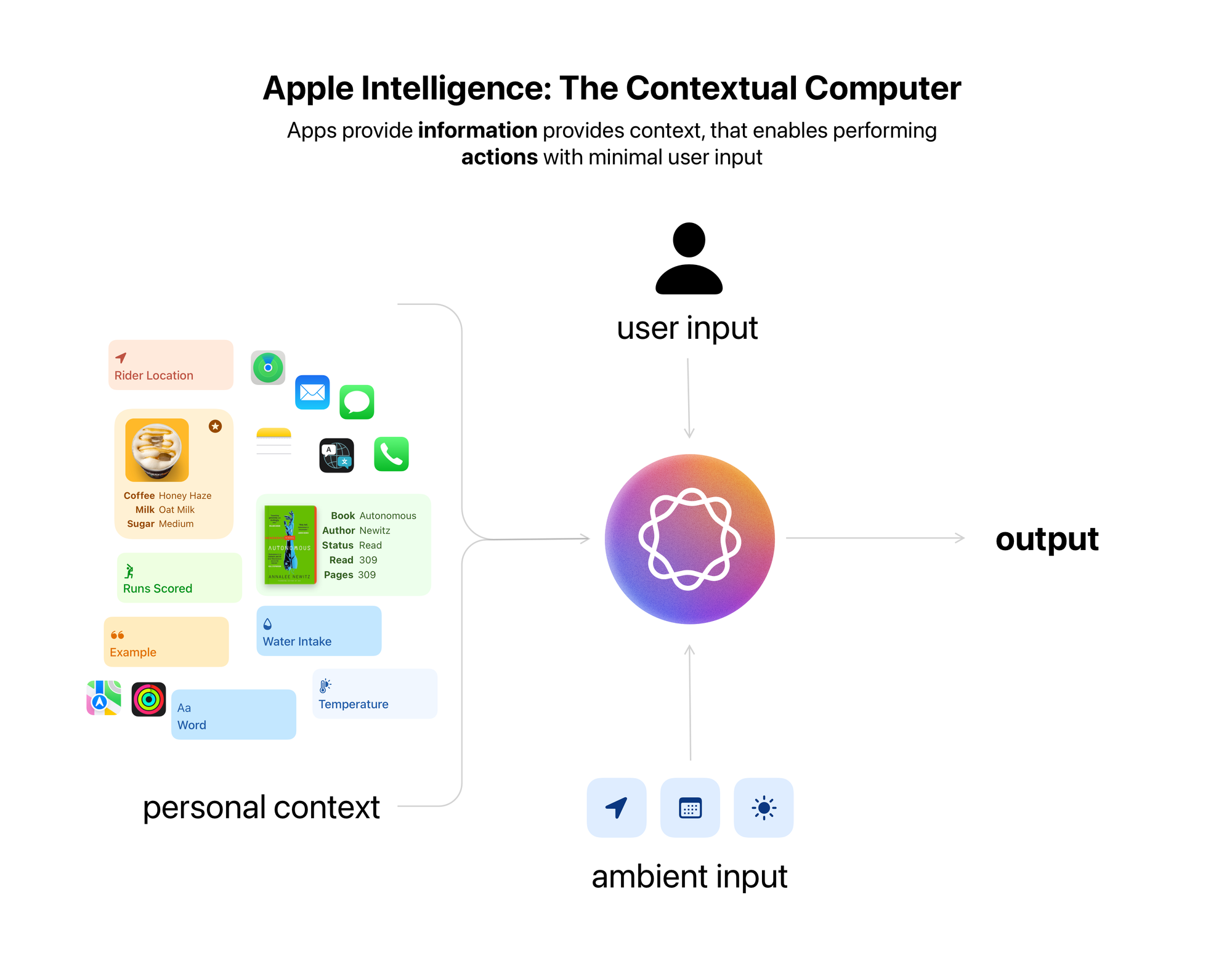
How does the device know that you’re reading Dennis Lehane’s Small Mercies? Your book tracking app defines that AppEntity defining that reading status. When you ask Siri to order your favourite afternoon coffee, it’ll be able to look at the Philz Coffee’s Intents and Entities to order a small Honey Haze for you.
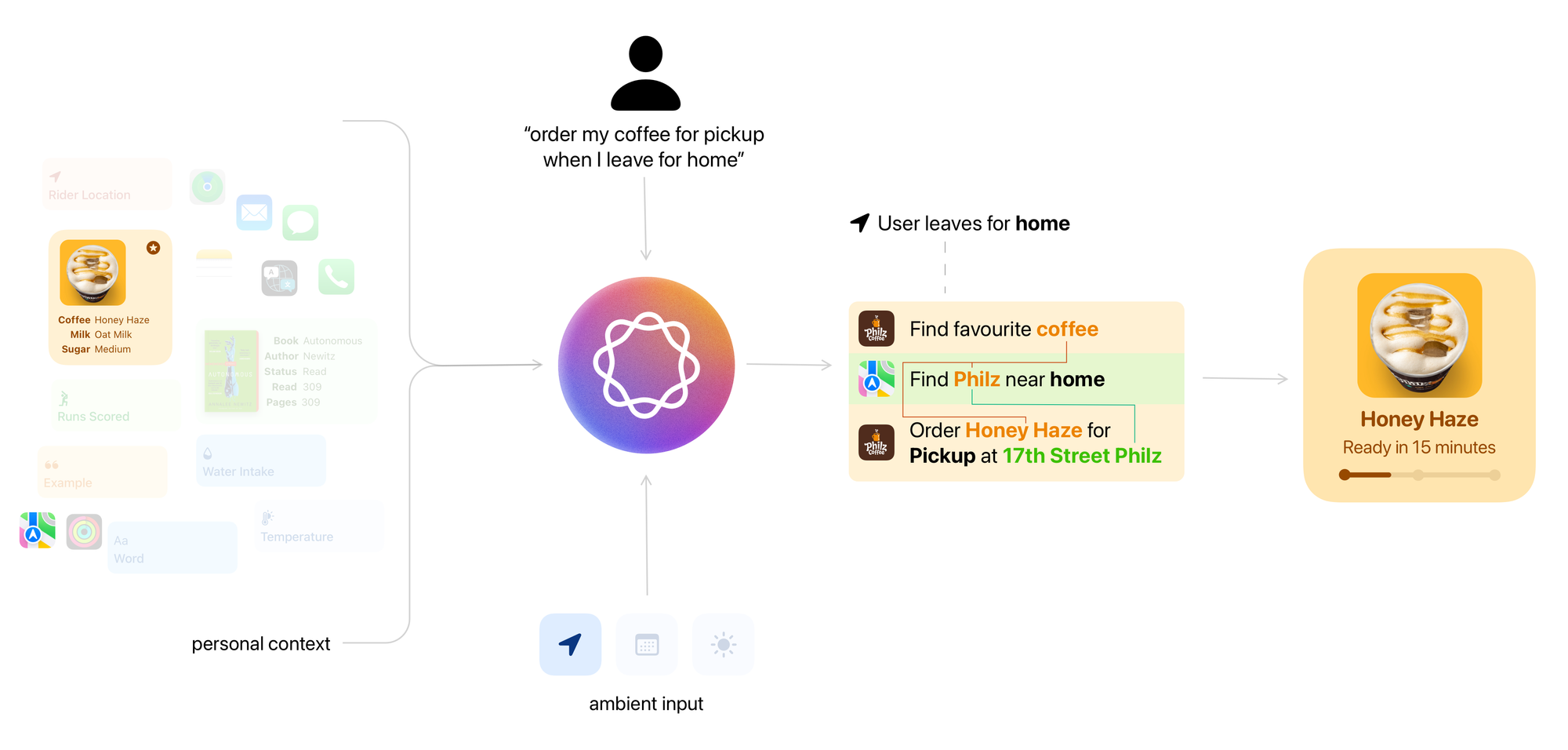
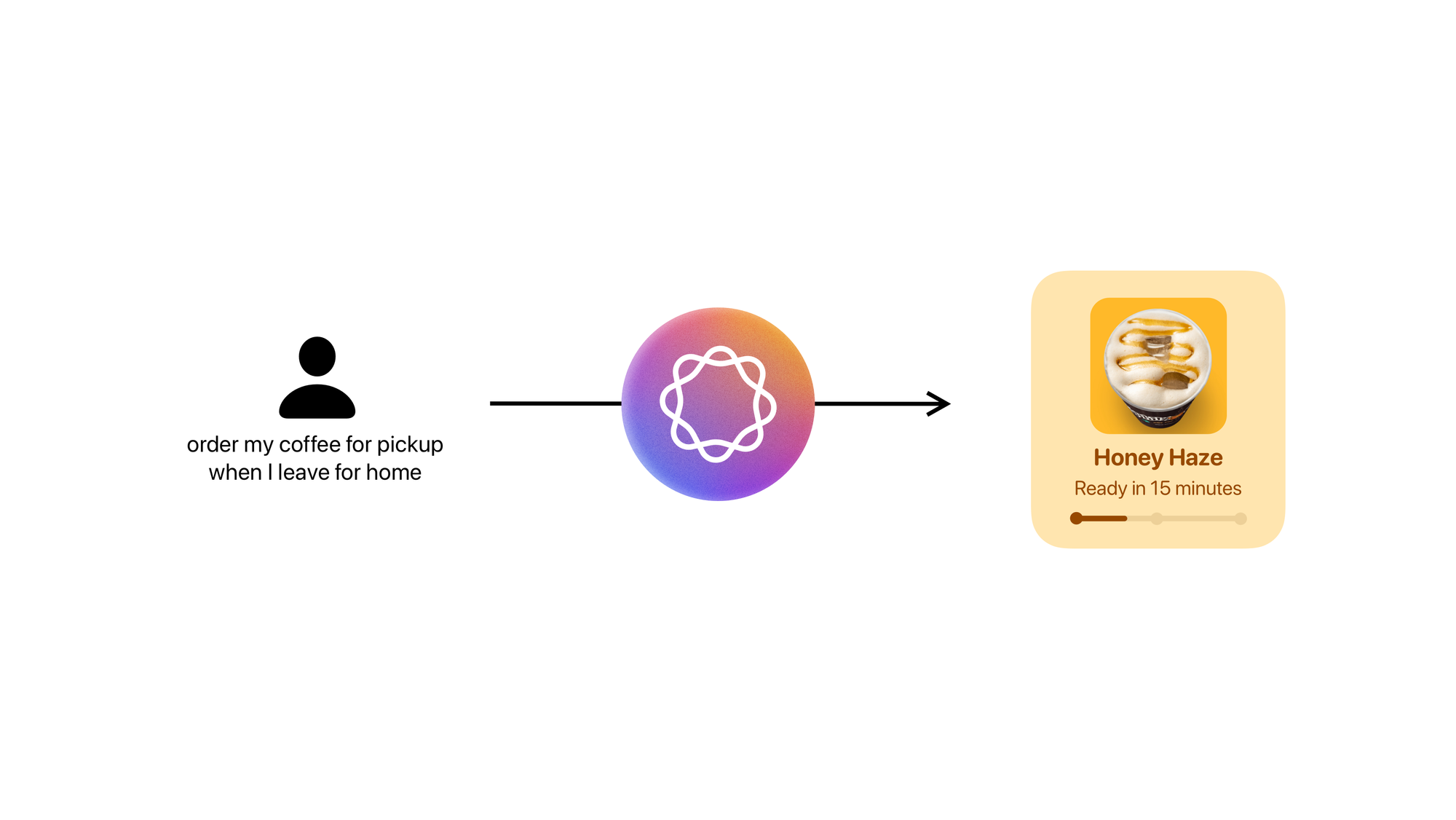
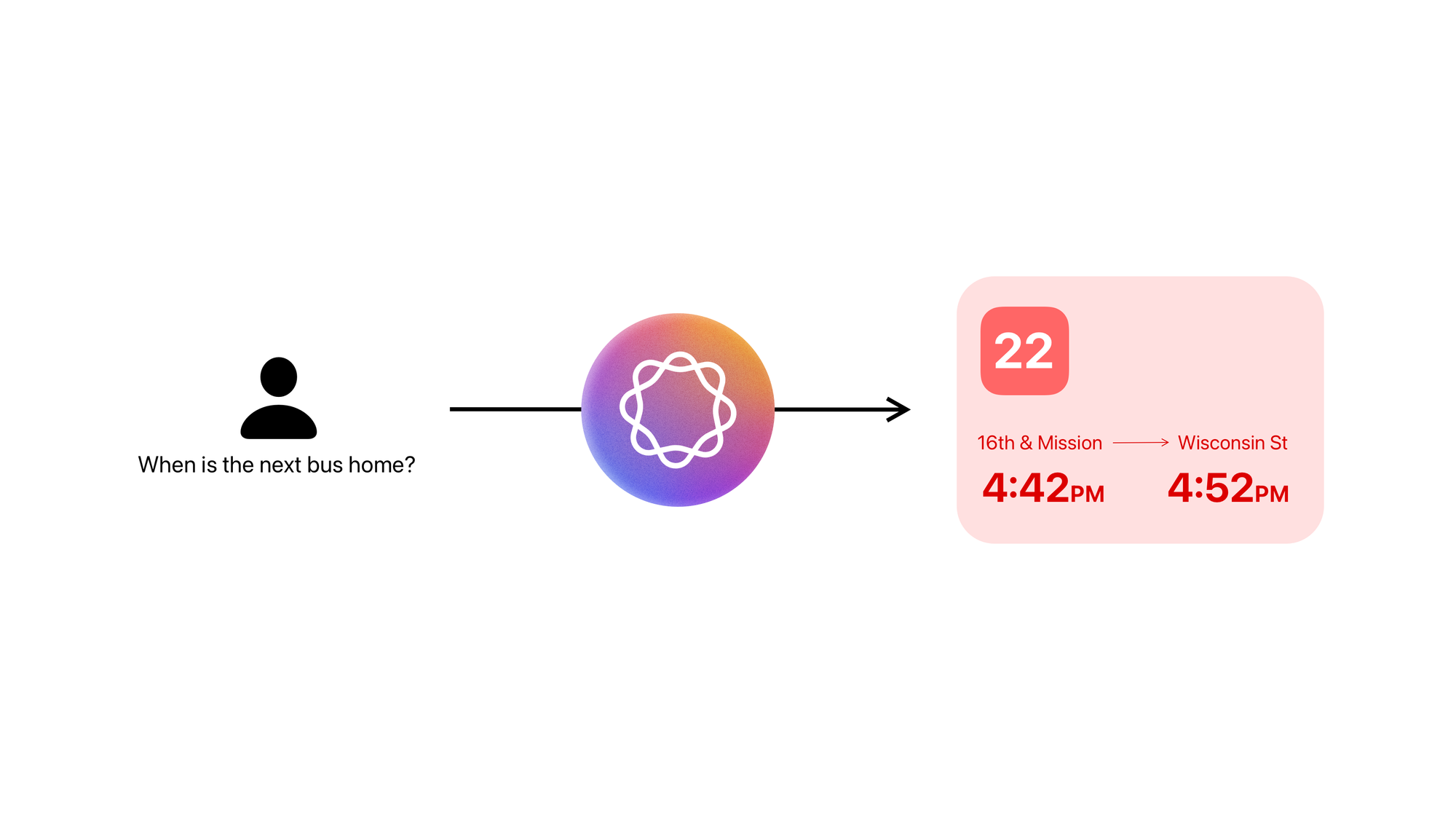
For a smarter future of computing, it’s imperative to think in terms of actions and not siloed interfaces.
Designing for Actions
We’ve read about how actions are the future of app and app design but how does one design an action?
What makes an action?
An action is defined as the process of doing something to achieve an aim.
The process of doing something, is preceded by understanding the given task and followed by generating a response.
In this context, the person is aided by computers to perform an action. So the person must communicate the requirements to perform that action.
And the computer must communicate that response to the person using an appropriate medium (voice, text, images, video, a change in the person’s environment)
Actions can be one and done, but more often than not, people want to follow up, they want a back and forth with the computer. i.e. They want to interact.
So an action could be defined by the input, output and interaction flows.
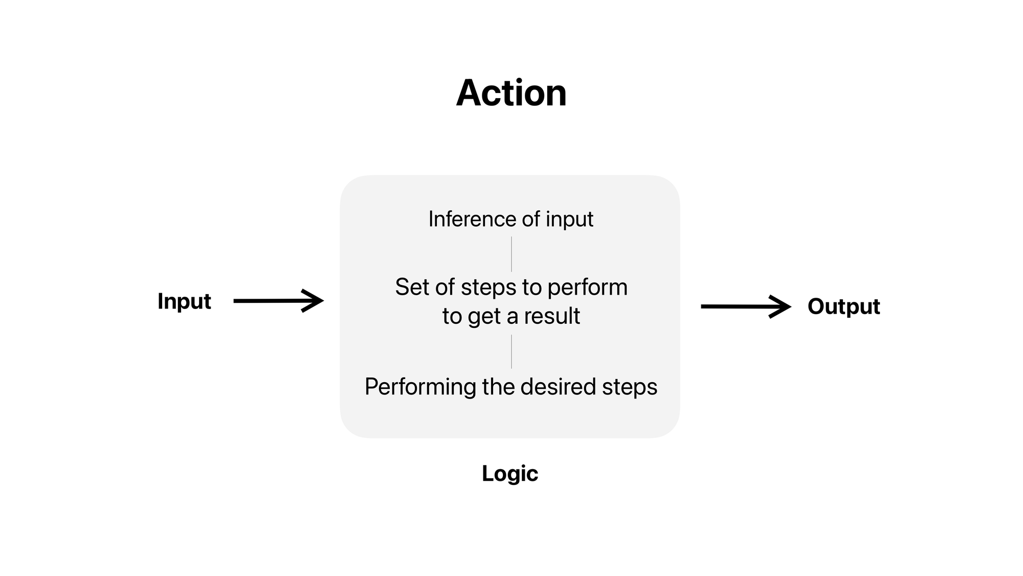
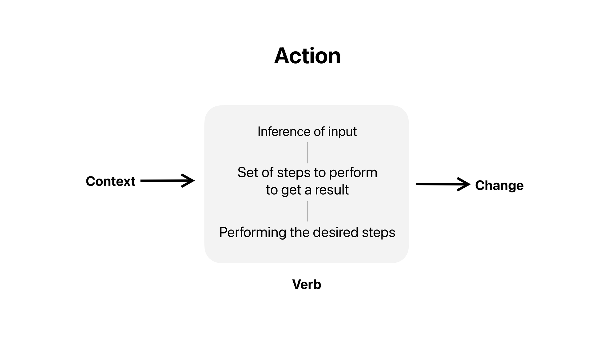
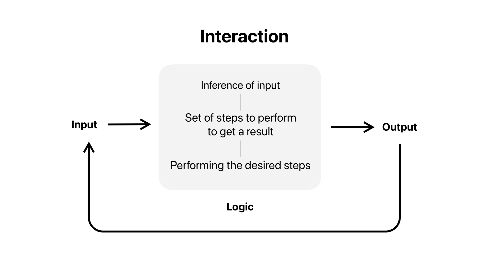
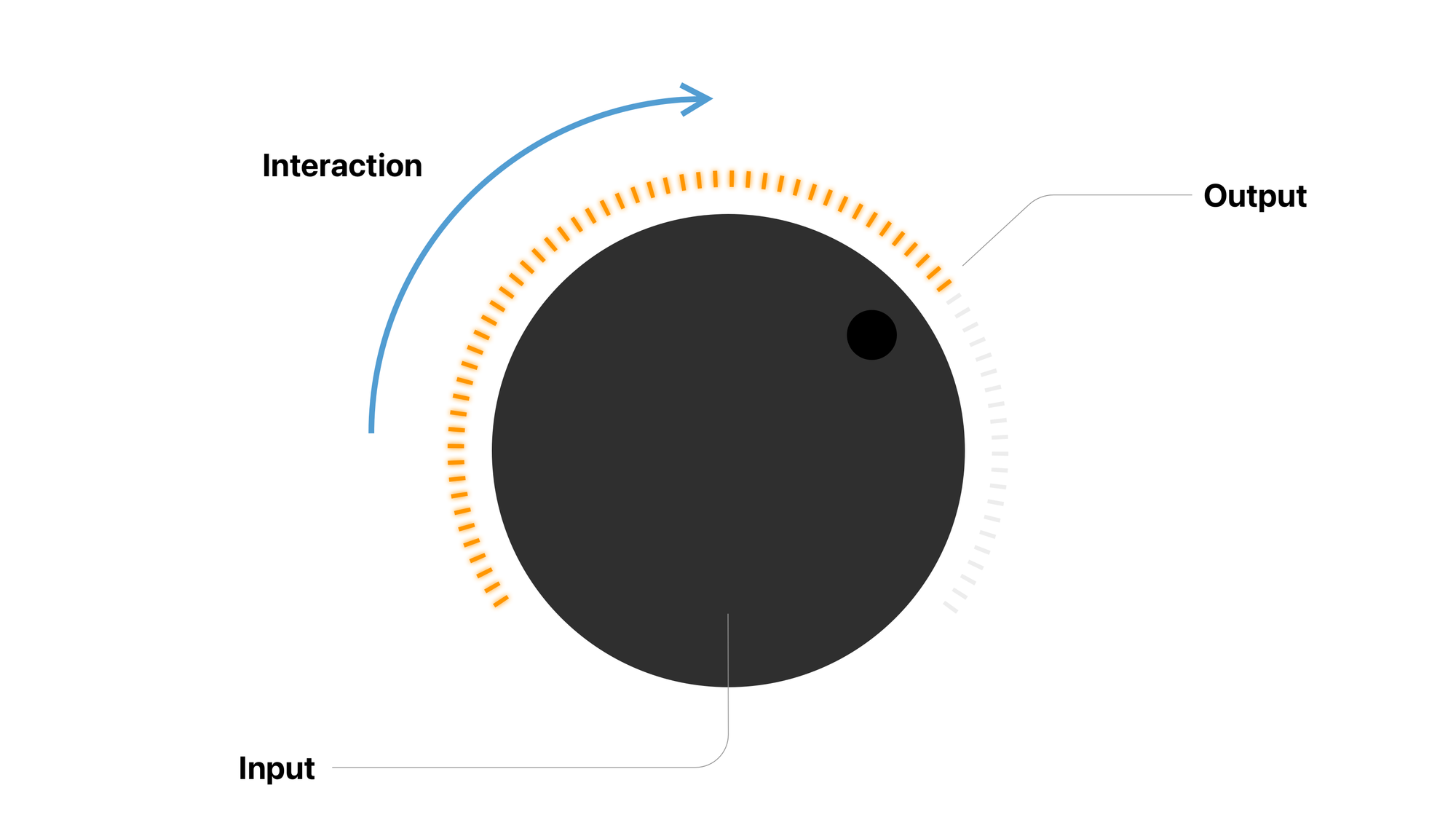
An action is not tied to a platform
As you see in the above examples actions are not tied to any platform. In fact, it’s not until we introduce interactions, that we begin to care about the modalities and affordances of an action.
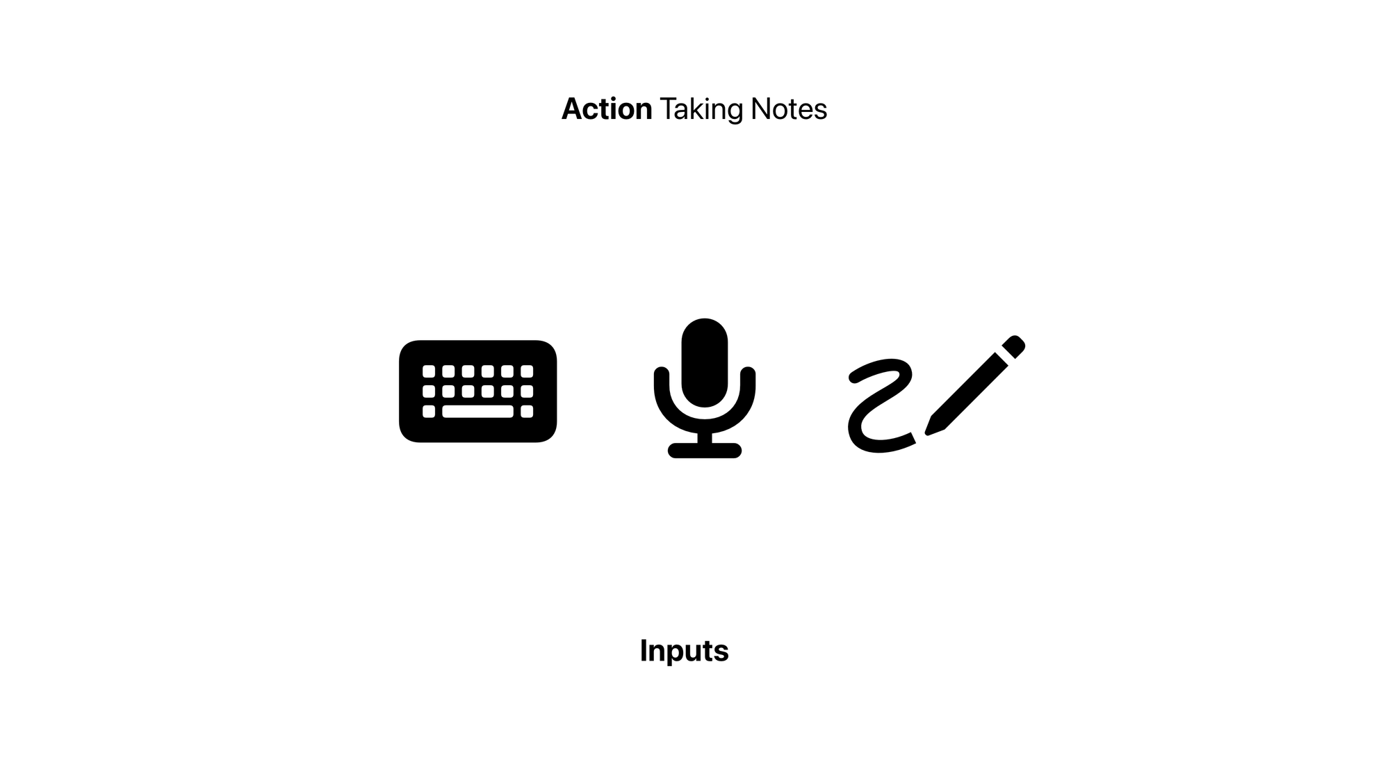
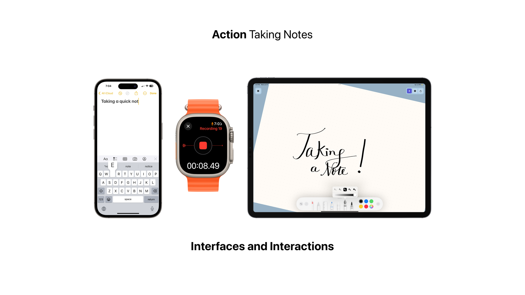
Where to begin?
One of my favourite learnings in UI Design has been to begin interfaces with the smallest screen supported. What does that? It helps develop a razor-sharp focus on what’s important. What must be above the fold.
With actions that focus is far more important. What is the smallest, most useful chunk that a task can be divided into is what defines an action. It’s a very focused approach to defining a task; and it’s important to keep that focus when scaling that task to different platforms.
Scaling to different platforms?
But we’re still designing apps right? Apps aren’t going away, they’re just evolving. So how do we scale our actions to an actual phone app UI?
Phone apps and screens are clusters of actions.
So we must begin as such, to design a phone apps UI, it’s worth going back to the four questions we defined at the very beginning of this article and define the key actions our product needs to perform.
These key actions then define an app’s primary navigation. What’s most important to the user, what must they see first? What kind of navigational hierarchy are we looking at? Flat, Hierarchical or Mixed?
Once we design the actions a person must perform in the app, and design how they’d reach the most important actions; we must now design which actions can be clustered together in a single screen, and then present them in a way that makes cohesive sense.
Notice how interactions become even more important here. Interactions define the controls and interfaces incorporated in a platform.
---
Actions and Information are like the atoms and bits of an app, and with new and emerging forms of technology they’re taking center stage. So it’s only imperative that our design practice also moves away from a platform centric model to an action centric model.
The design for actions framework.
My apps mentioned in the post:
