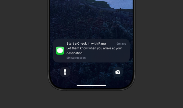
Artificial Intelligence The Paradox of Context in Computing Why more context isn’t always the solution for bad contextual computing. This post serves as a primer to contextual computing and offers a framework for designing good contextual experiences.
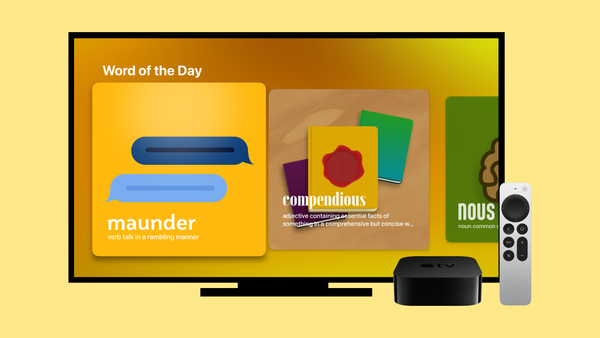
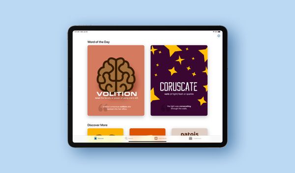
Action Centered Design Bringing Word of the Day by LookUp to Apple TV How an action-centered-design framework and SwiftUI helped me build the Apple TV app for Word of the Day by LookUp in an afternoon’s worth of work.
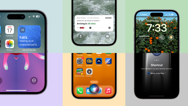
UI The way we interact with apps is changing, so should the way they are designed. The current state of apps and the advent of Apple Intelligence makes it important to have an action centered design approach to designing apps. The phone is only a part of a much larger ecosystem.
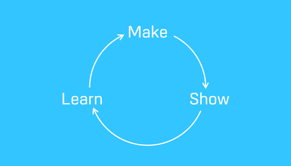
product design Make • Show • Learn The iterative design processes behind LookUp's product design and features.
lookup Designing apps iteratively Look is 10 years old. A detailed story on the design process of the app
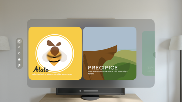
UI Redesigning LookUp’s word of the day for VisionOS A case study on how LookUp's Word of the Day cards were redesigned for Vision Pro
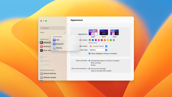
design Redesigning macOS Settings app Almost a year in, I am still struggling with the macOS Ventura Settings redesign. It’s not just the form design, it’s also the readability of the layout, the lack of visual cues in so many places and the confusing grouping. Overall, the Settings app seems like a bit
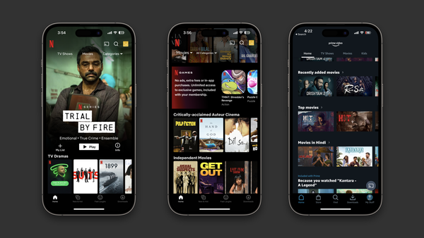
UI Navigation in streaming services is a mess. Streaming Service Navigation relies on showing a lot of options at once, but what if it were simpler?
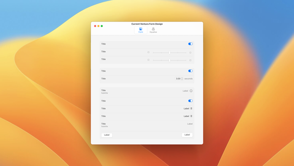
UI Redesigning the macOS Ventura Form Layout macOS Ventura introduces a new design to display forms. The design looks like this: As you can see with this design, it's got a couple of glaring of issues when used in wide width situation: There's too much space between the title and value. This makes reading the values veery
ipad Designed for iPad Over the last few years, the iPad has transformed significantly from being a large touch screen device to a device that supports multiple inputs and can be used in a variety of situations. It’s changed the way people interact with their apps. A good iPad app experience is not
apps The Laziness of the Home Tab If you use apps and websites like I do, you’ve probably seen a “Home” tab on many them. It’s usually meant to tell the user that it’s the first screen in a number of screens. It’s where you start your navigational journey. I’ve been thinking