Introducing Bondi

It started with a twitter thread about how people didn’t like the latest Photoshop icon, as it was a rounded rectangle compared to the square of the illustrator. I’ve always hated the aesthetic, but my latest experience with designing a macOS icon for my Catalyst app was so much fun that I decided to mock up my own versions of the Adobe icons for Apps that I often use.
My reference point like that for Catalyst icon, was an old design document highlighting details about the aqua icons. And how they have a unique shape and perspective with a strong graphic that conveys the app’s functions clearly.
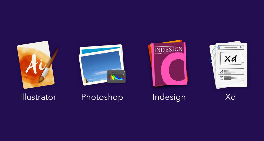
So with this idea in mind, I mocked these up:
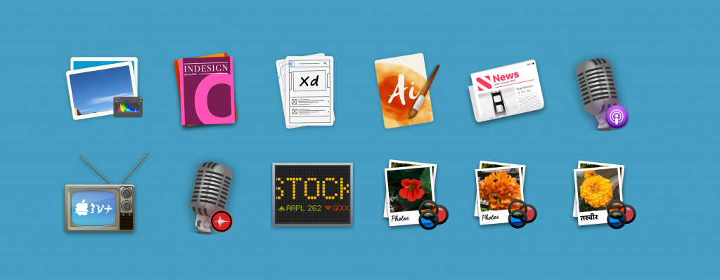
Next morning I jotted down some ideas, this time for apple’s own apps which seem to have taken a liking towards the circular icon aesthetic. They’re good, but they feel so out of sync with the rest of the OS that offer such a great homage to real world counterparts while maintaining the ease of being relatable to the app’s function.
No one looks at the Garageband icon and thinks it’s an app to edit photos!
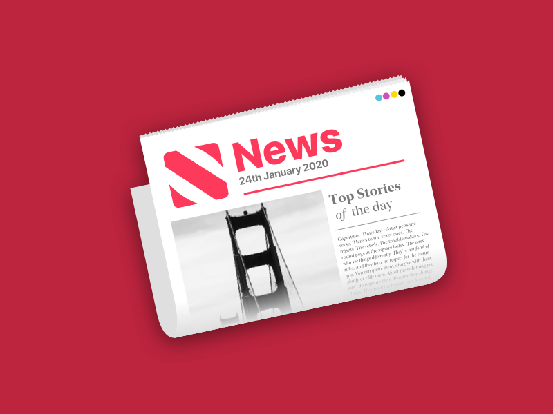
News
The newspaper communicates news. It’s got a unique shape to it and a desk-like perspective of a newspaper that’s about to unfolded.
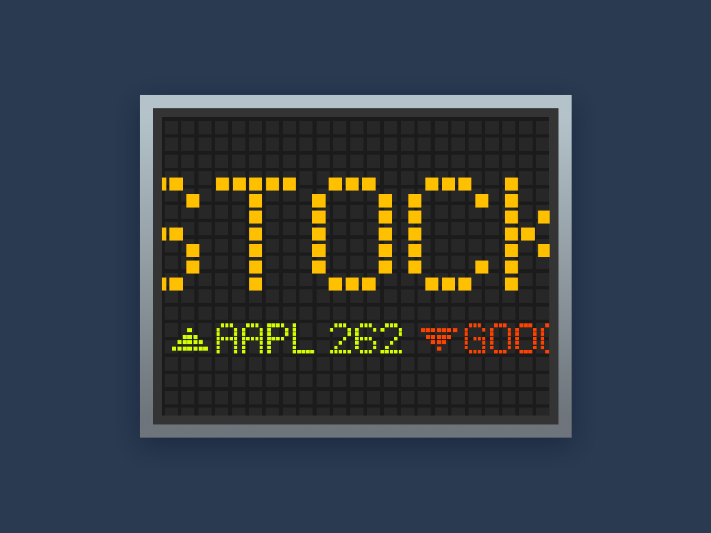
Stocks
The stocks app icon is designed to look like a part of larger ticker symbol. Something that you’d normally associate with a stock exchange. The metallic rims and lights are in sync with the utility apps in the rest of the OS.
TV
This one was slightly tricky to get right. It took me multiple attempts to get to something that I’d eventually like to use.
The first icon I designed was a modern flat TV with the light emitting as if to illuminate a dark room. A couple of hours with the icon and I quickly realized, that there was a problem. The icon was too thin and too wide. You could see very little of it in the dock.
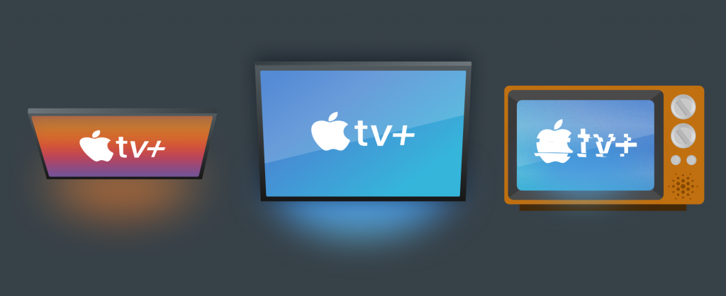
So, I designed the second icon in mind with a 4:3 aspect ratio. Unrealistic for modern TVs but gives a lot more shape to the icon. Even this one felt a bit bland. TVs are hard to get right. They’re just giant rectangles. It’s difficult to convey much meaning with them.
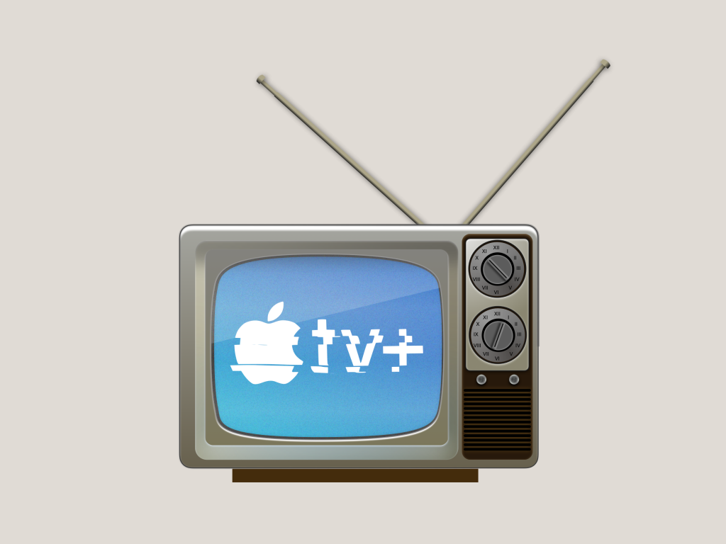
But it wasn’t always the case, a few decades back TVs were a representation of modern technology at the time, and they adorned the most elaborate textures and styles.
So I took a leaf out of that era and designed something that’d look good as a TV.
Ultimately I settled onto something that looked a lot like this TV. It’s not what TVs look like today, and most youngsters have never seen anything like this in real life. But it’s hard to look at it and think of anything else but it being your gateway to entertainment.
Photos
Photos offers an interesting conundrum that’s similar to the TV icon. Photos used to be a physical media, but they’re really that anymore, and so any visual representation of a photo would be a rectangle.
I used a similar approach to the TV icon with this one as well, albeit slightly more modern. Here I make use of the Polaroid instant pictures, along with physical filters as a reinforcing tool. Polaroid’s instant images and filters have often had an inspiration on how photos work on modern day devices, and these just feel ideal for the app.

Another thing I did with this icon, is that I scribbled photos in the area where you’d usually see a message written on a polaroid image, and since photos are so location centric, I also, picked a couple of photos to offer the icon in three different variants with photos taken across Berkeley and Delhi.
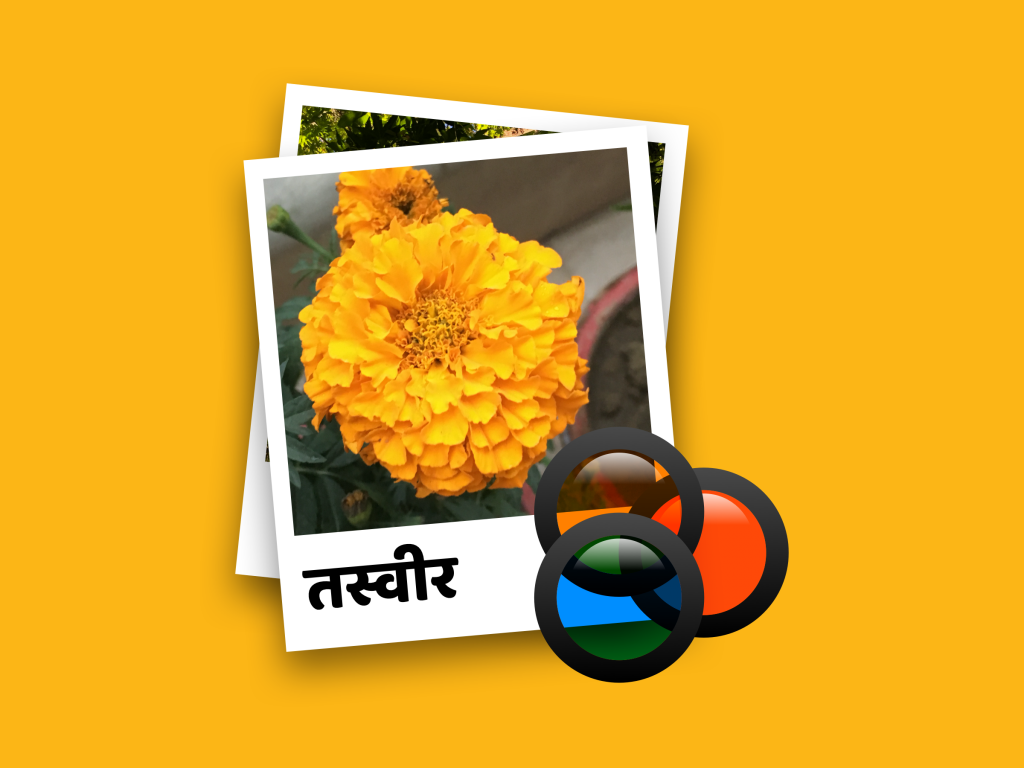
The Delhi version of the photos icon also has a localized title, with a marigold flower. I intend to add more localized icons for the Photos app in the future.
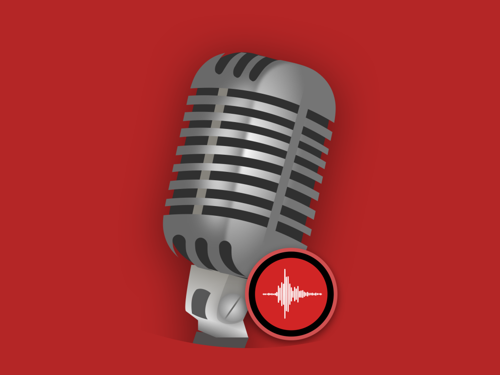
Voice Memos
A rather simple icon, Voice Memos has a mic, signifying a recording app, with the tool at the bottom showing the voice memos icon from iOS. The red color is also used to signify a recording button.
Podcasts:
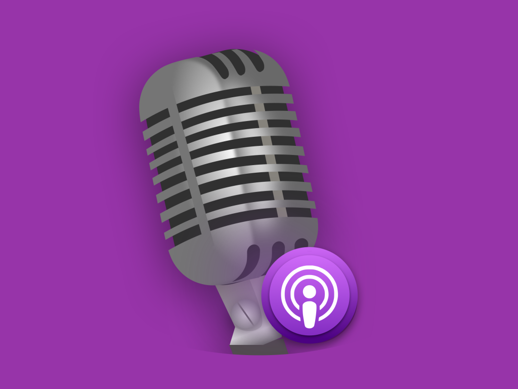
Podcasts’ icon has traditionally shown a generic icon that seems like a combination of a person and a broadcast. I didn’t want to go as far as creating a 3D figurine for the Podcasts icon. So, I used a different media here. Podcasts, more often than not get associated with conversations and talk shows. So to communicate the idea, I tried to use a podcasting mic.
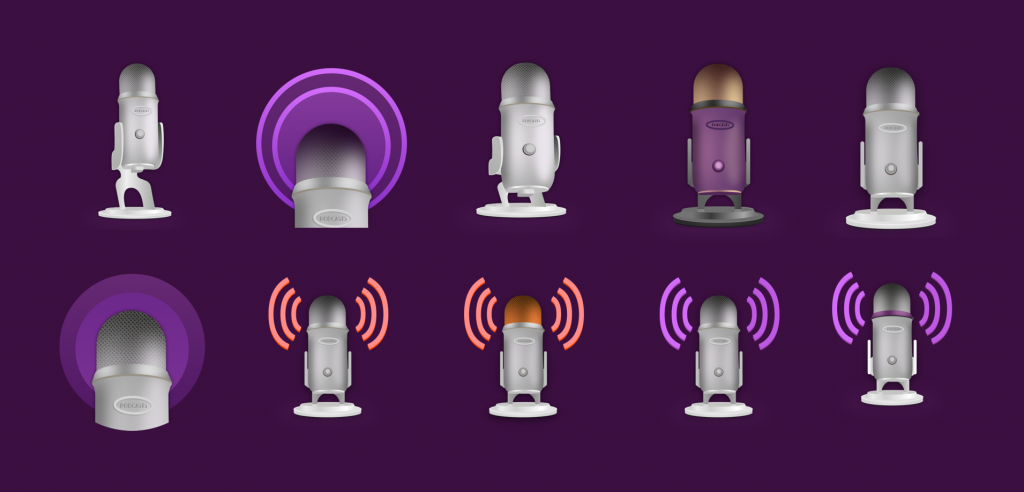
While a podcasting mic is a decent idea, it was far too thin and lacked visual contrast for the . The broadcasting echoes seem whimsical but they’re not really in line with the rest of the icons in the pack.
And so, I decided to use the Voice memos mic, to signify a talk show here, with the podcasts icon at the bottom indicating that it’s still the podcast app.