Designing apps iteratively
Look is 10 years old. A detailed story on the design process of the app

LookUp at 10: The origins, design process and principles that made LookUp.
LookUp just turned 10 years old this week. It’s a huge milestone that I still can’t believe, when me and my brother (Mudit Bhargava) started working on LookUp we had no idea we’d still be working on it years down the line.
I wanted to take a moment to reflect on the 10 year old journey of the app, how it has progressed over the years, the design processes, achievements, and the principles that govern LookUp’s and all my apps’ design.
What is LookUp?
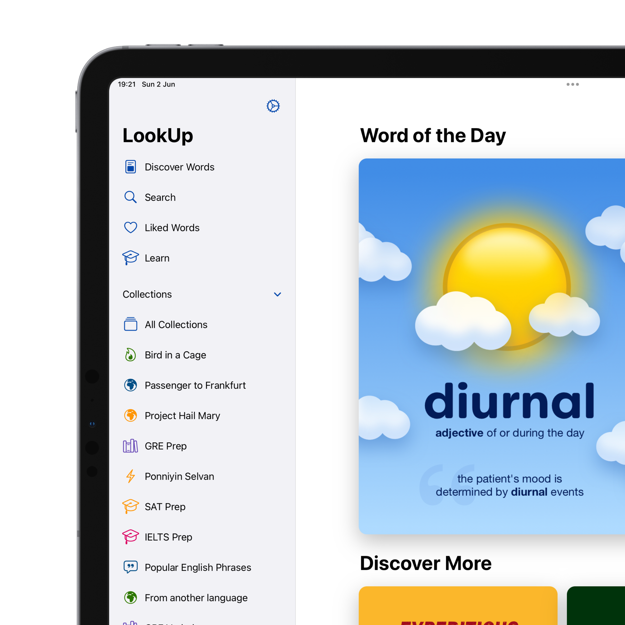
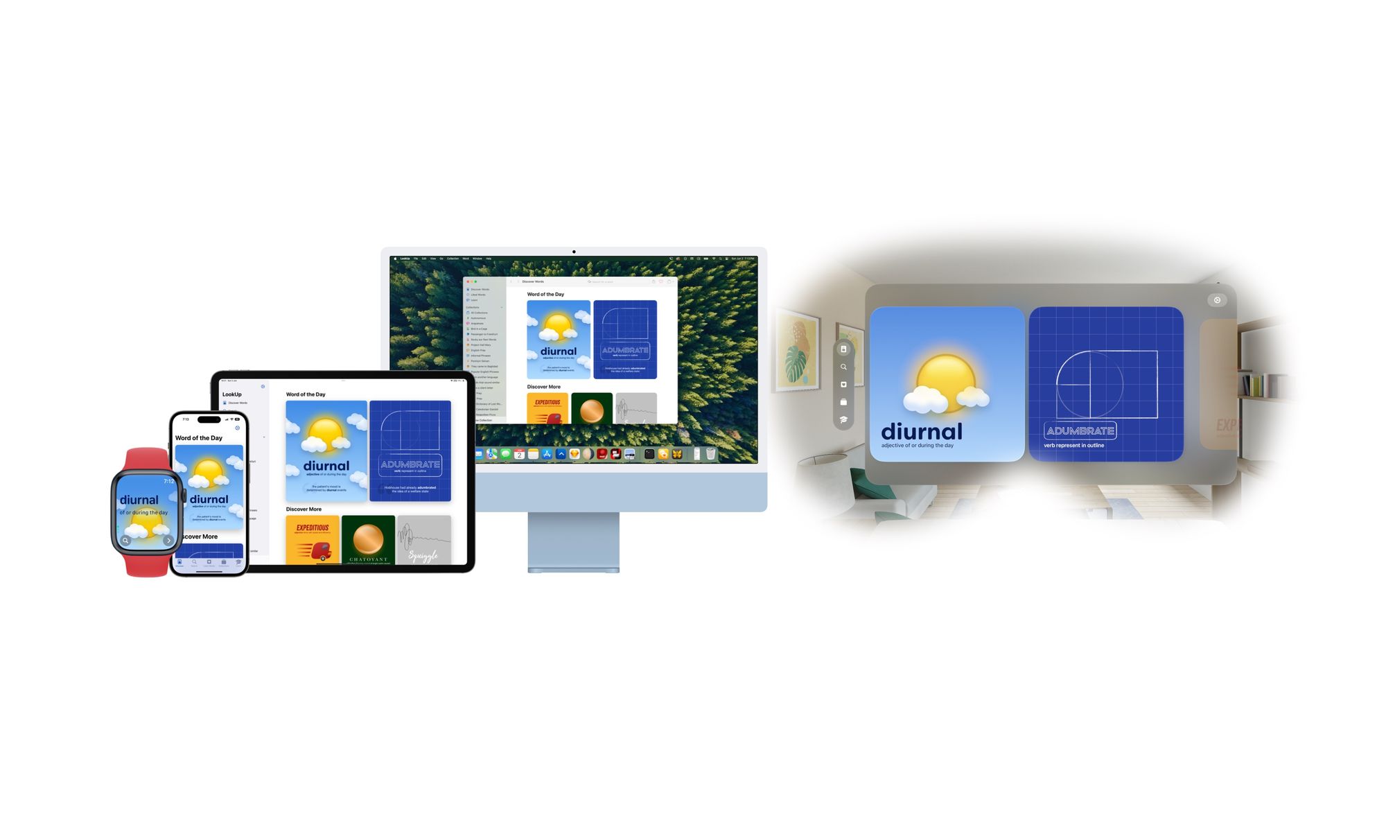
LookUp is a dictionary app that enables learners of the English language to build their vocabulary in a fun and intuitive way through illustrations, translations, interactive quizzes and an easy to use interface.
LookUp is especially powerful for learners preparing for their english proficiency tests, or building communication skills for workplace environments.
It is available on all Apple platforms.
Origins
I started working on LookUp with my brother, in August 2012. Having designed a couple of iOS games, we really wanted to delve into productivity apps (what I mostly used my iPod touch back then). At that time I was in high school and vocabulary building was a challenge.
Most dictionary apps looked the same; large blocks of text that were difficult to peruse, just like a physical dictionary. Their interface was full of ads, unwanted permission dialogues, and sign up flows (Who wants to signup for a dictionary app!?!). The apps were also 300-400 MB in size, which didn’t help given me and my brother shared an 8GB iPod touch.
More importantly the entire experience was not friendly for non-native English speakers who would often need more context than just the definition. I needed example sentences, and images; I would often end up doing multiple google searches to get a proper understanding of a word. By the time I had done that, I was already distracted by phone, and my reading flow broken.
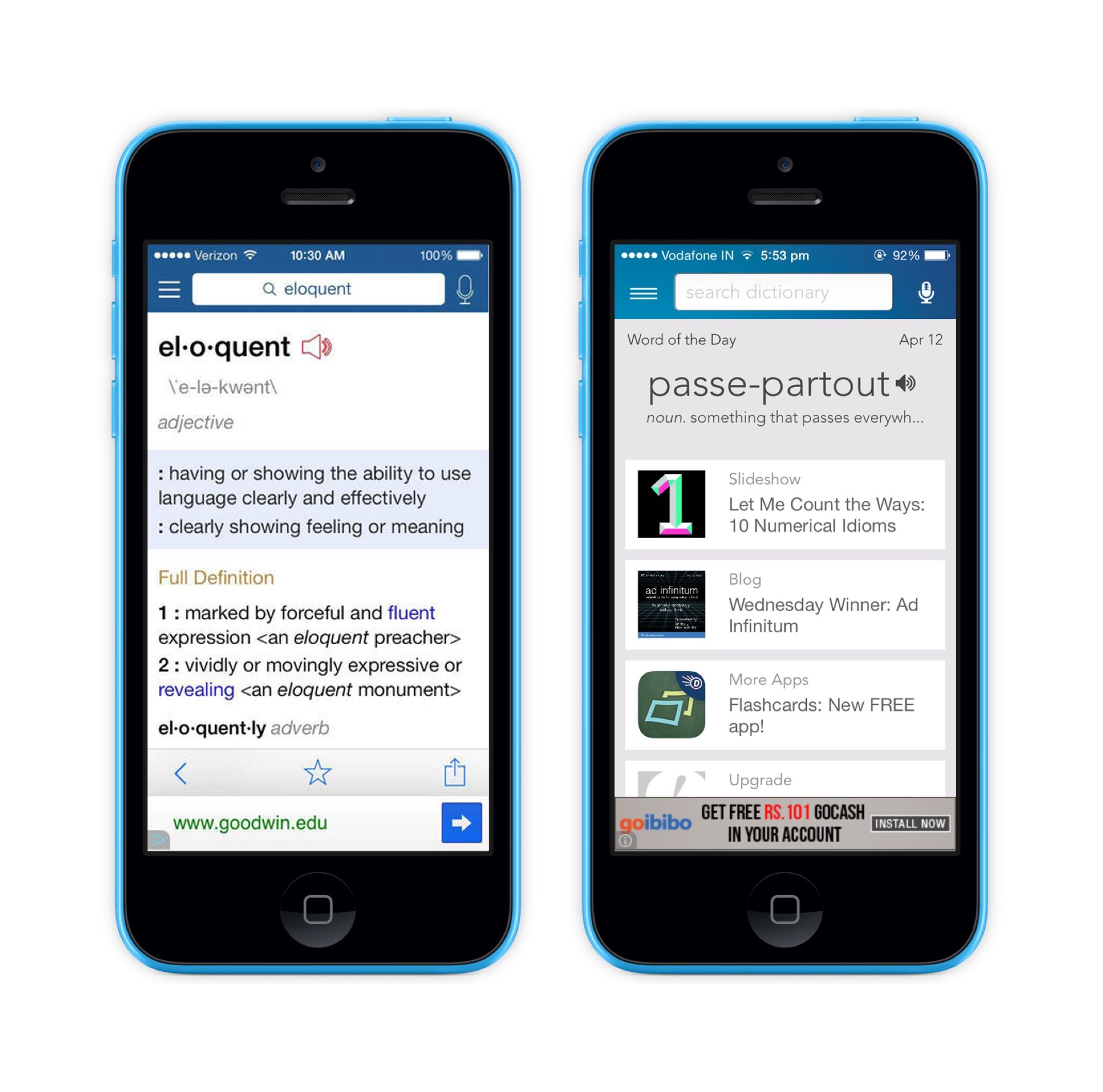
So I envisioned a super minimalist dictionary, that provided all the context I needed, Meanings, Synonyms, Pronunciations, and Wikipedia (A lot of my look ups involved scientific terminology or technical terms, for which Wikipedia was amazing at providing information). And, that’s how LookUp or as it was then called W.O.A.M (Word and Meanings) came to be.
My brother and I prototyped an early version of the app and started using it. Living with the product for a few months, I could instantly see the appeal. But then exams hit (12th standard exams in India are intense). We paused development on LookUp. My brother started his job, and I (unsurprisingly) botched my exams and was now attempting them again for the next year; So making a dictionary app was out of question for a while.
I kept using the rudimentary prototyping, urging my brother to make it better on the side. We always found time to tinker a little with our app “WOAM”.
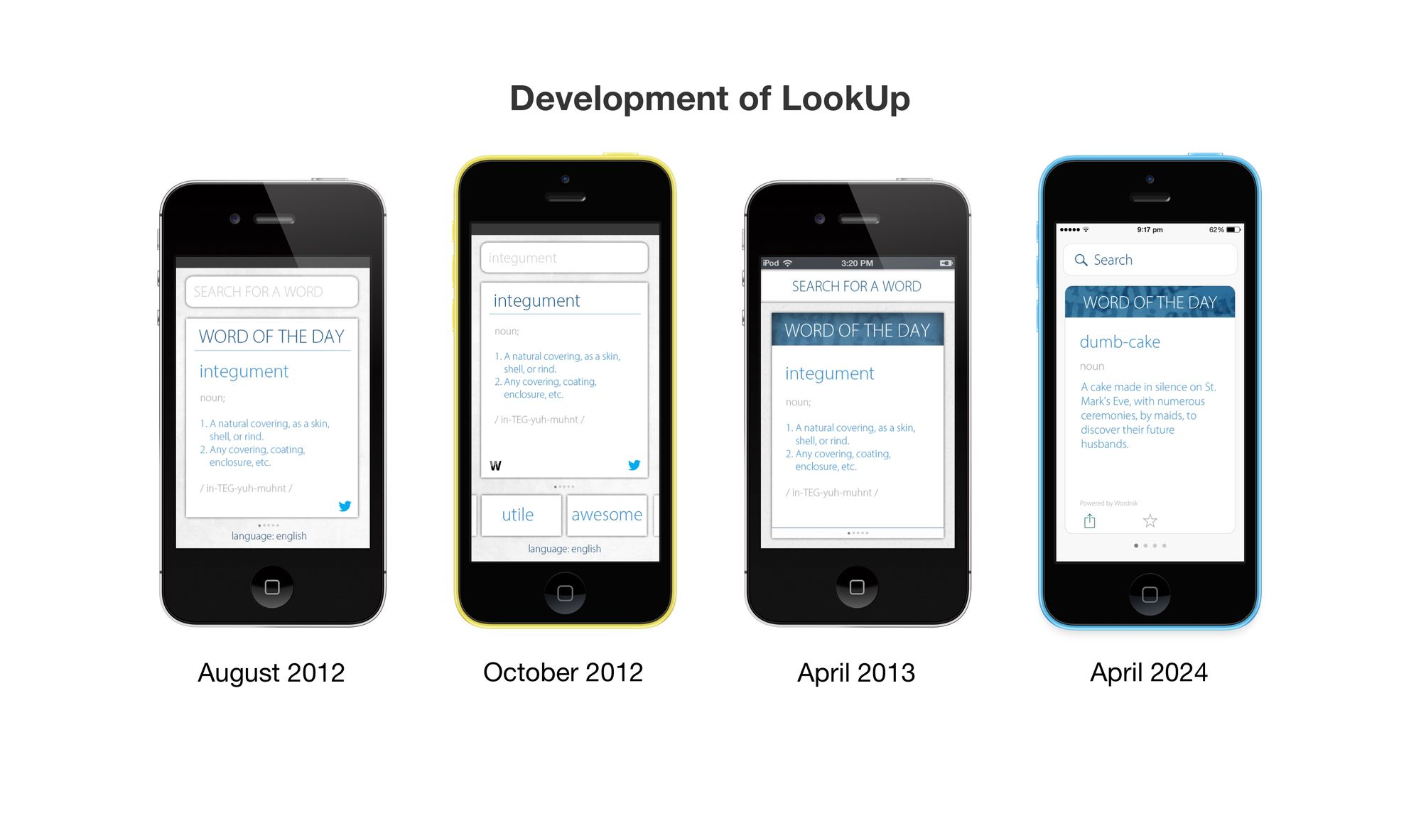
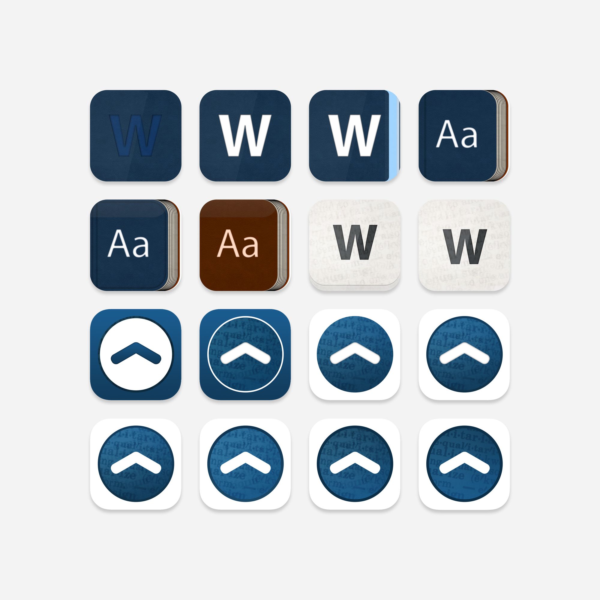
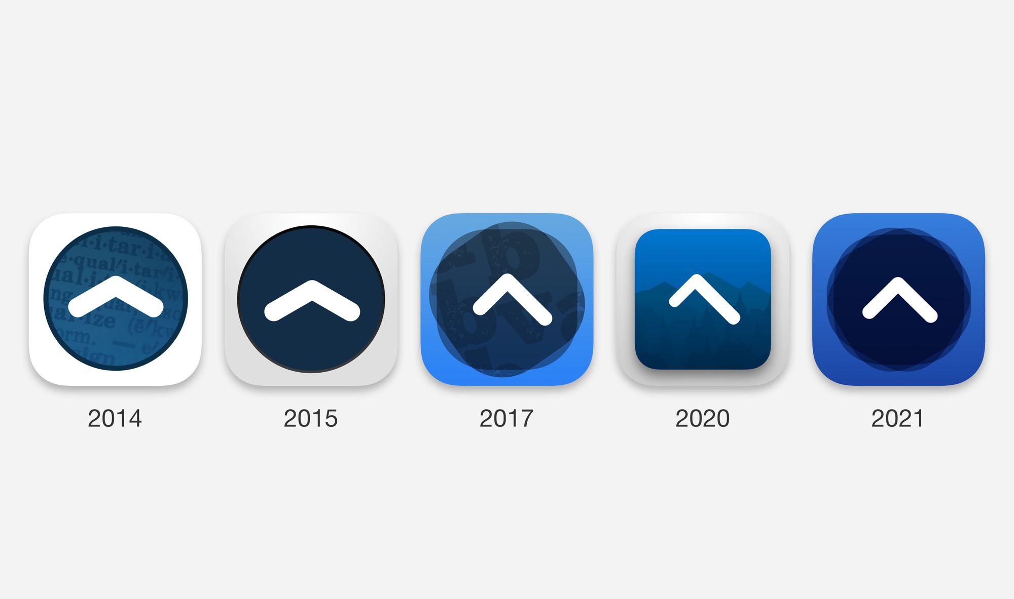
In January 2014, my brother finally quit his job, and started working on it more often. We kept making progress, tweaking the interactions, trying to get pixel perfect designs, adding and changing the product iteratively.
The name had to change too, WOAM was a good production name but terrible for actual use. I had just heard a lexicography talk at the time, about how the name should be a “verb”; an action that you can perform and we started brainstorming names around that. LookUp stuck instantly. It was clean, simple and elegant just like our product!
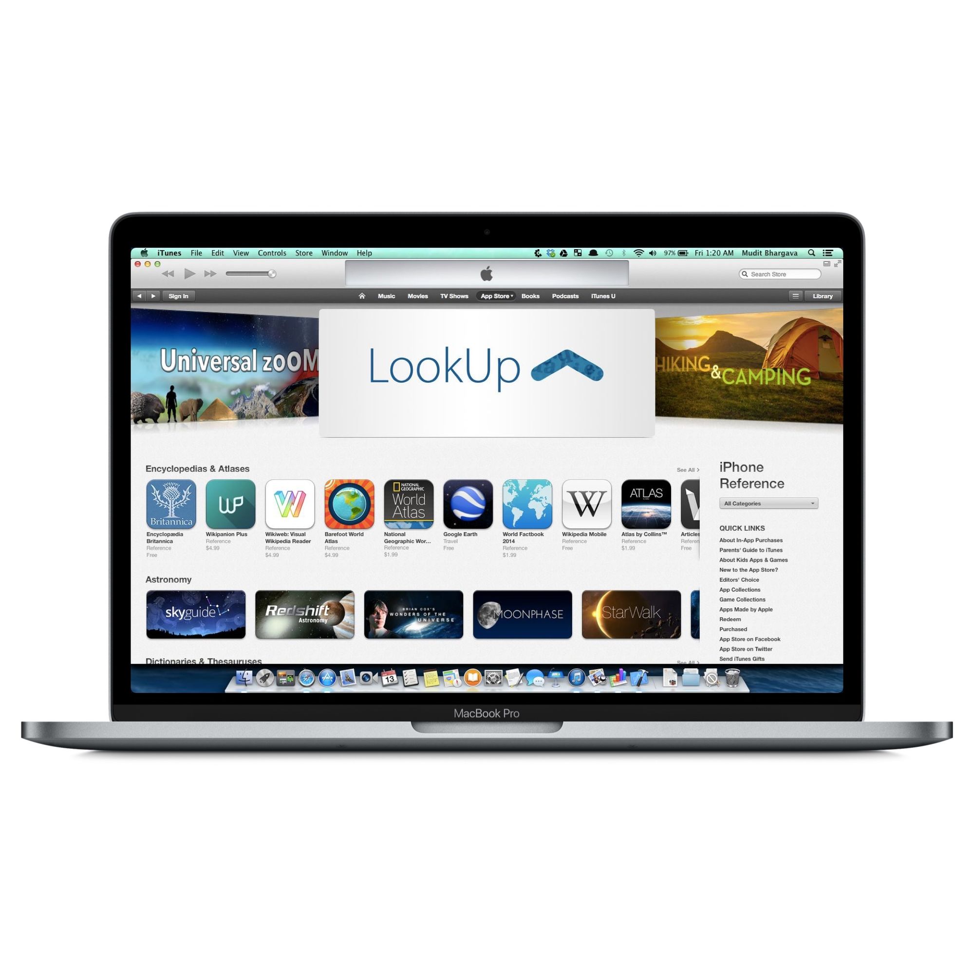
At some point we took a call to stop adding features, and started polishing for the release. In May 2014, we finally shipped what we were working on.
We released to with an App Store feature; we were one of the “Best New Apps” for that week. This was nothing short of a dream for two kids who hacked together a dictionary, at their home with little experience in building apps and absolutely no knowledge of lexicography.
Word of the Day Design
Being a visual learner, I have always learnt better with visual representations. Illustrations leave a visual imprint, and help in remembering things.
Visuals have a much bigger impact on people’s memory than large blocks of text. Having a visual association with words makes people remember words more easily than viewing large chunks of text.
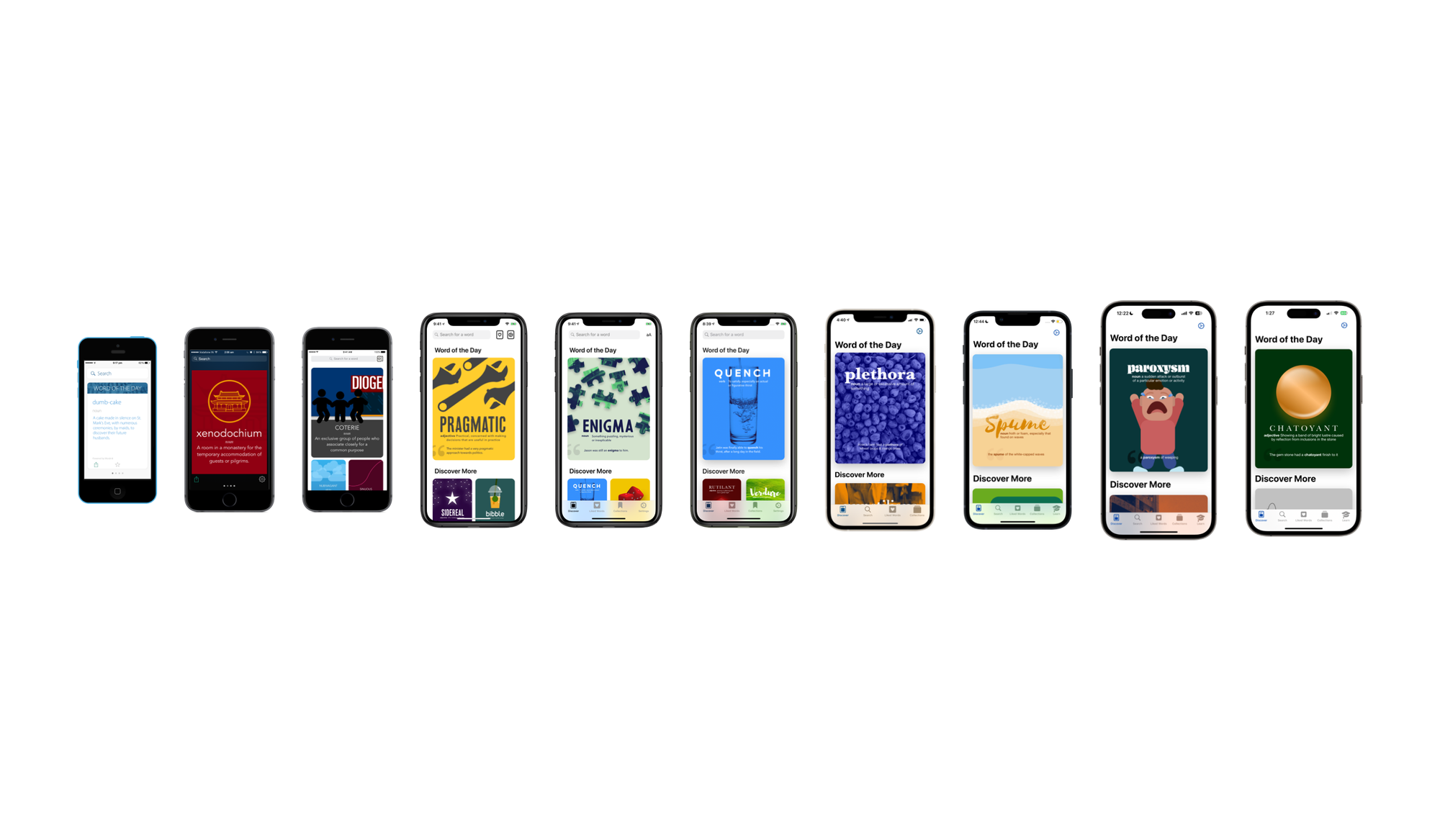
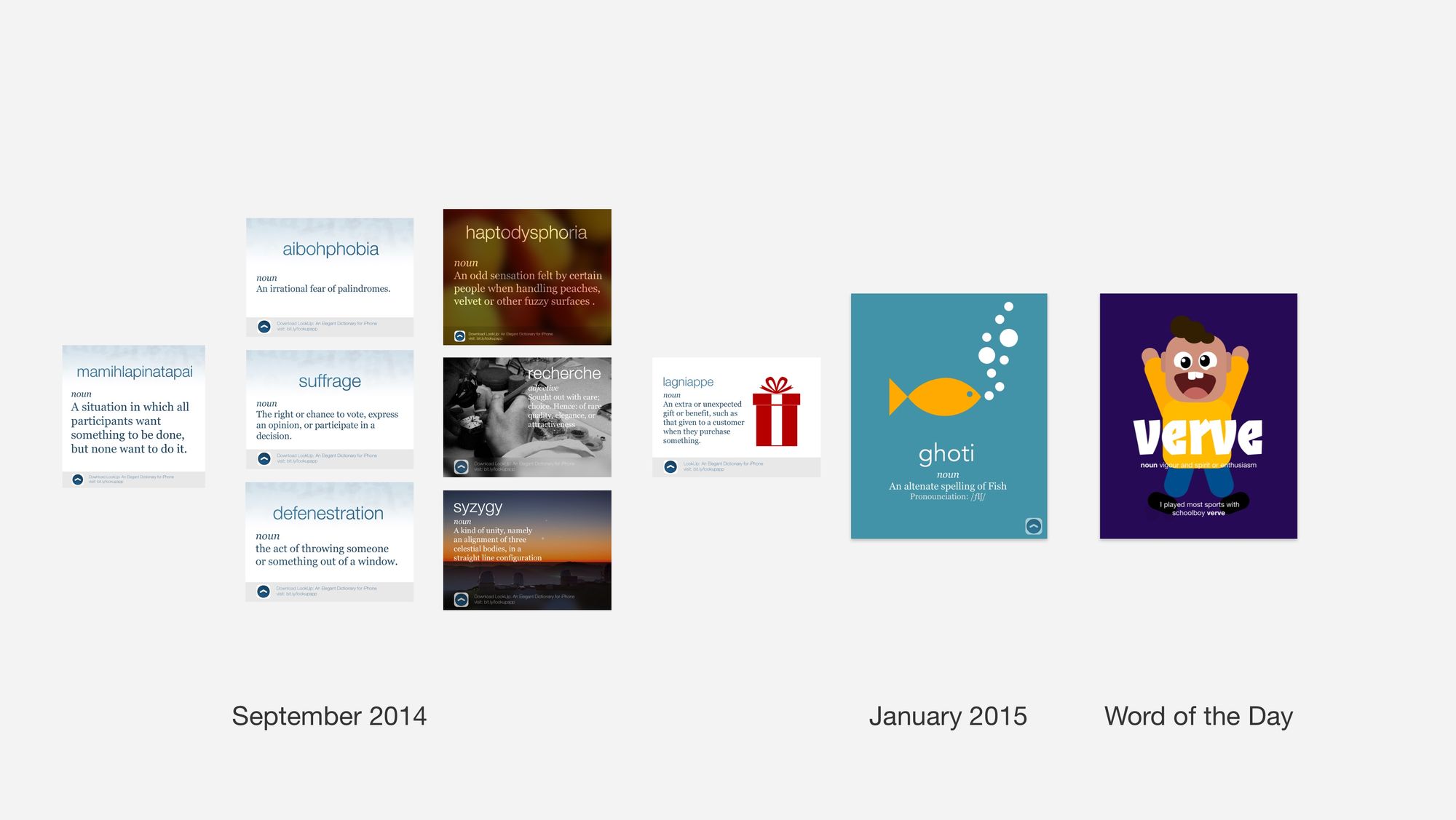
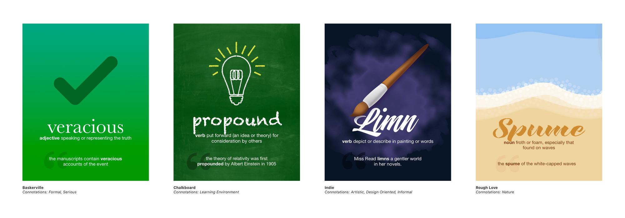
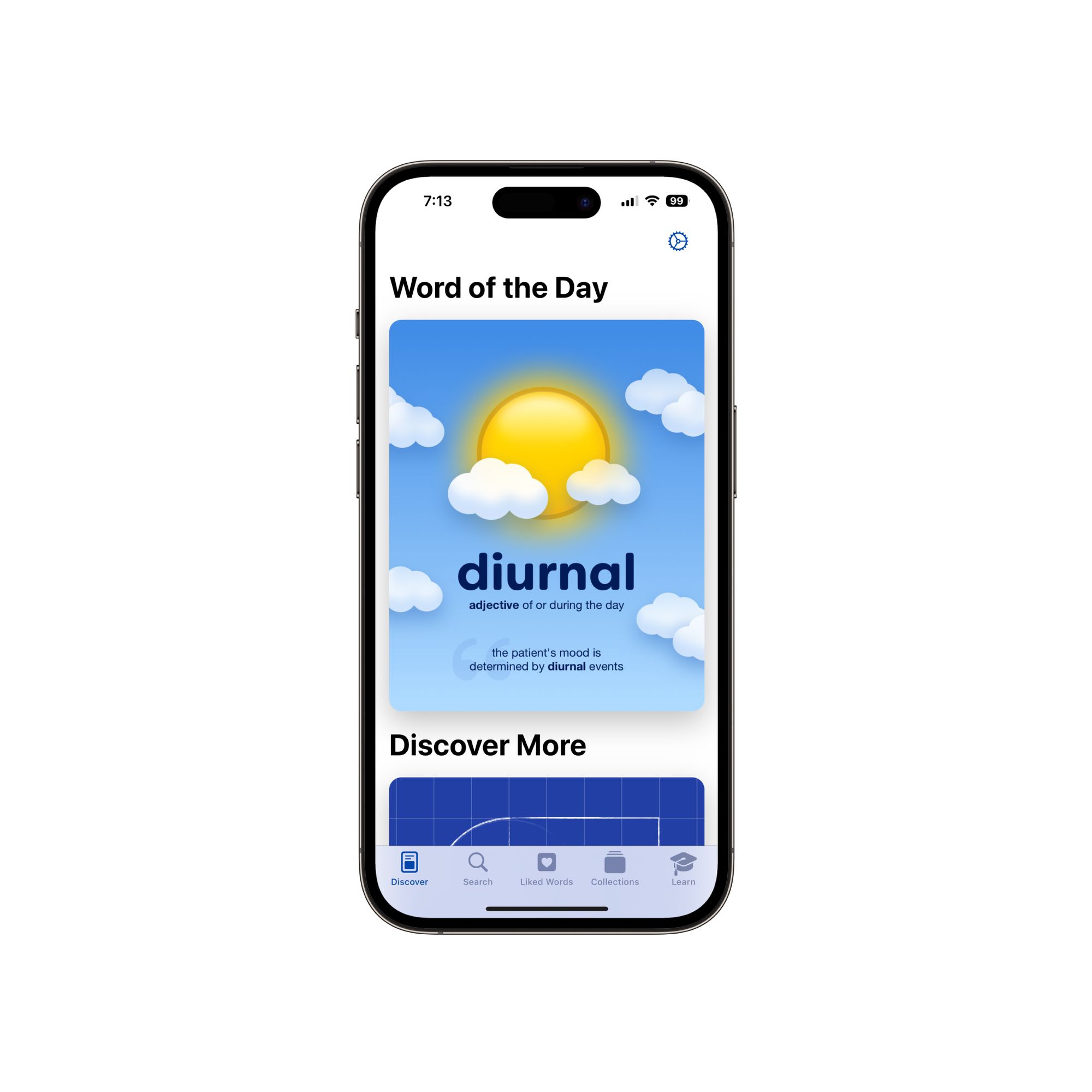
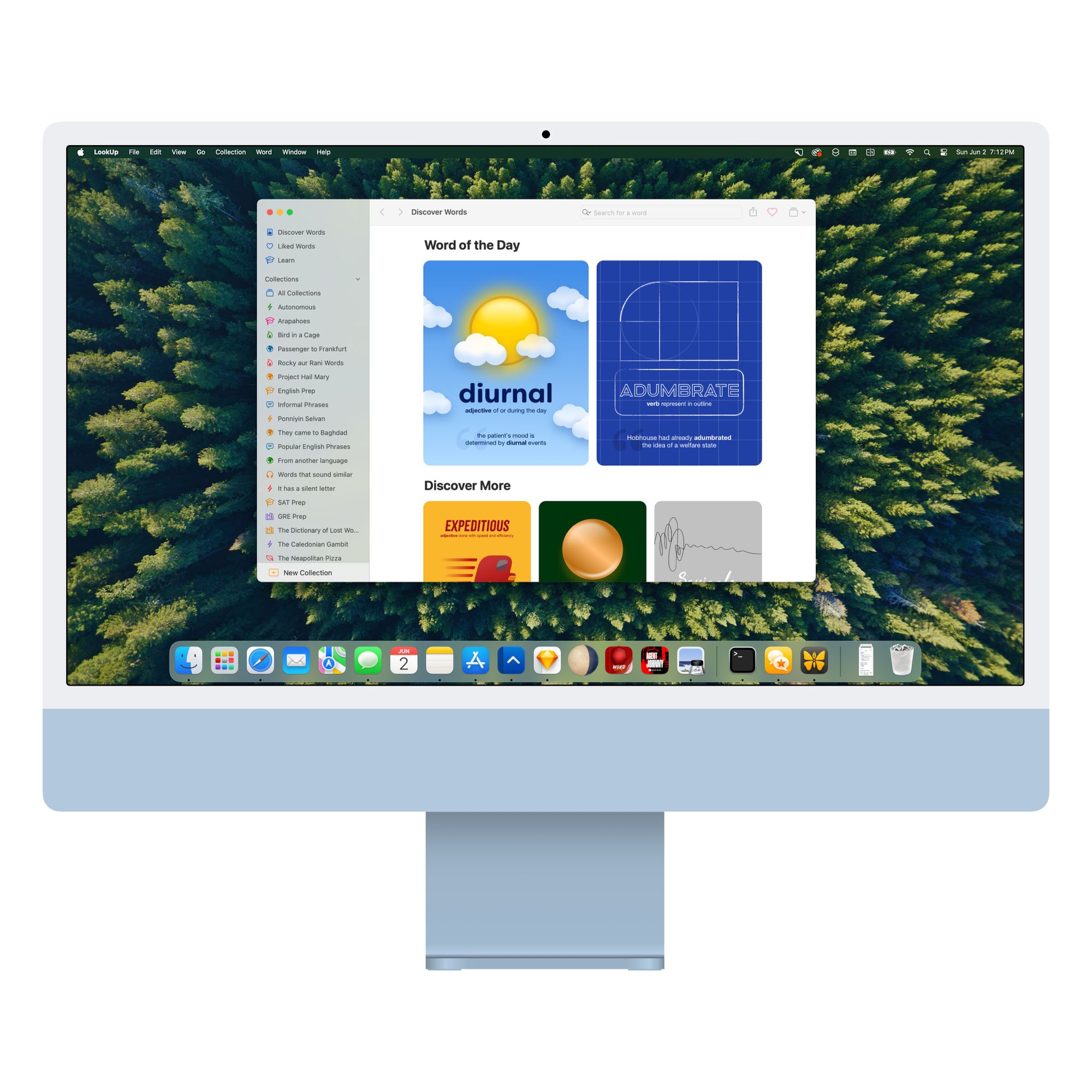
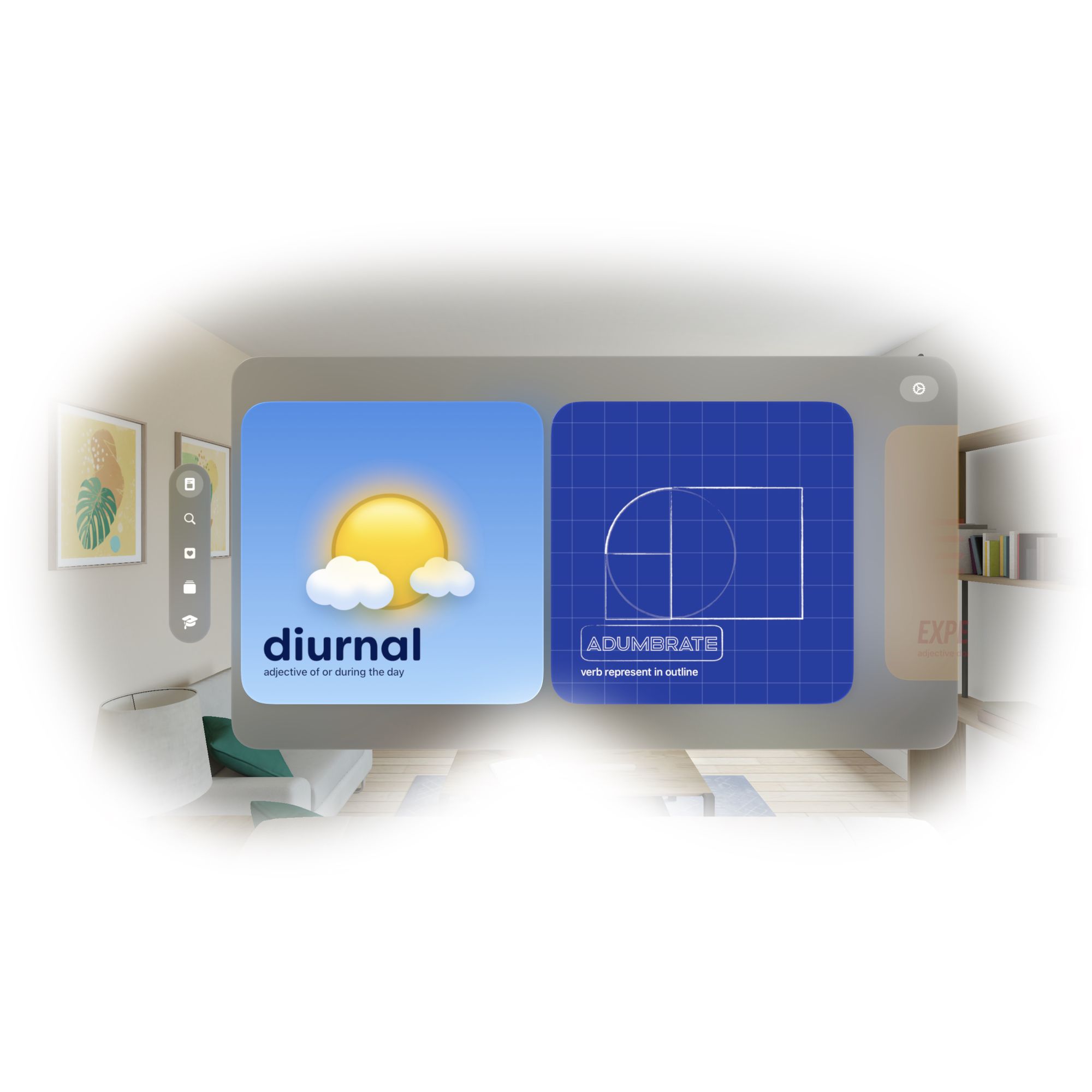
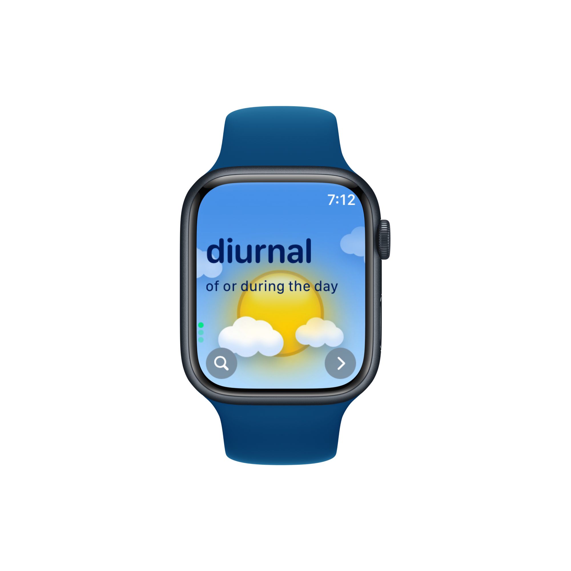
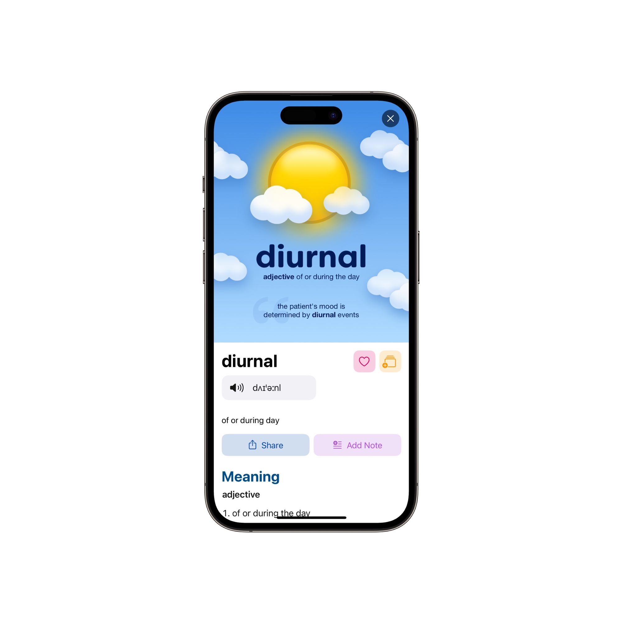
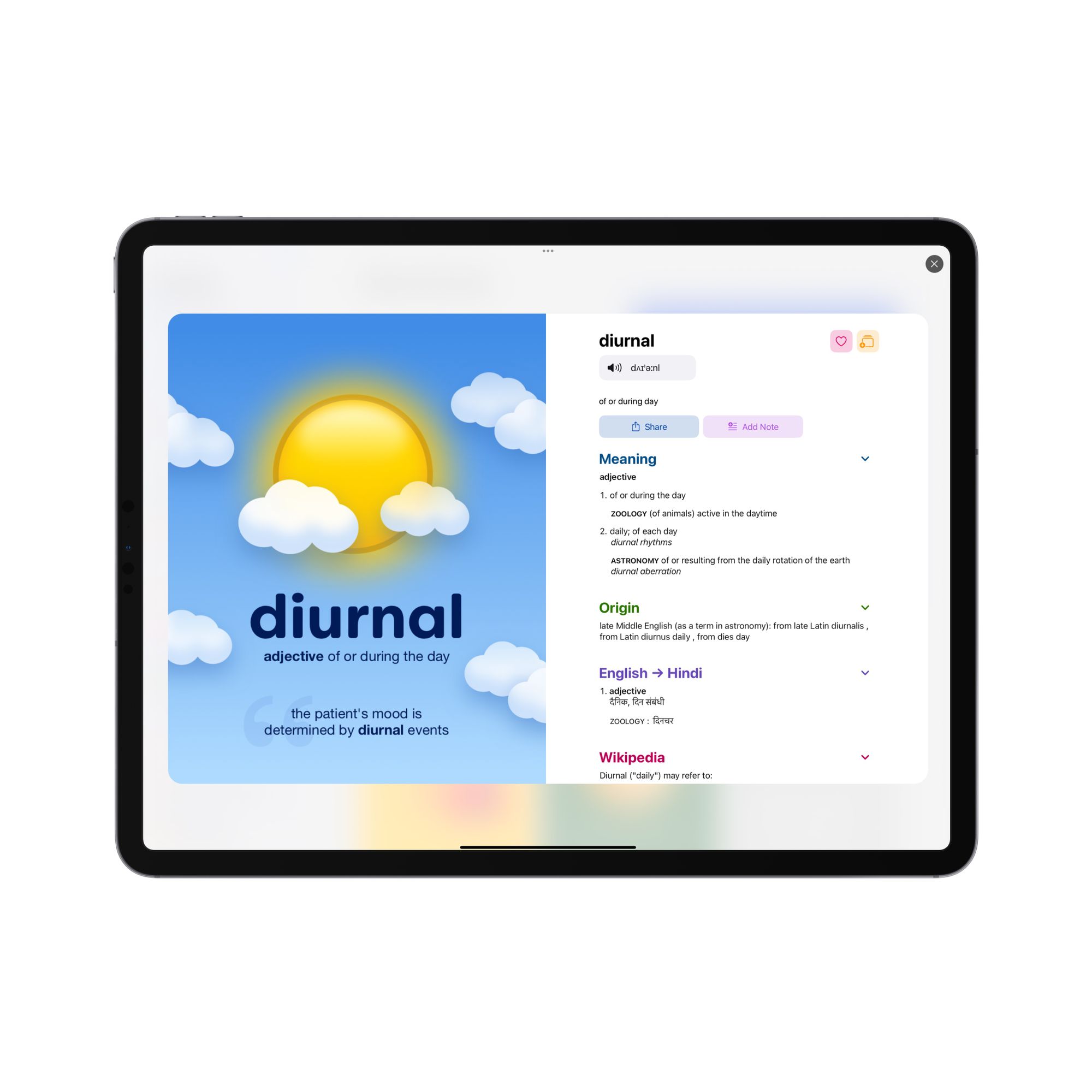
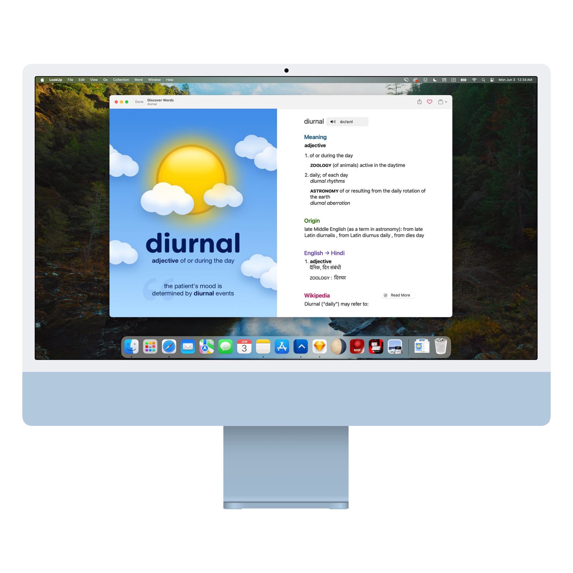
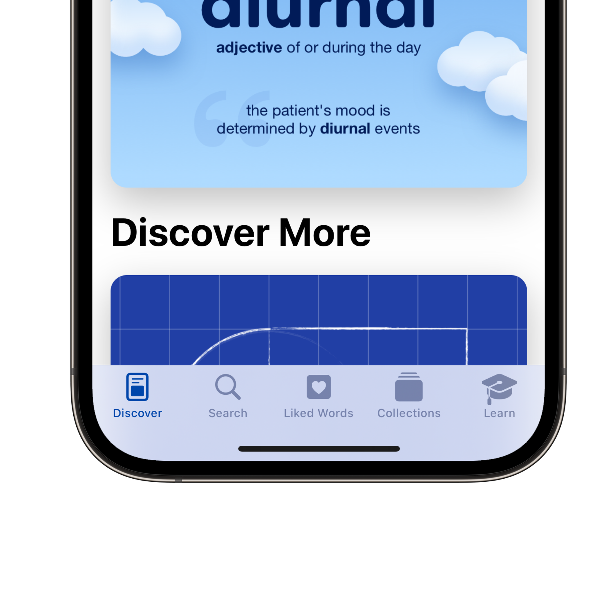
In LookUp, Word of the Day is an attempt at making the vocabulary building process more visual, easier and more fun; than the traditional cramming of the dictionary. Each word of the day is accompanied by an illustration. The illustrations provide a quick and easy to understand explanation for the word. They’re also accompanied by a short definition and an example usage of the word.
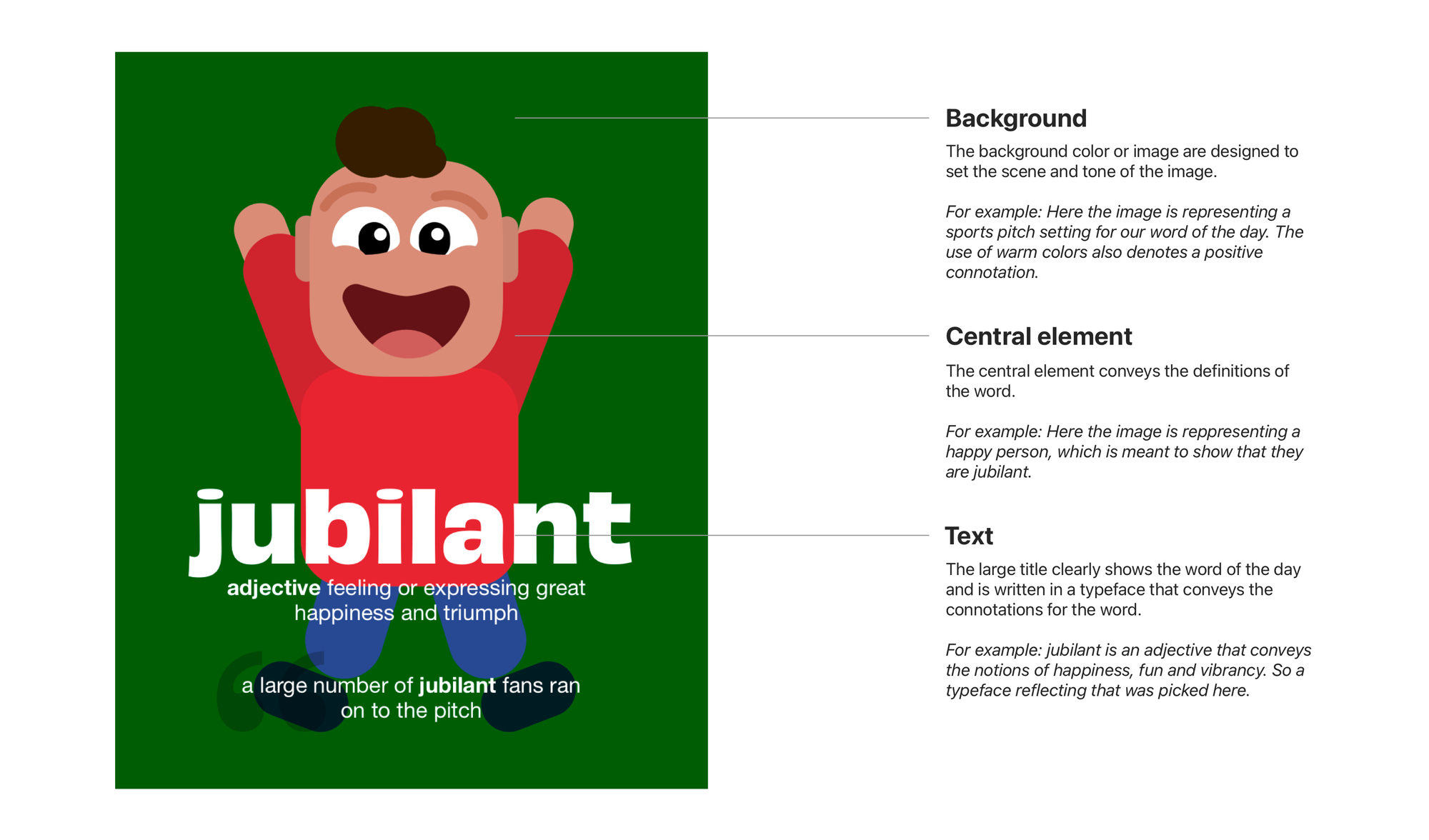
Word of the Day graphics are basically minimalist posters for a word. Each Word of the Day poster is made up of 3 elements: An informative background and a central object image that serve as visual cues to inform the meaning of the word. These images are carefully designed to visually convey what the word means. The final element is the word’s title itself. The title’s font is carefully picked to convey the right connotation of the meaning and provide an additional layer of context.
 Vidit Bhargava
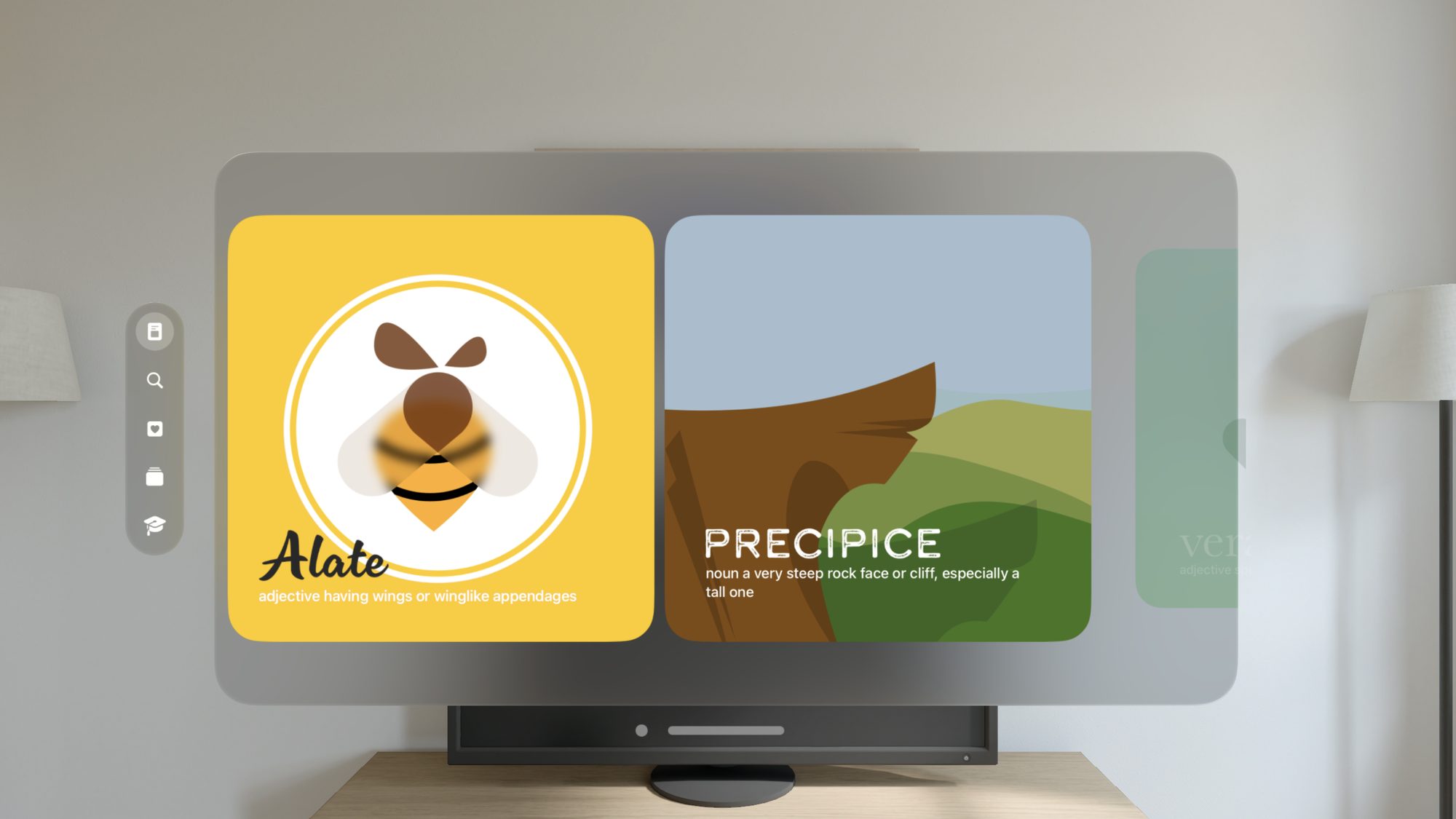
Principles behind LookUp’s design
While LookUp has evolved in its design over the years, the key principles behind how LookUp is designed have remained the same. These are, I believe the core tenets of what makes this take on dictionaries so opinionated.
- No Ads: Ads are yuck! 🤮
- No Sign-up flows: Nobody needs to create an account to use a dictionary
- No long onboarding: It’s just words and meanings. Using the app should be obvious!
- No Pesky Tracking: A dictionary app doesn’t need to track your location or track your search history.
- No feature creep: We’re very deliberate about what we add to our app. It’s a measure 1000 times and cut once culture.
LookUp strives to provide a fun, easy to use, experience. The experience that is so straightforward to use that you don’t need any training to use it. It’s what you buy an iPhone for, to get a quality experience.
Design process
From sketch → Sketch → Xcode → App
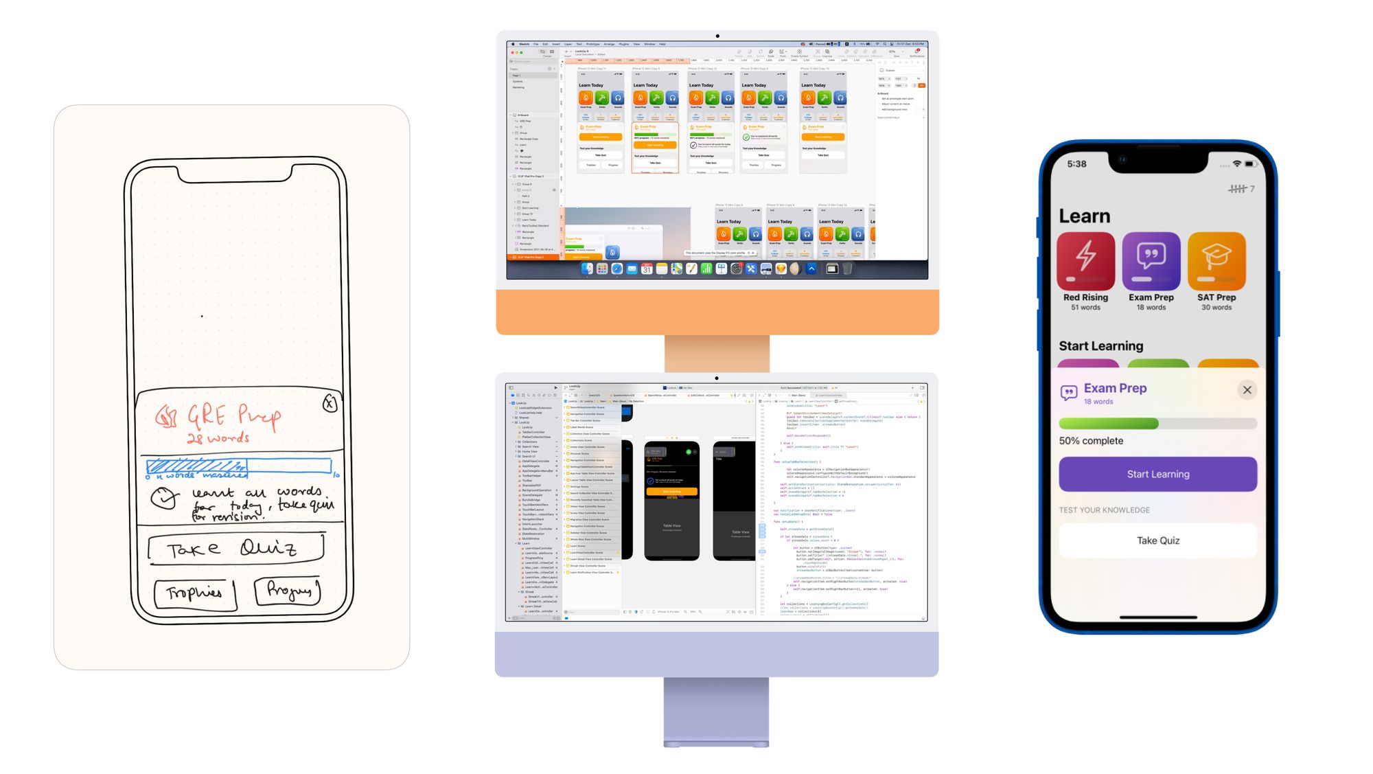
Iterative Design is awesome
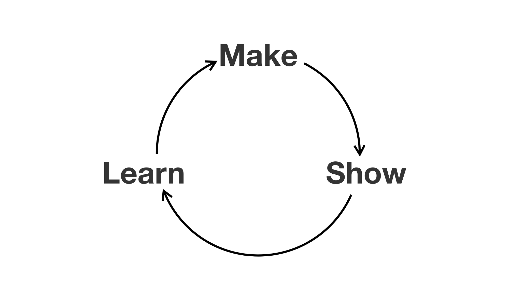
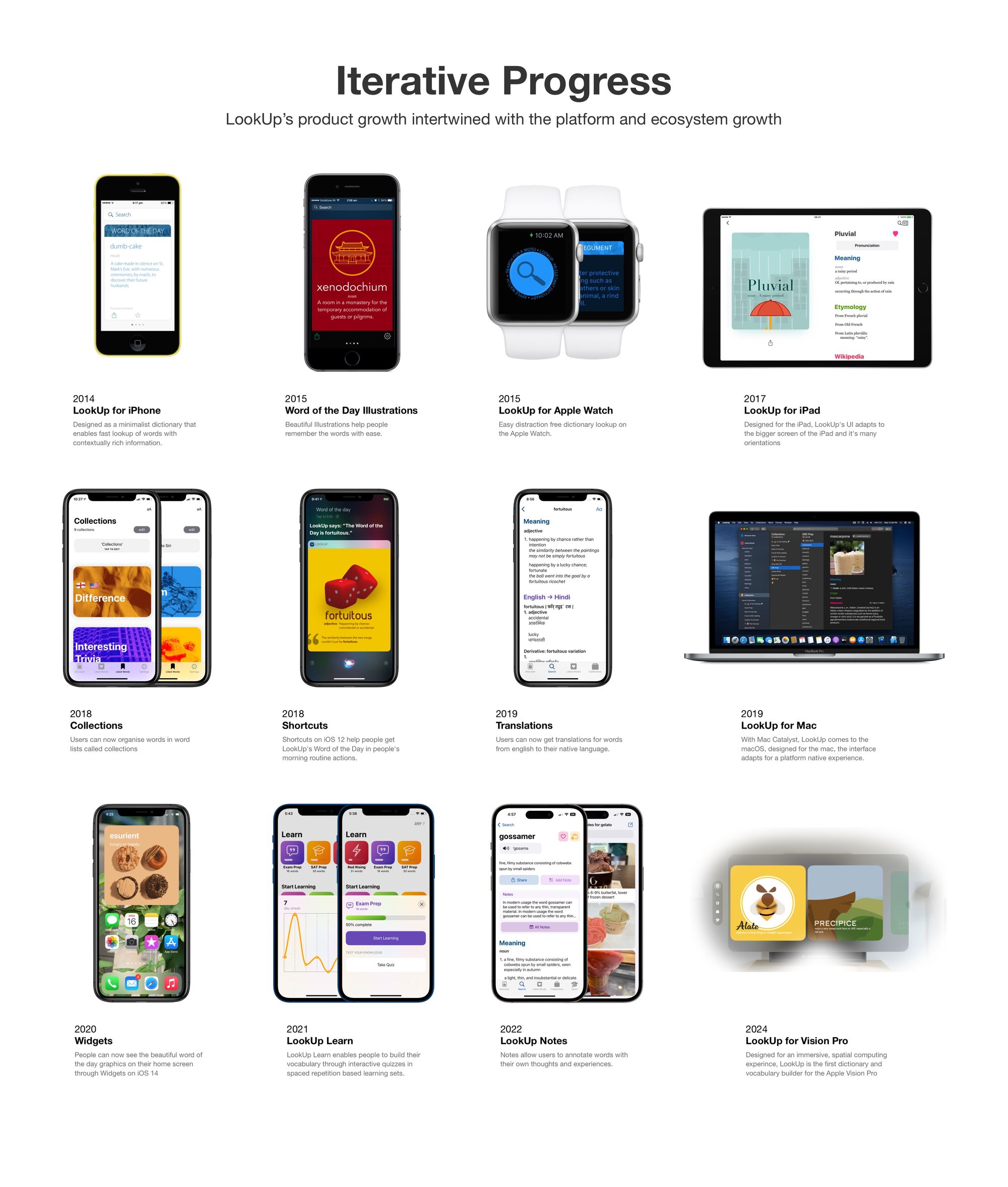
What’s more important than shipping an app is to continuously iterate and improve on it. We’ve gradually improved lookup by focusing each update on the direction we want to take the app in, and things people have requested.
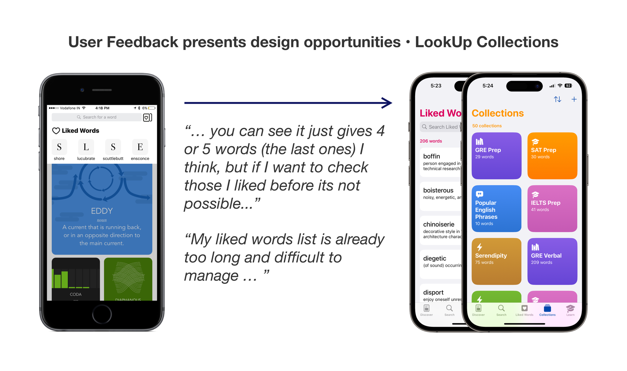
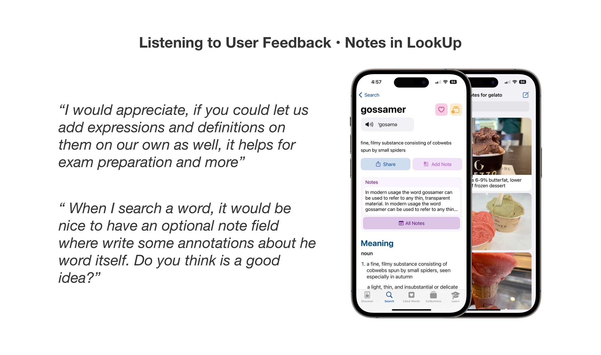
Sometimes there’s a direct link to people making requesting something and us providing it. For example Offline Support. Sometimes there are opportunities in the critical feedback presented by the users.
Removing features that don’t work out
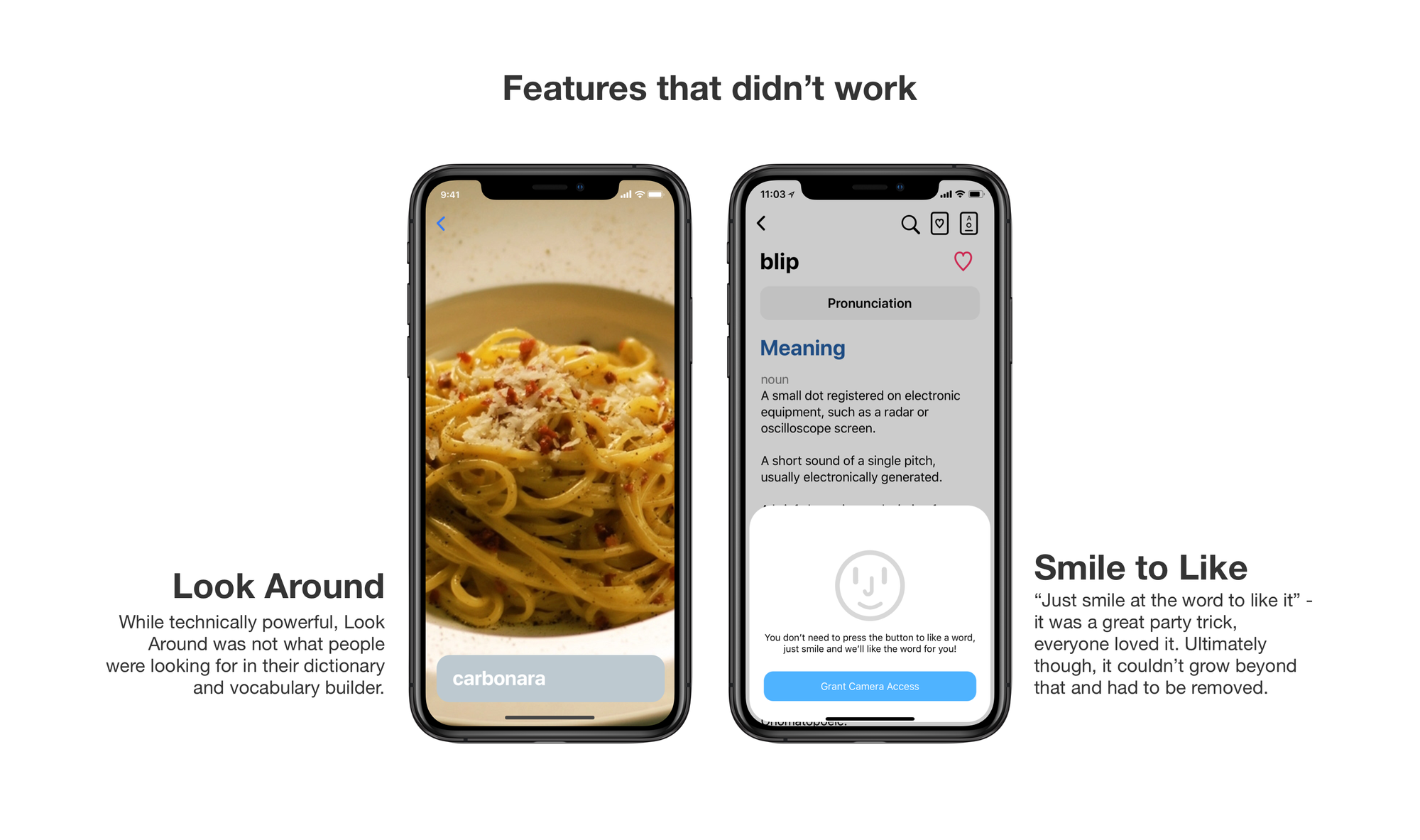
Another important factor is removing things that don’t work. Over the years, we added a lot of new capabilities to our apps, some of them worked perfectly, some of them not so much.
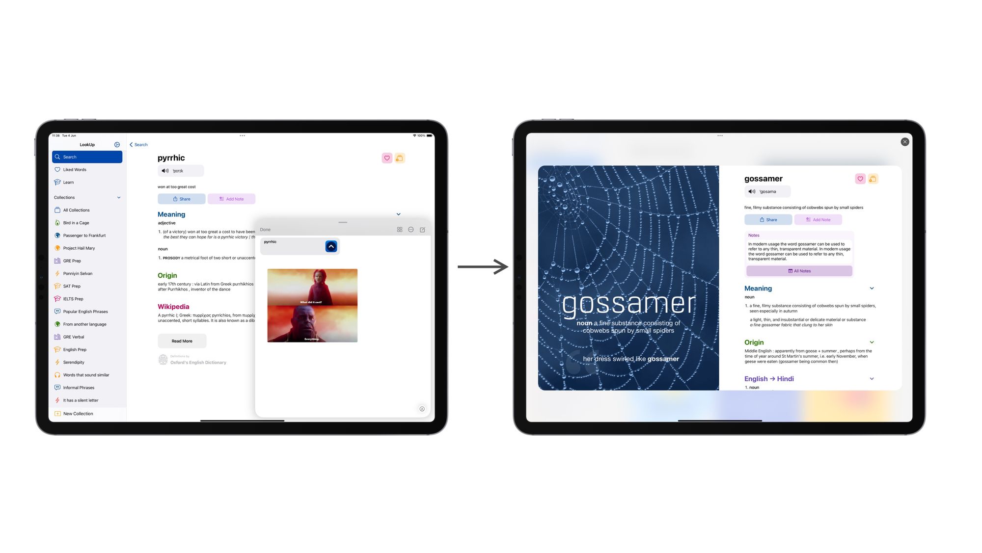
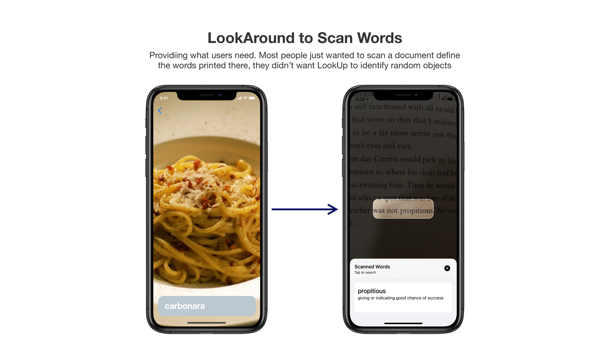
LookAround was impressive in that it showed how powerful CoreML was when it launched and it was really fun to use it but it was also not a great feature for our app. Most people just wanted to scan the text from a document. So we removed LookAround. Instead, next year, we came up with Scan Words. Which, as the name suggests provides a much better value for people.
Users often suggest solutions in their feedback mails, and that’s really interesting too. Users are great at identifying the problem, sometimes their solutions can be based on what they see elsewhere, and it’s important to dig deeper, and provide something meaningful.
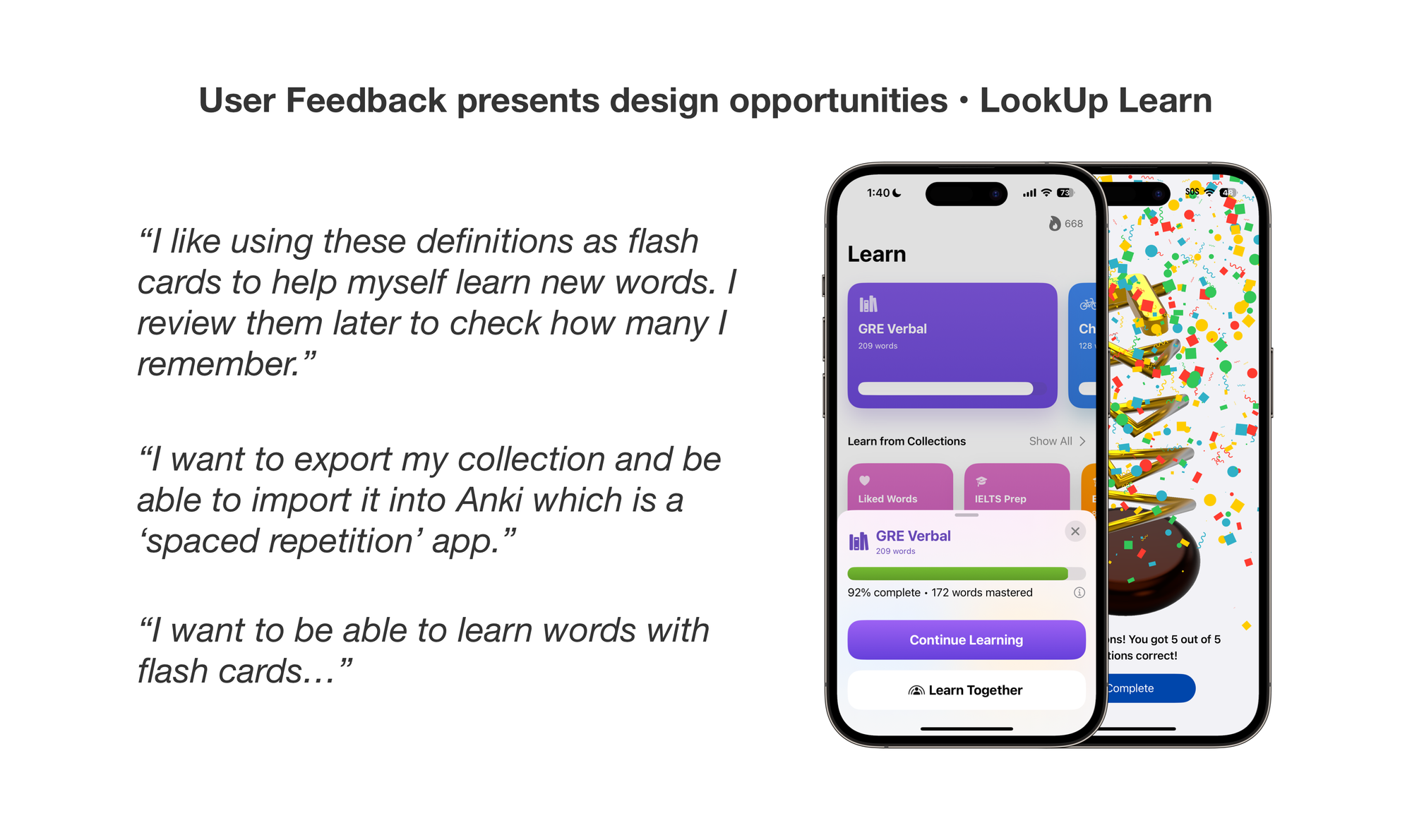
First, when Collections came out in 2018, a lot of users requested the ability to create flash cards. What we discovered was that people wanted to a way to build their vocabulary. And while flash cards was one of the ways to do it, interactive quizzes was another interesting way that leveraged flash card style learning but made it more interactive. So we came out with Quizzes in 2019.
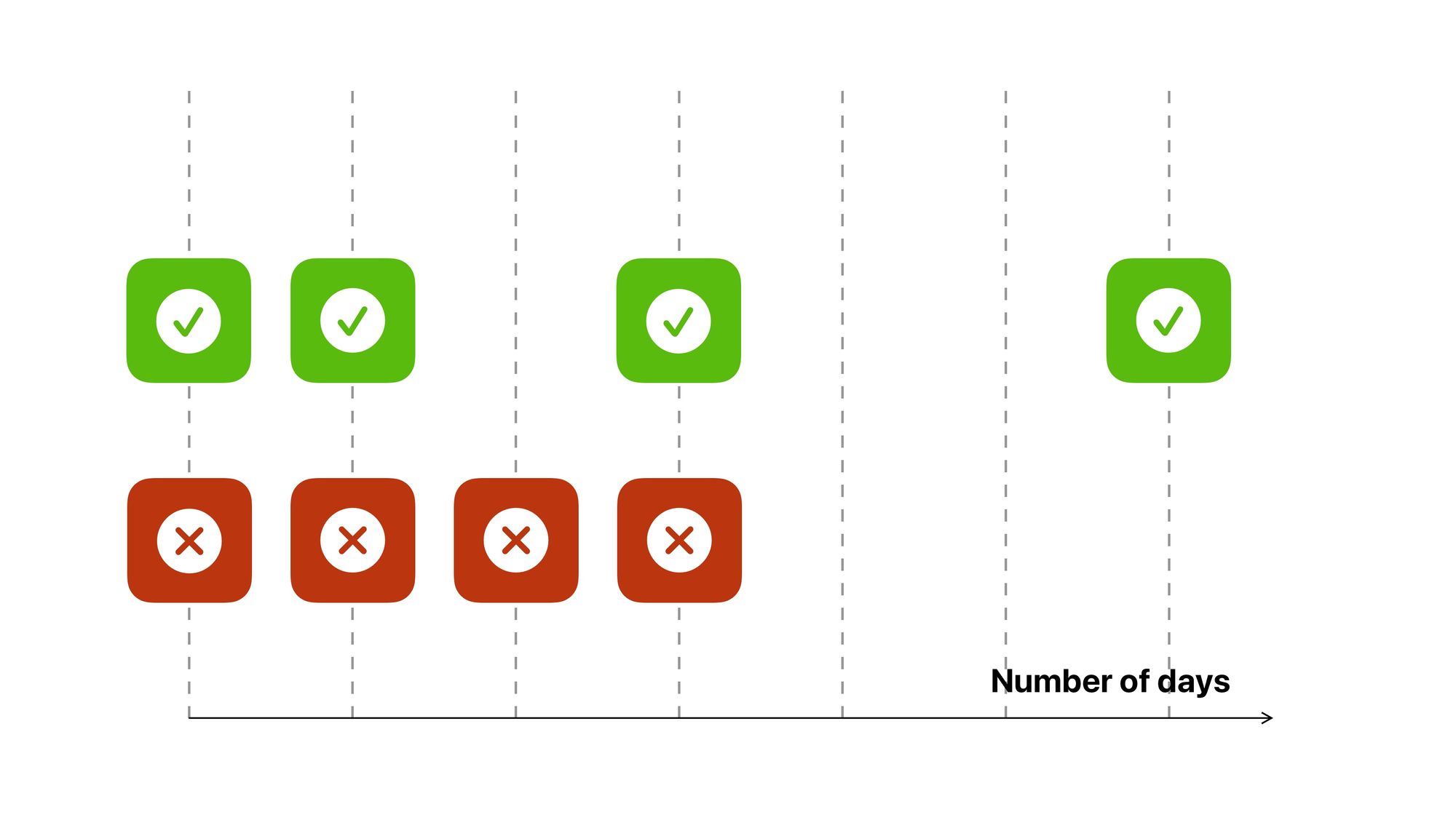
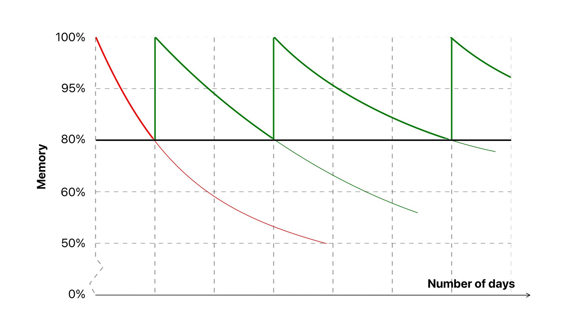
Flash Cards also facilitate more learning techniques. So, we researched on those techniques and built a custom learning engine that used spaced repetition to help people build their vocabulary.
What started as a simple request for flash cards, actually helped us build the groundwork for LookUp’s vocabulary building features.
Digging Deeper into the Design
It’s important to design things carefully. It’s not just about following the Human Interface Guidelines. It’s also about creating something meaningful and something that helps people.
When we built the Learn features, a lot of time went into researching learning techniques, and how people build their vocabulary.
 Vidit Bhargava
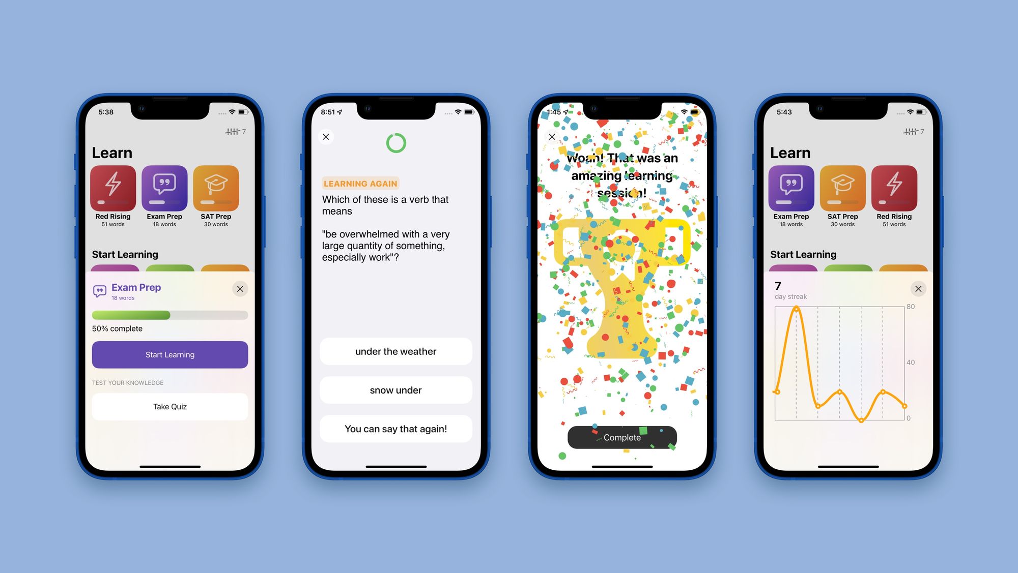
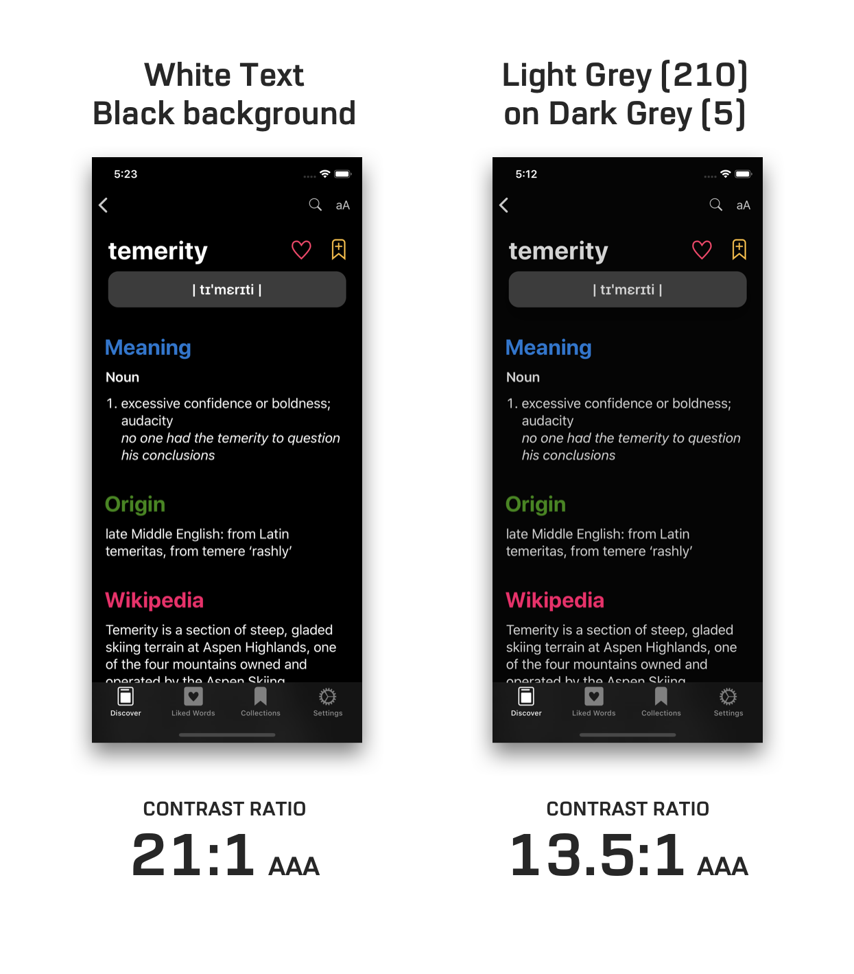
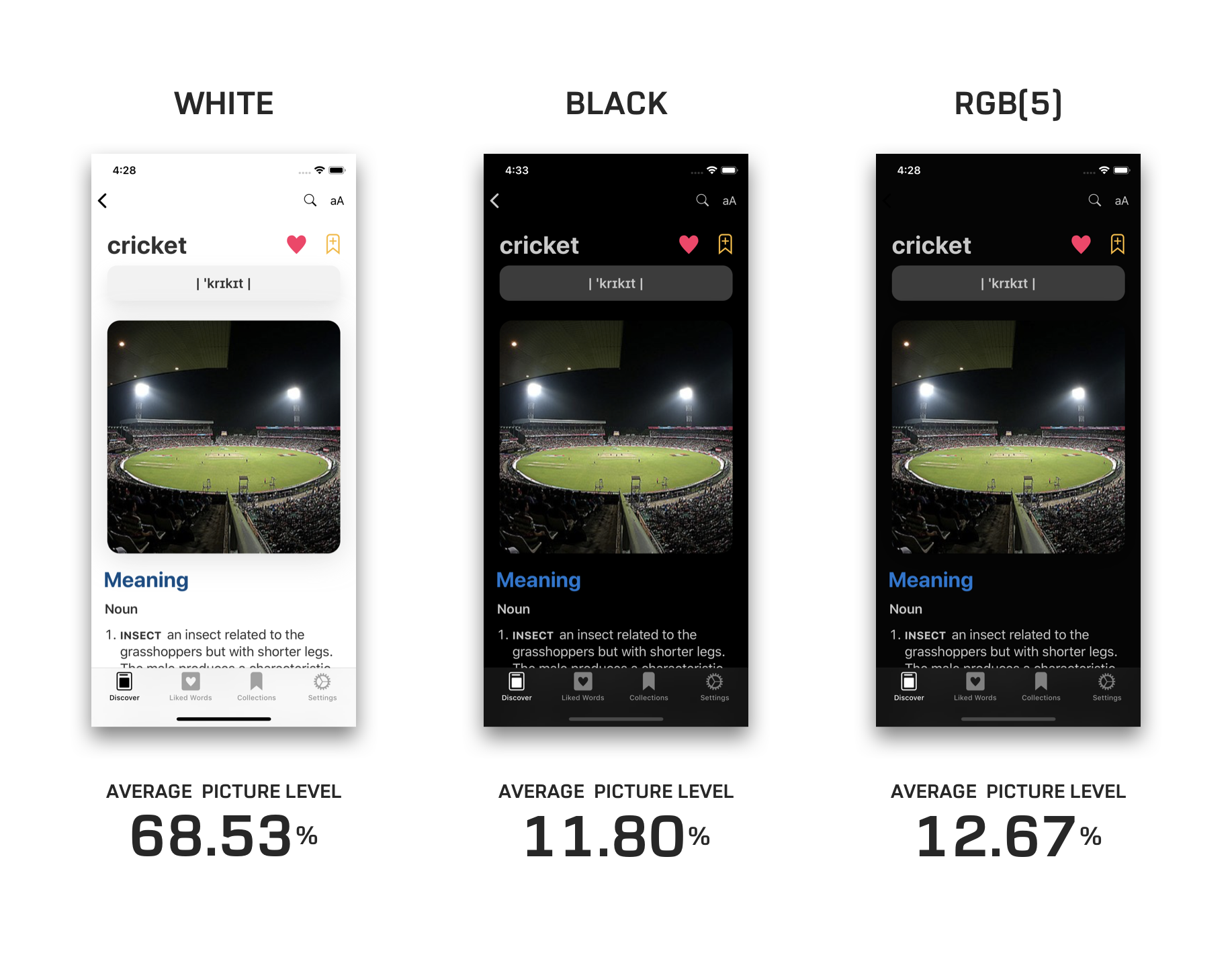
When designing the dark mode for LookUp. We didn’t stop at just creating a dark version of the app, we researched about creating a reader friendly dark mode that’s also accessible.
 Vidit Bhargava
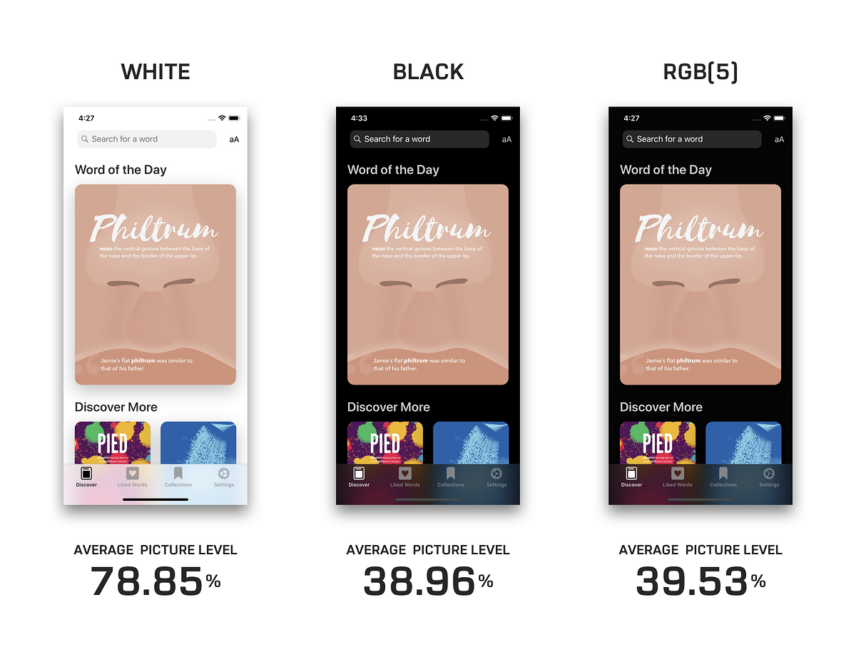
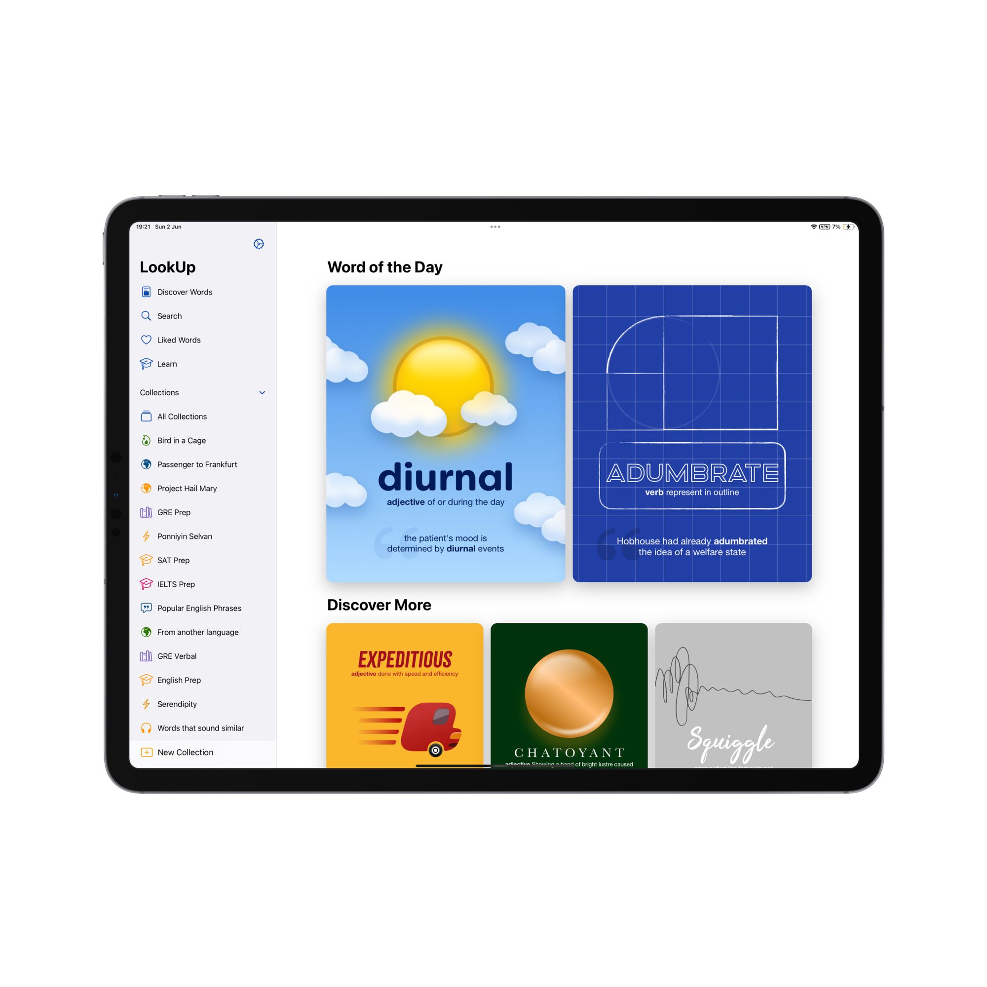
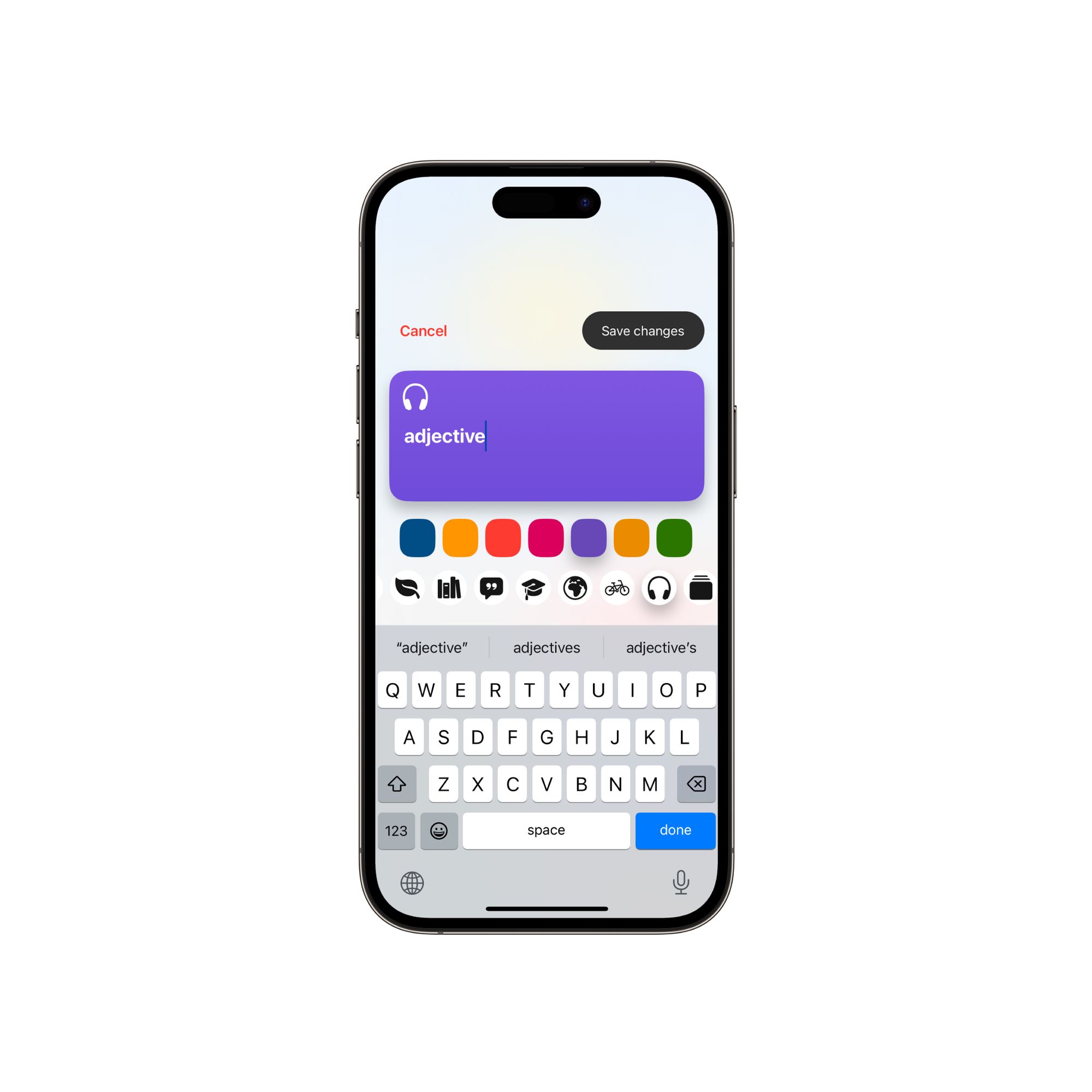
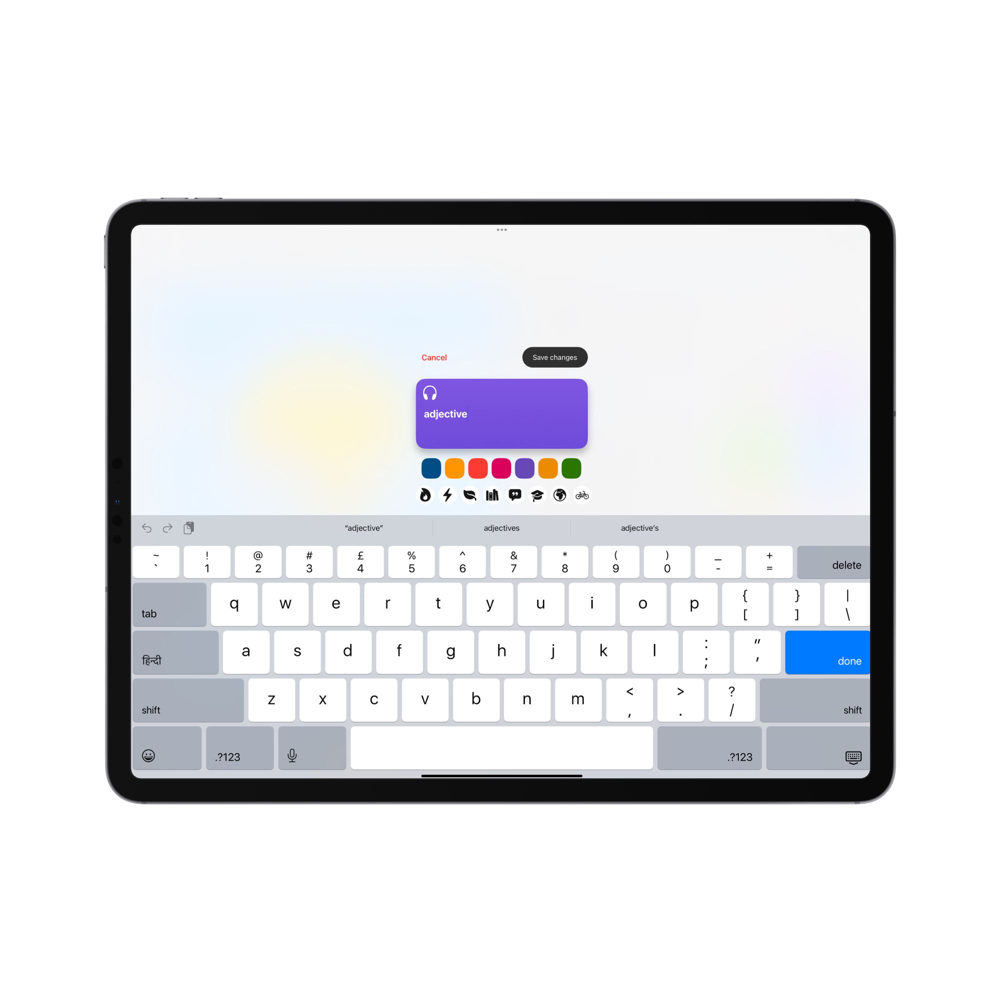
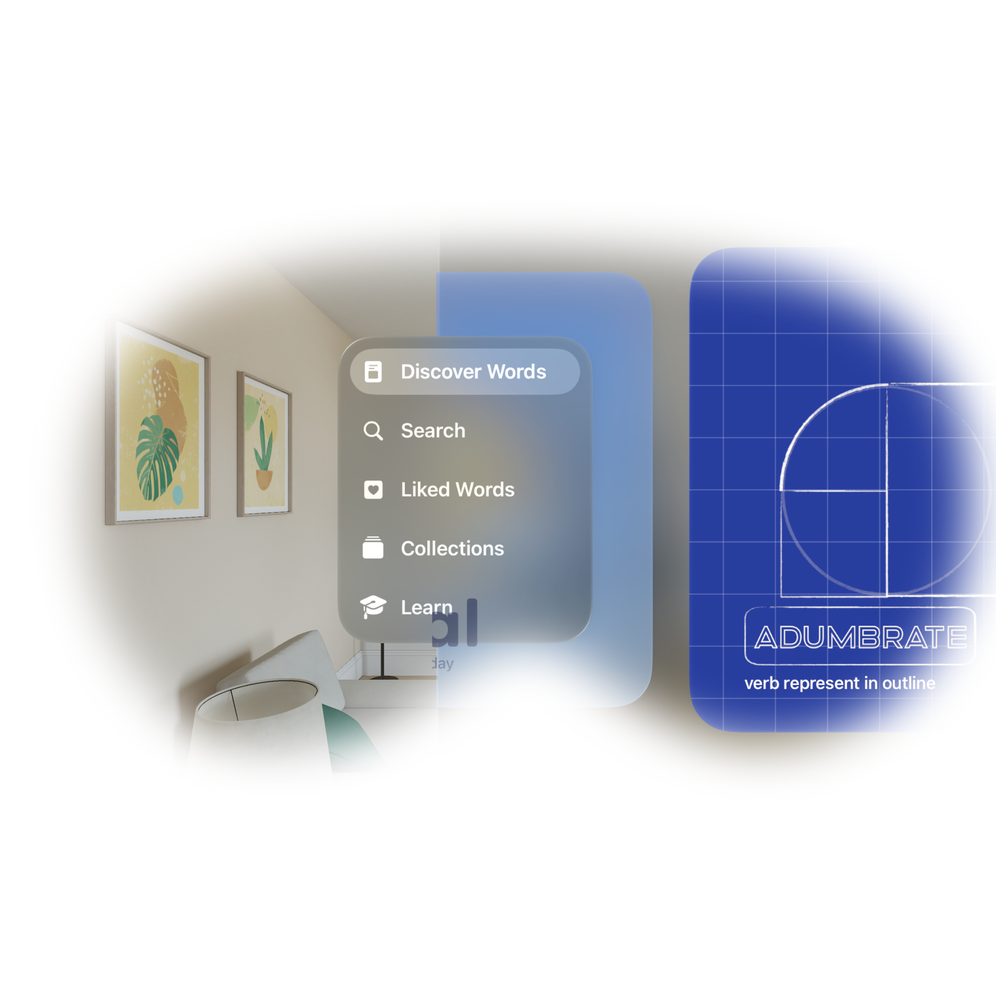
The iPad UI isn’t just about creating a sidebar. The UI actually adapts to different sizes and adapts facilitates multi-modal inputs.
Vidit Bhargava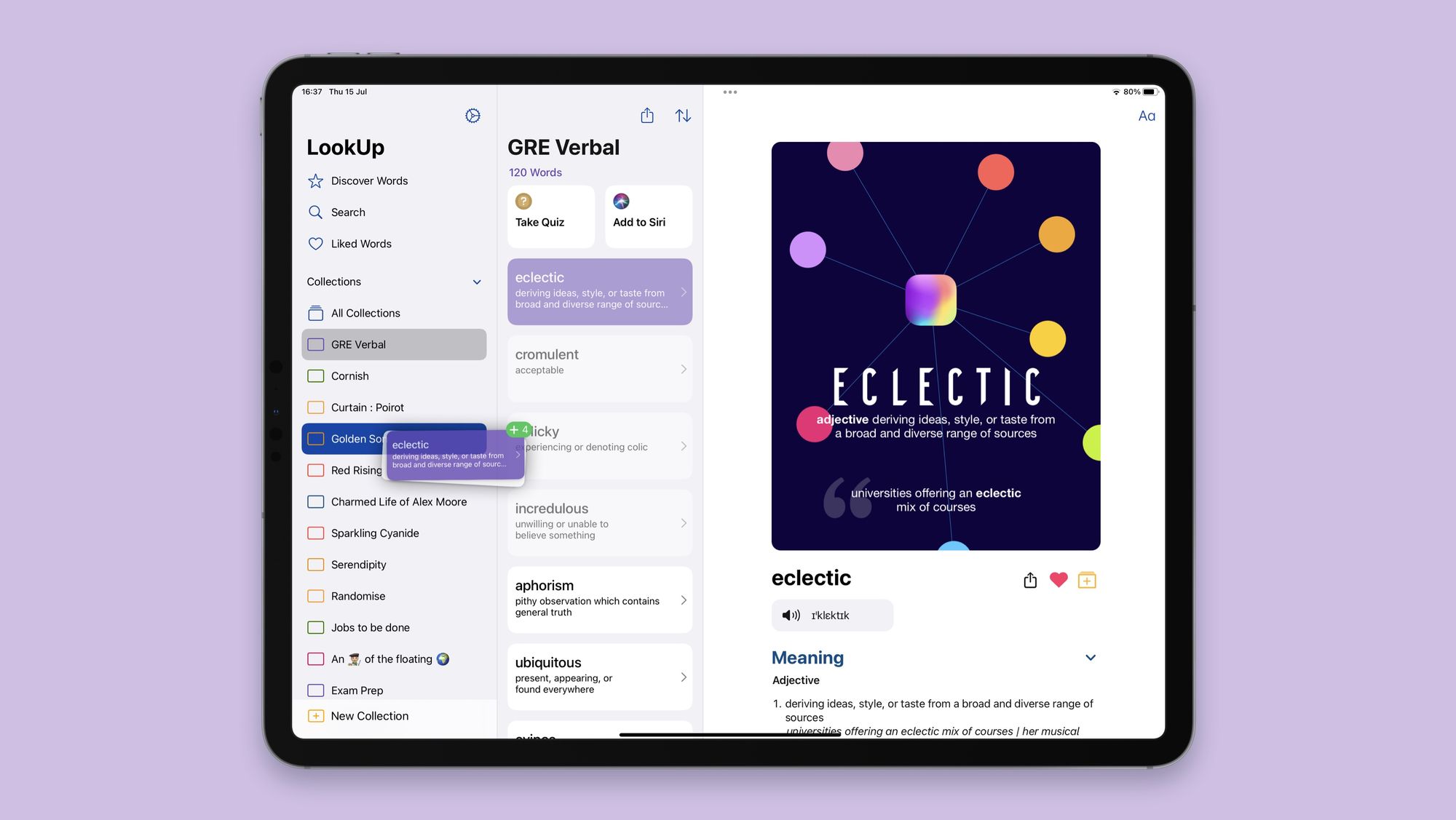

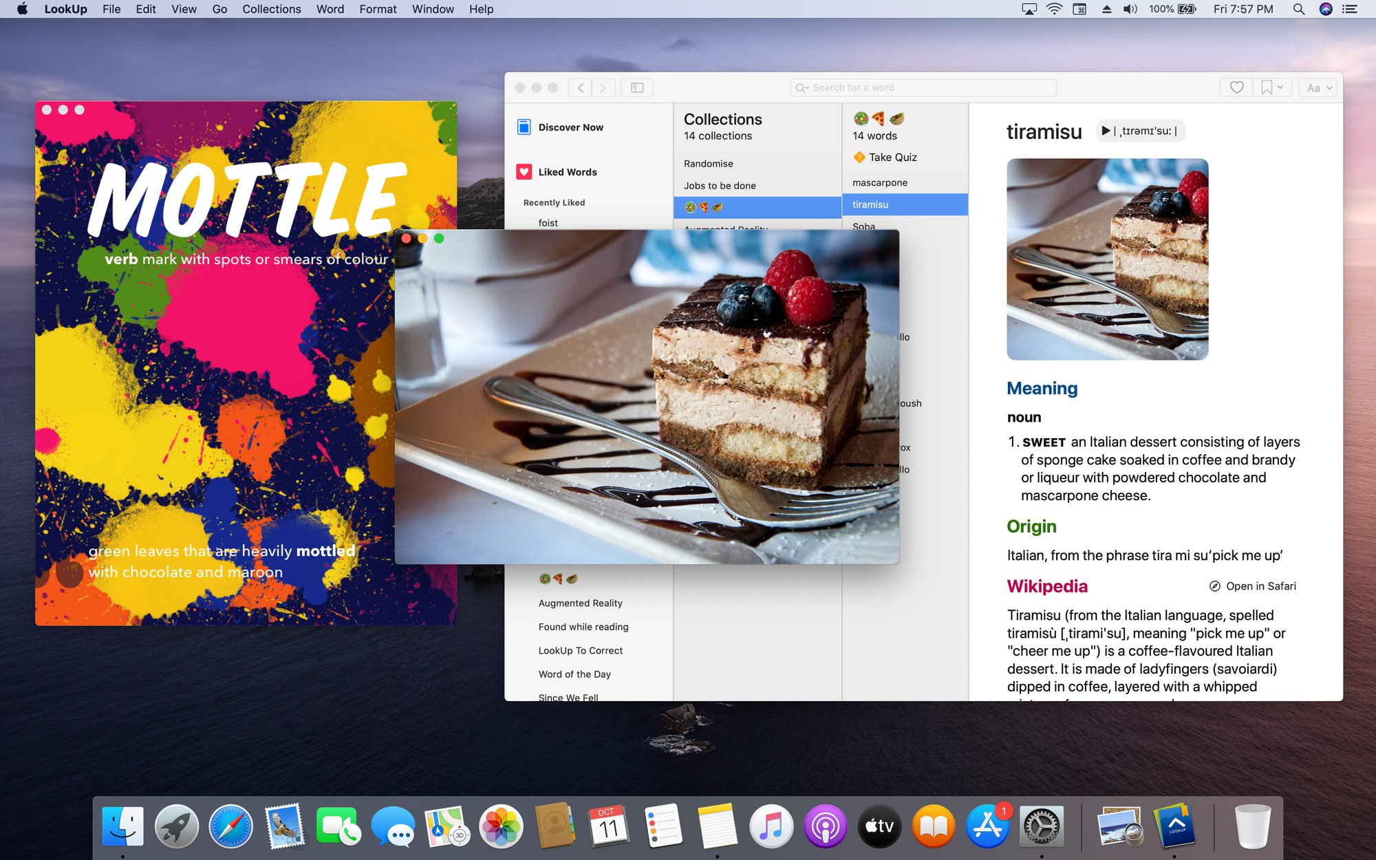
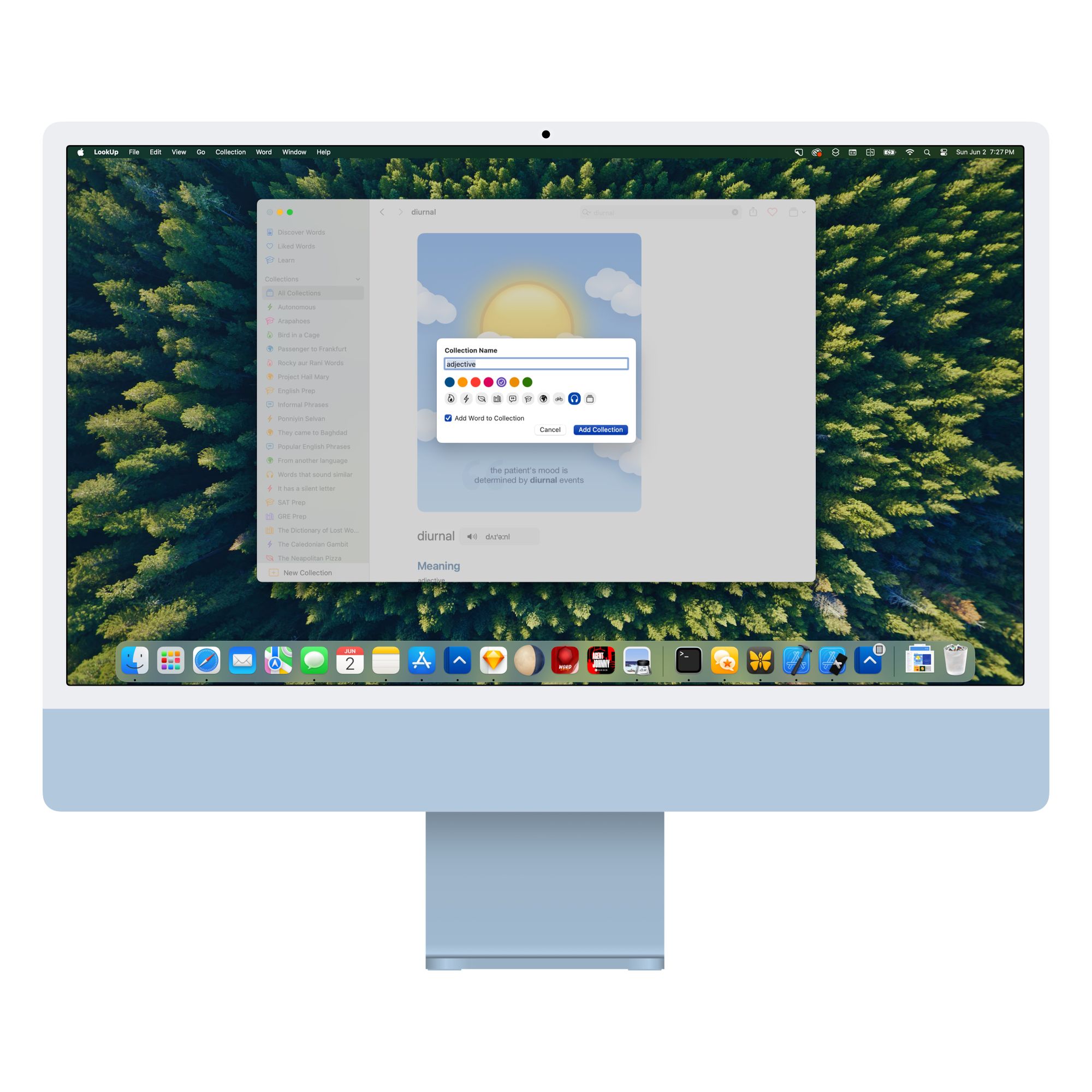
On the Mac, the app doesn’t look like an iPhone or iPad app. When I designed LookUp for the Mac, I really took the time to have an interface that fits the macOS UI and feels natural for that paradigm.
Vidit Bhargava
When designing for new platforms another interesting aspect is to constantly design and redesign the interface till it feels just right.
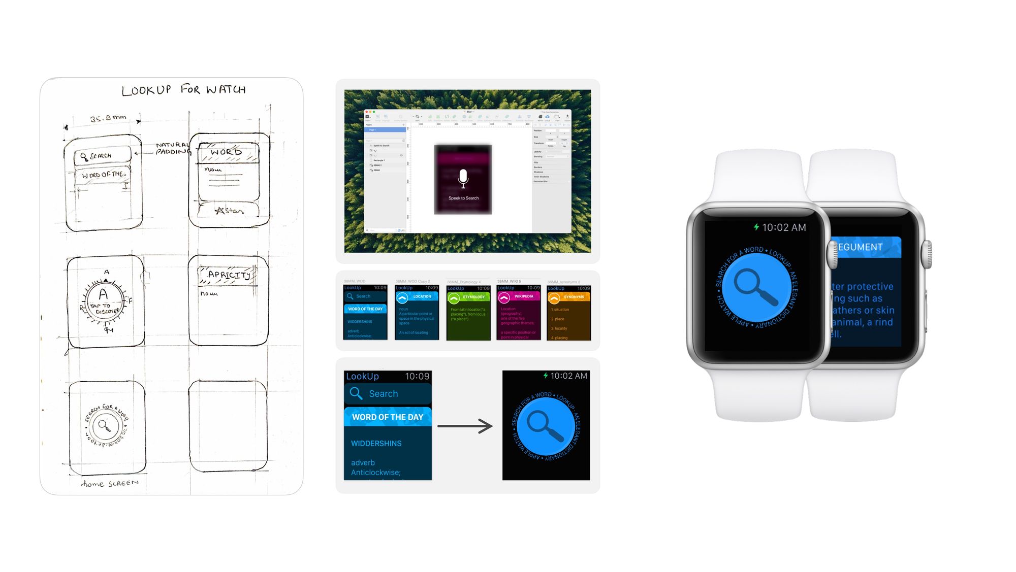
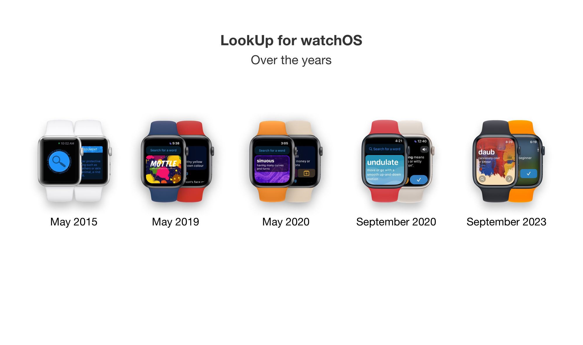
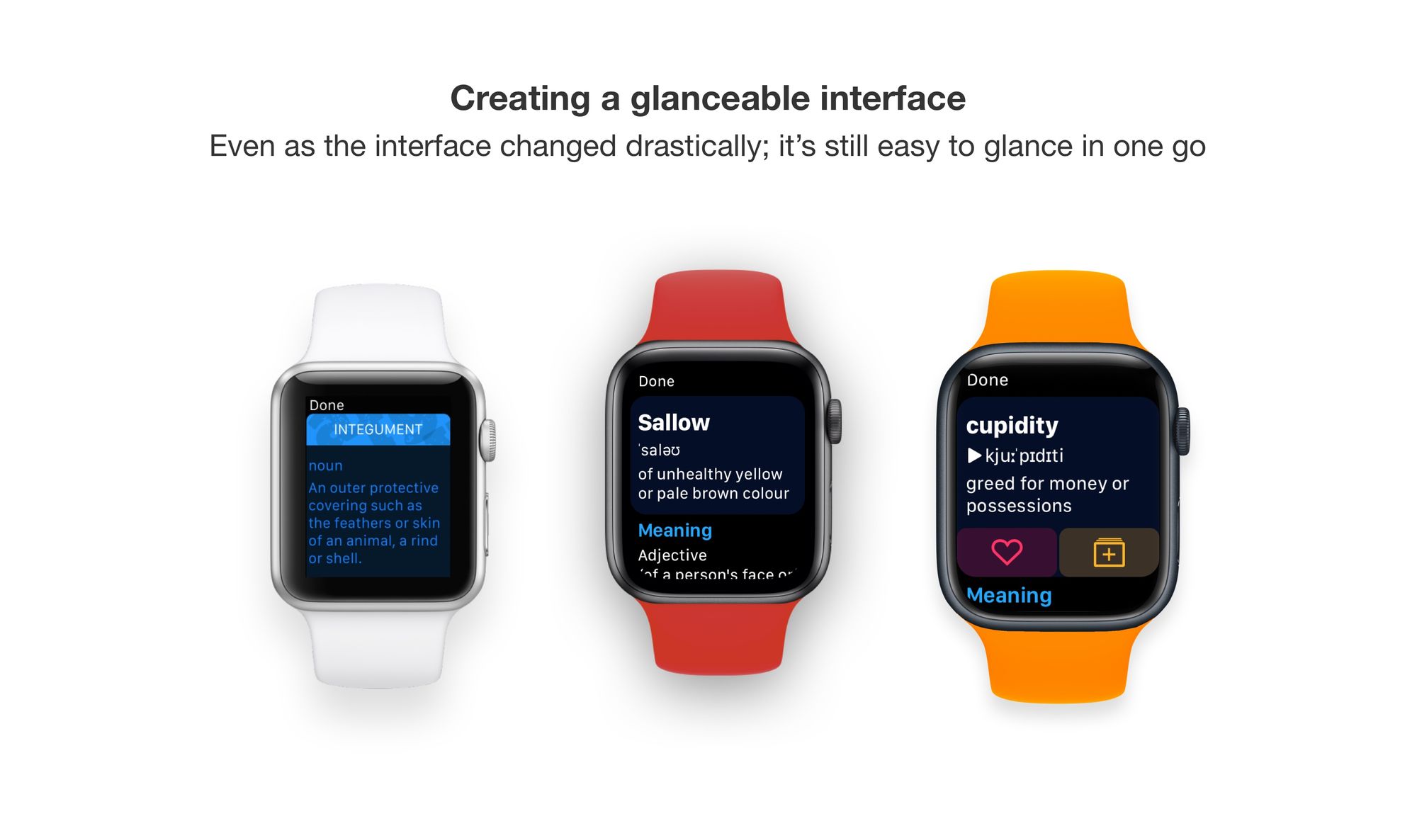
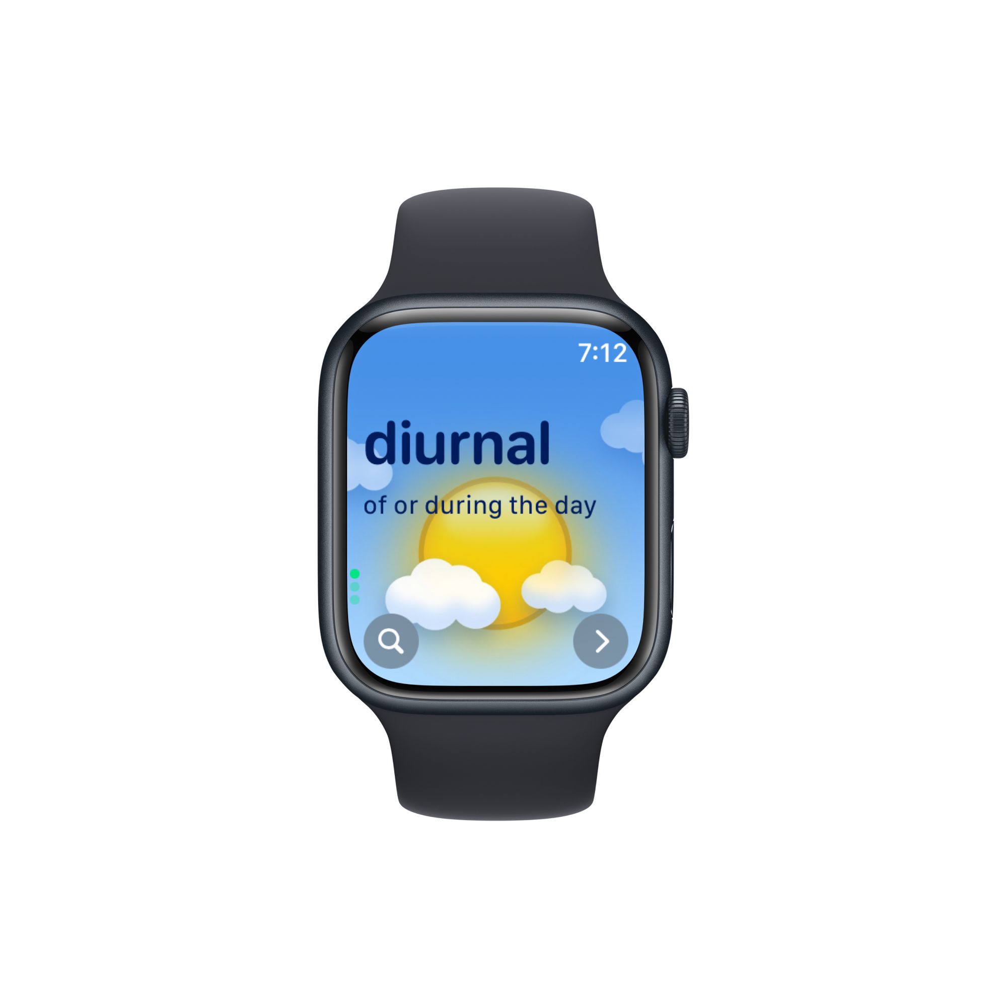
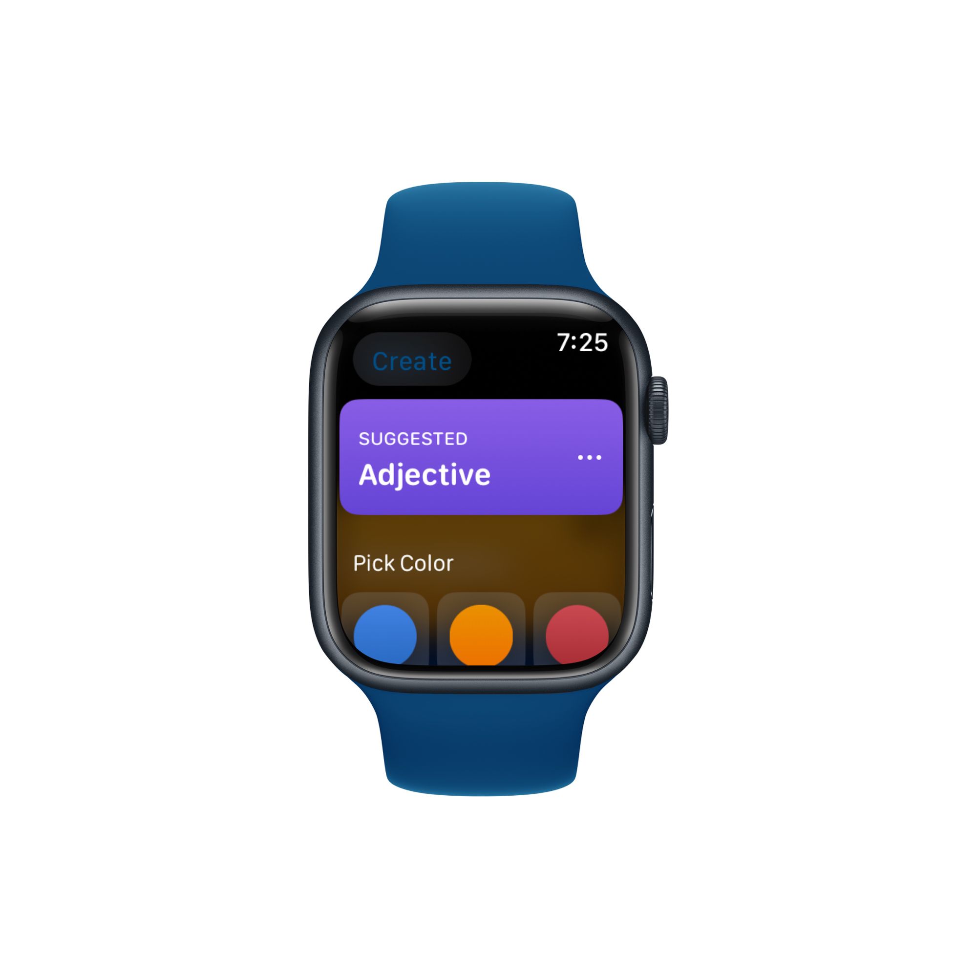
For watchOS - the experience was designed keeping in mind a quick glanceable interface. That makes it easy to discover words without performing a lot of interactions.

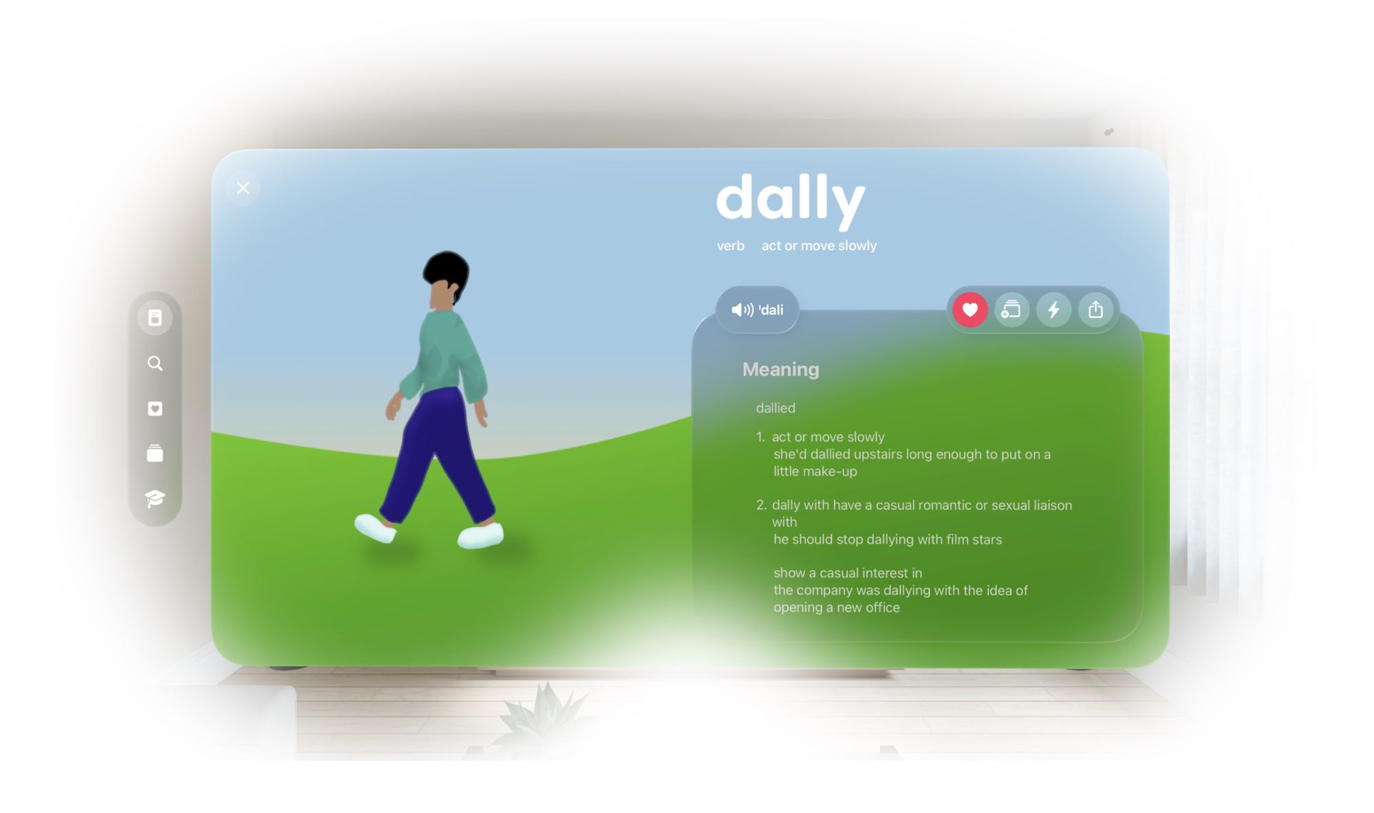
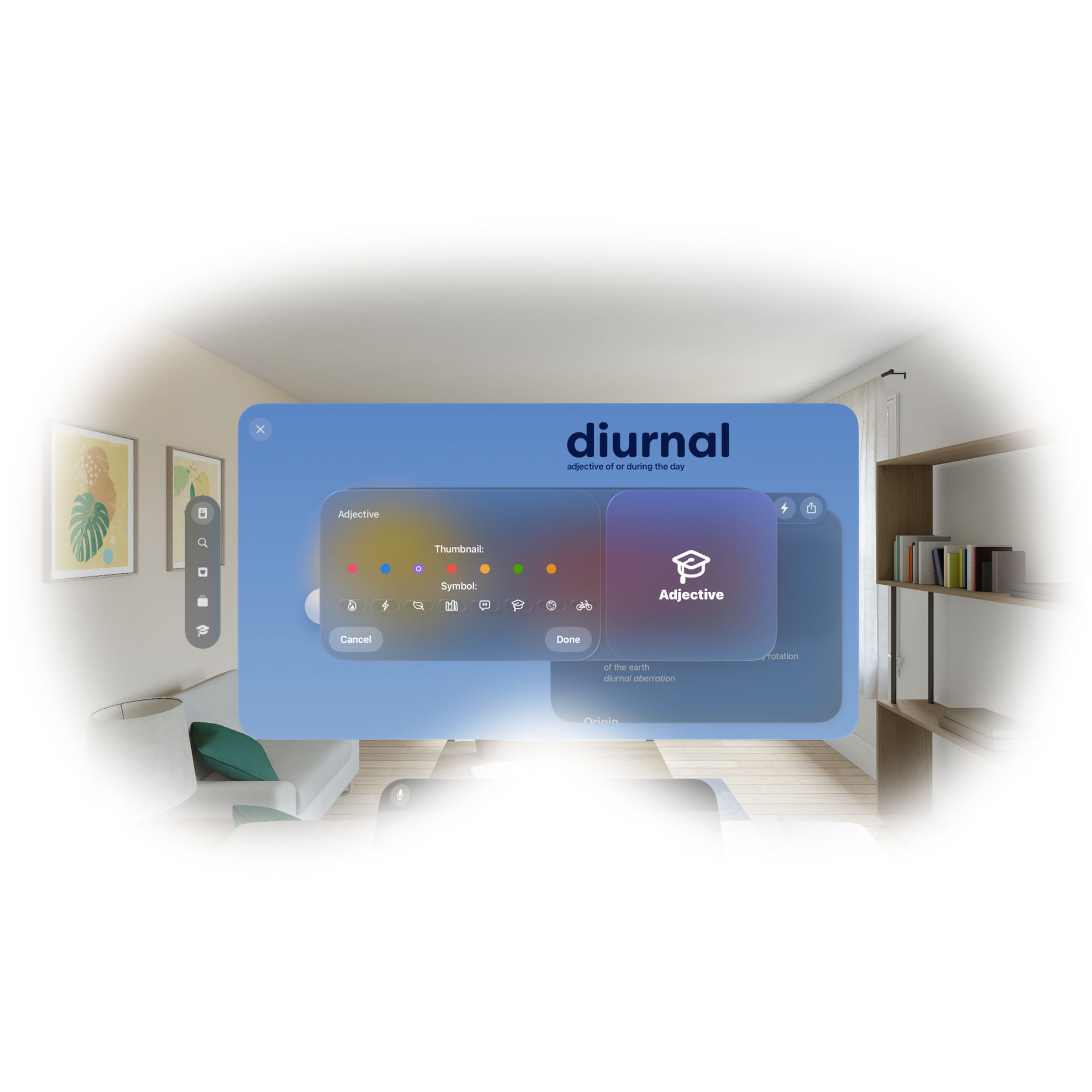
For visionOS: The App and Word of the Day were designed to feel at home with the platform. We also needed up creating new features like Reverse LookUp that take advantage of the platform.
Vidit Bhargava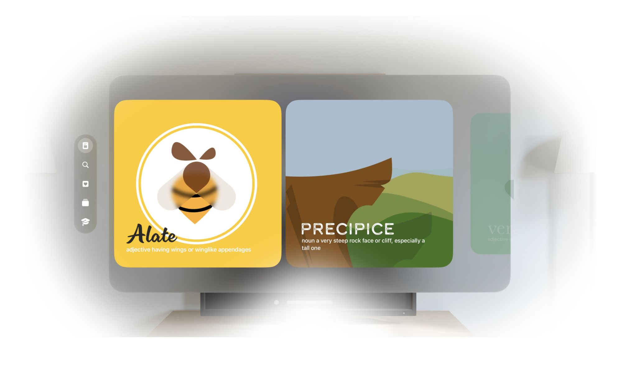
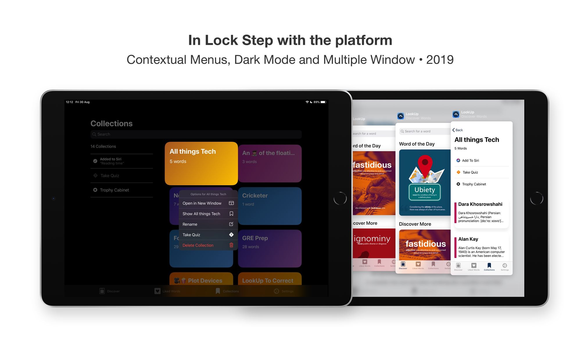
Staying in lock step with the platform
Another crucial area for LookUp is to stay in lock step with the platform. What does that mean? That means we’re ready with new features that take advantage of the latest in Apple platforms, usually on day 1.
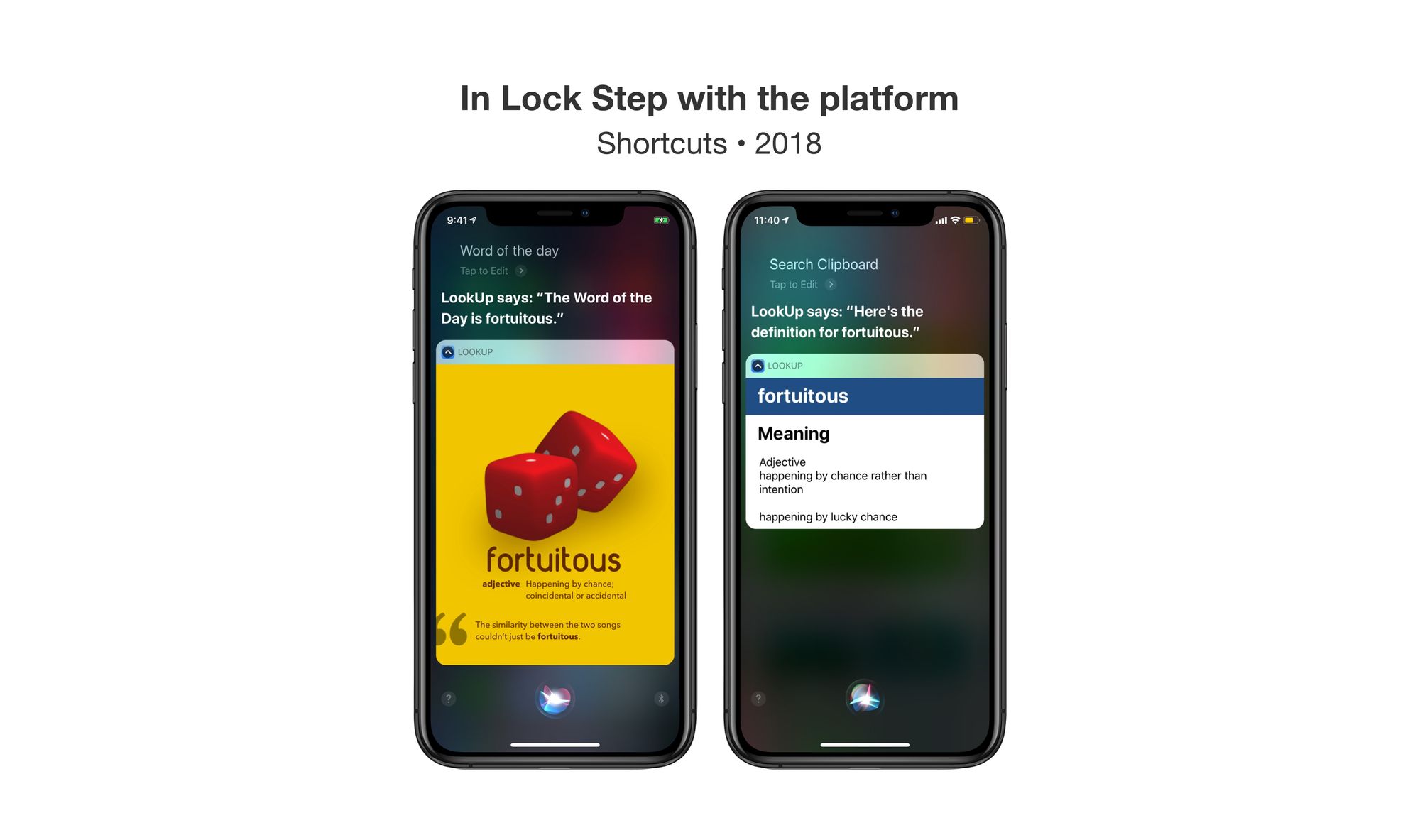
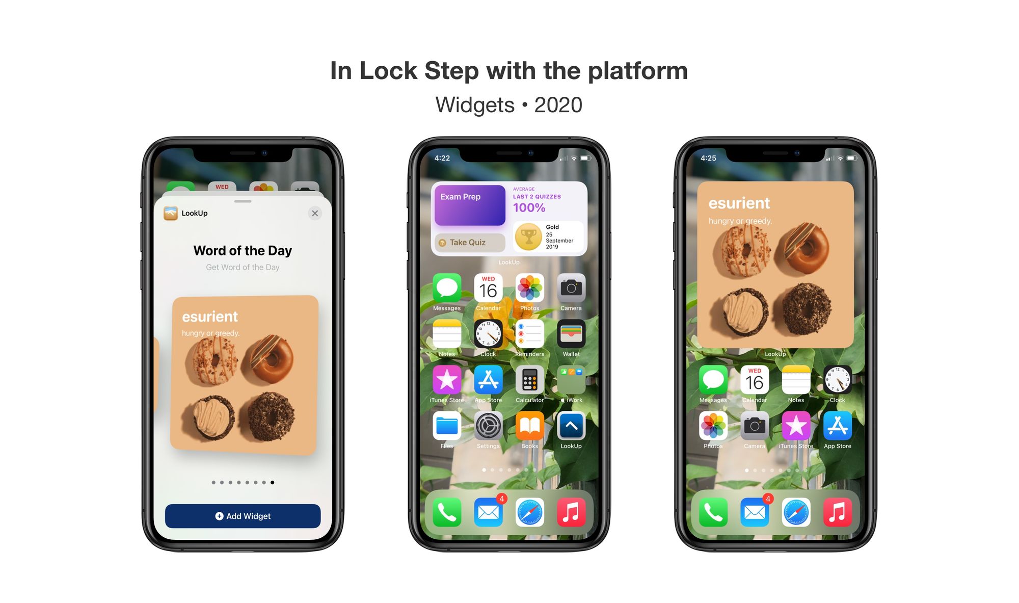
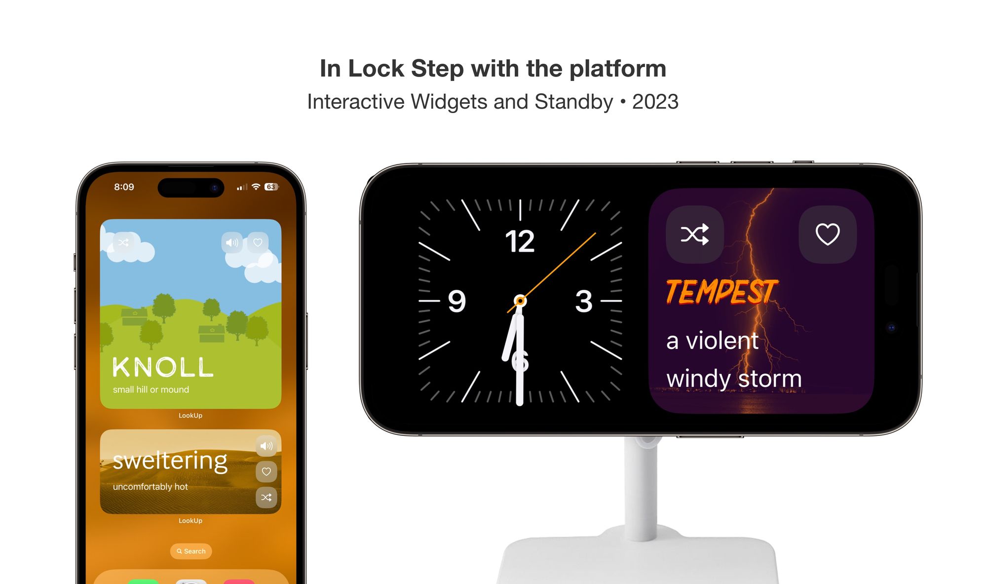
Why is this important? - People expect their devices to work a certain way. When new features release they try them. For example, Widgets. When Widgets came out everyone wanted to use them, and Words of the Day were a natural place for it.
Consistent UI is not Same UI
While LookUp's UI is consistent across platforms, it is not the same. For Each Platform, LookUp's UI adapts for what's ideal for that platform. So, for example on watchOS the UI adapts to be glanceable and easy to navigate quickly, on iPad, it supports multi-modal input, on macOS, keyboard shortcuts and multi window are support.
But it goes beyond that, even visually, there. are minor tweaks done to make the app feel at home with the platform.


Milestones
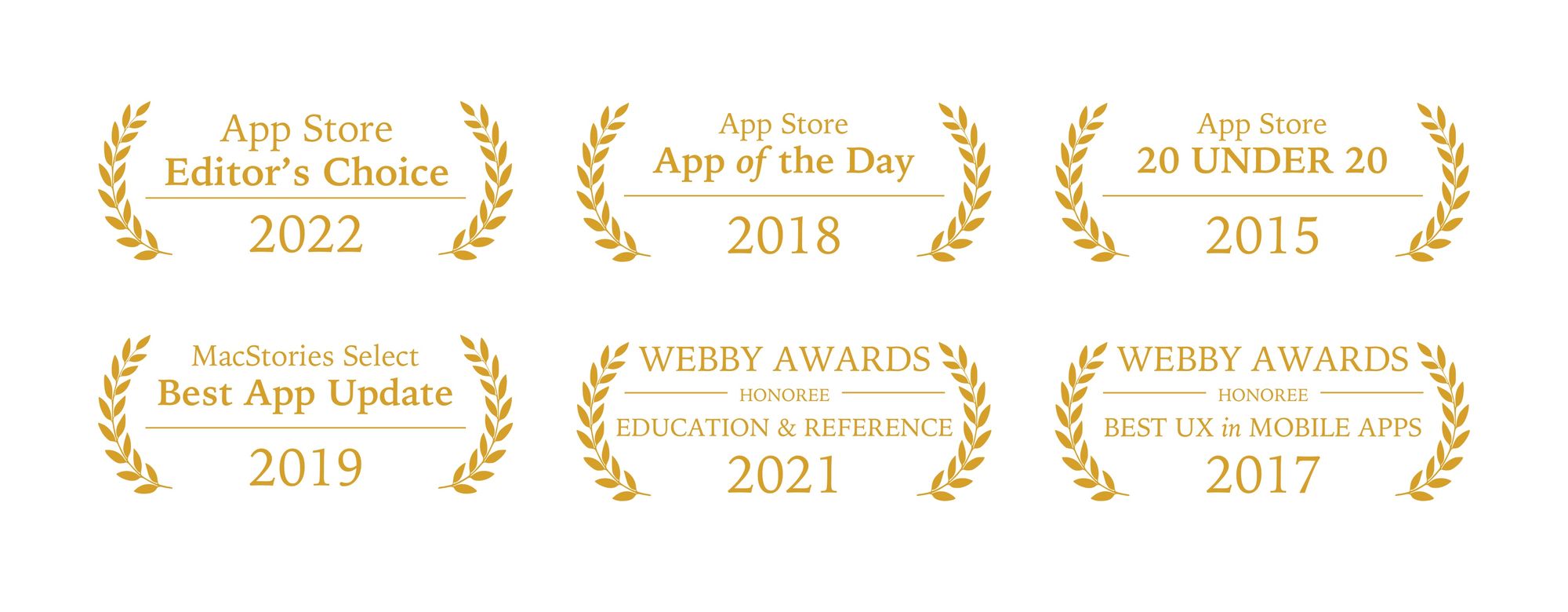
Over the last few years lookup has won several accolades. This includes App Store Editor’s Choice, App Stories 20Under20, MacStories Select Awards, and much more.
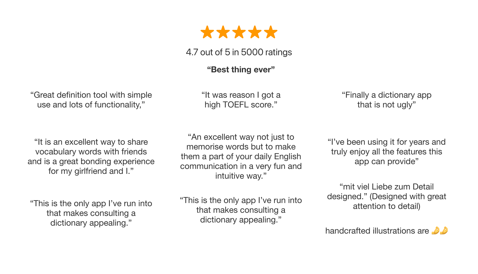
But more than that it’s the feedback and the heartwarming reviews I get from the users that keeps me going every day.
Download LookUp from the App Store for free: https://apps.apple.com/in/app/lookup-dictionary-learn-daily/id872564448?platform=mac