Redesigning LookUp’s word of the day for VisionOS
A case study on how LookUp's Word of the Day cards were redesigned for Vision Pro

Last month we launched LookUp for Apple Vision Pro. Completely redesigned from the ground up, LookUp on visionOS is designed to take advantage of the new interactions and design paradigms that come with the spatial computing platform, making it feel at home with the Vision OS platform.
A major part of the redesign was LookUp’s Word of the Day cards; a feature that everyone loves about LookUp. LookUp’s word of the day cards have been completely revamped for the vision OS era, creating a modular and more interactive experience.
What makes the Word of the Day Cards stick?
Before I dive into the redesign, I’d like to share a bit about the feature. Visuals have a much bigger impact on people’s memory than large blocks of text. Having a visual association with words makes people remember words more easily than viewing large chunks of text.
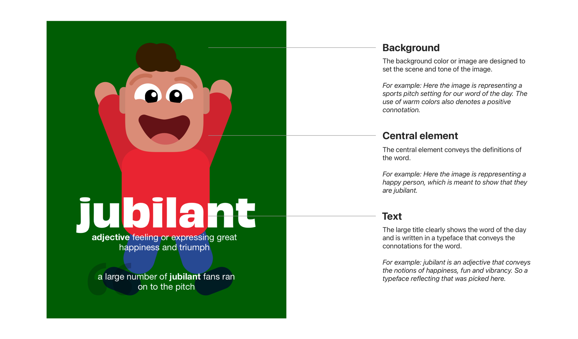
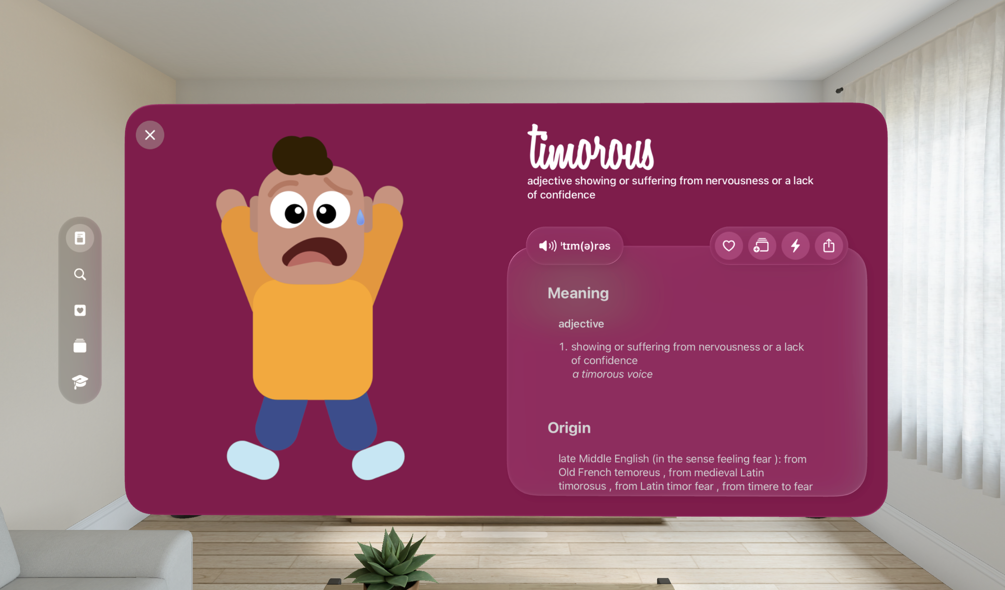
In LookUp, Word of the Day is an attempt at making the vocabulary building process more visual, easier and more fun; than the traditional cramming of the dictionary. Each word of the day is accompanied by an illustration. The illustrations provide a quick and easy to understand explanation for the word. They’re also accompanied by a short definition and an example usage of the word.
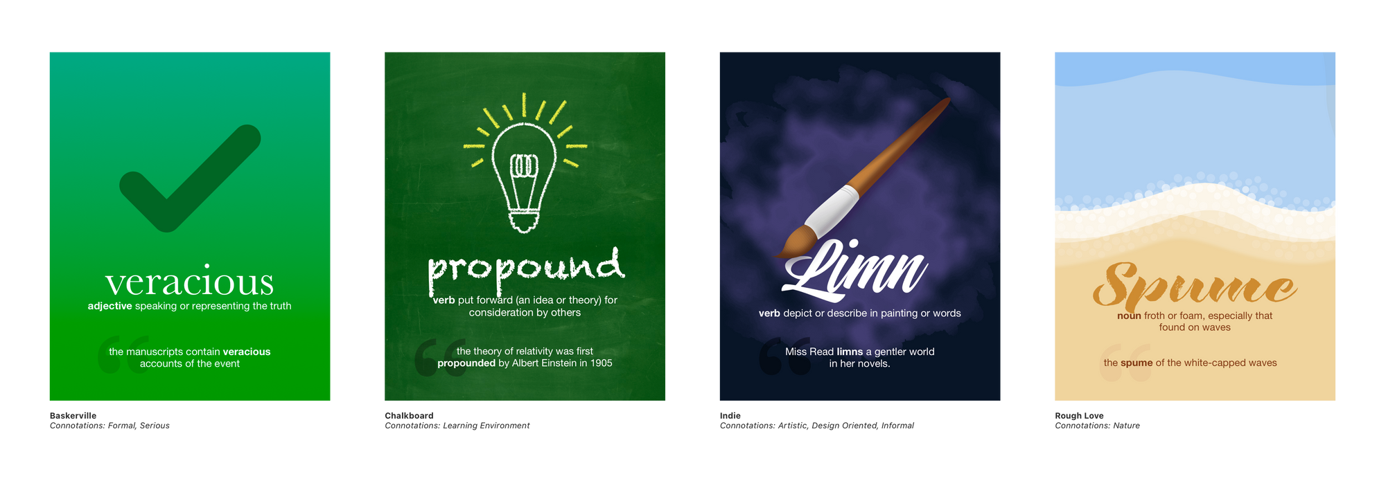
Each Word of the Day poster is made up of 3 elements. An informative background and a central object image that serve as visual cues to inform the meaning of the word. These images are carefully designed to visually convey what the word means. The final element is the word’s title itself. The title’s font is carefully picked to convey the right connotation of the meaning and provide an additional layer of context.
Redesigned for Vision Pro
The current UI for LookUp on iOS looks a lot like this.
Simply porting it to Vision Pro would have provided people with a way to access the content. But these sections of static images don’t scale into different dimensions.
One of the biggest assets of Vision OS is that the content doesn’t need to occupy a fixed space or be constrained in a small window. Windows are resizable, content can take different shapes and the content itself can scale.
Visuals are much more immersive and impactful on Vision Pro so it makes a lot more sense to give visuals a room to shine.
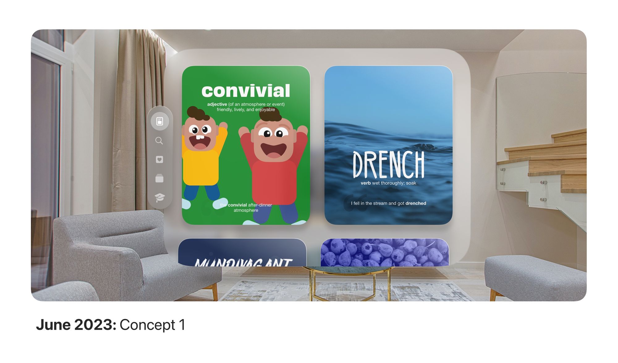
Keeping this in mind, it didn’t make sense to keep Word of the Day cards to be restricted to a rectangular shape. What we did instead is create a modular card that took the core elements of the Word of the Day and made it much more scalable and interactive.
Interactive, Modular and Immersive
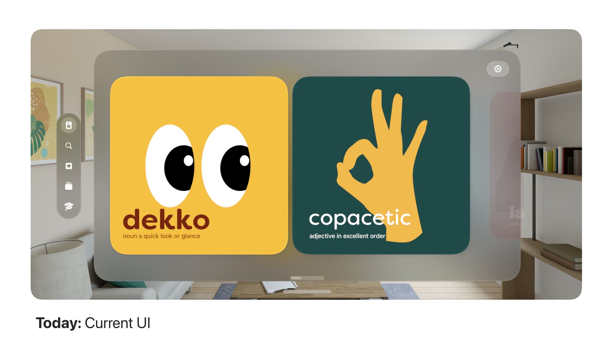
The resultant new Word of the Day cards are dynamic objects that when compact provide with essential information and context to remember a word, and when expanded, expose a plethora of easy to understand content that would allow people to learn the word better; The cards themselves use subtle 3D cues like parallax to create an overall immersive experience than looking at a 2D poster.
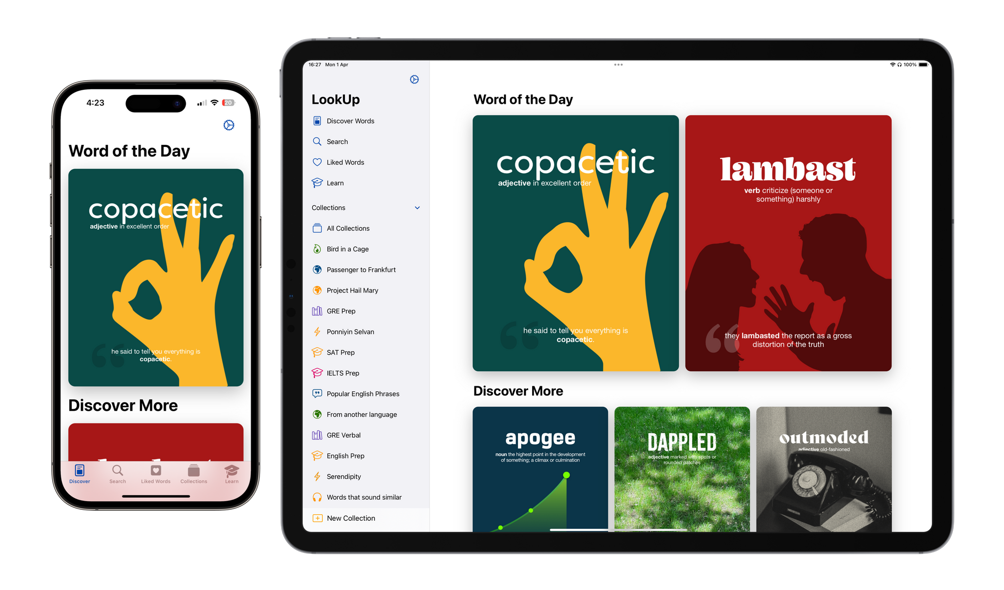
The redesigned Word of the Day Browsing Screen
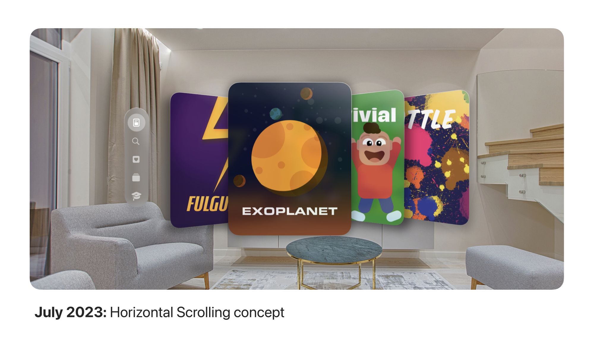
The word of the Day browsing experience has also been redesigned for the Vision Pro. We started with a vertical scrolling list of Words of the Day cards but quickly realized that given how eye tracking and pinching to tap are the key interactions, it’s much easier to horizontally scroll through these cards, as it keeps eye and head movement to the bare minimum, causing less fatigue for the user.
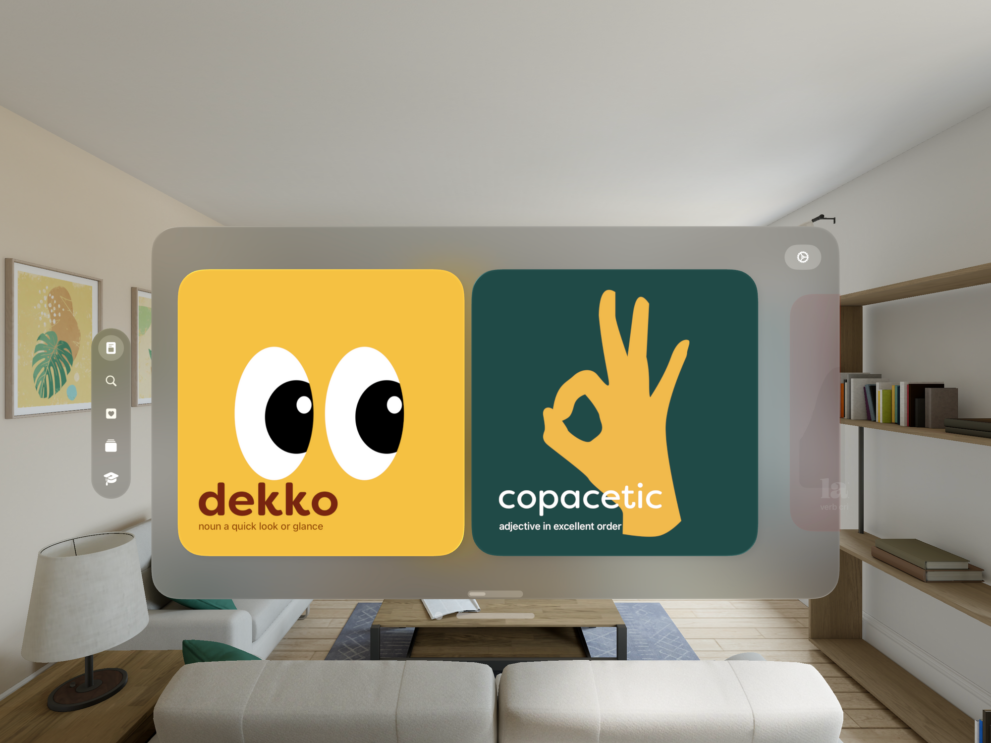
It’s much easier to horizontally scroll through these cards, as it keeps eye and head movement to the bare minimum, causing less fatigue for the user.
Designing a new format for the Word of the Day images.
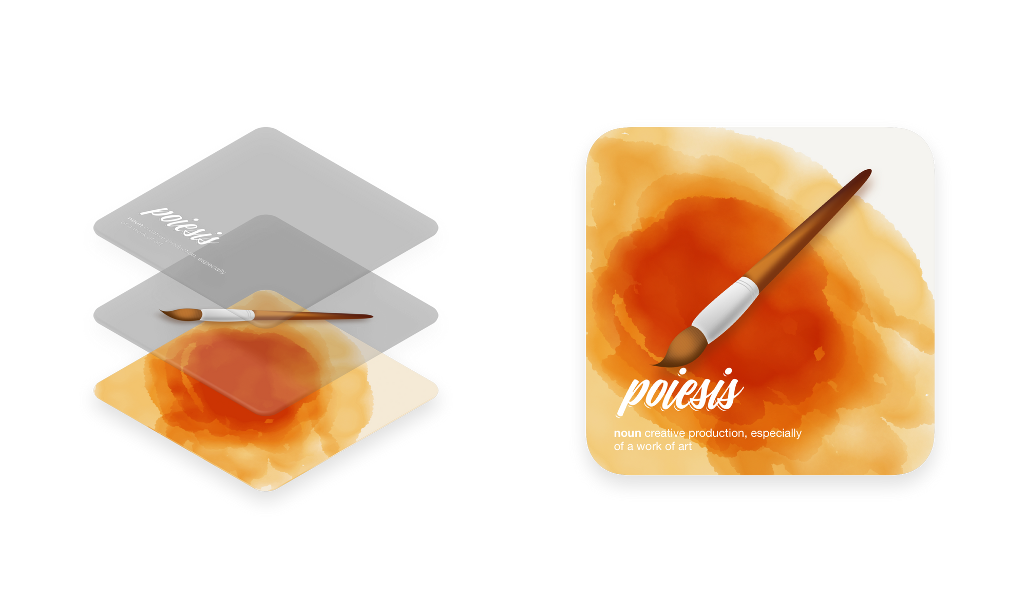
To create the dynamic words of the day, we actually ended up creating a new format for our Word of the Day images.
This new image, practically encompasses multiple layers of one image in a compressed format. So when the app opens it, it’s able to access all the assets and arrange them dynamically.
The file is shipped with metadata for the word, background color and other details that make up the word of the day card.
The new image format is a fast and efficient means of delivering word of the day and results in a flexible card interface that scales beautifully for the new platform.
Back to iOS
Another place where such a dynamic word of the day system makes a lot of sense is the new Widgets on iOS 17 and macOS Sonoma. Because these widgets are now multiple layers of image assets, they scale beautifully on different sizes and format such as StandBy.
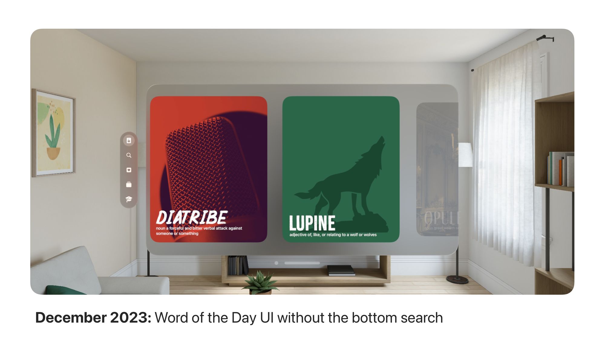
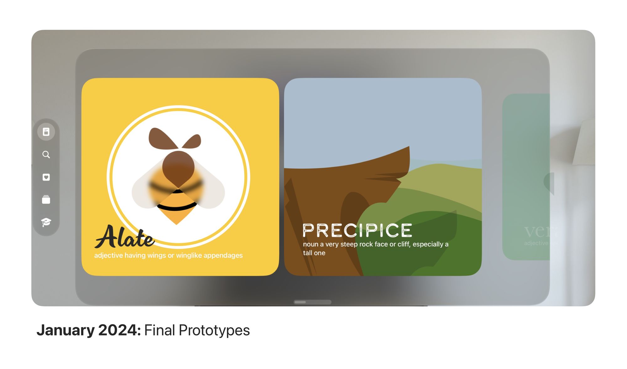
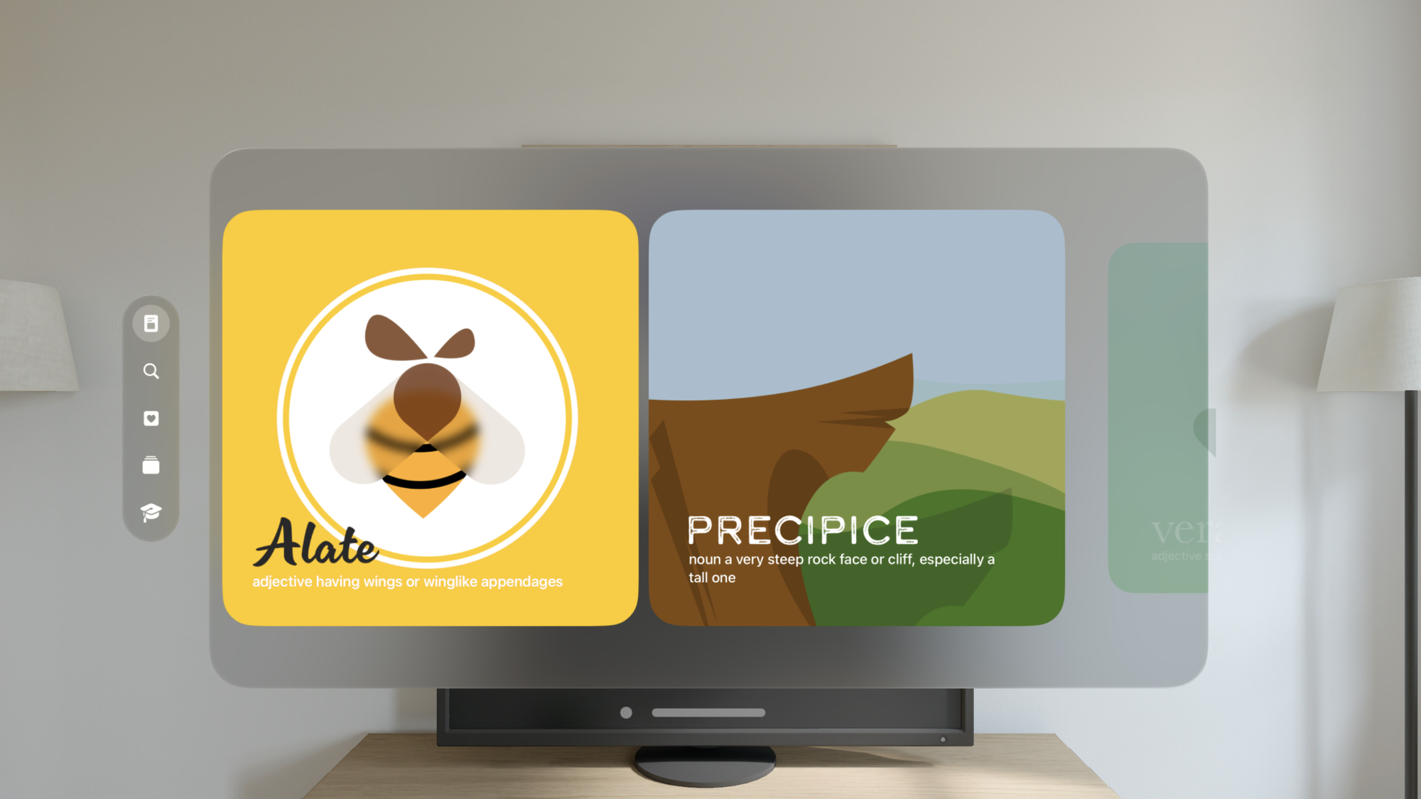
The Journey
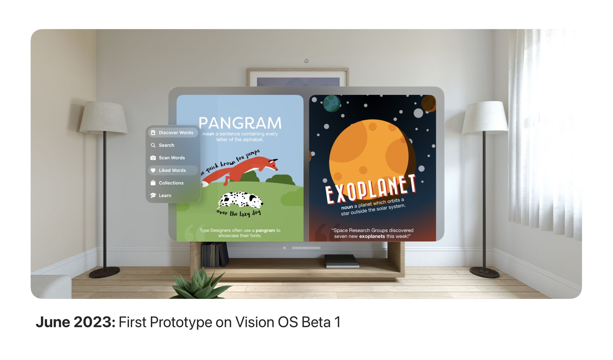
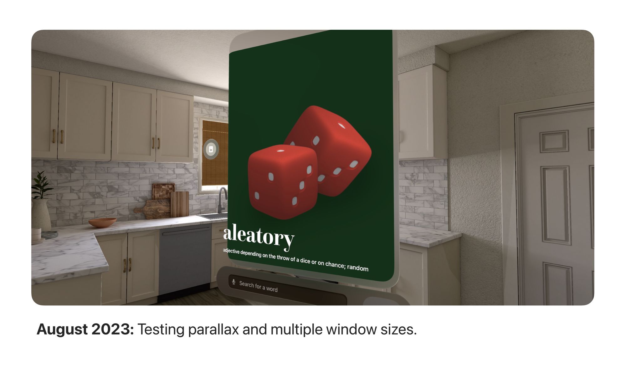
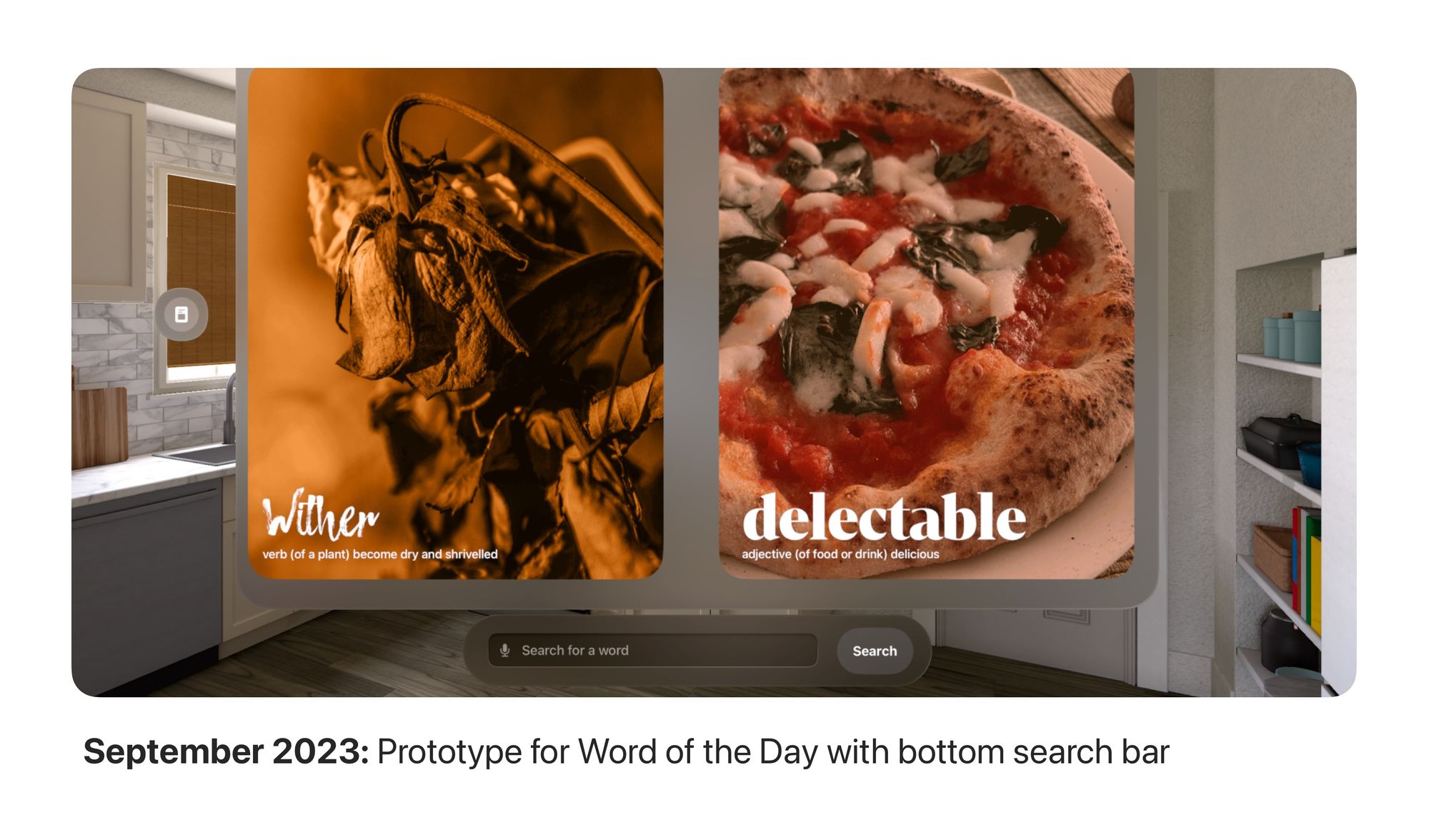
Creating the new Word of the Day layout wasn't a one day job. It was a painstaking effort that began in June 2023 after the announcement. The UI underwent multiple iterations, redesigns, crazy concepts to be where it is today.