Navigation in streaming services is a mess.
Streaming Service Navigation relies on showing a lot of options at once, but what if it were simpler?

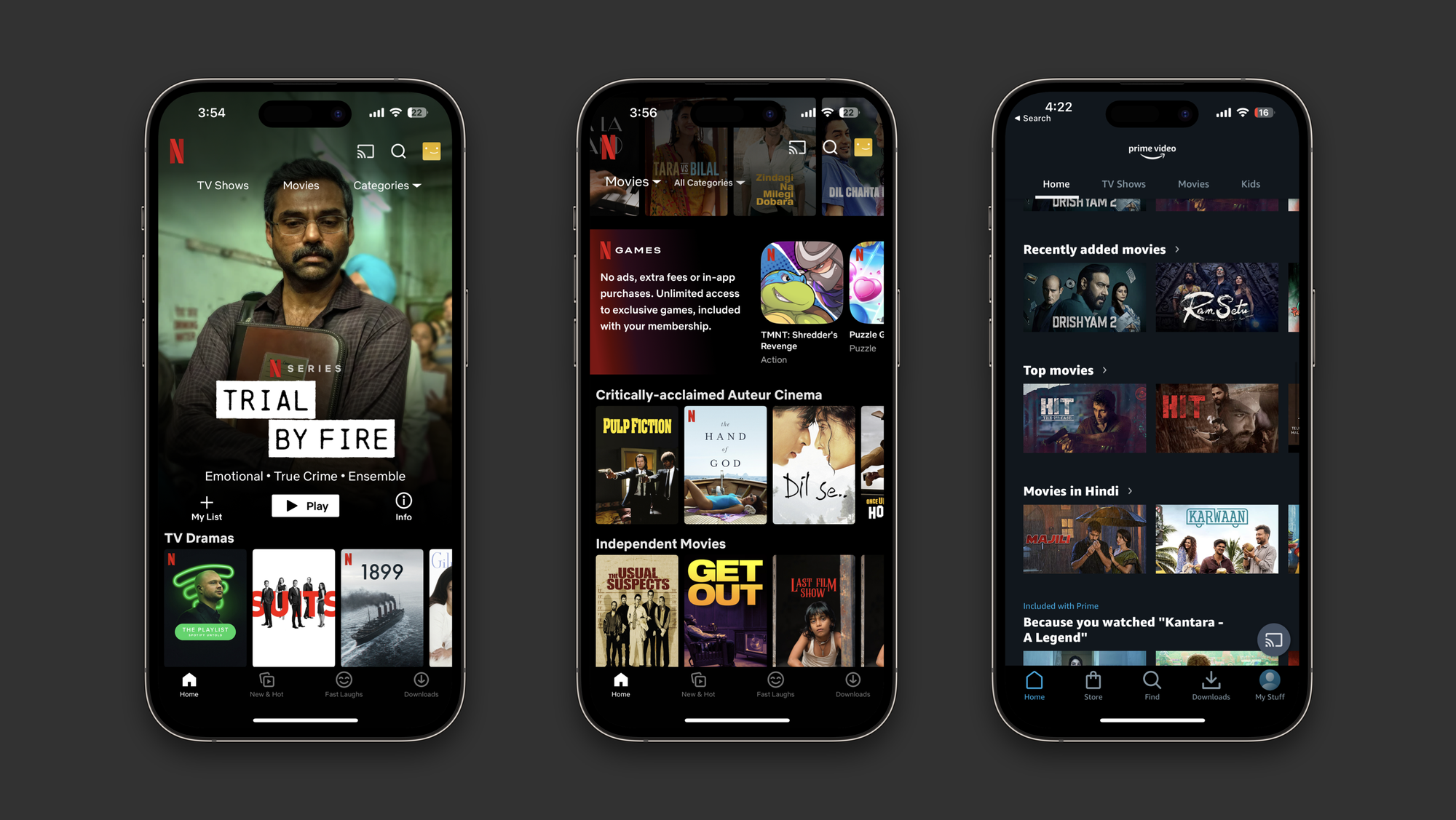
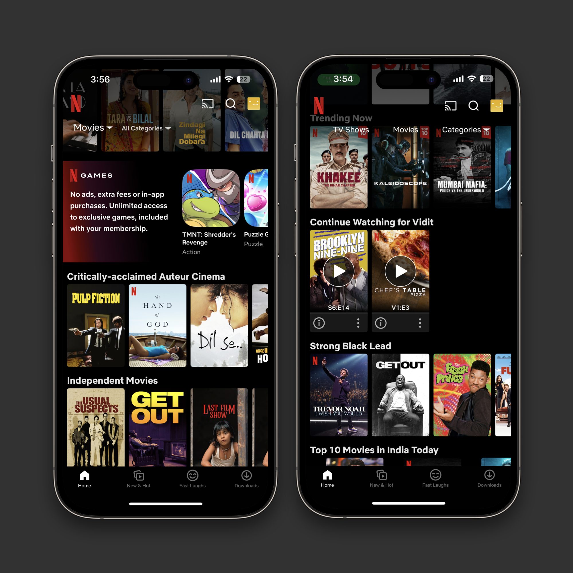
I was browsing through Netflix today, and I realised how broken its navigation structure is. Netflix, bombards you with a sea of posters, hoping you’ll find something exciting to watch.
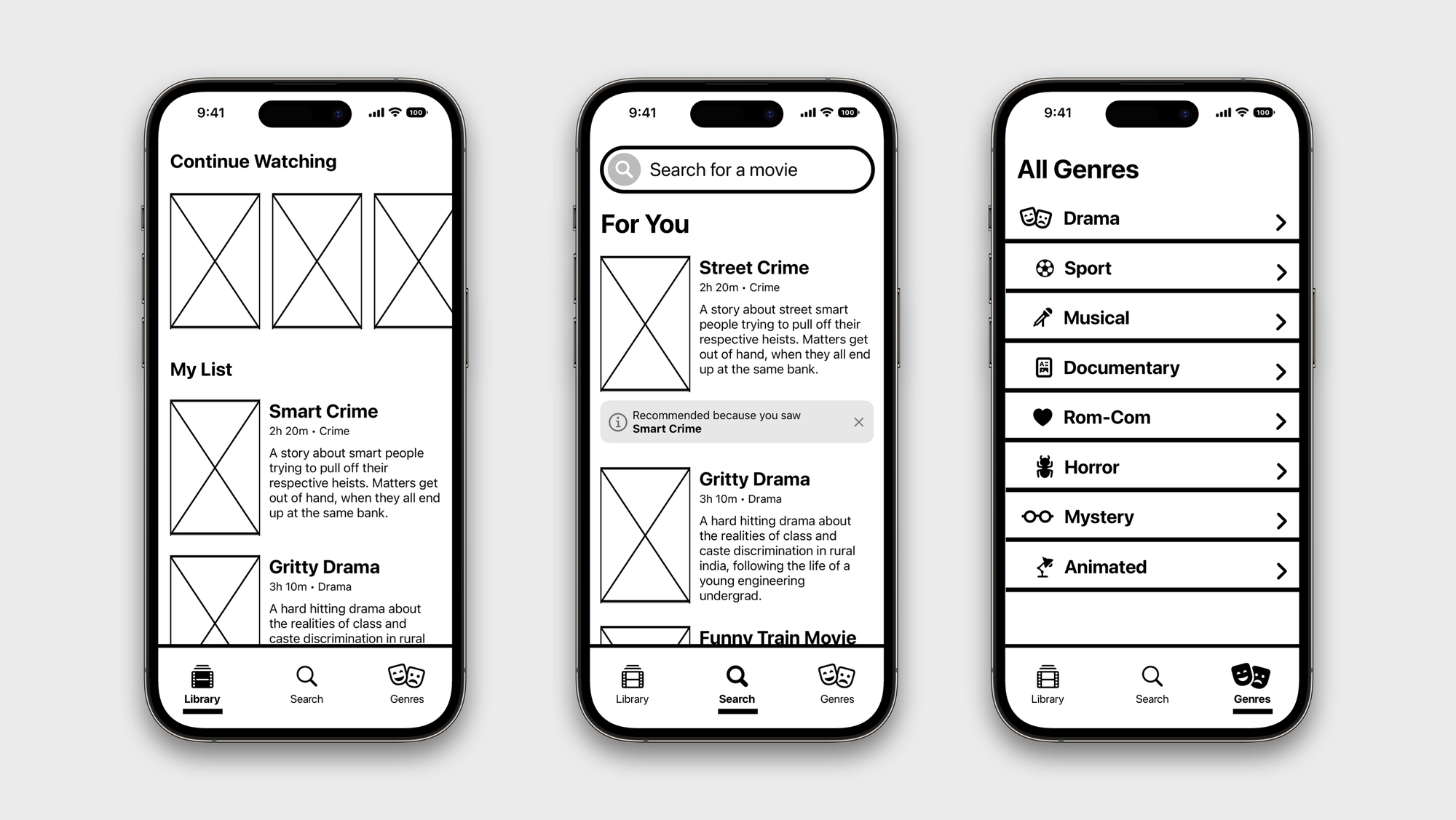
I have a list of movies I keep on Netflix, but it’s hard to reach, I have a couple of shows I am watching and they’re hard to reach too. They all reside somewhere amongst the sea of others in a section of their own.
It’s essentially solving its discovery problem by overwhelming the user with information and ultimately what bubbles on top is what gets most attention.
And this is the case with nearly every streaming service. One Top Pane to highlight the week’s latest, most popular release, and then dozens of sections that have a never-ending list of posters.
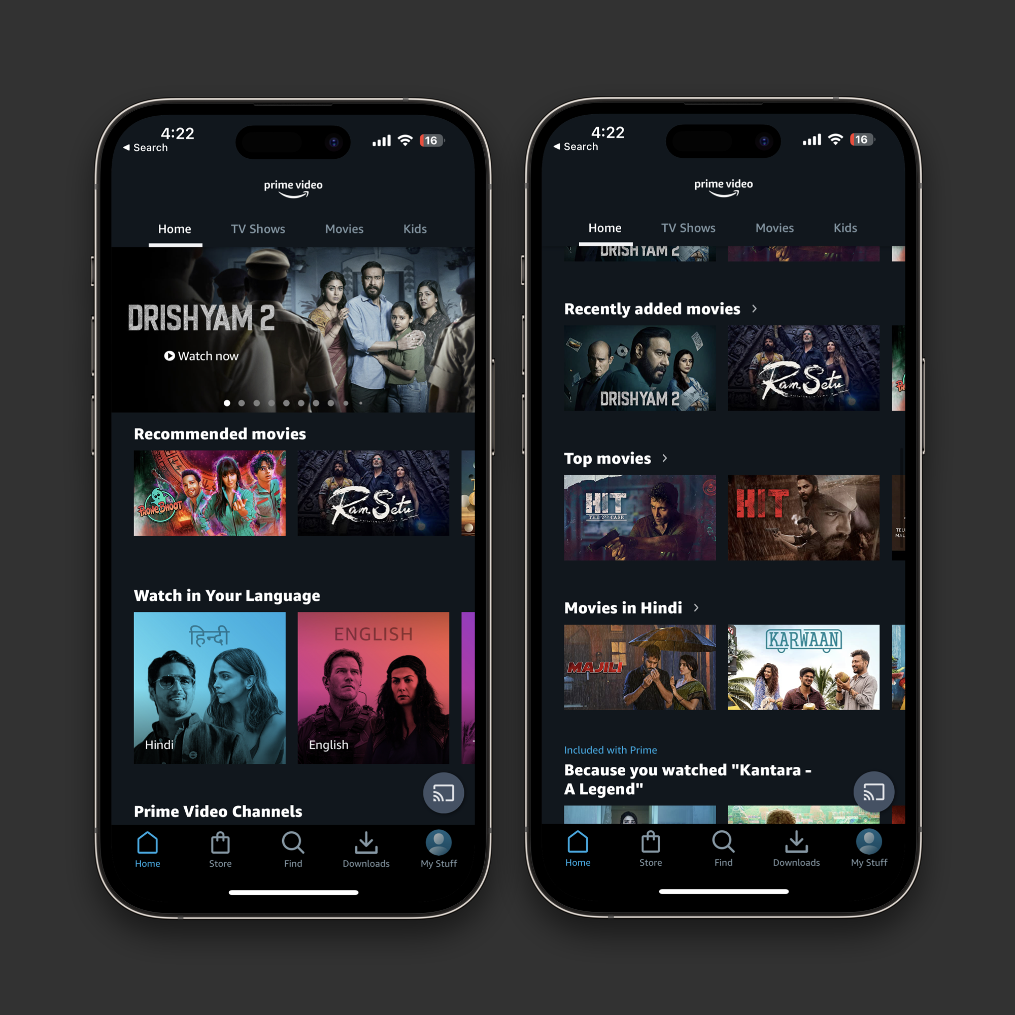
This to me, is not ideal. It surfaces what the service wants to see at the top, ignores the user’s manually entered preferences, and offers too much choice all at once.
So I did a quick wireframe on how the streaming service navigation could be improved. It divides the catalog in three tabs. “Library”, “For You”, and “Genre” making browsing content much more manageable, and still leaving room for ML based discovery.