Redesigning the macOS Ventura Form Layout

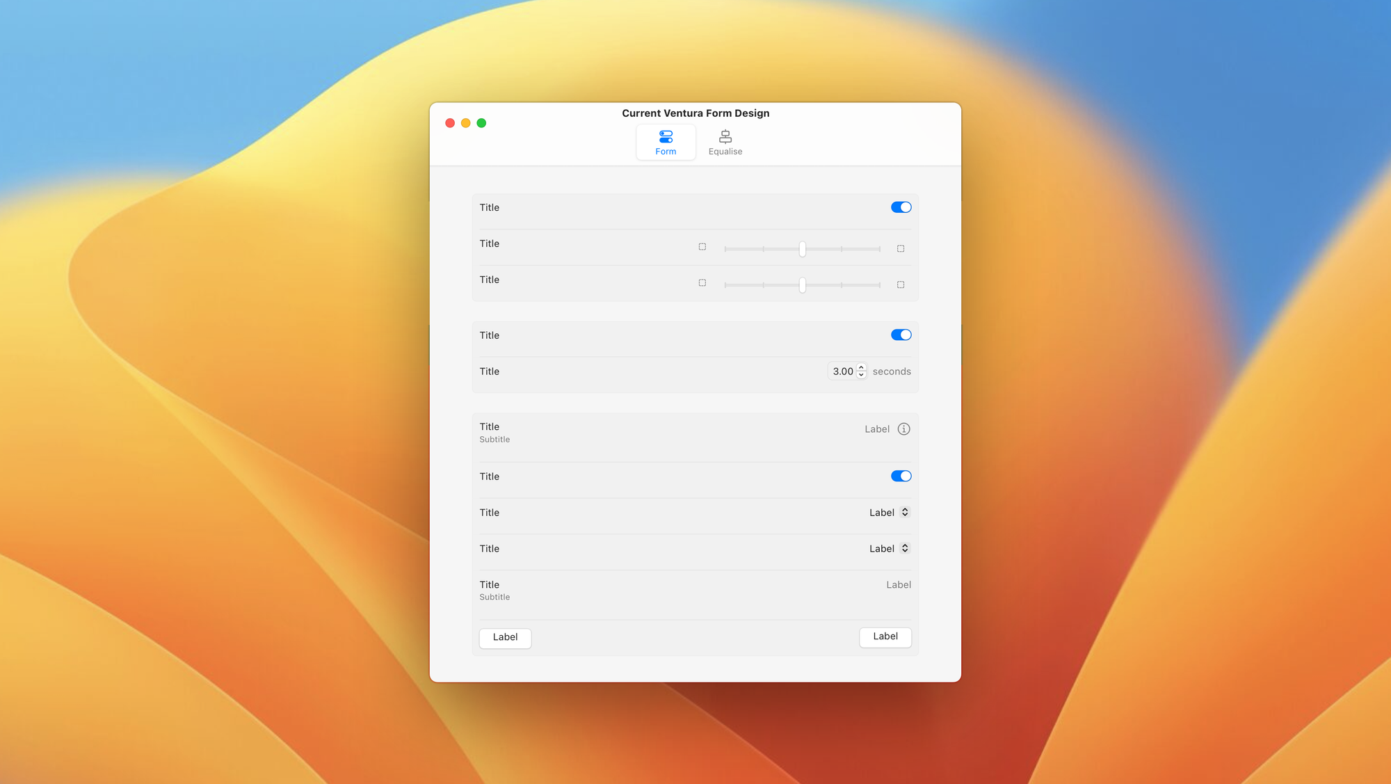
macOS Ventura introduces a new design to display forms. The design looks like this:

As you can see with this design, it's got a couple of glaring of issues when used in wide width situation:
- There's too much space between the title and value. This makes reading the values veery difficult.
- Even when grouping, the sameness of each item makes it look like a block of text even more so than the previous versions
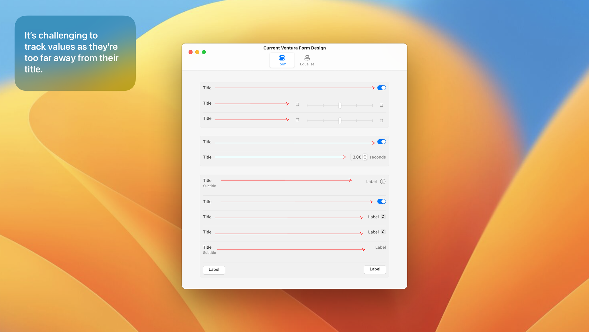
This issue can be fixed. If the form design goes back to the center equalise format that's been in use in macOS X since day 1.
The center equalise process, solves the issue of tracking values very elegantly, and overall offers a much more readable UI.

I really hope Apple makes this change in their form design, as it's affecting critical apps like System Settings and Print Dialogues.