Make • Show • Learn
The iterative design processes behind LookUp's product design and features.
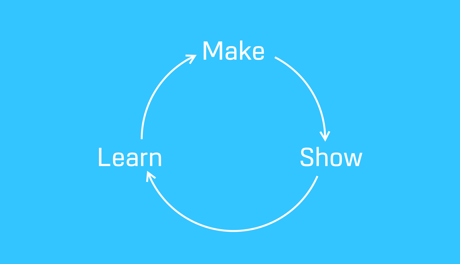
Iteration in design is perhaps one of the most underrated process. What’s more important than shipping an app is to continuously iterate and improve on it. I've gradually improved LookUp by focusing each update on the direction we want to take the app in, and things people have requested.
Sometimes there’s a direct link to people making requesting something and us providing it. For example Offline Support. Sometimes there are opportunities in the critical feedback presented by the users.
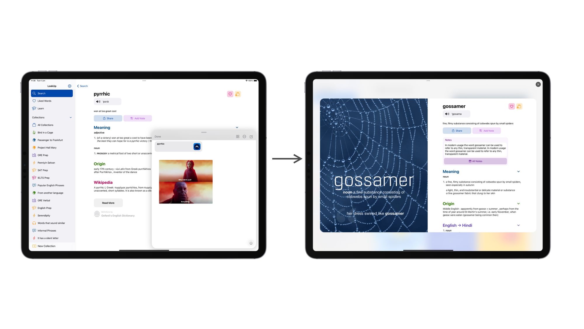
Removing features that don’t work out
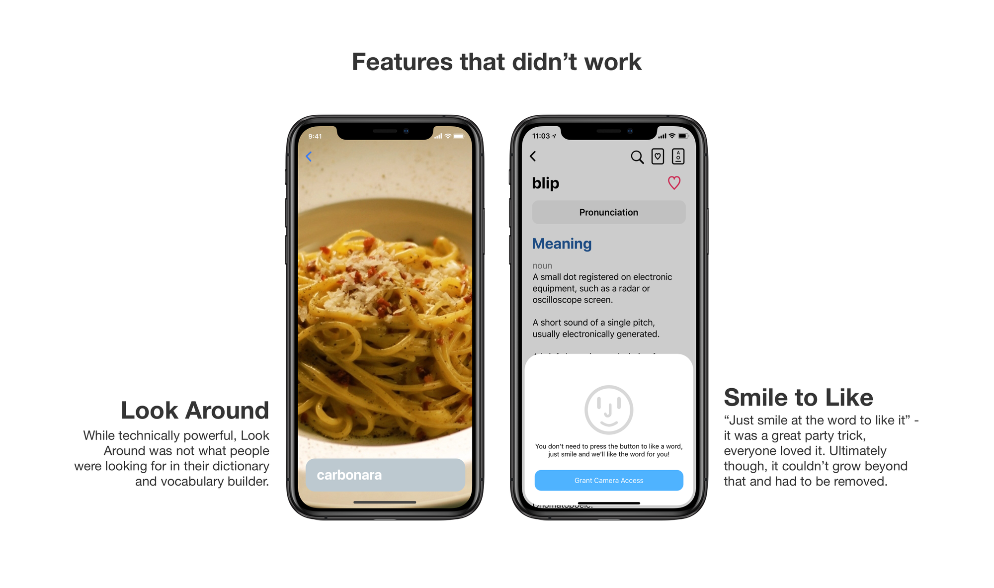
Another important factor is removing things that don’t work. Over the years, we added a lot of new capabilities to our apps, some of them worked perfectly, some of them not so much.
LookAround was impressive in that it showed how powerful CoreML was when it launched and it was really fun to use it but it was also not a great feature for our app. Most people just wanted to scan the text from a document. So we removed LookAround. Instead, next year, we came up with Scan Words. Which, as the name suggests provides a much better value for people.
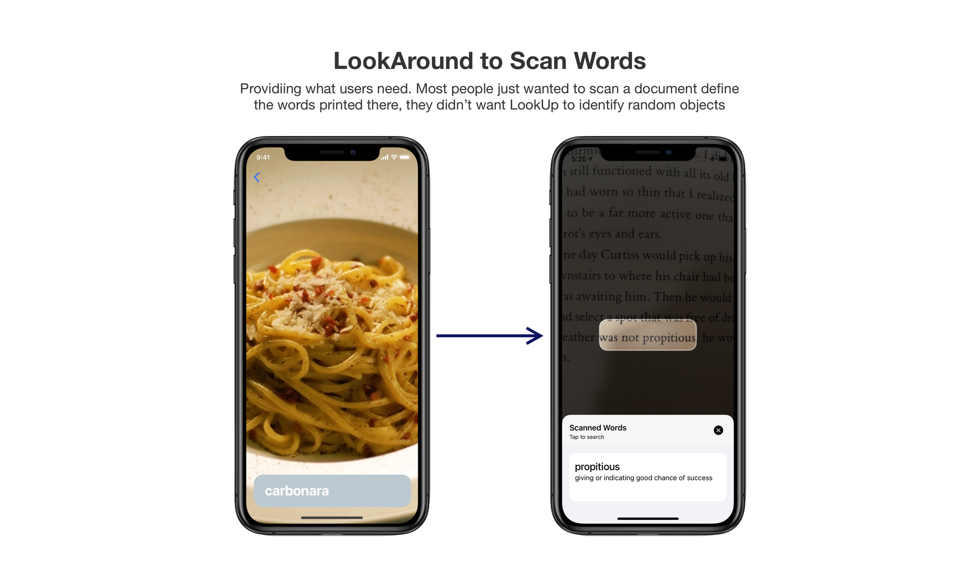
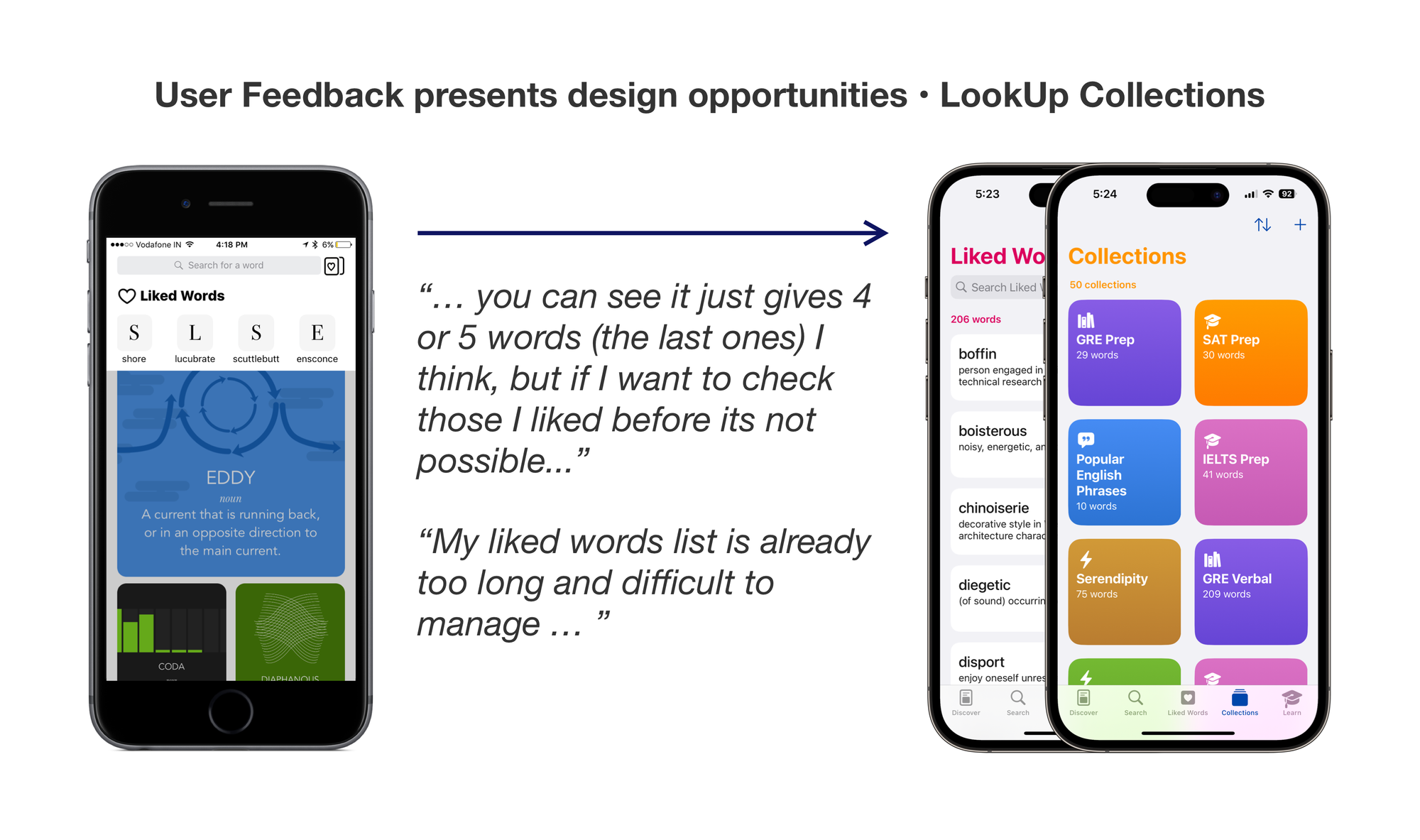
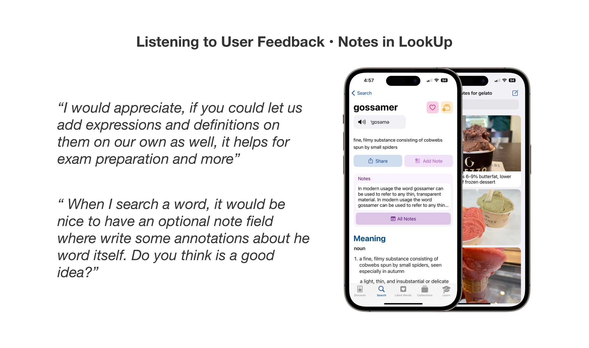
Users often suggest solutions in their feedback mails, and that’s really interesting too. Users are great at identifying the problem, sometimes their solutions can be based on what they see elsewhere, and it’s important to dig deeper, and provide something meaningful.
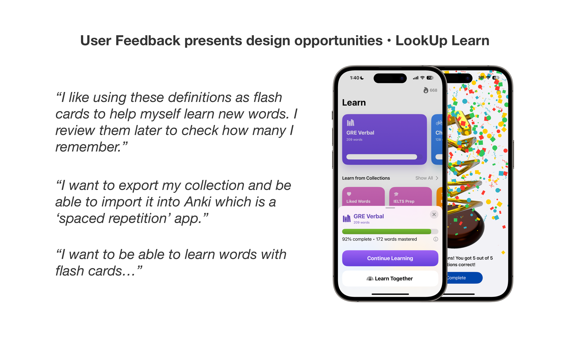
First, when Collections came out in 2018, a lot of users requested the ability to create flash cards. What we discovered was that people wanted to a way to build their vocabulary. And while flash cards was one of the ways to do it, interactive quizzes was another interesting way that leveraged flash card style learning but made it more interactive. So we came out with Quizzes in 2019.
Flash Cards also facilitate more learning techniques. So, we researched on those techniques and built a custom learning engine that used spaced repetition to help people build their vocabulary.
What started as a simple request for flash cards, actually helped us build the groundwork for LookUp’s vocabulary building features.
This is an excerpt from the LookUp at 10 Design Case Study:
