Redesigning macOS Settings app


Almost a year in, I am still struggling with the macOS Ventura Settings redesign. It’s not just the form design, it’s also the readability of the layout, the lack of visual cues in so many places and the confusing grouping.
Overall, the Settings app seems like a bit of a downgrade. Sure, the sidebar layout is good, but there’s so much that can be done.
I revisited some of my six month old redesigns today and have compiled, how I feel the Settings app must be redesigned.


Key Ideas
My redesign is based on three key ideas:
- Move to Center Equalise form layouts: For better readability
- Regroup Sections for better clarity
- Allow Editing the Sidebar to show and hide different sections and move them around
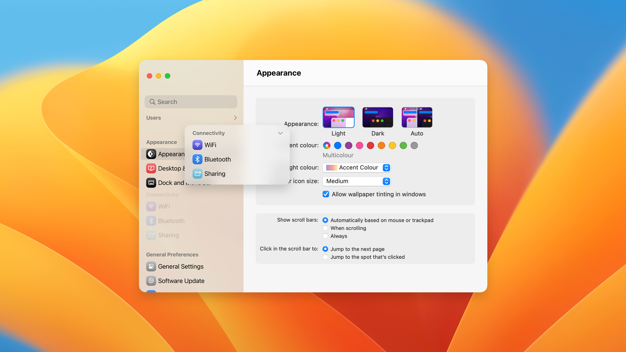
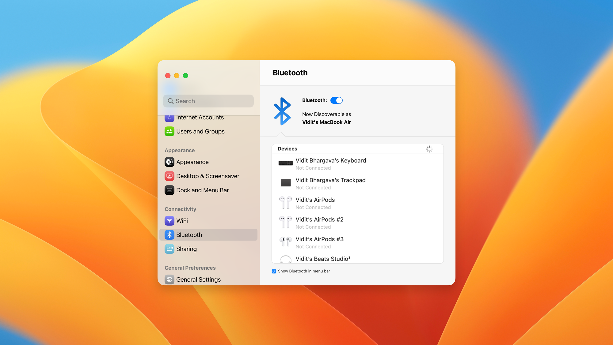
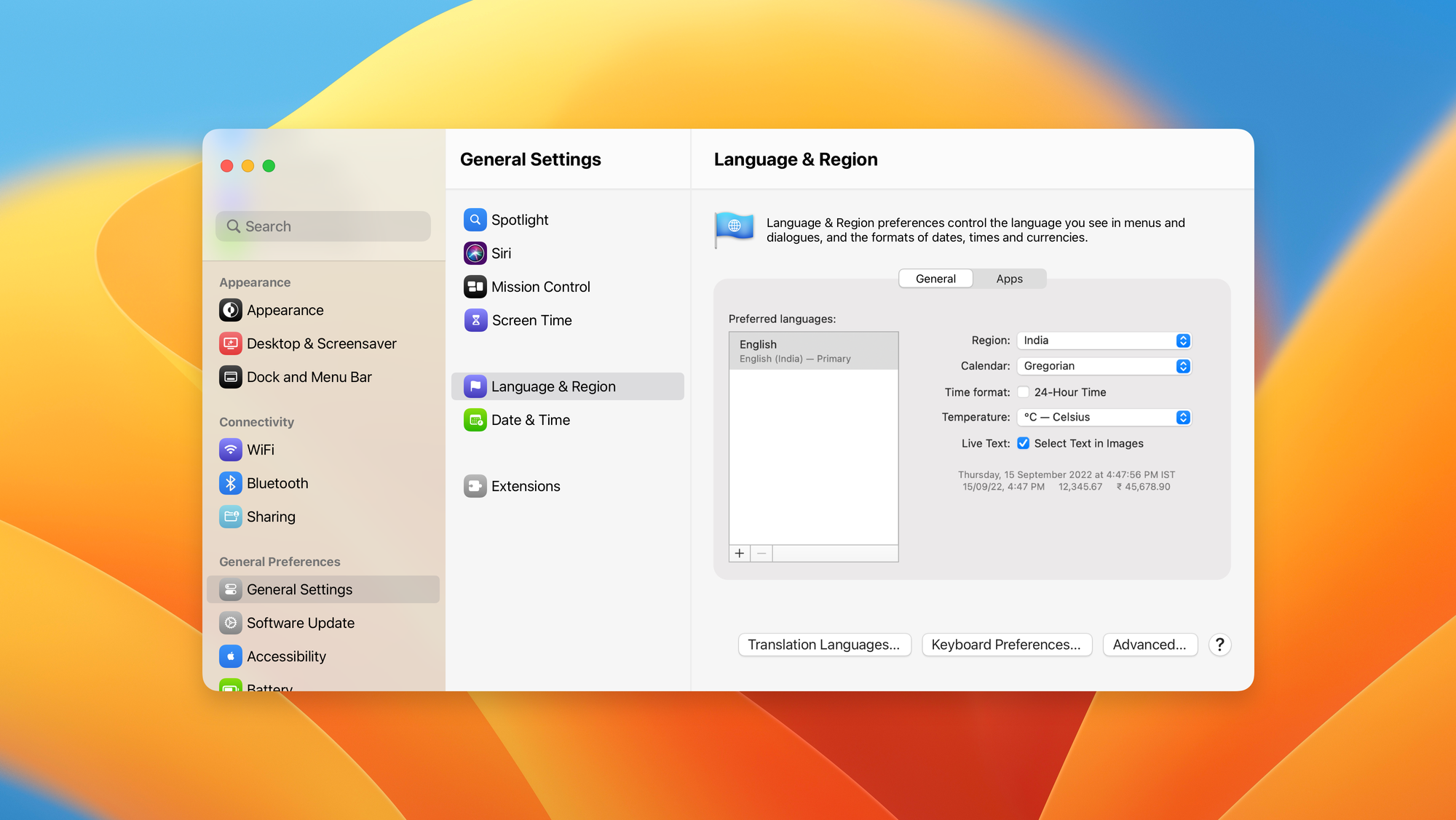
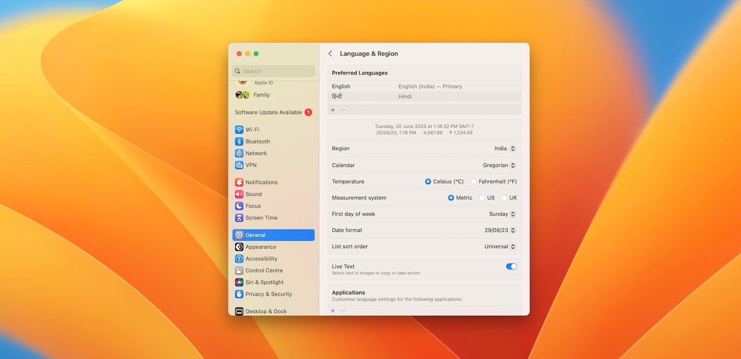
Using Center Equalised forms and Multiple Columns
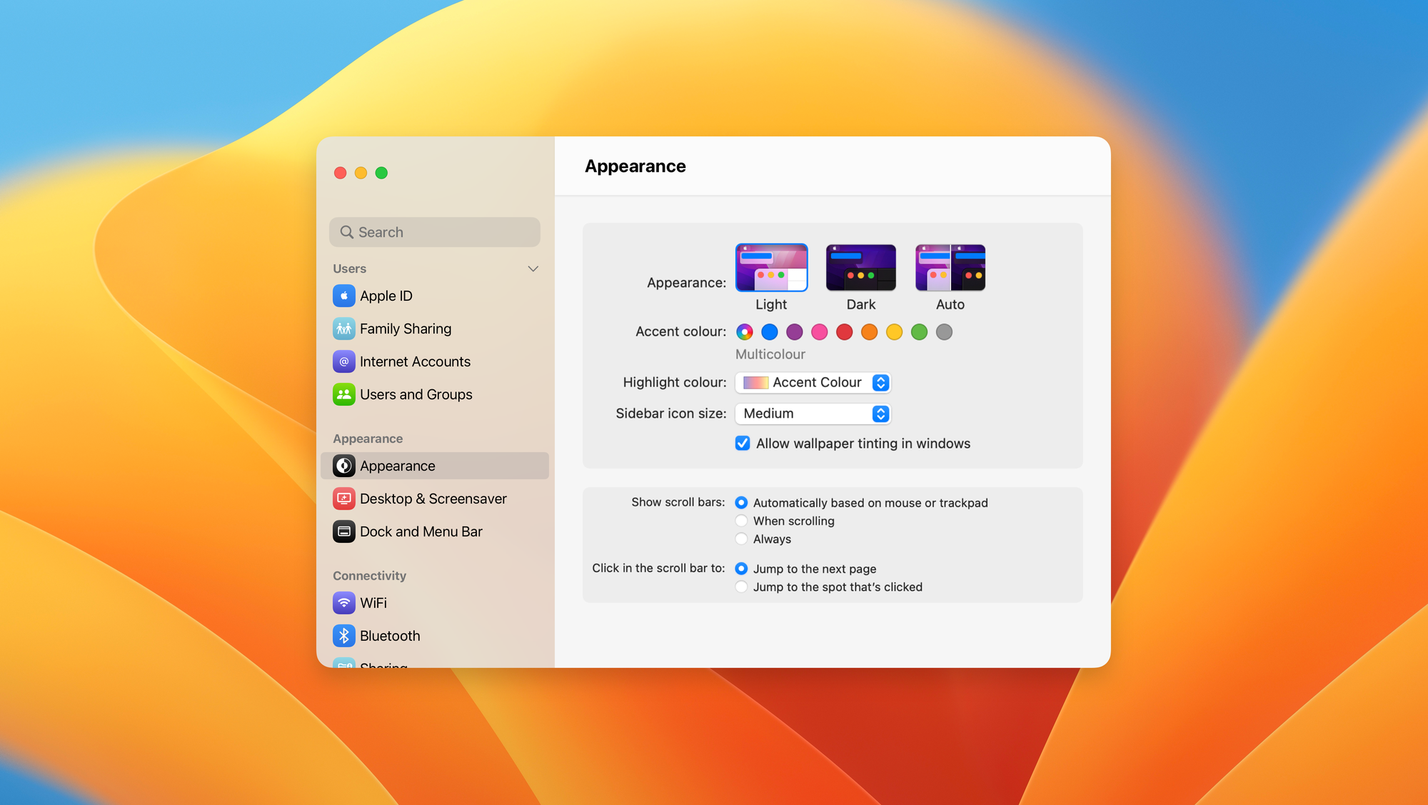
In this redesign, you can see how the forms have been designed for better legibility and how multiple columns declutter the interface from drill-down menus that can be slow to navigate.
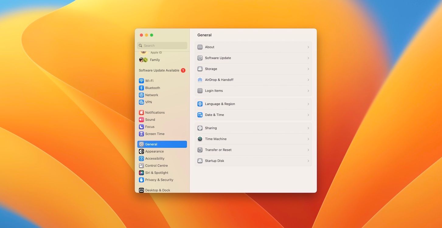

Regrouping Sections
The redesign organises Settings into 8 logical sections, each one can progressively disclose further settings by adding more columns when clicked on.
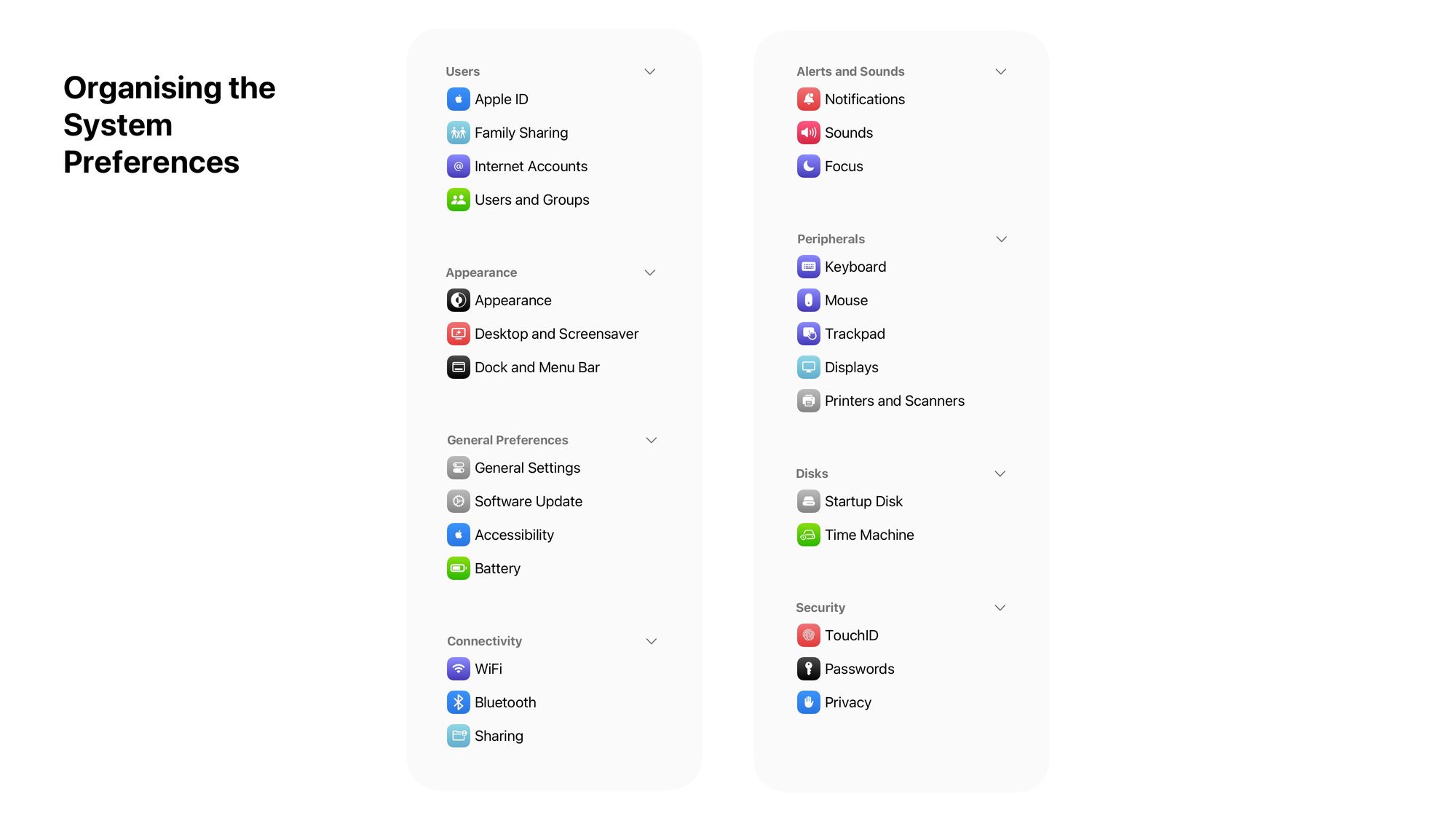
Allowing Drag and Drop for customisability
Settings is a complex app, every user has different priorities for their settings. It’s important that users be able to control where different sections are placed in the sidebar.